28 Vis: Scatterplots and Layers
Purpose: Scatterplots are a key tool for EDA. Scatteplots help us inspect the relationship between two variables. To enhance our scatterplots, we’ll learn how to use layers in ggplot to add multiple pieces of information to our plots.
Reading: (None, this is the reading)
## ── Attaching core tidyverse packages ──────────────────────── tidyverse 2.0.0 ──
## ✔ dplyr     1.1.4     ✔ readr     2.1.5
## ✔ forcats   1.0.0     ✔ stringr   1.5.1
## ✔ ggplot2   3.5.2     ✔ tibble    3.2.1
## ✔ lubridate 1.9.4     ✔ tidyr     1.3.1
## ✔ purrr     1.0.4
## ── Conflicts ────────────────────────────────────────── tidyverse_conflicts() ──
## ✖ dplyr::filter() masks stats::filter()
## ✖ dplyr::lag()    masks stats::lag()
## ℹ Use the conflicted package (<http://conflicted.r-lib.org/>) to force all conflicts to become errors28.1 Scatterplots
A scatterplot is simply a graph of two variables (x and y) where every data row is shown using a point. We can make a scatterplot by using the geom_point() geometry.
## NOTE: No need to modify! Just example code
mpg %>%
  ggplot(mapping = aes(x = displ, y = hwy)) +
  geom_point()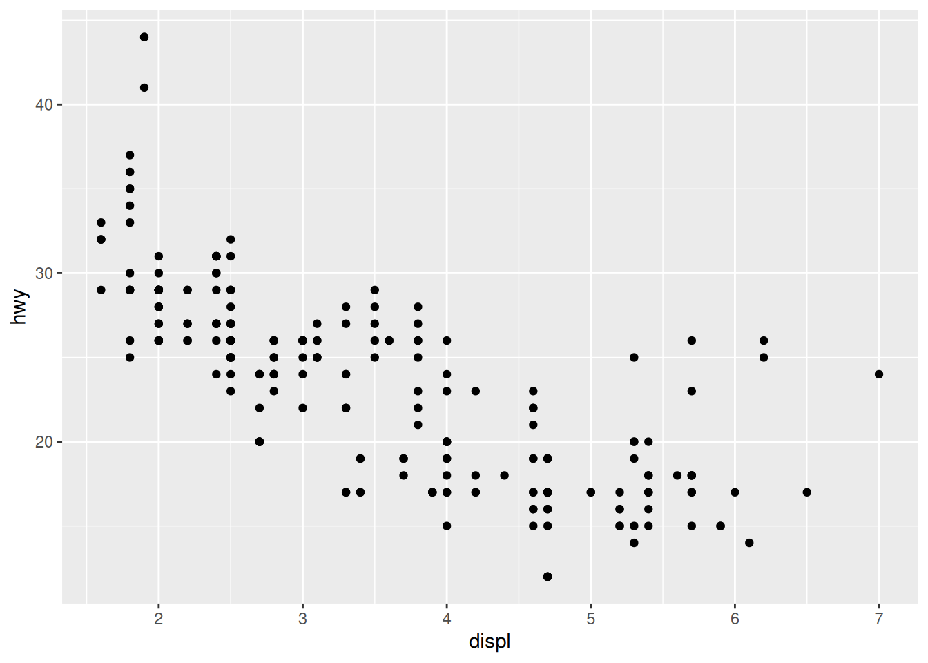
Part of the power of the scatterplot is that it’s a flexible way to show all the data. Unlike bar charts (where our data needs to be 1:1), a scatterplot easily deals with multiple y values for the same x simply by plotting multiple points.
However, when we start plotting a lot of data, we start to encounter overplotting.
28.2 Solutions to Overplotting: Jittering, Counting, Alpha
Overplotting is when multiple observations “land” in the same location in our graph, giving the false impression of a single point. Overplotting often happens when we have rounded values. For instance, the fuel economy values are integer values; this leads to a lot of overplotting.
28.2.1 Jittering
One way to overcome overplotting is to randomly “jitter” the points: add a small random offset to the numerical values. We can do this with geom_jitter(), which is a drop-in replacement for geom_point():
## NOTE: No need to modify! Just example code
mpg %>%
  ggplot(mapping = aes(x = displ, y = hwy)) +
  geom_jitter()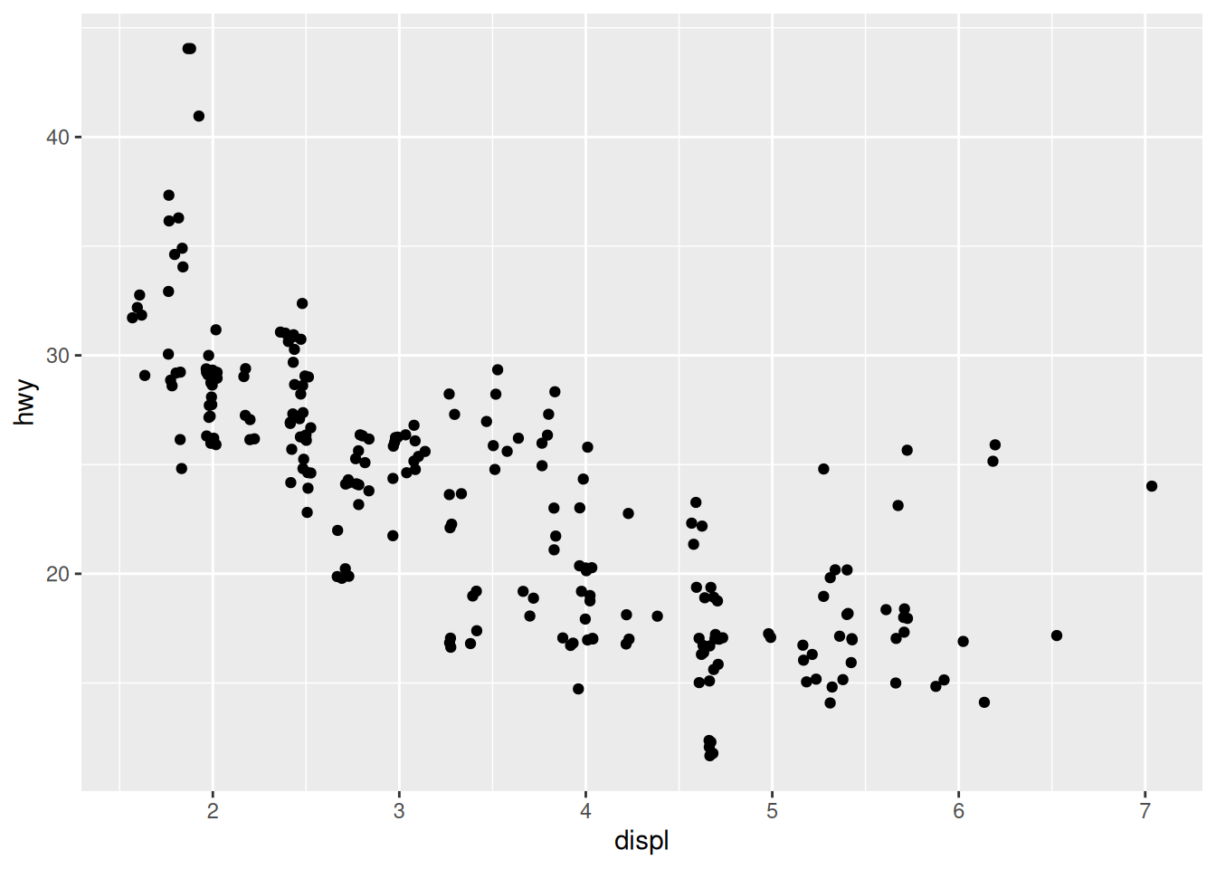
Now that we’ve jittered the data, we can see little “clusters” of points where we’d previously seen a single point. Unfortunately, jittering introduces some “lies” into our visual: We have to be careful not to interpret the jittering as true variability in the data.
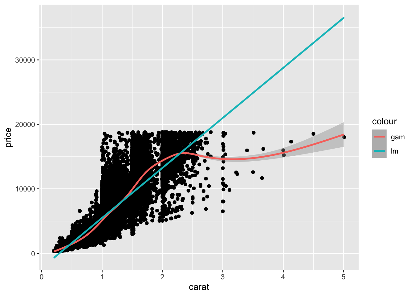
To overcome this, we can adjust the level of jittering in the horizontal and vertical directions. Since we know that hwy values are integers only, we can add a small jittering in the vertical direction only, and easily remember that the vertical jitter isn’t actually in the data.
28.2.2 q1 Adjust the jitter
Modify the code below to adjust the jittering to be 0 in the horizontal direction.
Note: If you do this correctly, you should see vertical “streaks” with no horizontal jittering.
## TASK: Adjust the jittering to be 0 in the horizontal direction
mpg %>%
  ggplot(mapping = aes(x = displ, y = hwy)) +
  geom_jitter(
    width = 0,
    height = 0.5
  )
28.2.3 Count
If our x, y values land precisely at the same point, there’s another good option to deal with overplotting: geom_point() will count the number of rows that land at the same point and visualize them by size:
## NOTE: No need to modify! Just example code
mpg %>%
  ggplot(mapping = aes(x = displ, y = hwy)) +
  geom_count()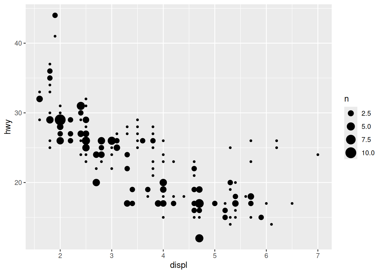
Personally, I find geom_count() to be much more effective at showing this dataset, compared with geom_jitter().
28.2.4 Alpha
We can’t use geom_count() unless values land in exactly the same place. Even then, we may find that our points still overlap. Thankfully, there’s one more trick for overplotting: adjust the transparency of points using the alpha argument. This is particularly helpful when we have an extreme amount of data:
## NOTE: No need to modify! Just example code
diamonds %>%
  ggplot(aes(x = carat, y = price)) +
  geom_point(alpha = 1/20)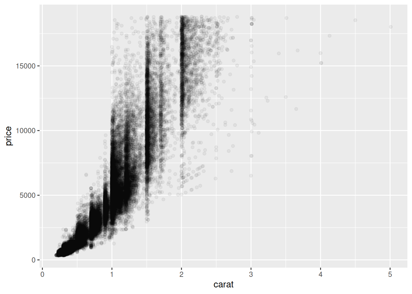
I like specifying alpha using a fraction; in this way, I can easily tell what number of overlapping points will appear solid. For instance, with alpha = 1/20, I know that a region of solid color is at least 20 overlapping points.
28.3 Adding variables
Like other geom_*() functions, we can map additional (optional) aesthetics with geom_point(). One of the most useful (optional) aesthetics is color.
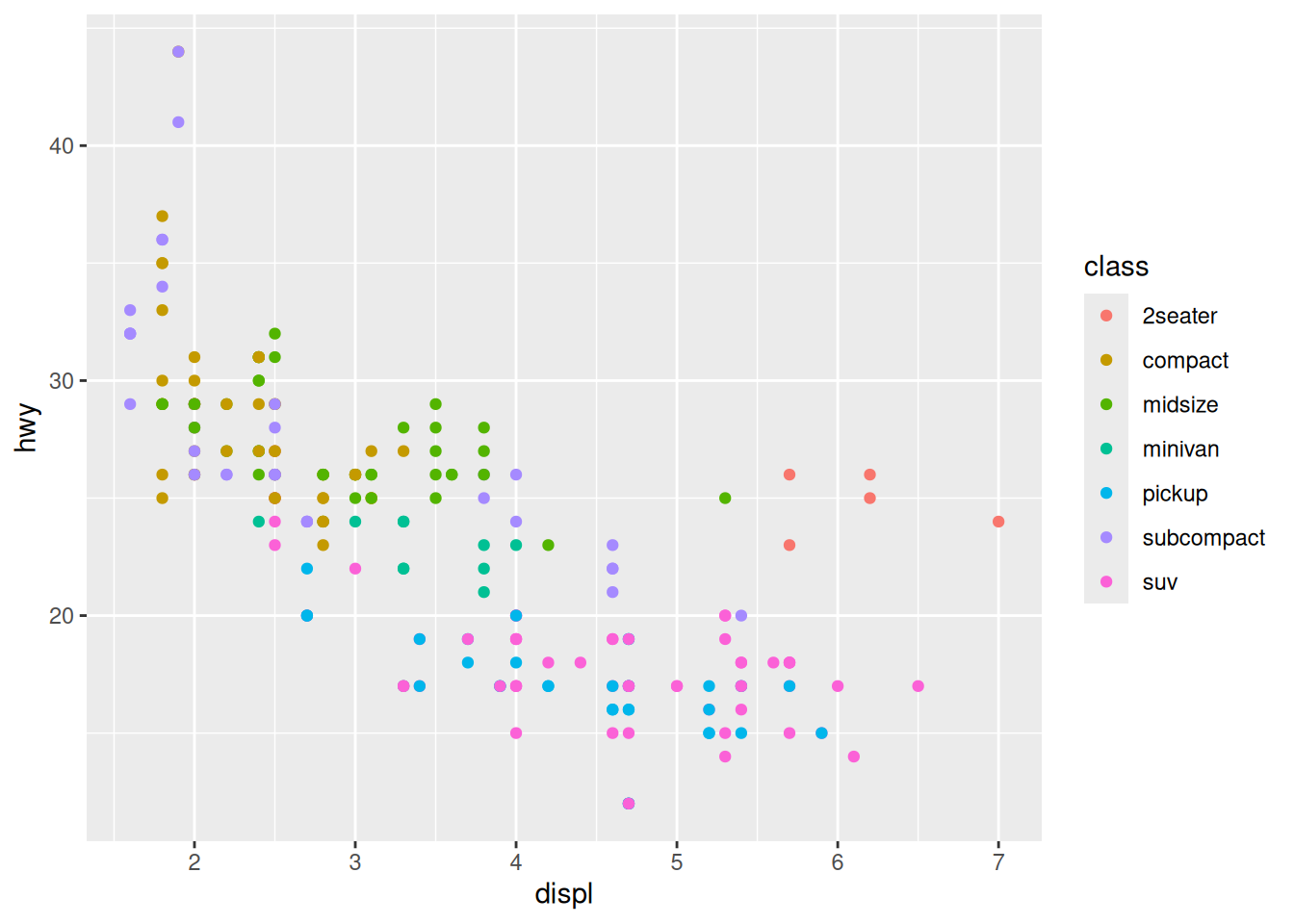
In the plot above, we’re getting a misleading impression of the data, again due to overplotting.
28.4 Layers
Formally, ggplot is a “layered grammar of graphics”; each layer has the option to use built-in or inherited defaults, or override those defaults. There are two major settings we might want to change: the source of data or the mapping which defines the aesthetics. If we’re being verbose, we write a ggplot call like:
## NOTE: No need to modify! Just example code
ggplot(
  data = mpg,
  mapping = aes(x = displ, y = hwy)
) +
  geom_point()
However, ggplot makes a number of sensible defaults to help save us typing. Ggplot assumes an order for data, mapping, so we can drop the keywords:
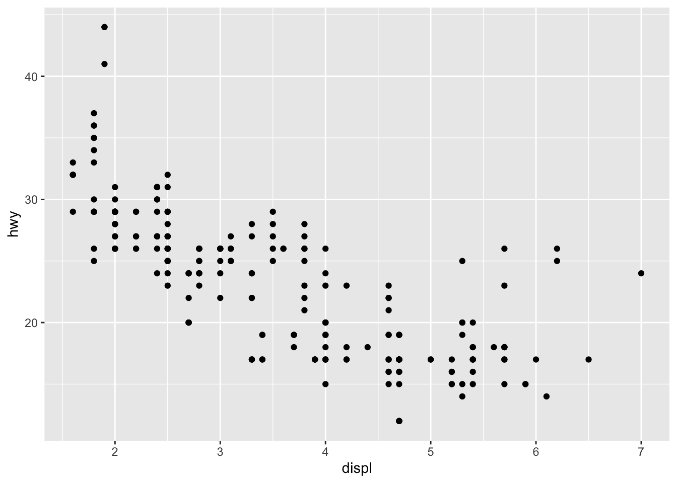
Similarly the aesthetic function aes() assumes the first two arguments will be x, y, so we can drop those arguments as well. Once we know what we’re doing, we can write some really short code:

Above geom_point() inherits the mapping from the base ggplot call; however, we can override this. This can be helpful for a number of different purposes: The following example uses the same x mapping for both geom_point() calls, but uses a different y mapping for each.
## NOTE: No need to modify! Just example code
ggplot(mpg, aes(x = displ)) +
  geom_point(aes(y = hwy, color = "hwy")) +
  geom_point(aes(y = cty, color = "cty"))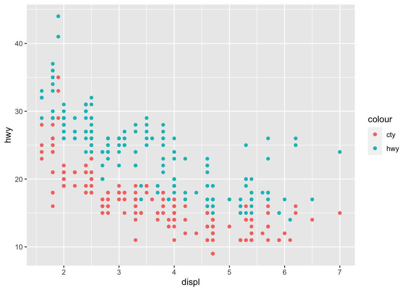
Later, we’ll learn more concise ways to construct graphs like the one above. But for now, we’ll practice using layers to add more information to scatterplots.
28.4.1 q3 Add a label layer
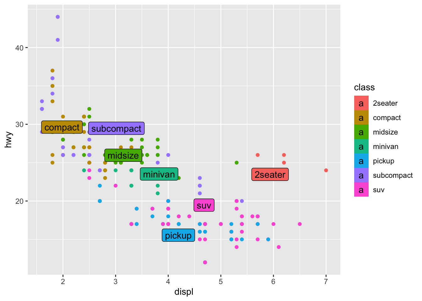
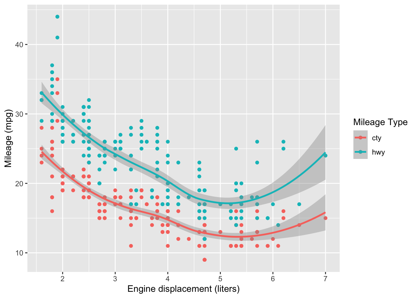
Add non-overlapping labels to the following scattterplot using the provided df_annotate.
Hint 1: geom_label_repel() comes from the ggrepel package. Make sure to load ggrepel, and use help to figure out how to use geom_label_repel()!
Hint 2: You’ll have to use the data keyword to override the data layer!
## TODO: Use df_annotate below to add text labels to the scatterplot
df_annotate <-
  mpg %>%
  group_by(class) %>%
  summarize(
    displ = mean(displ),
    hwy = mean(hwy)
  )

mpg %>%
  ggplot(aes(displ, hwy)) +
  geom_point(aes(color = class)) +
  geom_label_repel(
    data = df_annotate,
    aes(label = class, fill = class)
  )
28.4.2 q4 Interpret a scatterplot
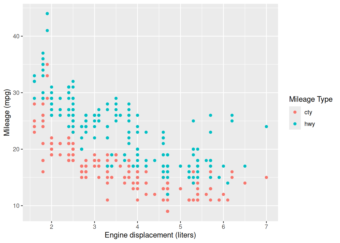
Study the following scatterplot: Note whether city (cty) or highway (hwy) mileage tends to be greater.
## NOTE: No need to modify! Just analyze the scatterplot
mpg %>%
  pivot_longer(names_to = "source", values_to = "mpg", c(hwy, cty)) %>%
  ggplot(aes(displ, mpg, color = source)) +
  geom_point() +
  scale_color_discrete(name = "Mileage Type") +
  labs(
    x = "Engine displacement (liters)",
    y = "Mileage (mpg)"
  )
Observations:
- hwy mileage tends to be larger; driving on the highway is more efficient
- Mileage tends to decrease with engine size; cars with larger engines tend to be less efficient
28.5 Aside: Scatterplot vs bar chart
Why use a scatterplot vs a bar chart? A bar chart is useful for emphasizing some threshold. Let’s look at a few examples:
28.6 Raw populations
Two visuals of the same data:
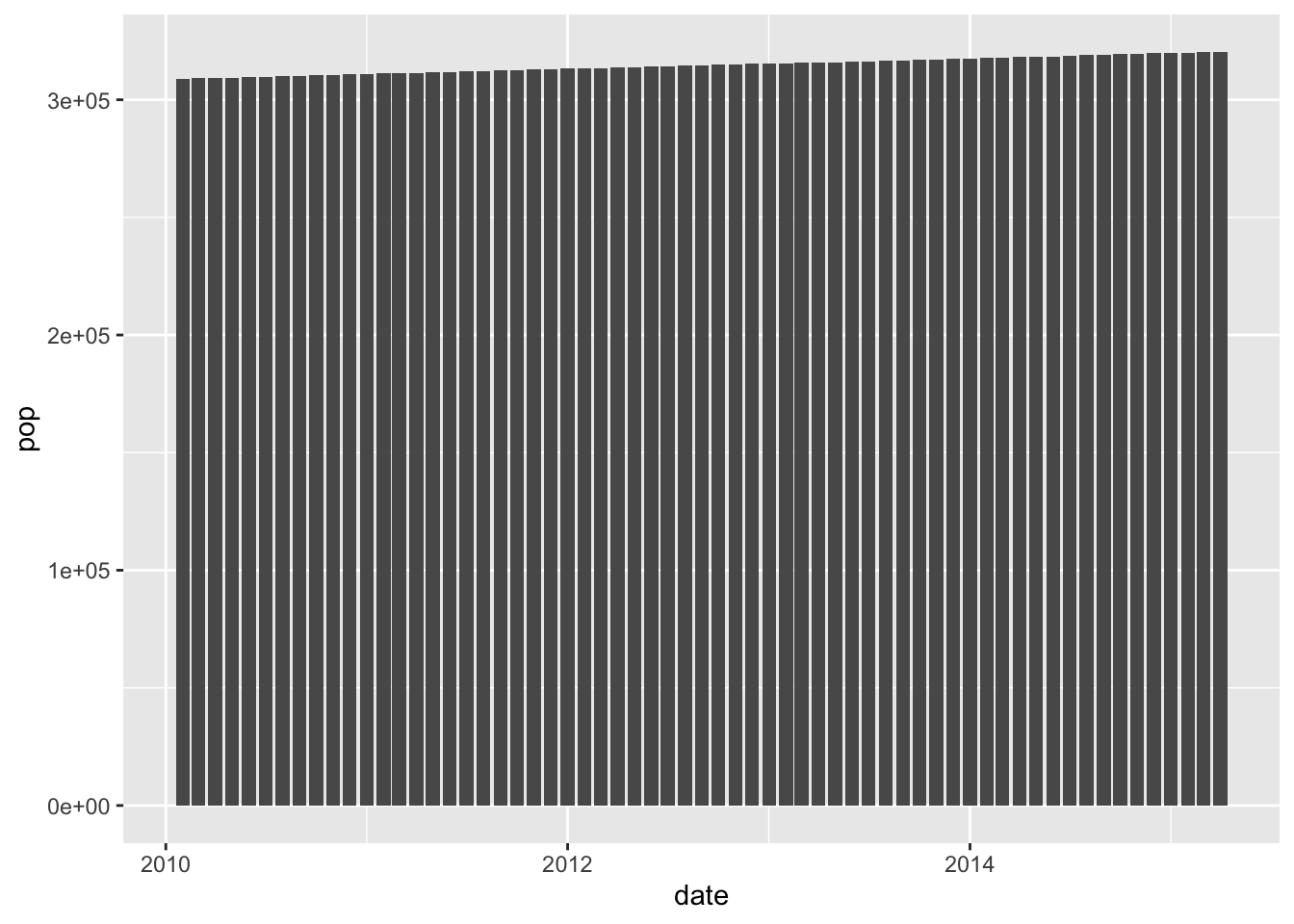
Here we’re emphasizing zero, so we don’t see much of a change
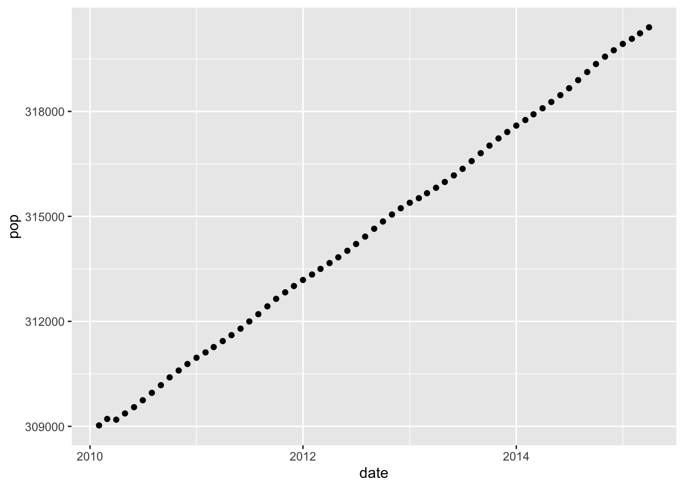
Here’s we’re not emphasizing zero; the scale is adjusted to emphasize the trend in the data.
28.7 Population changes
Two visuals of the same data:
economics %>%
  mutate(pop_delta = pop - lag(pop)) %>%
  filter(date > lubridate::ymd("2005-01-01")) %>%
  ggplot(aes(date, pop_delta)) +
  geom_col()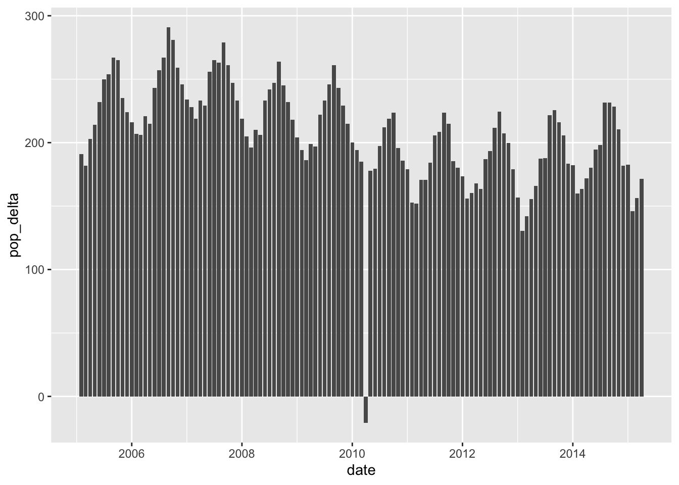
Here we’re emphasizing zero, so we can easily see the month of negative change.
economics %>%
  mutate(pop_delta = pop - lag(pop)) %>%
  filter(date > lubridate::ymd("2005-01-01")) %>%
  ggplot(aes(date, pop_delta)) +
  geom_point()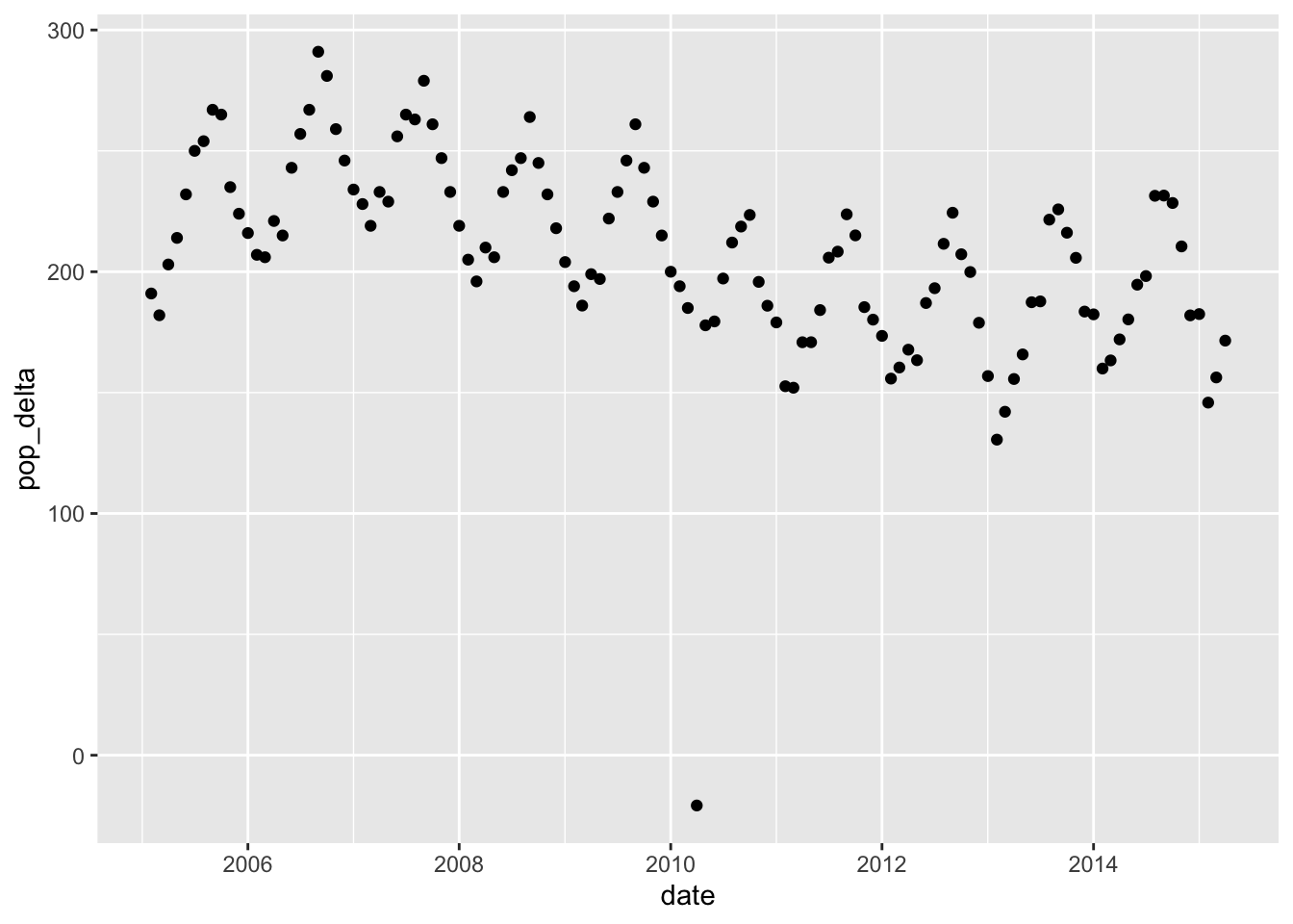
Here we’re not emphasizing zero; we can easily see the outlier month, but we have to read the axis to see that this is a case of negative growth.
For more, see Bars vs Dots.
