20 Vis: Histograms
Purpose: Histograms are a key tool for EDA. In this exercise we’ll get a little more practice constructing and interpreting histograms and densities.
Reading: (None, this is the reading)
## ── Attaching core tidyverse packages ──────────────────────── tidyverse 2.0.0 ──
## ✔ dplyr     1.1.4     ✔ readr     2.1.5
## ✔ forcats   1.0.0     ✔ stringr   1.5.1
## ✔ ggplot2   3.5.2     ✔ tibble    3.2.1
## ✔ lubridate 1.9.4     ✔ tidyr     1.3.1
## ✔ purrr     1.0.4
## ── Conflicts ────────────────────────────────────────── tidyverse_conflicts() ──
## ✖ dplyr::filter() masks stats::filter()
## ✖ dplyr::lag()    masks stats::lag()
## ℹ Use the conflicted package (<http://conflicted.r-lib.org/>) to force all conflicts to become errors
20.1 Histograms
A histogram is a form of bar chart. Much like geom_bar(), histograms count up rows. Unlike geom_bar(), a histogram is well-suited to deal with continuous data. To illustrate, let’s look at the displ values in the mpg dataset with a geom_bar():
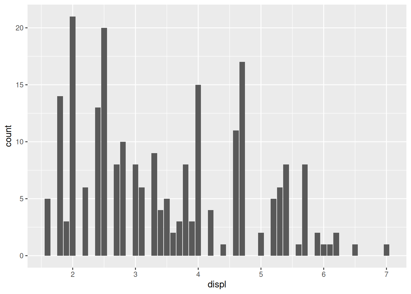
Some of the displ values only appear once, but they’re very close to similar values. This can give a misleading impression of the data. A histogram first “bins” the data before counting up rows. This allows us to combine values that are nearby:
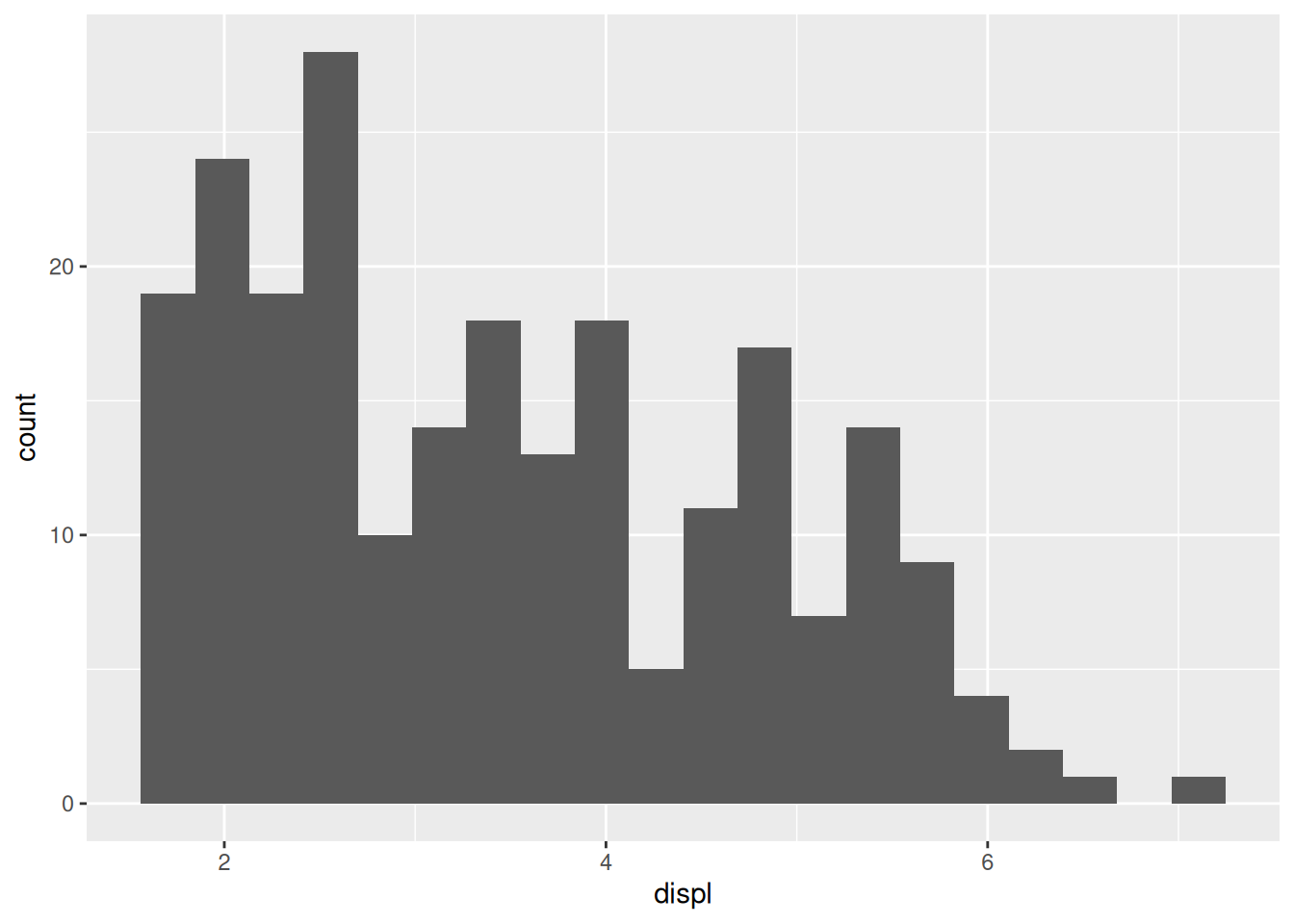
This view of the data gives a better impression of a “bulk” of data near displ == 2.
20.2 The golden rule of histograms
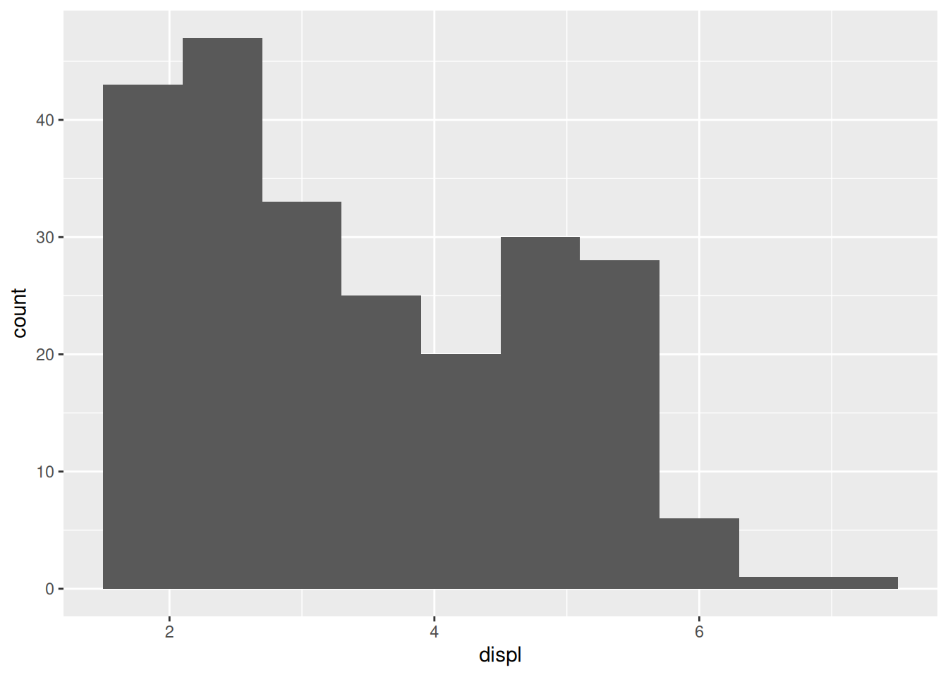
Since we have to bin the data to make a histogram, there is an important choice to be made in the number of bins. A different bin count can lead to a totally different view of the data.
If we pick very few bins, we lose a lot of resolution:
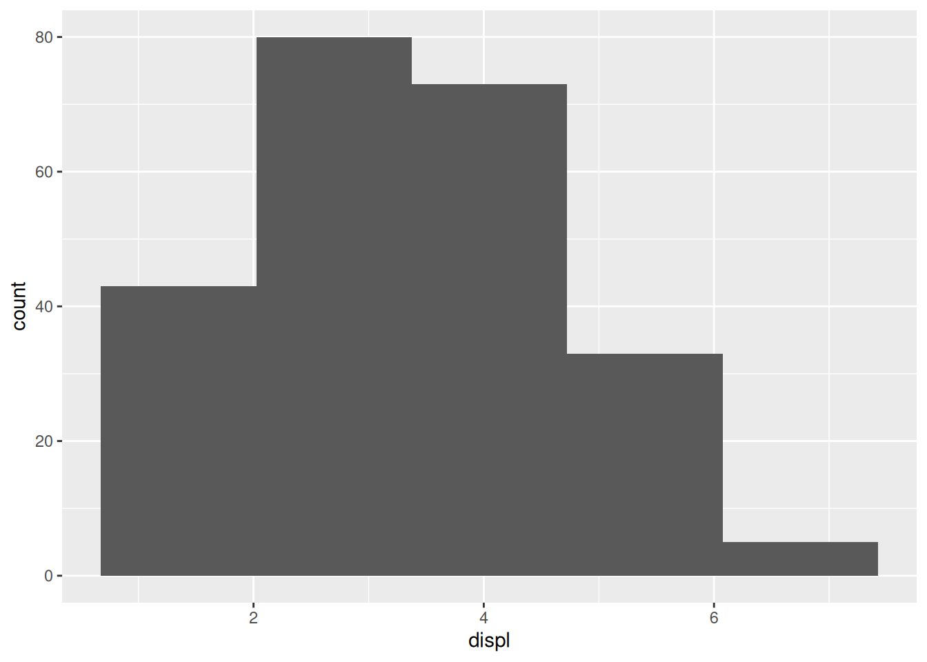
This plot gives the impression that the data peaks around displ == 3 or so. However, we get a different view with more bins,
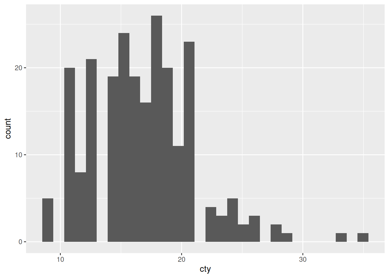
This plot shows us a peak around displ == 2 and another peak around displ == 5. Increasing the bin count again gives us yet another view,
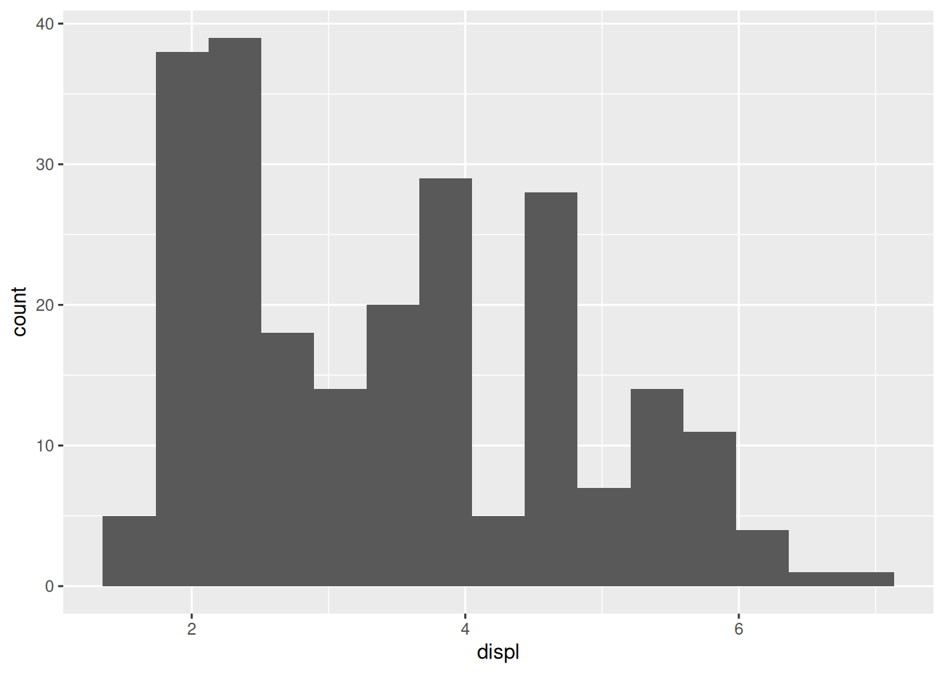
We still see a peak around displ == 2, but now the peak near displ == 5 seems more diffuse. Patterns that tend to persist across multiple bin sizes tend to be more trustworthy.
20.3 Frequency polygons
Frequency polygons are a useful tool to show “histograms” with multiple groups. As we saw last time, bars can easily overlap. A frequency polygon bins the data, but shows counts using lines (rather than bars),
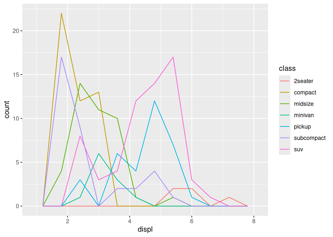
Note how we can see all the lines, and nothing is stacked (since there are no bars).
20.4 Density plots
There’s one more alternative to a frequency polygon, which is to plot an estimated density of the data. We’ll talk about (probability) densities later in the class, but for now, the thing to know is that densities always integrate to 1.
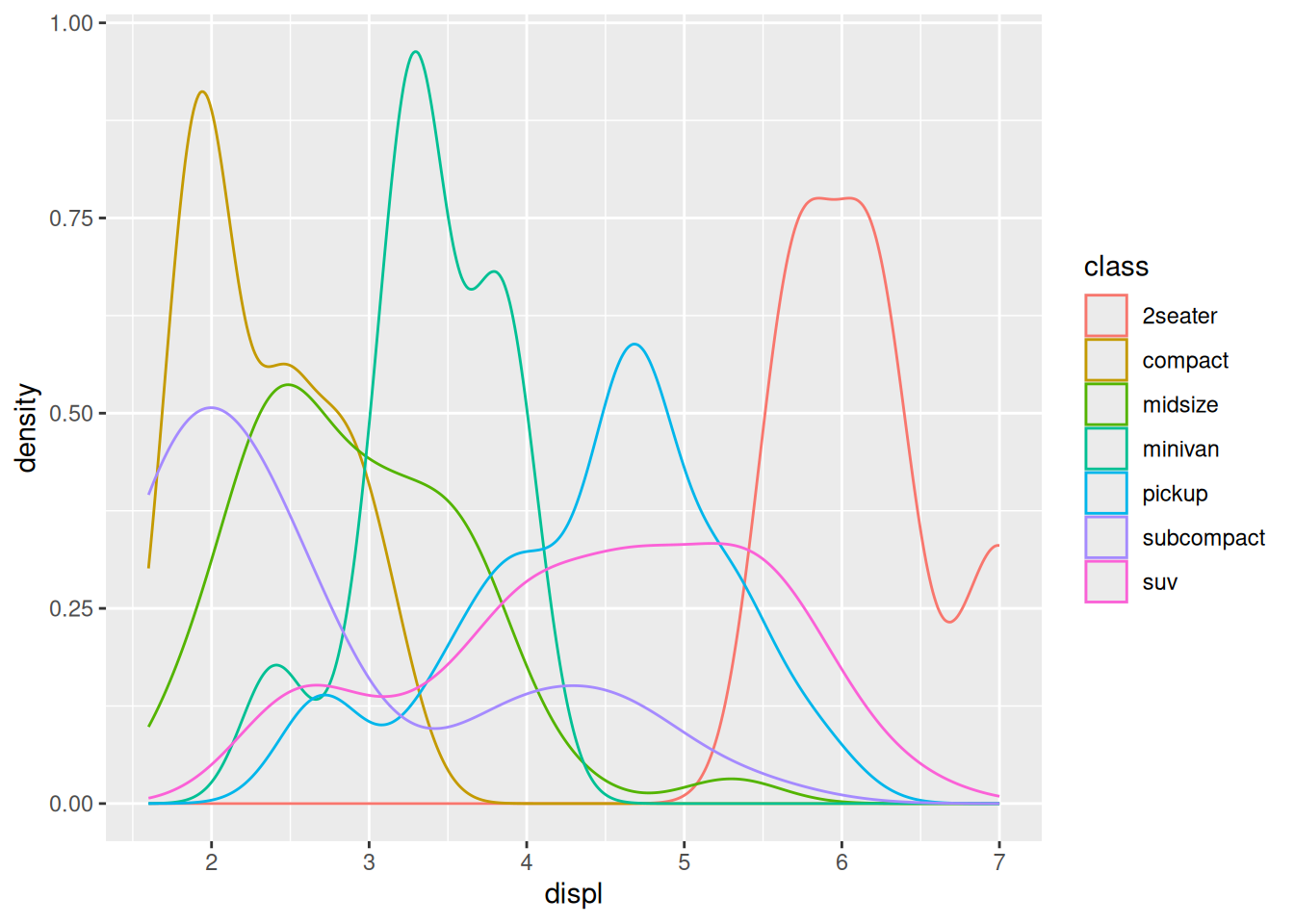
Density plots are better for showing where the data tends to be located. Frequency polygon plots also show where the data is located, but are better for showing the relative size of each group.
20.4.1 q2 Interpret a graph
Using the graphs generated in the chunks q1-vis1 and q1-vis2 below, answer:
- Which
classhas the most vehicles? - Which
classhas the broadest distribution ofctyvalues? - Which graph—
vis1orvis2—best helps you answer each question?
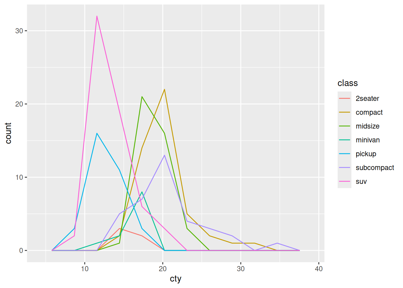
- From this graph, it’s easy to see that
suvis the most numerous class
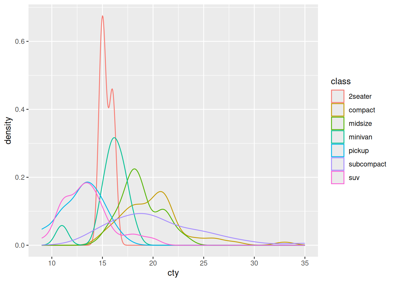
- From this graph, it’s easy to see that
subcompacthas the broadest distribution
In my opinion, it’s easier to see the broadness of subcompact by the density plot q1-vis2.
In the previous exercise, we learned how to facet a graph. Let’s use that part of the grammar of graphics to clean up the graph above.
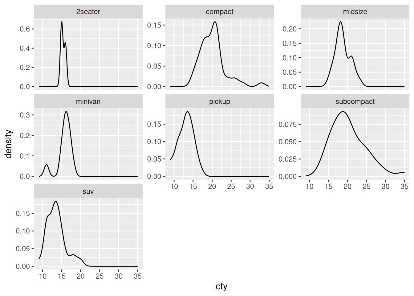
20.4.2 q3 Modify a plot
Modify q1-vis2 to use a facet_wrap() on the class. “Free” the vertical axis with the scales keyword to allow for a different y scale in each facet.
In the reading, we learned that the “most important thing” to keep in mind with geom_histogram() and geom_freqpoly() is to explore different binwidths. We’ll explore this idea in the next question.
20.4.3 q4 Analyze a histogram
Analyze the following graph; make sure to test different binwidths. What patterns do you see? Which patterns remain as you change the binwidth?
## TODO: Run this chunk; play with differnet bin widths
diamonds %>%
  filter(carat < 1.1) %>%

  ggplot(aes(carat)) +
  geom_histogram(binwidth = 0.01, boundary = 0.005) +
  scale_x_continuous(
    breaks = seq(0, 1, by = 0.1)

  )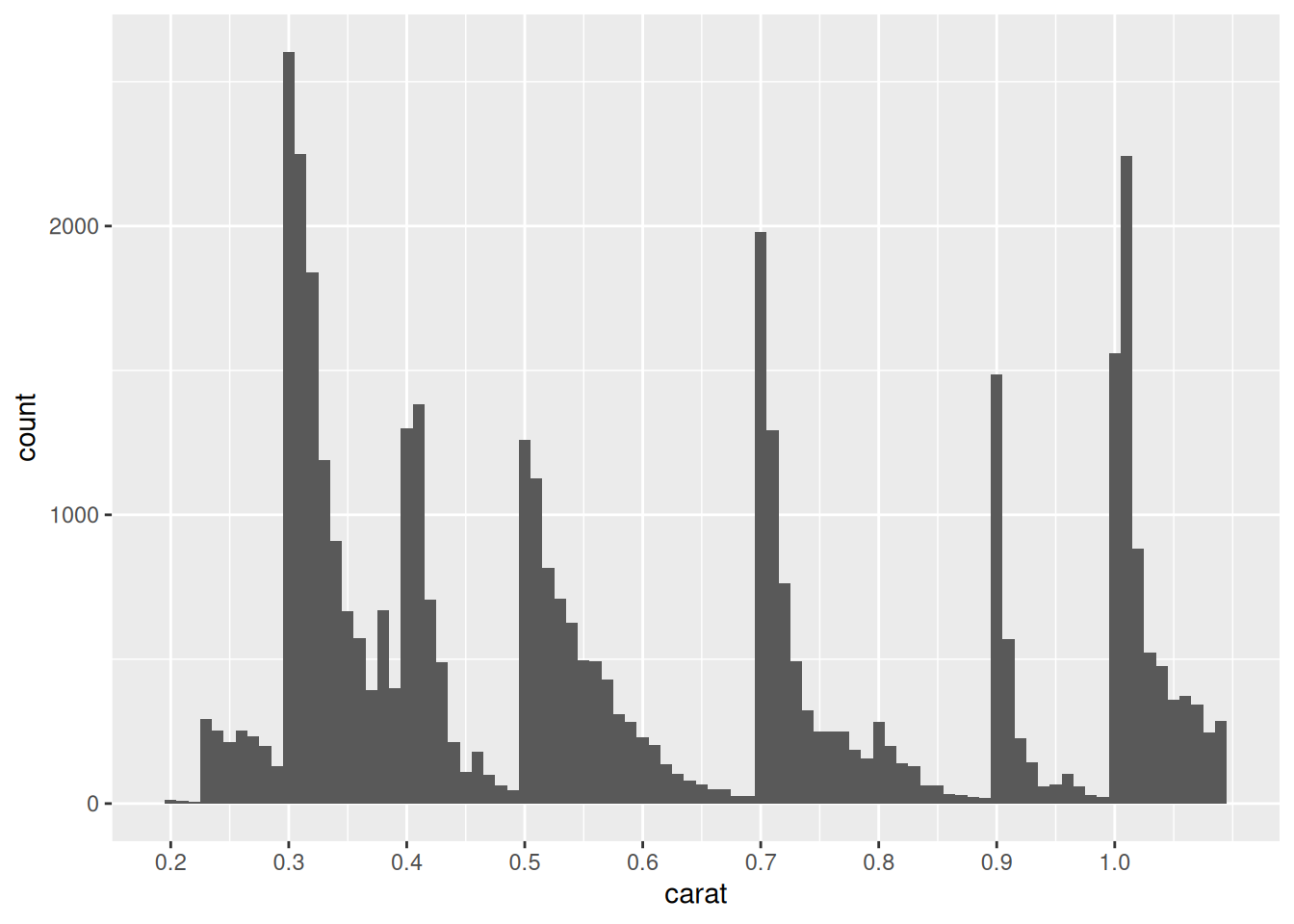
Observations
- The largest number of diamonds tend to fall on or above even 10-ths of a carat.
- The peak near 0.5 is very broad, compared to the others.
- The peak at 0.3 is most numerous