52 Data: Liberating data with WebPlotDigitizer
Purpose: Sometimes data are messy—we know how to deal with that. Other times data are “locked up” in a format we can’t easily analyze, such as in an image. In this exercise you’ll learn how to liberate data from a plot using WebPlotDigitizer.
Reading: (None, this exercise is the reading.)
Optional Reading: WebPlotDigitizer tutorial video ~ 19 minutes. (I recommend you give this a watch if you want some inspiration on other use cases: There are a lot of very clever ways to use this tool!)
## ── Attaching core tidyverse packages ──────────────────────── tidyverse 2.0.0 ──
## ✔ dplyr     1.1.4     ✔ readr     2.1.5
## ✔ forcats   1.0.0     ✔ stringr   1.5.1
## ✔ ggplot2   3.5.2     ✔ tibble    3.2.1
## ✔ lubridate 1.9.4     ✔ tidyr     1.3.1
## ✔ purrr     1.0.4
## ── Conflicts ────────────────────────────────────────── tidyverse_conflicts() ──
## ✖ dplyr::filter() masks stats::filter()
## ✖ dplyr::lag()    masks stats::lag()
## ℹ Use the conflicted package (<http://conflicted.r-lib.org/>) to force all conflicts to become errorsBackground: WebPlotDigitizer is one of those tools that is insanely useful, but no one ever teaches. I didn’t learn about this until six years into graduate school. You’re going to learn some very practical skills in this exercise!
Note: I originally extracted these data from an Economist article on American meat prices and production in 2020.
52.1 Setup
52.1.1 q1 Get WebPlotDigitizer.
Go to the WebPlotDigitizer website and download the desktop version (matching your operating system).
Note 1: There should be a free version available; try clicking the Access archived v4 link.
Note 2: On Mac OS X you may have to open Security & Privacy in order to launch WebPlotDigitizer on your machine.
52.2 Extract
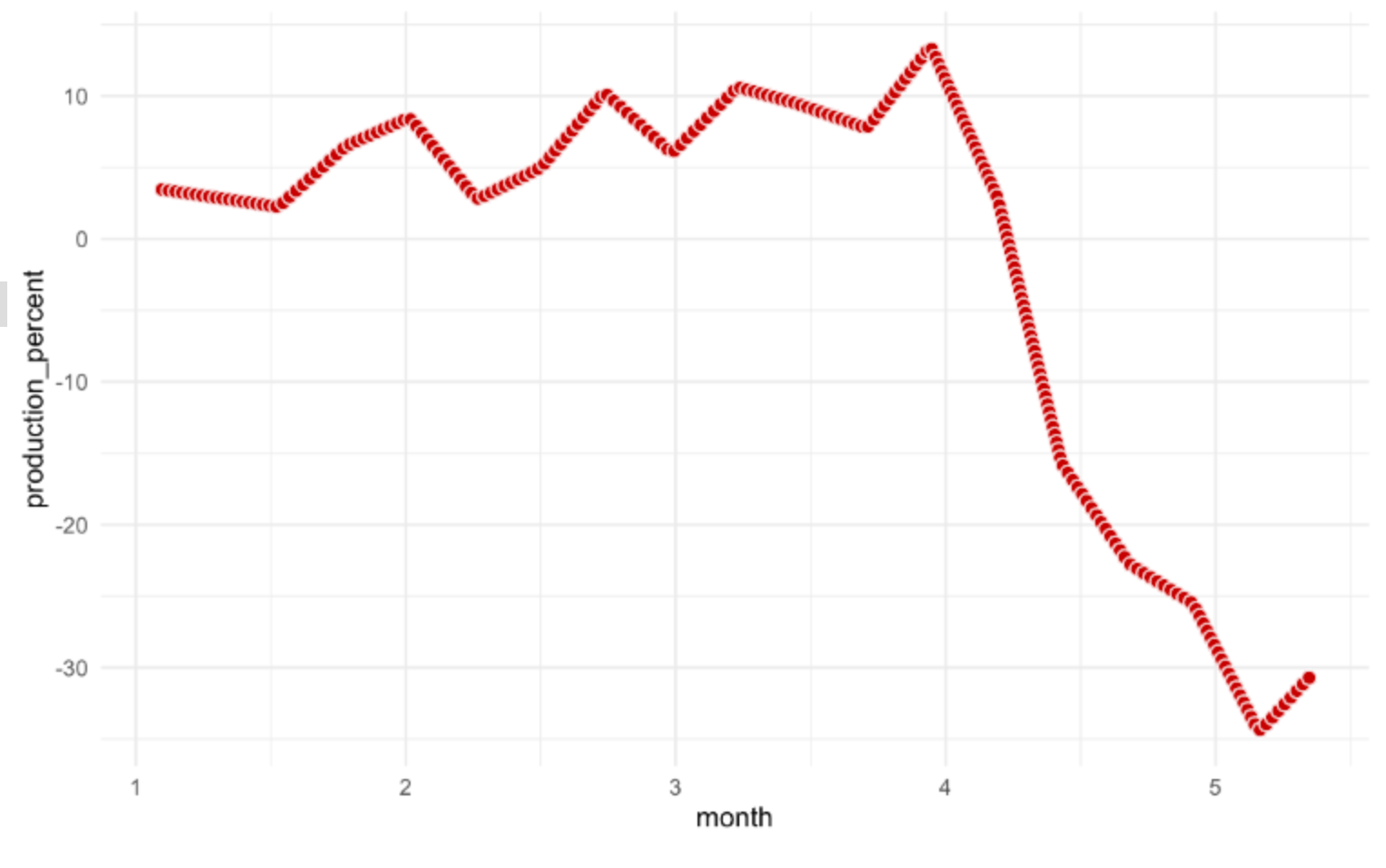
52.2.1 q2 Extract the data from the following image:
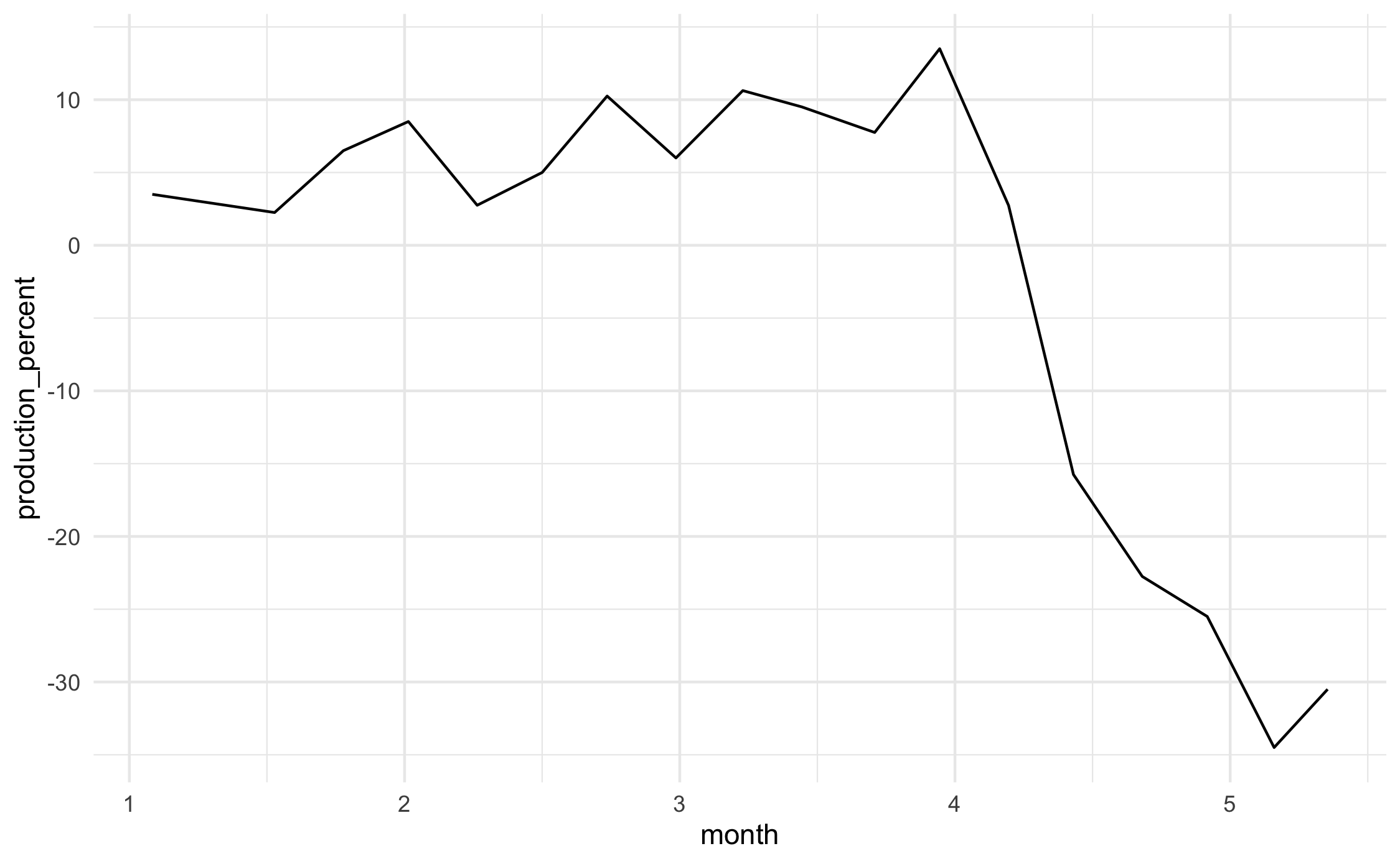
This image shows the percent change in US beef production as reported in this Economist article. We’ll go through extraction step-by-step:
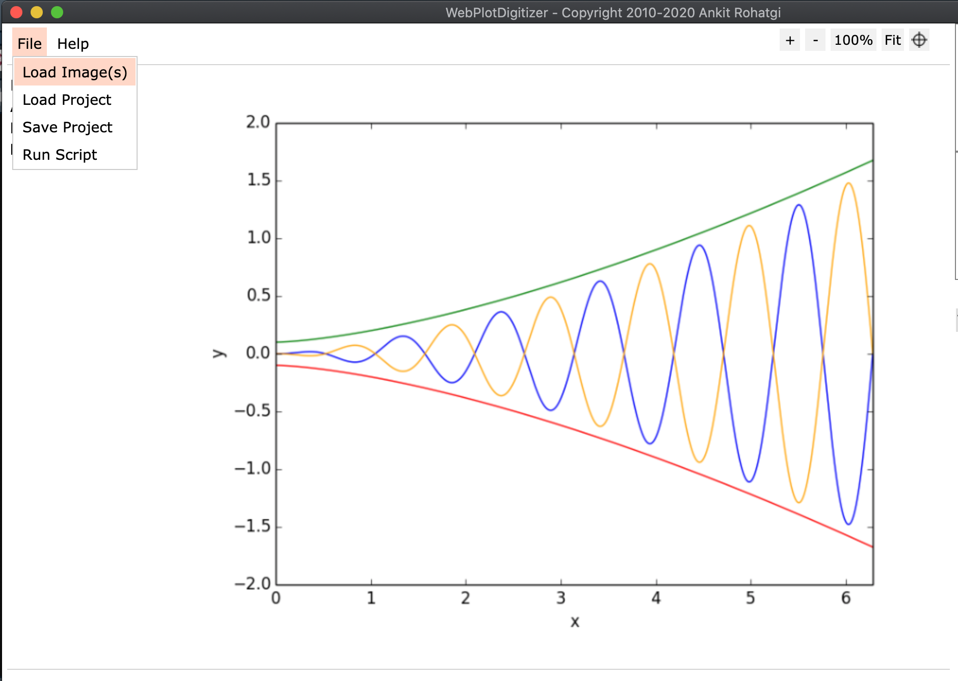
- Click the
Load Image(s)button, and select./images/beef_production.png.
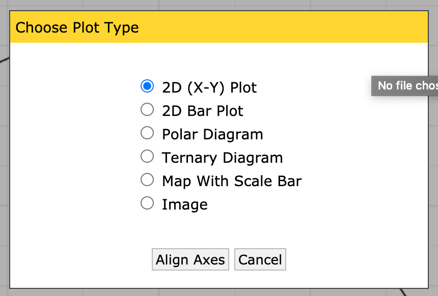
 2. Choose the
 2D (X-Y) Plot type.
 3. Make sure to read these instructions!
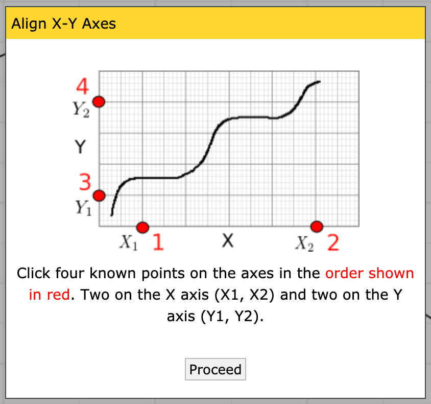 4. Place the four control points; it doesn’t matter what precise values you pick, just that you know the X values for the first two, and the Y values for the second two.
Note: Once you’ve placed a single point, you can use the arrow keys on your keyboard to make micro adjustments to the point; this means you don’t have to be super-accurate with your mouse. Use this to your advantage!
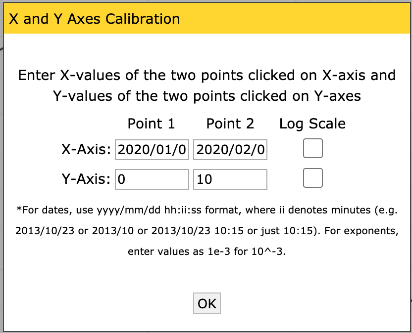
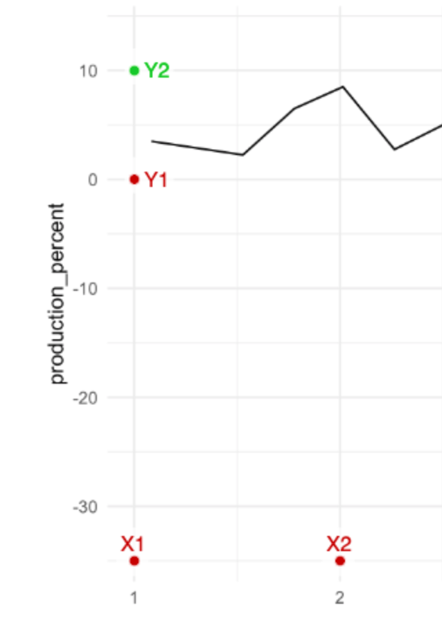 5. Calibrate the axes by entering the X and Y values you placed. Note that you can give decimals, dates, times, or exponents.
 6. Now that you have a set of axes, you can extract the data. This plot is fairly high-contrast, so we can use the Automatic Extraction tools. Click on the
 Box setting, and select the foreground color to match the color of the data curve (in this case, black).
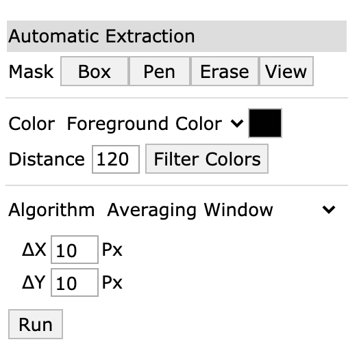
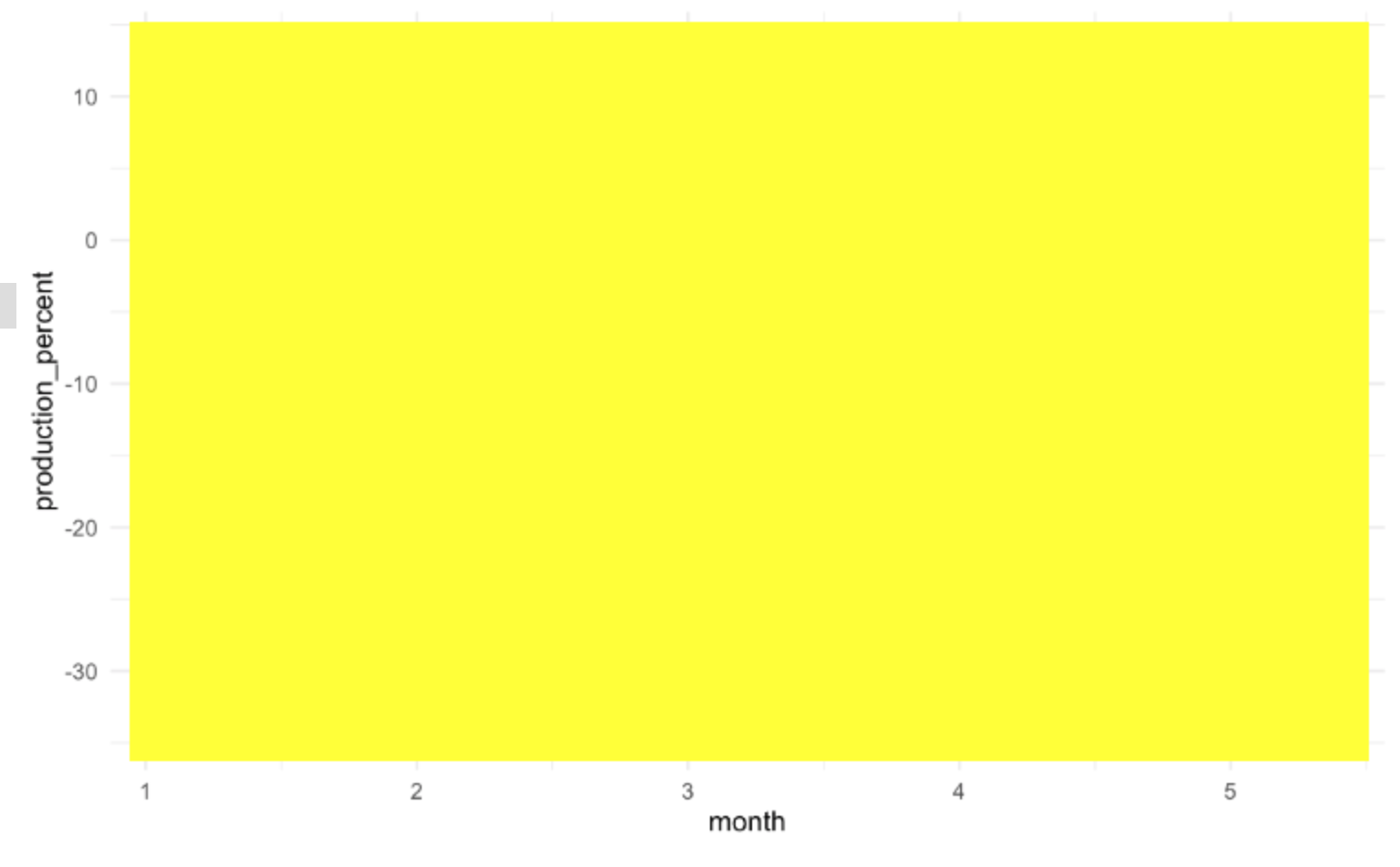
- Once you’ve selected the box tool, draw a rectangle over an area containing the data. Note that if you cover the labels, the algorithm will try to extract those too!
 8. Click the
 Run button; you should see red dots covering the data curve.
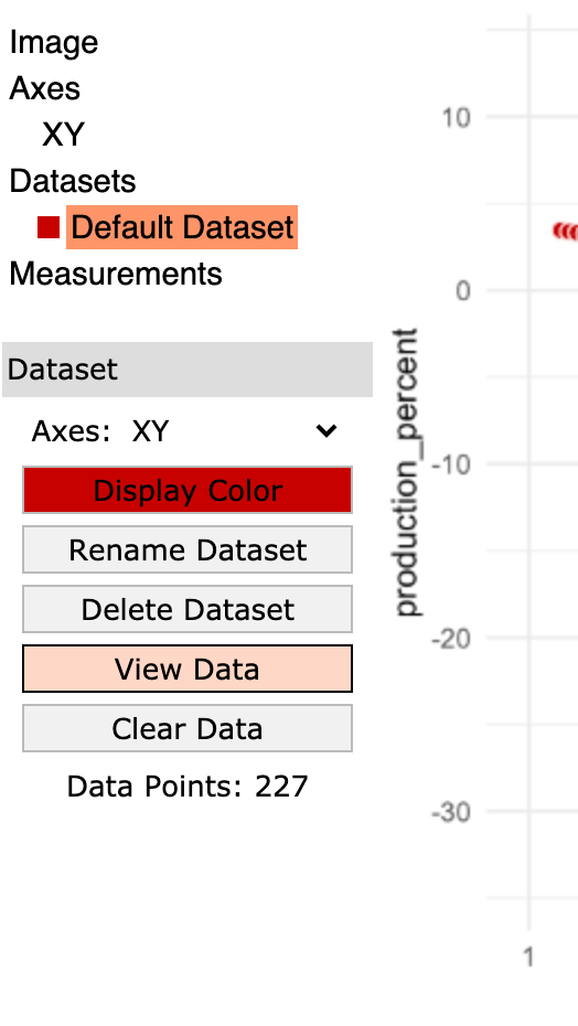
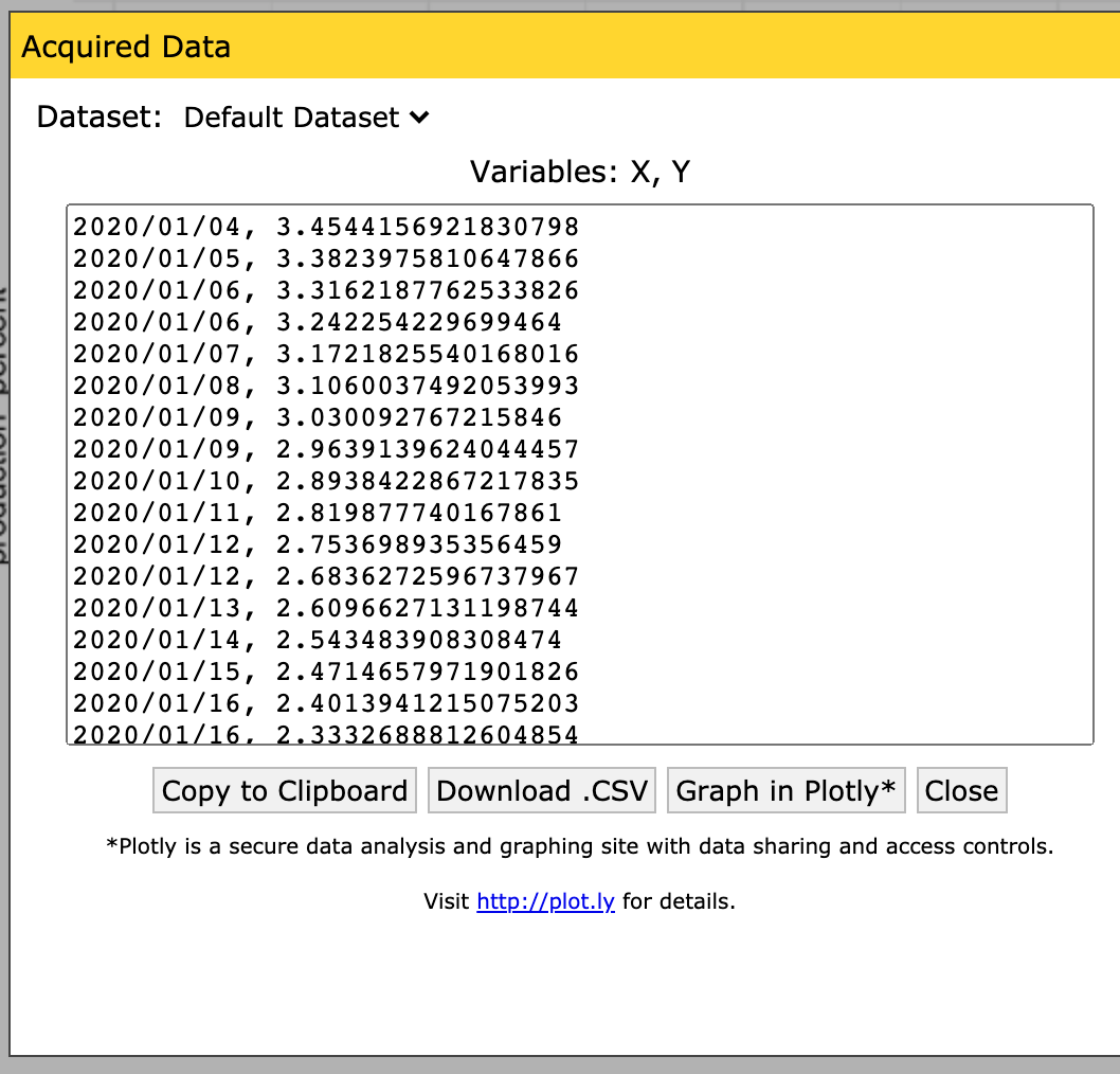
- Now you can save the data to a file; make sure the dataset is selected (highlighted in orange) and click the
View Databutton.
 10. Click the
 Download .CSV button and give the file a sensible name.
 Congrats! You just liberated data from a plot!
52.3 Use the extracted data
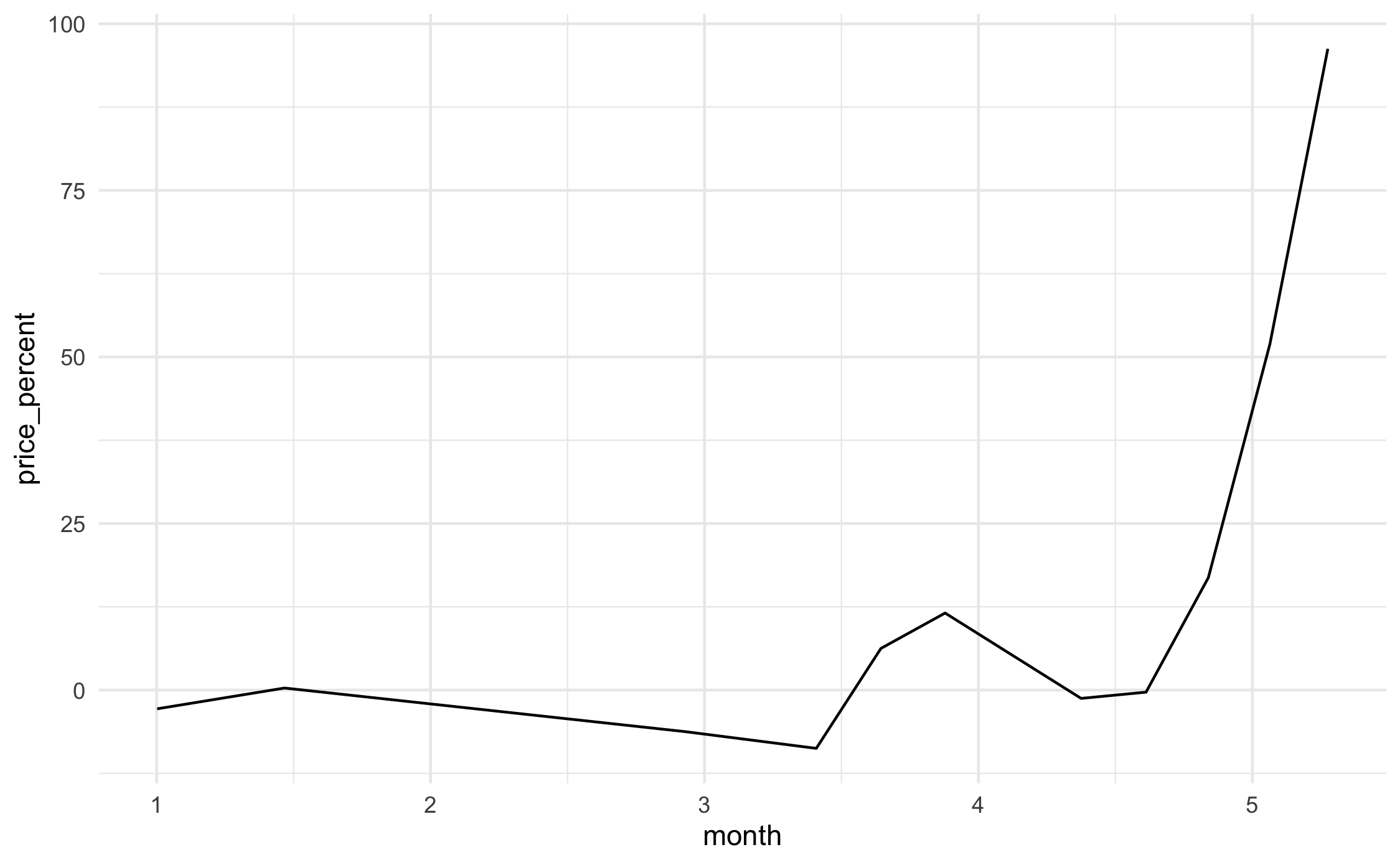
52.3.1 q4 Load the price and production datasets you extracted. Join and plot price vs production; what kind of relationship do you see?
## NOTE: Your filenames may vary!
df_price <- read_csv(
  "./data/beef_price.csv",
  col_names = c("date", "price_percent")
)
## Rows: 232 Columns: 2
## ── Column specification ────────────────────────────────────────────────────────
## Delimiter: ","
## dbl (1): price_percent
## date (1): date
##
## ℹ Use `spec()` to retrieve the full column specification for this data.
## ℹ Specify the column types or set `show_col_types = FALSE` to quiet this message.df_production <- read_csv(
"./data/beef_production.csv",
col_names = c("date", "production_percent")
)## Rows: 227 Columns: 2
## ── Column specification ────────────────────────────────────────────────────────
## Delimiter: ","
## dbl (1): production_percent
## date (1): date
##
## ℹ Use `spec()` to retrieve the full column specification for this data.
## ℹ Specify the column types or set `show_col_types = FALSE` to quiet this message.## NOTE: I'm relying on WebPlotDigitizer to produce dates in order to
## make this join work. This will probably fail if you have numbers
## rather than dates.
df_both <-
inner_join(
df_price,
df_production,
by = "date"
)## Warning in inner_join(df_price, df_production, by = "date"): Detected an unexpected many-to-many relationship between `x` and `y`.
## ℹ Row 7 of `x` matches multiple rows in `y`.
## ℹ Row 2 of `y` matches multiple rows in `x`.
## ℹ If a many-to-many relationship is expected, set `relationship =
## "many-to-many"` to silence this warning.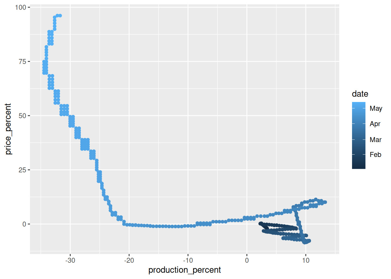
Observations:
- In the middle of the pandemic beef production dropped quickly without a large change in price.
- After production dropped by 20% beef price began to spike.
- As the pandemic continued in the US, beef production increased slightly, but price continued to rise.