12 Vis: Data Visualization Basics
Purpose: The most powerful way for us to learn about a dataset is to visualize the data. Throughout this class we will make extensive use of the grammar of graphics, a powerful graphical programming grammar that will allow us to create just about any graph you can imagine!
Reading: (None, this is the reading)
12.0.1 q1 Inspect a dataset
Inspect the diamonds dataset. What do the cut, color, and clarity variables mean?
Hint: We learned how to inspect a dataset in e-data-00-basics!
12.0.2 q2 Standard checks
Use your “standard checks” to determine what variables the dataset has.
## Rows: 53,940
## Columns: 10
## $ carat   <dbl> 0.23, 0.21, 0.23, 0.29, 0.31, 0.24, 0.24, 0.26, 0.22, 0.23, 0.…
## $ cut     <ord> Ideal, Premium, Good, Premium, Good, Very Good, Very Good, Ver…
## $ color   <ord> E, E, E, I, J, J, I, H, E, H, J, J, F, J, E, E, I, J, J, J, I,…
## $ clarity <ord> SI2, SI1, VS1, VS2, SI2, VVS2, VVS1, SI1, VS2, VS1, SI1, VS1, …
## $ depth   <dbl> 61.5, 59.8, 56.9, 62.4, 63.3, 62.8, 62.3, 61.9, 65.1, 59.4, 64…
## $ table   <dbl> 55, 61, 65, 58, 58, 57, 57, 55, 61, 61, 55, 56, 61, 54, 62, 58…
## $ price   <int> 326, 326, 327, 334, 335, 336, 336, 337, 337, 338, 339, 340, 34…
## $ x       <dbl> 3.95, 3.89, 4.05, 4.20, 4.34, 3.94, 3.95, 4.07, 3.87, 4.00, 4.…
## $ y       <dbl> 3.98, 3.84, 4.07, 4.23, 4.35, 3.96, 3.98, 4.11, 3.78, 4.05, 4.…
## $ z       <dbl> 2.43, 2.31, 2.31, 2.63, 2.75, 2.48, 2.47, 2.53, 2.49, 2.39, 2.…
The diamonds dataset has variables carat, cut, color, clarity, depth, table, price, x, y, z.
Now that we have the list of variables in the dataset, we know what we can visualize!
12.1 The Grammar of Graphics
In this class, we’ll use the Grammar of Graphics for data visualization. This is implemented in the ggplot2 package. The anatomy of a ggplot is broken down below:
## NOTE: No need to edit; run and inspect

ggplot(            # 1. Starting a ggplot
  data = diamonds  # 2. Dataset to visualize
) +                # 3. Adding elements to the plot
  geom_point(      # 4. Geometry
    mapping = aes( # 5. `Aes`thetic mapping
      x = carat,   # 5.1. Mapping the `x` variable
      y = depth    # 5.2. Mapping the `y` variable
    )
  )
The core idea in ggplot is that we can break every concievable plot down into just a few elements:
- Data (the
dataargument): The data to visualize - Geometries (or
geom_*()functions): The visual elements we’ll use to show the data - Mapping (the relationship between the data and the geometries)
Assuming we’re not messing with the data[1], this implies that making a plot boils down to choosing the geometries and mapping geometries to the data. This is a bit abstract, but once you internalize this approach, you can make virtually any plot you can imagine.
[1] Sometimes we’ll mess with the data to make a more informative plot—stay tuned!
Let’s practice: Adapt the code above to complet the task below.
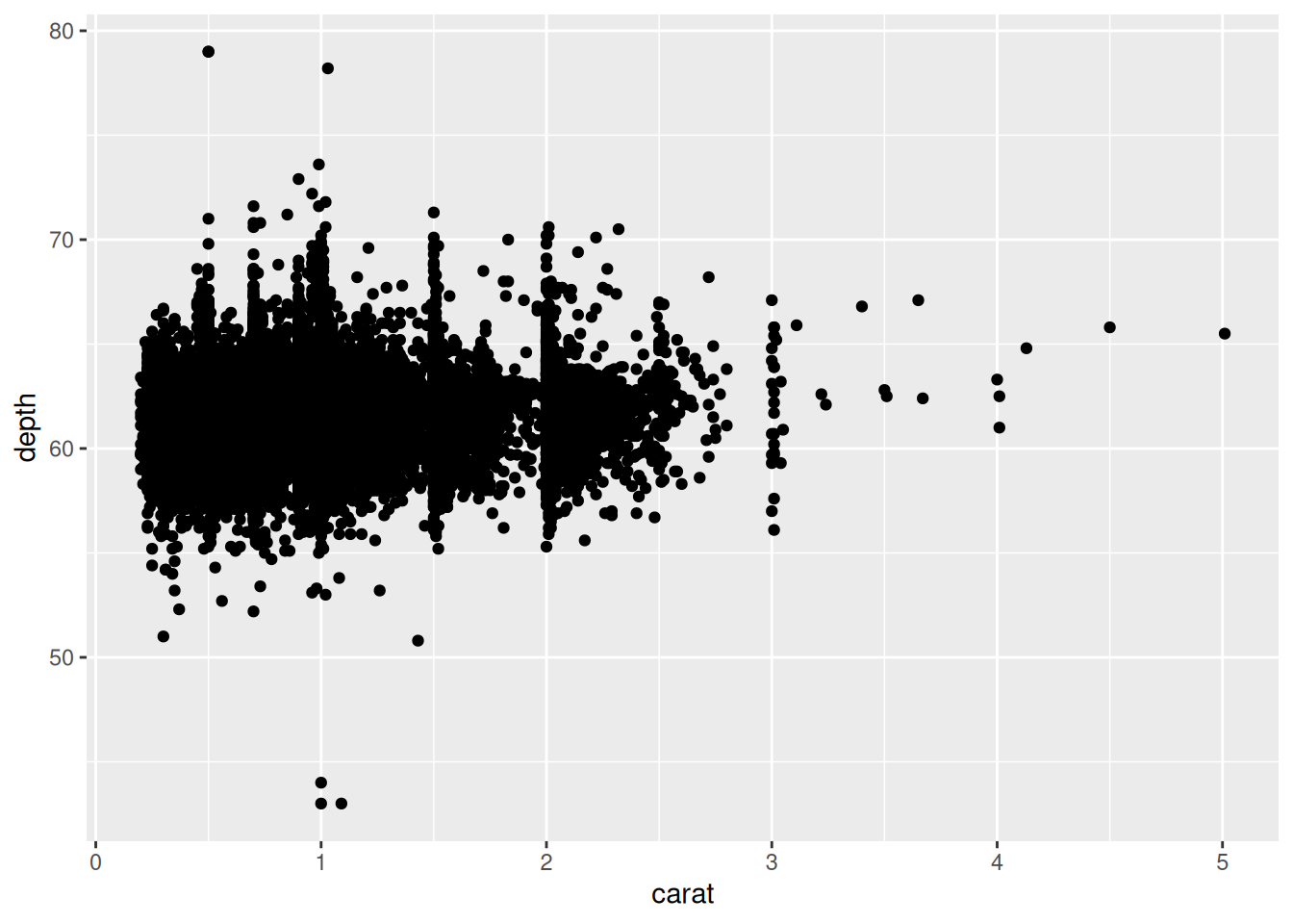
12.1.1 q3 Make your first ggplot
Using ggplot, visualize price vs carat with points. What trend do you observe?
Hint: Usually the language y vs x refers to the vertical axis vs horizontal axis. This is the opposite order from the way we often specify x, y pairs. Language is hard!
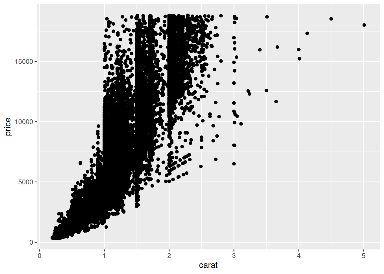
Observations:
pricegenerally increases withcarat- The trend is not ‘clean’; there is no single curve in the relationship
12.2 A note on aesthetics
The function aes() is short for aesthetics. Aesthetics in ggplot are the mapping of variables in a dataframe to visual elements in the graph. For instance, in the plot above you assigned carat to the x aesthetic, and price to the y aesthetic. But there are many more aesthetics you can set, some of which vary based on the geom_ you are using to visualize.
## NOTE: This is some more advanced code we'll learn to write later
diamonds %>%
  group_by(carat) %>%
  summarize(
    price = mean(price),
    n = n()
  ) %>%

  # This is the focus of this code: Note the
  # additional `linewidth` argument to aes()
  ggplot() +
  geom_line(aes(x = carat, y = price, linewidth = n))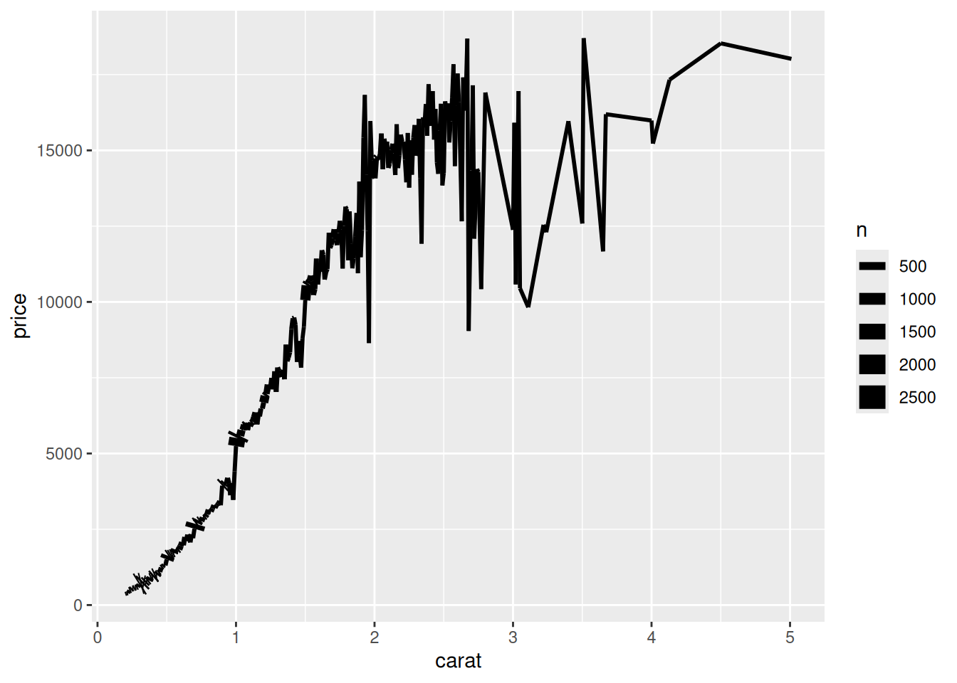
As with any R function, we can consult the documentation to learn more.
12.2.1 q4 Read the docs
Look up the documentation for geom_point(), and scroll down to the Aesthetics section. What aesthetics (other than x and y) does geom_point() accept?
12.2.2 q5 Visualize a third variable
Adapt your code from q3 to visualize price, carat, and cut simultaneously.
Hint: Remember that you can add additional aesthetic mappings in aes().
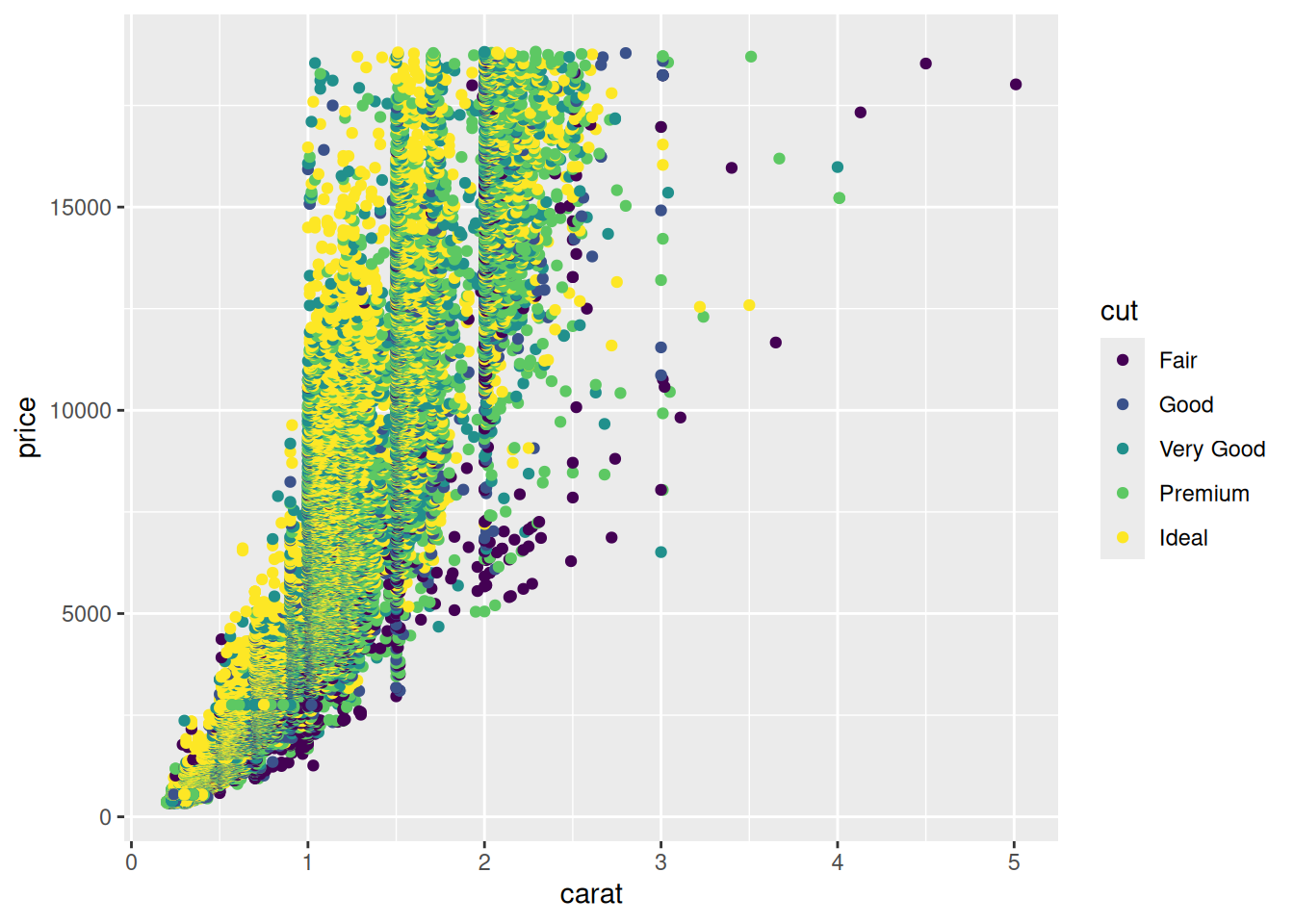
Observations:
pricegenerally increases withcarat- The
cuthelps explain the variation in price;Idealcut diamonds tend to be more expensiveFaircut diamonds tend to be less expensive