35 Vis: Perceptual Basics
Purpose: Creating a presentation-quality graph is an exercise in communication. In order to create graphs that other people can understand, we should know some stuff about how humans see data. Through the required “reading” (video) you’ll learn about visual perception, then put these ideas to use criticizing some graphs. Later, you’ll use these ideas to improve some graphs.
Reading: How Humans See Data (Video)
## ── Attaching core tidyverse packages ──────────────────────── tidyverse 2.0.0 ──
## ✔ dplyr     1.1.4     ✔ readr     2.1.5
## ✔ forcats   1.0.0     ✔ stringr   1.5.1
## ✔ ggplot2   3.5.2     ✔ tibble    3.2.1
## ✔ lubridate 1.9.4     ✔ tidyr     1.3.1
## ✔ purrr     1.0.4
## ── Conflicts ────────────────────────────────────────── tidyverse_conflicts() ──
## ✖ dplyr::filter() masks stats::filter()
## ✖ dplyr::lag()    masks stats::lag()
## ℹ Use the conflicted package (<http://conflicted.r-lib.org/>) to force all conflicts to become errors
35.1 Criticize these graphs!
Using the ideas from the reading (video), state some issues with the following graphs. As a reminder, the visual hierarchy is:
- Position along a common scale
- Position on identical but nonaligned scales
- Length
- Angle; Slope (With slope not too close to 0, \(\pi/2\), or \(\pi\).)
- Area
- Volume; Density; Color saturation
- Color hue
35.1.1 q1 What are some issues with the following graph? Don’t just say “it’s bad”—use concepts from the required reading.
## NOTE: No need to edit; run and criticize
mpg %>%
  ggplot(aes(manufacturer, cty)) +
  geom_boxplot() +
  coord_flip()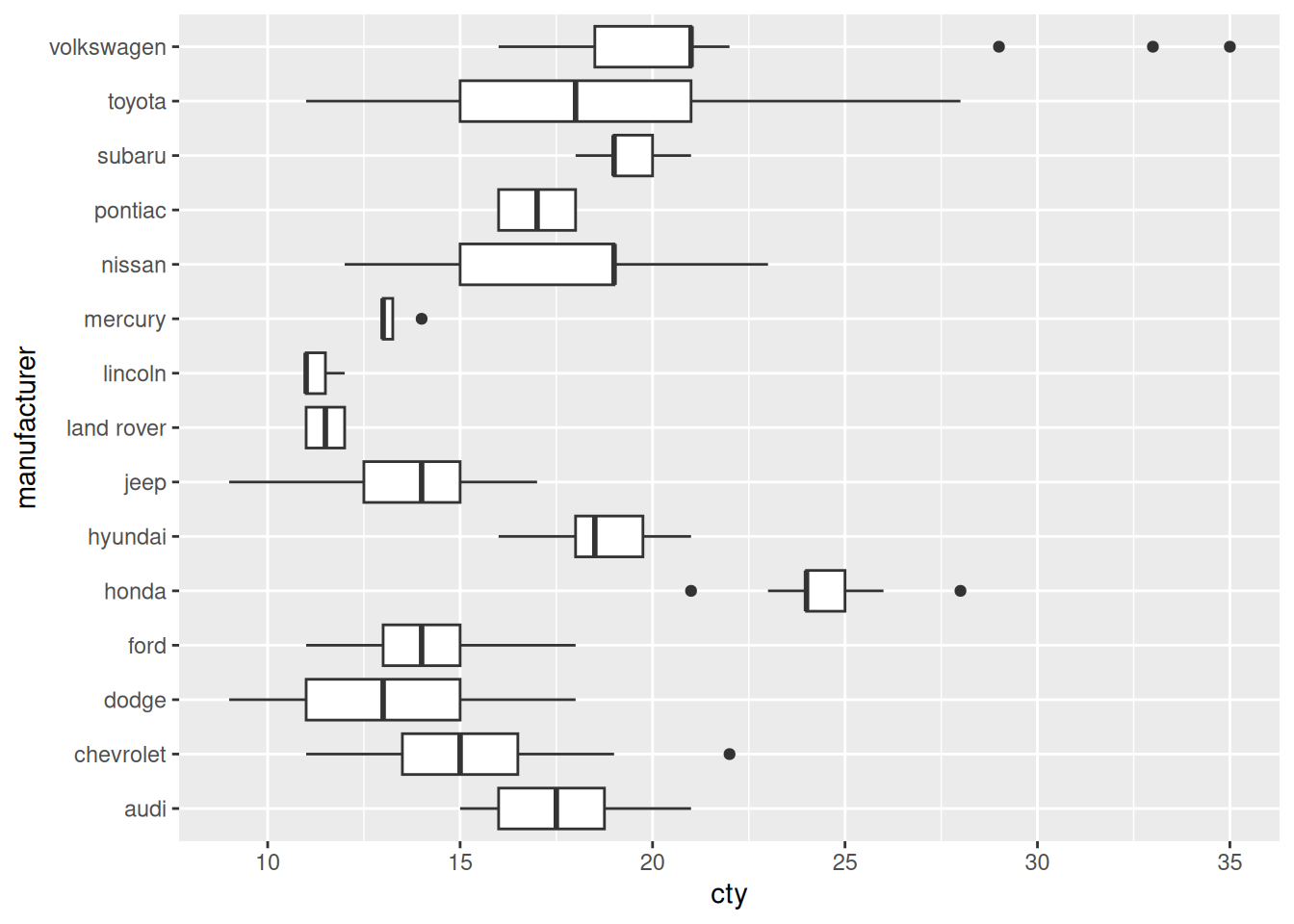
Observations:
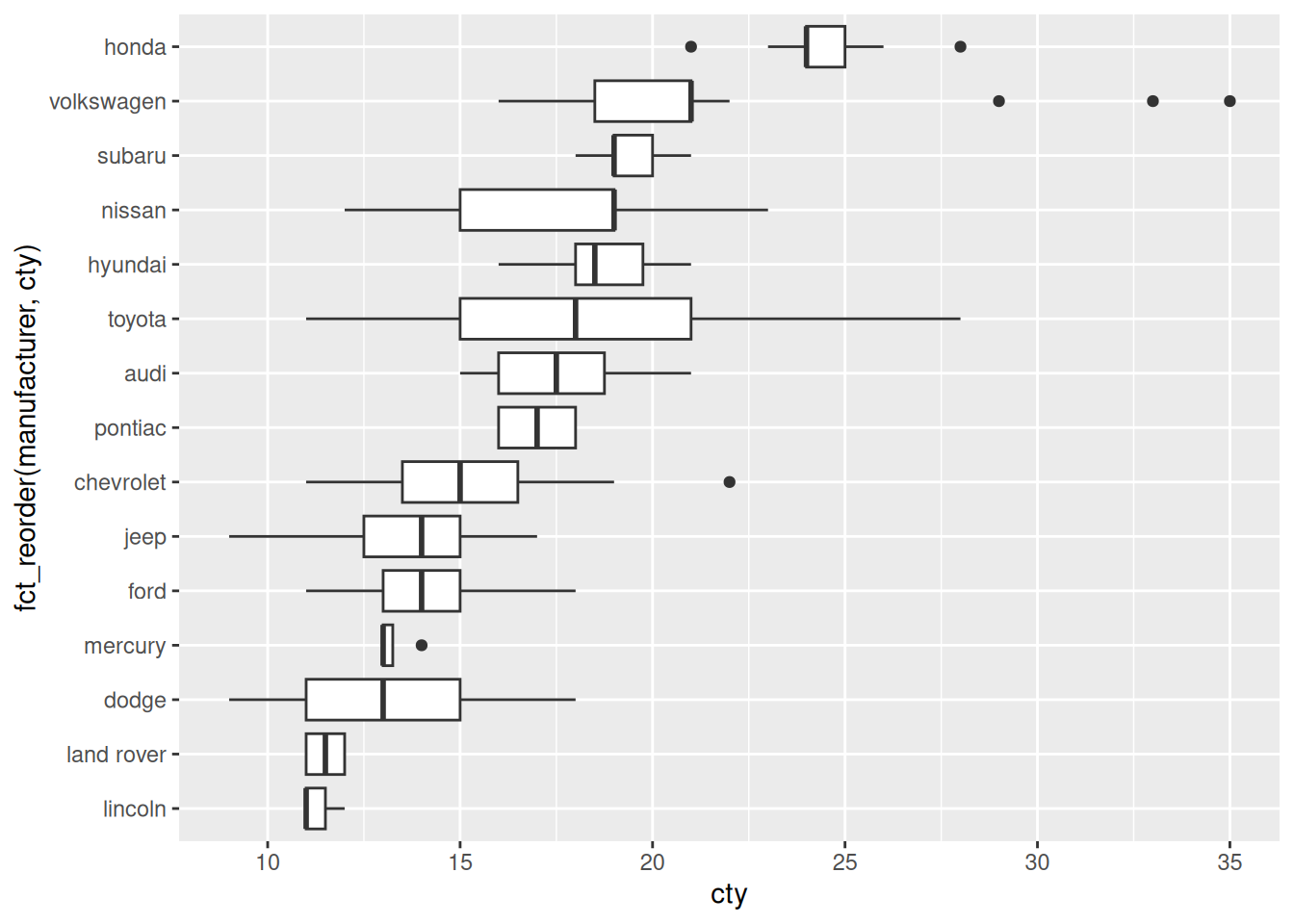
- An alphabetical ordering of factors is almost never meaningful.
We’ll learn how to reorder factors in e-data11-factors:
35.1.2 q2 What are some issues with the following graph? Don’t just say “it’s bad”—use concepts from the required reading.
## NOTE: No need to edit; run and criticize
as_tibble(mtcars) %>%
  mutate(model = rownames(mtcars)) %>%

  ggplot(aes(x = "", y = "", size = mpg)) +
  geom_point() +
  facet_wrap(~model)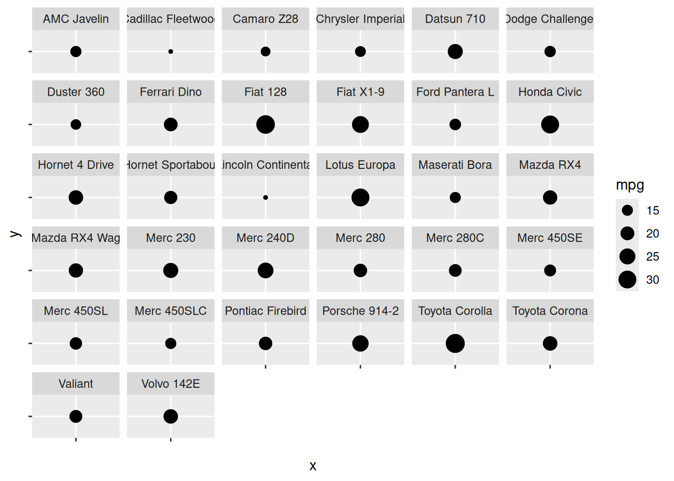
- Area is low on the visual hierarchy; it is difficult to see the difference between mpg values.
35.1.3 q3 What are some issues with the following graph? Don’t just say “it’s bad”—use concepts from the required reading.
## NOTE: No need to edit; run and criticize
diamonds %>%
  ggplot(aes(clarity, fill = cut)) +
  geom_bar()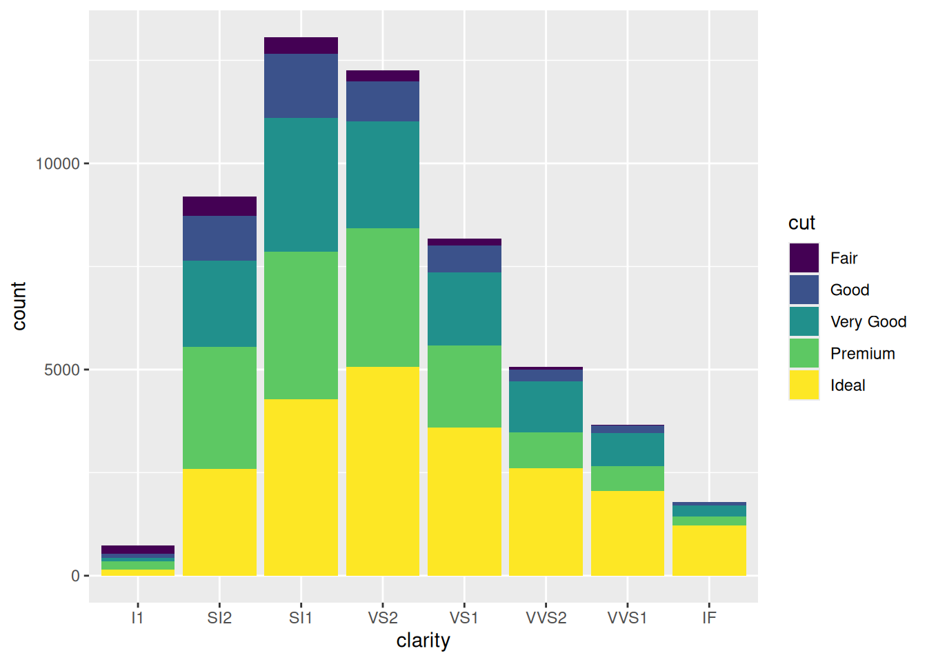
- Stacked bar charts force us to make comparisons using length, rather than position along a common axis.
35.1.4 q4 What are some issues with the following graph? Don’t just say “it’s bad”—use concepts from the required reading.
## NOTE: No need to edit; run and criticize
diamonds %>%
  ggplot(aes(x = "", fill = cut)) +
  geom_bar() +
  coord_polar("y") +
  labs(x = "")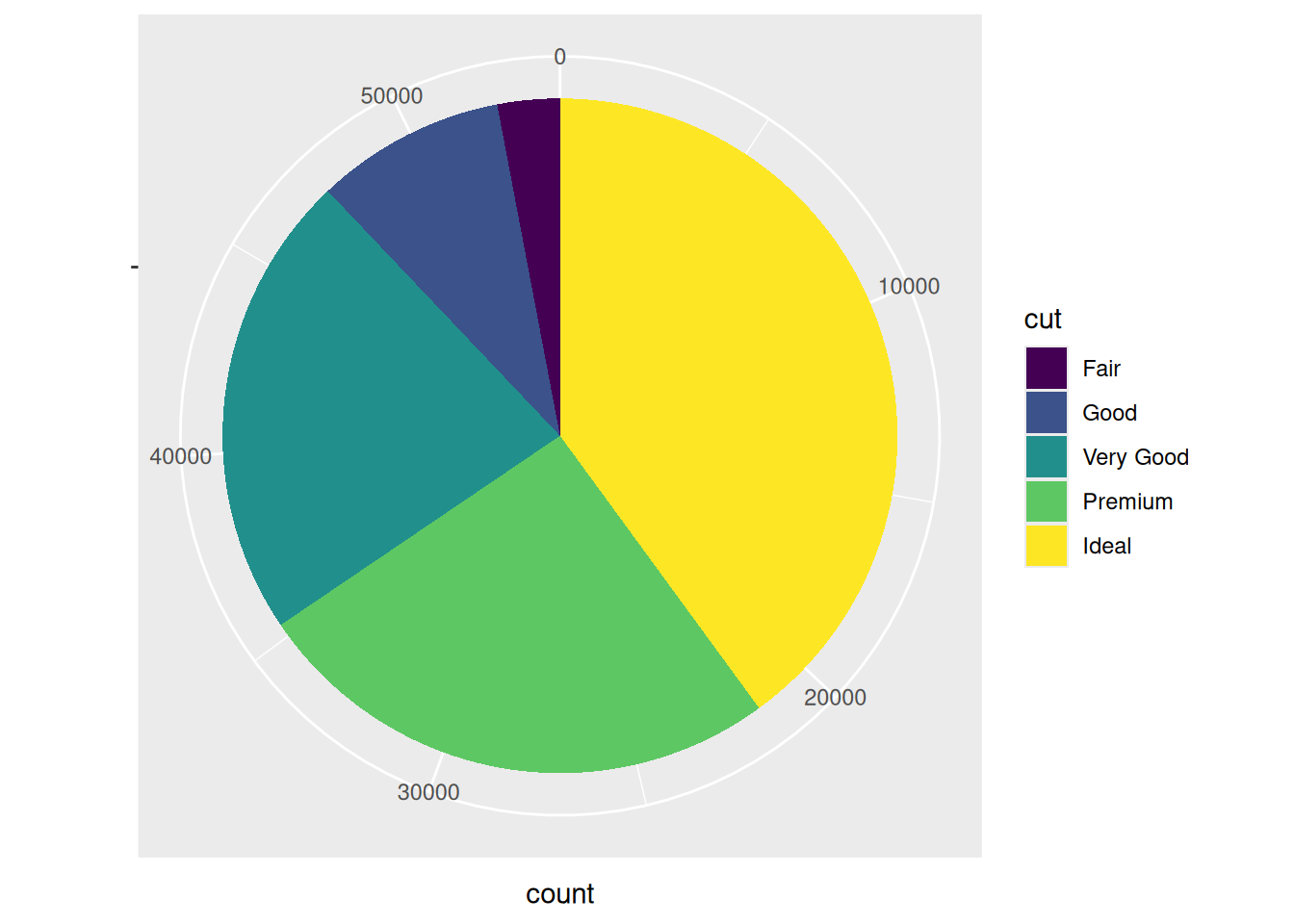
- A pie chart has encodes numbers as angles, which is low on the visual hierarchy.