42 Stats: The Central Limit Theorem and Confidence Intervals
Purpose: When studying sampled data, we need a principled way to report our results with their uncertainties. Confidence intervals (CI) are an excellent way to summarize results, and the central limit theorem (CLT) helps us to construct these intervals.
Reading: (None, this is the reading)
Topics: The central limit theorem (CLT), confidence intervals
## ── Attaching core tidyverse packages ──────────────────────── tidyverse 2.0.0 ──
## ✔ dplyr     1.1.4     ✔ readr     2.1.5
## ✔ forcats   1.0.0     ✔ stringr   1.5.1
## ✔ ggplot2   3.5.2     ✔ tibble    3.2.1
## ✔ lubridate 1.9.4     ✔ tidyr     1.3.1
## ✔ purrr     1.0.4
## ── Conflicts ────────────────────────────────────────── tidyverse_conflicts() ──
## ✖ dplyr::filter() masks stats::filter()
## ✖ dplyr::lag()    masks stats::lag()
## ℹ Use the conflicted package (<http://conflicted.r-lib.org/>) to force all conflicts to become errors42.1 Central Limit Theorem
Let’s return to a result from e-stat04-population:
## NOTE: No need to edit this
set.seed(101)
n_observations <- 9
n_samples <- 5e3

df_samp_unif <-
  map_dfr(
    1:n_samples,
    function(id) {
      tibble(
        Z = runif(n_observations),
        id = id
      )
    }
  )

df_samp_unif %>%
  group_by(id) %>%
  summarize(stat = mean(Z)) %>%

  ggplot(aes(stat)) +
  geom_histogram() +
  labs(
    x = "Estimated Mean",
    title = "Sampling Distribution: Estimated Mean",
    caption = "Population: Uniform"
  )
## `stat_bin()` using `bins = 30`. Pick better value with `binwidth`.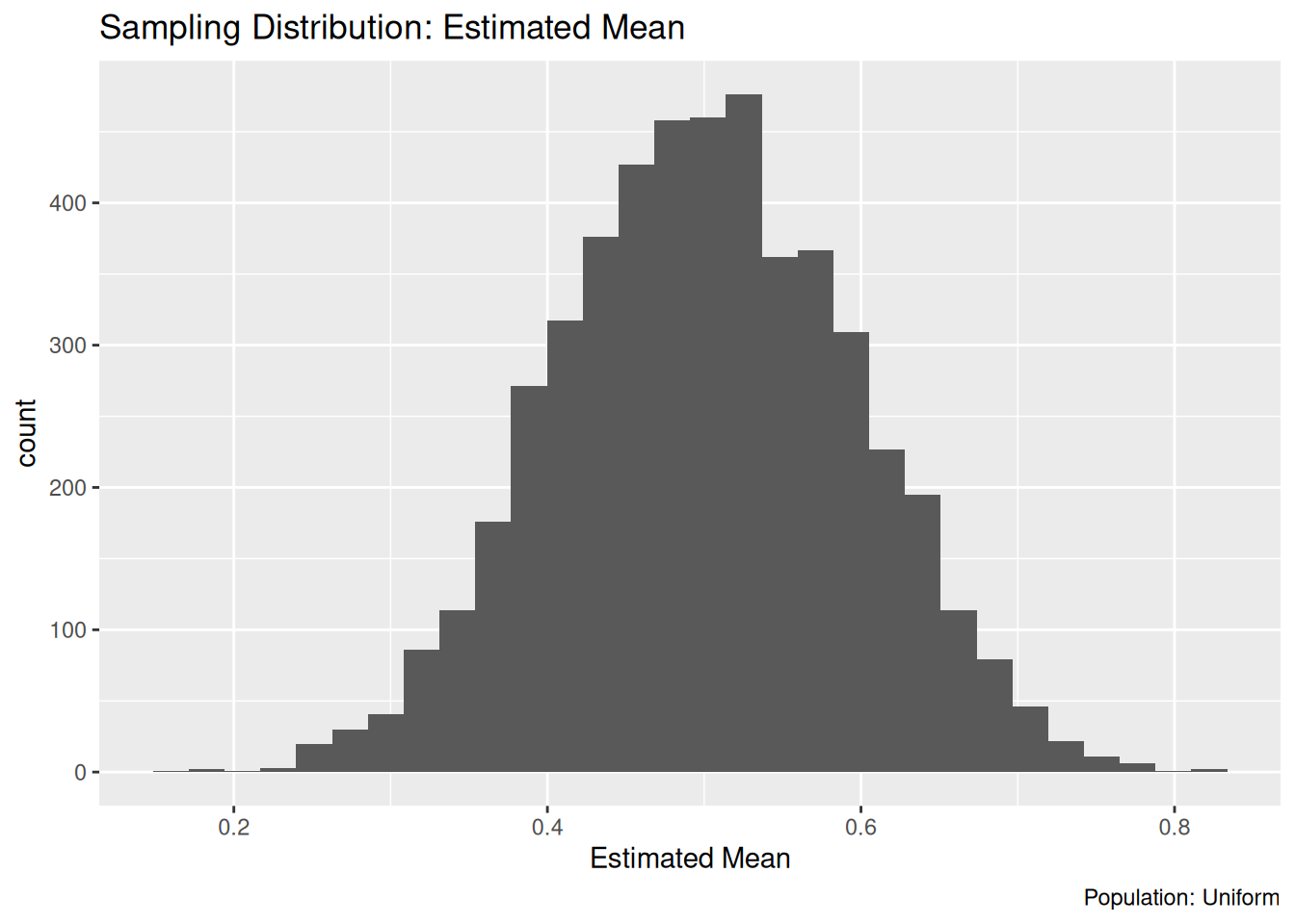
If you said that the sampling distribution from the exercise above looks roughly normal, then you are correct! This is an example of the central limit theorem, a central idea in statistics. Here we’ll introduce the central limit theorem (CLT), use it to approximate the sampling distribution for the sample mean, and in turn use that to construct an approximate confidence interval.
For populations satisfying mild conditions[1], the sample mean \(\overline{X}\) converges to a normal distribution as the sample size \(n\) approaches infinity. Specifically
\[\overline{X} \stackrel{d}{\to} N(\mu, \sigma^2 / n),\]
where \(\mu\) is the mean of the population, \(\sigma\) is the standard deviation of the population, and \(\stackrel{d}{\to}\) means converges in distribution, a technical definition that is beyond the scope of this lesson.
Below I simulate sampling from a uniform distribution and compute the mean at different sample sizes to illustrate the CLT:
## NOTE: No need to change this!
set.seed(101)
n_repl <- 5e3

df_clt <-
  map_dfr(
    1:n_repl,
    function(id) {
      map_dfr(
        c(1, 2, 9, 81, 729),
        function(n) {
          tibble(
            Z = runif(n),
            n = n,
            id = id
          )
        }
      )
    }
  ) %>%
  group_by(n, id) %>%
  summarize(mean = mean(Z), sd = sd(Z))
## `summarise()` has grouped output by 'n'. You can override using the `.groups`
## argument.Let’s visualize the sampling distribution for each sample size:
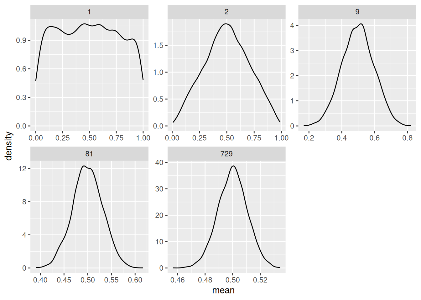
At just 1 our sample mean is \(X_1 / 1\)—we’re just drawing single observations from the population, so we see a uniform. At 2 we something that looks like a tent. By 9 samples we see a distribution that looks quite normal.
The CLT doesn’t work for all problems. The CLT is often used for sums of random variables—the mean is one such sum. However, something like a quantile is not estimated by a sum of random variables, so we can’t use the CLT to approximate a sampling distribution. We already learned that we can use bootstrap resampling to approximate a sampling distribution. An advantage of the CLT approach is that it is dead simple—once we know the math.
Note that the CLT tells us about estimates like the sample mean, it does not tell us anything about the distribution of the underlying population. We will use the CLT to help construct confidence intervals.
42.2 Confidence Intervals
Let’s learn about confidence intervals by way of example. I’ll lay out a procedure, then explain how it works.
First, let’s use some moment arithmetic to build a normal distribution with mean \(\mu\) and standard deviation \(\sigma / \sqrt{n}\) out of a standard normal \(Z\). This gives us
\[X = \mu + (\sigma / \sqrt{n}) Z.\]
Now imagine we wanted to select two endpoints to give us the middle \(95%\) of this distribution. We could do this with \(qnorm()\) with the appropriate values of mean, sd. But using the definition of \(X\) above, we can also do this by using the appropriate quantiles of the standard normal \(Z\). The following code gives the upper quantile.
## [1] 1.959964This is approximately 1.96 when seeking a \(95%\) confidence level—this is a value that’s so famous, it gets its own Wikipedia page. Since the standard normal distribution is symmetric about zero, we can use the same value z_c with a negative sign for the appropriate lower quantile.
Note that our confidence level \(C\) is often reported as an “alpha level” instead \(\alpha = 1 - C\). This can be a more convenient way to compute z_c, and it gives an identical value.
## [1] 1.959964Here’s the procedure, we’ll build lower and upper bounds for an interval based on the sample mean and sample standard error \([\hat{mu} - z_c \hat{\text{SE}}, \hat{mu} + z_c \hat{\text{SE}}]\). I construct this interval for each sample in df_clt, and check whether the interval contains the population mean of 0.5. The following code visualizes the first 100 intervals.
## NOTE: No need to change this!
df_clt %>%
  filter(
    n > 1,
    id <= 100
  ) %>%
  mutate(
    se = sd / sqrt(n),
    lo = mean - z_c * se,
    hi = mean + z_c * se
  ) %>%

  ggplot(aes(id)) +
  geom_hline(yintercept = 0.5, linetype = 2) +
  geom_errorbar(aes(
    ymin = lo,
    ymax = hi,
    color = (lo <= 0.5) & (0.5 <= hi)
  )) +
  facet_grid(n~.) +
  scale_color_discrete(name = "CI Contains True Mean") +
  theme(legend.position = "bottom") +
  labs(
    x = "Replication",
    y = "Estimated Mean"
  )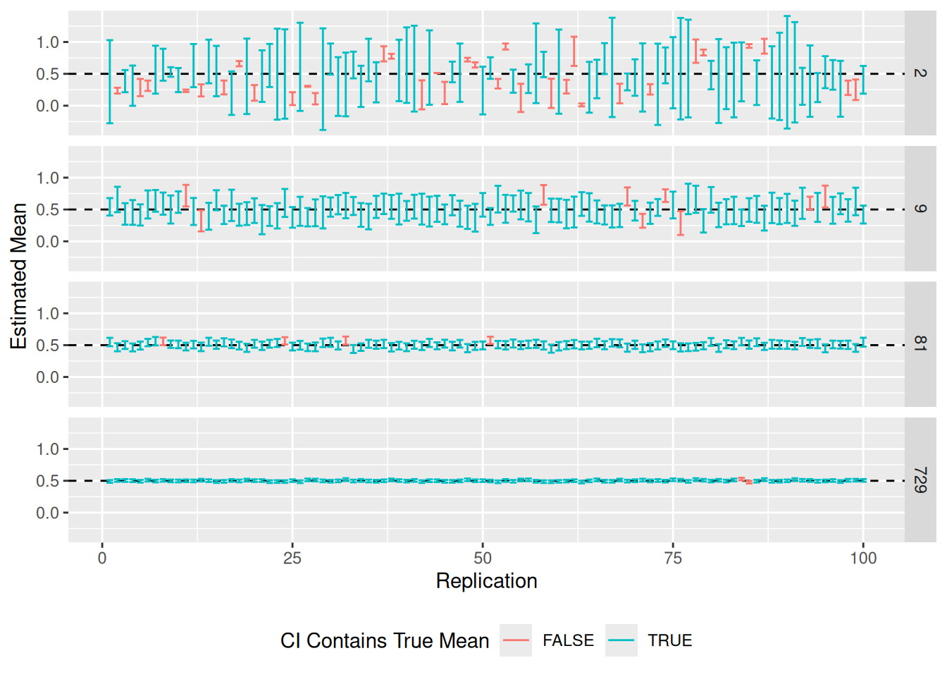
Some observations to note:
- The confidence intervals tend to be larger when \(n\) is small, and shrink as \(n\) increases.
- We tend to have more “misses” when \(n\) is small.
- Every confidence interval either does or does not include the true value. Therefore a single confidence interval actually has no probability associated with it. The “confidence” is not in a single interval, but rather in the procedure that generated the interval.
The following code estimates the frequency with which each interval includes the true mean; this quantity is called coverage, and it should match the nominal \(95%\) we selected above.
## NOTE: No need to change this!
df_clt %>%
  filter(n > 1) %>%
  mutate(
    se = sd / sqrt(n),
    lo = mean - z_c * se,
    hi = mean + z_c * se,
    flag = (lo <= 0.5) & (0.5 <= hi)
  ) %>%
  group_by(n) %>%
  summarize(coverage = mean(flag))
## # A tibble: 4 × 2
## n coverage
## <dbl> <dbl>
## 1 2 0.661
## 2 9 0.908
## 3 81 0.945
## 4 729 0.950Some observations to note:
- The coverage is well below our desired \(95%\) when \(n\) is small; this is because we are making an approximation.
- As \(n\) increases, the coverage tends towards our desired \(95%\).
This animation is the best visual explain I’ve found on how confidence intervals are constructed [2].
42.2.1 q1 Make a CLT approximation for a confidence interval
Using the CLT, approximate a \(99\%\) confidence interval for the population mean using the sample z_q1.
## TASK: Estimate a 99% confidence interval with the sample below
set.seed(101)
z_q1 <- rnorm(n = 100, mean = 1, sd = 2)
lo_q1 <- mean(z_q1) - qnorm( 1 - (1 - 0.99) / 2 ) * sd(z_q1) / sqrt(100)
hi_q1 <- mean(z_q1) + qnorm( 1 - (1 - 0.99) / 2 ) * sd(z_q1) / sqrt(100)
Use the following tests to check your answer.
## [1] TRUE## [1] TRUE## [1] "Nice!"42.3 Making Comparisons with CI
Why would we bother with constructing a confidence interval? Let’s take a look at a real example with the NYC flight data.
Let’s suppose we were trying to determine whether the mean arrival delay time of American Airlines (AA) flights is greater than zero. We have the population of 2013 flights, so we can answer this definitively:
## NOTE: No need to change this!
df_flights_aa <-
  flights %>%
  filter(carrier == "AA") %>%
  summarize(across(
    arr_delay,
    c(
      "mean" = ~mean(., na.rm = TRUE),
      "sd" = ~sd(., na.rm = TRUE),
      "n" = ~length(.)
    )
  ))
df_flights_aa
## # A tibble: 1 × 3
## arr_delay_mean arr_delay_sd arr_delay_n
## <dbl> <dbl> <int>
## 1 0.364 42.5 32729The arr_delay_mean is greater than zero, so case closed.
But imagine we only had a sample of flights, rather than the whole population. The following code randomly samples the AA flights, and repeats this process at a few different sample sizes. I also construct confidence intervals: If the confidence interval has its lower bound greater than zero, then we can be reasonably confident the mean delay time is greater than zero.
## NOTE: No need to change this!
set.seed(101)

# Downsample at different sample sizes, construct a confidence interval
df_flights_sampled <-
  map_dfr(
    c(5, 10, 25, 50, 100, 250, 500), # Sample sizes
    function(n) {
      flights %>%
        filter(carrier == "AA") %>%
        slice_sample(n = n) %>%
        summarize(across(
          arr_delay,
          c(
            "mean" = ~mean(., na.rm = TRUE),
            "se" = ~sd(., na.rm = TRUE) / length(.)
          )
        )) %>%
        mutate(
          arr_delay_lo = arr_delay_mean - 1.96 * arr_delay_se,
          arr_delay_hi = arr_delay_mean + 1.96 * arr_delay_se,
          n = n
        )
    }
  )

# Visualize
df_flights_sampled %>%
  ggplot(aes(n, arr_delay_mean)) +
  geom_hline(
    data = df_flights_aa,
    mapping = aes(yintercept = arr_delay_mean),
    size = 0.1
  ) +
  geom_hline(yintercept = 0, color = "white", size = 2) +
  geom_errorbar(aes(
    ymin = arr_delay_lo,
    ymax = arr_delay_hi,
    color = (0 < arr_delay_lo)
  )) +
  geom_point() +
  scale_x_log10() +
  scale_color_discrete(name = "Confidently Greater than Zero?") +
  theme(legend.position = "bottom") +
  labs(
    x = "Observations",
    y = "Arrival Delay (minutes)",
    title = "American Airlines Delays"
  )
## Warning: Using `size` aesthetic for lines was deprecated in ggplot2 3.4.0.
## ℹ Please use `linewidth` instead.
## This warning is displayed once every 8 hours.
## Call `lifecycle::last_lifecycle_warnings()` to see where this warning was
## generated.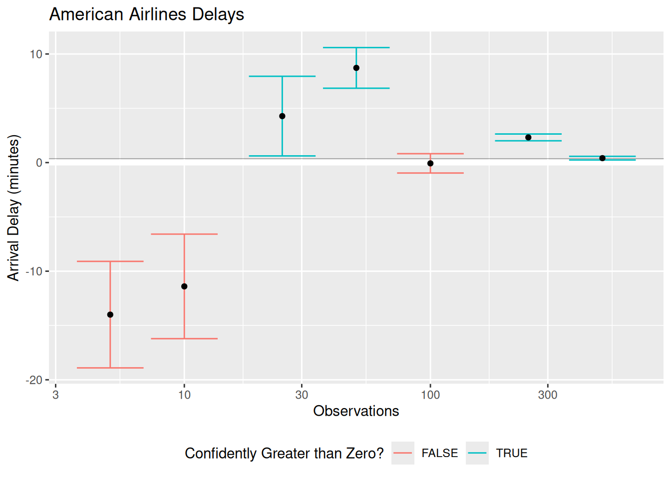
These confidence intervals illustrate a number of different sampling scenarios. In some of them, we correctly determine that the mean arrival delay is confidently greater than zero. The case at \(n = 100\) is inconclusive; the CI is compatible with both positive and negative mean delay times. Note the two lowest \(n\) cases; there we “confidently” determine that the mean arrival delay is negative [3]. Any time we are doing estimation we are in danger of making an incorrect conclusion, even when we do the statistics correctly! Obtaining data simply decreases the probability of making a false conclusion [4].
However, combining all our available information to form a confidence interval is a principled way to report our results. A confidence interval gives us a plausible range of values for the population value, and by its width gives us a sense of how accurate our estimate is likely to be.
42.4 (Bonus) Deriving an Approximate Confidence Interval
(This is bonus content provided for the curious reader.)
Under the CLT, the sampling distribution for the sample mean is
\[\overline{X} \sim N(\mu, \sigma^2 / n).\]
We can standardize this quantity to form
\[(\overline{X} - \mu) / (\sigma / \sqrt{n}) \sim N(0, 1^2).\]
This is called a pivotal quantity; it is a quantity whose distribution does not depend on the parameters we are trying to estimate. The lower and upper quantiles corresponding to a symmetric \(C\) confidence level are q_C = qnorm( 1 - (1 - C) / 2 ) and -q_C, which means
\[\mathbb{P}[-q_C < (\overline{X} - \mu) / (\sigma / \sqrt{n}) < +q_C] = C.\]
With a small amount of arithmetic, we can re-arrange the inequalities inside the probability statement to write
\[\mathbb{P}[\overline{X} - q_C (\sigma / \sqrt{n}) < \mu < \overline{X} + q_C (\sigma / \sqrt{n})] = C.\]
Using a plug-in estimate for \(\sigma\) gives the procedure defined above.
42.5 Notes
[1] Namely, the population must have finite mean and finite variance.
[2] This the best visualization of the confidence interval concept that I have ever found. Click through Frequentist Inference > Confidence Interval to see the animation.
[3] Part of the issue here is that we are not accounting for the additional variability that arises from estimating the standard deviation. Using a t-distribution to construct more conservative confidence intervals helps at lower sample sizes.
[4] The process of making decisions about what to believe about reality based on data is called hypothesis testing. We’ll talk about this soon!