18 Vis: Bar Charts
Purpose: Bar charts are a key tool for EDA. In this exercise, we’ll learn how to construct a variety of different bar charts, as well as when—and when not—to use various charts.
Reading: (None, this is the reading)
## ── Attaching core tidyverse packages ──────────────────────── tidyverse 2.0.0 ──
## ✔ dplyr     1.1.4     ✔ readr     2.1.5
## ✔ forcats   1.0.0     ✔ stringr   1.5.1
## ✔ ggplot2   3.5.2     ✔ tibble    3.2.1
## ✔ lubridate 1.9.4     ✔ tidyr     1.3.1
## ✔ purrr     1.0.4
## ── Conflicts ────────────────────────────────────────── tidyverse_conflicts() ──
## ✖ dplyr::filter() masks stats::filter()
## ✖ dplyr::lag()    masks stats::lag()
## ℹ Use the conflicted package (<http://conflicted.r-lib.org/>) to force all conflicts to become errors
18.1 Two types of bar chart
There are two geometries in ggplot that will make a bar chart:
geom_bar()is used for counting. It takes thexaesthetic only.
geom_col()is used to showx, ypairs. It requires both anxandyaesthetic.
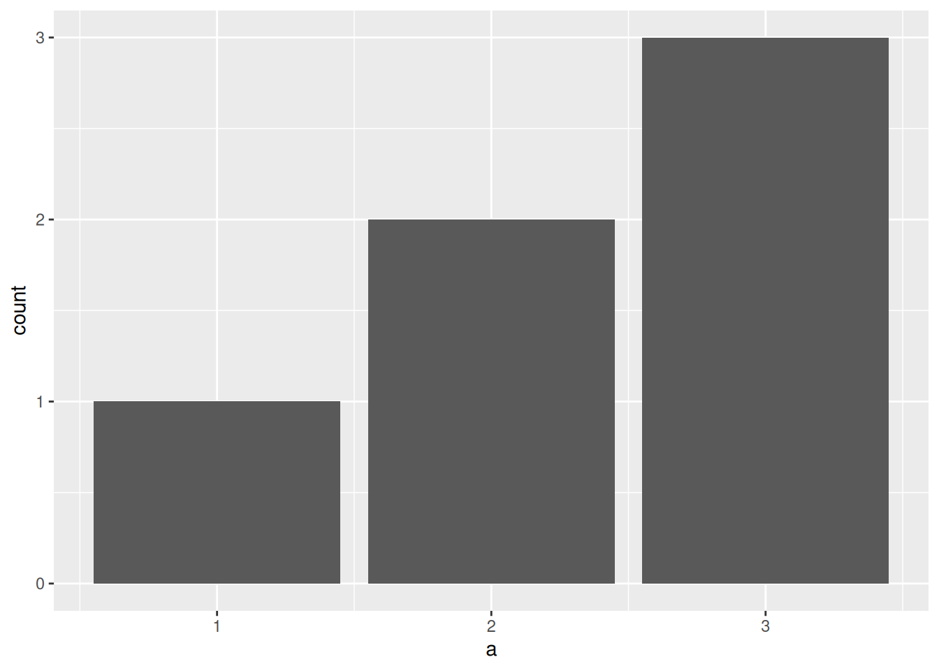
## NOTE: Do not edit this
tibble(
  a = c(1, 2, 3),
  b = c(3, 1, 2)
) %>%
  ggplot(aes(x = a, y = b)) +
  geom_col()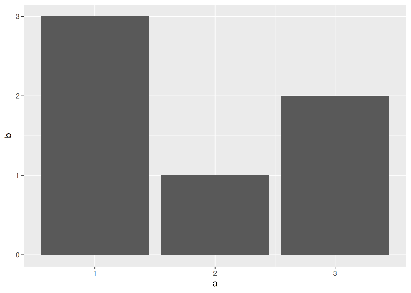
geom_bar() effectively counts the number of rows belonging to each unique value of the x aesthetic. We can do a manual geom_bar() by using the count() function:
## NOTE: Do not edit this
tibble(a = c(1, 2, 2, 3, 3, 3)) %>%
  count(a) %>% # Count adds the column `n` of counts
  ggplot(aes(x = a, y = n)) +
  geom_col()
18.2 Fundamentals of the bar chart
There are some common properties of all bar charts:
- Values are shown with bars
- The top of the bar is the data value
- The bottom of the bar is at zero
- The data must be 1:1
- That is, for each value of the
xaesthetic, there is only one value of theyaesthetic*
- That is, for each value of the
The requirement of 1:1 data is really important! Look at what happens if we try to plot data that is not 1:1:
## NOTE: Do not edit this
tibble(
  a = c(1, 2, 2), # Note that our x aesthetic (a) has repeat values
  b = c(3, 1, 2)  # Hence, we have two different b values for a == 2
) %>%
  ggplot(aes(x = a, y = b)) +
  geom_col()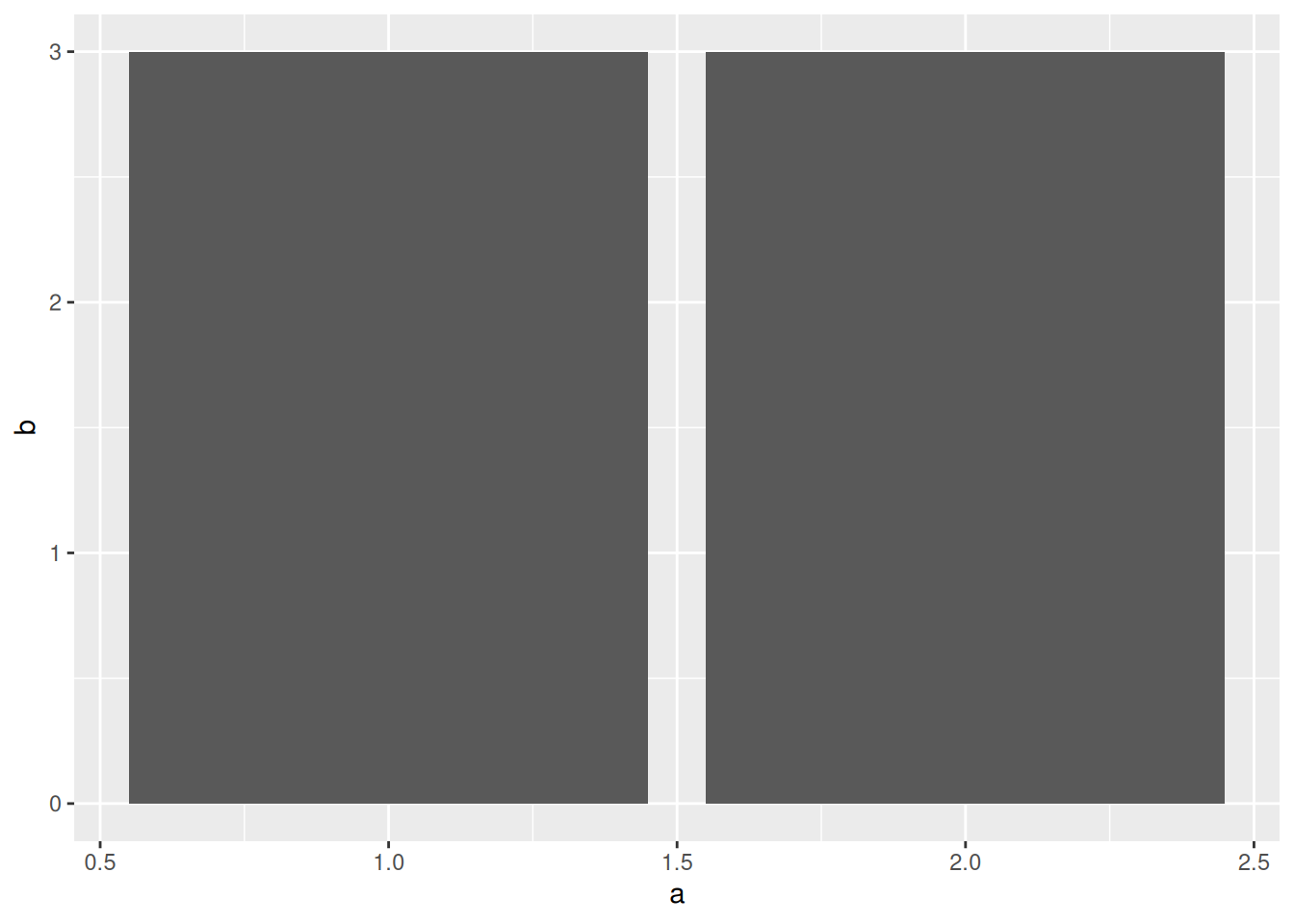
It’s hard to tell what’s happening, but the bars for a == 2 are stacked. But if we try to interpret this plot, it seems like b == 3 when a == 2, which is not true.
*There’s an exception when we have additional aesthetics such as fill or color.
For the mpg dataset, we can see that the pairs cty, hwy clearly don’t have this one-to-one property:
## # A tibble: 11 × 11
##    manufacturer model      displ  year   cyl trans drv     cty   hwy fl    class
##    <chr>        <chr>      <dbl> <int> <int> <chr> <chr> <int> <int> <chr> <chr>
##  1 audi         a4           2    2008     4 manu… f        20    31 p     comp…
##  2 audi         a4 quattro   2    2008     4 manu… 4        20    28 p     comp…
##  3 hyundai      tiburon      2    2008     4 manu… f        20    28 r     subc…
##  4 hyundai      tiburon      2    2008     4 auto… f        20    27 r     subc…
##  5 subaru       forester …   2.5  2008     4 manu… 4        20    27 r     suv
##  6 subaru       forester …   2.5  2008     4 auto… 4        20    26 r     suv
##  7 subaru       impreza a…   2.5  2008     4 auto… 4        20    25 p     comp…
##  8 subaru       impreza a…   2.5  2008     4 auto… 4        20    27 r     comp…
##  9 subaru       impreza a…   2.5  2008     4 manu… 4        20    27 r     comp…
## 10 volkswagen   new beetle   2.5  2008     5 manu… f        20    28 r     subc…
## 11 volkswagen   new beetle   2.5  2008     5 auto… f        20    29 r     subc…
18.2.1 q2 Inspect this plot
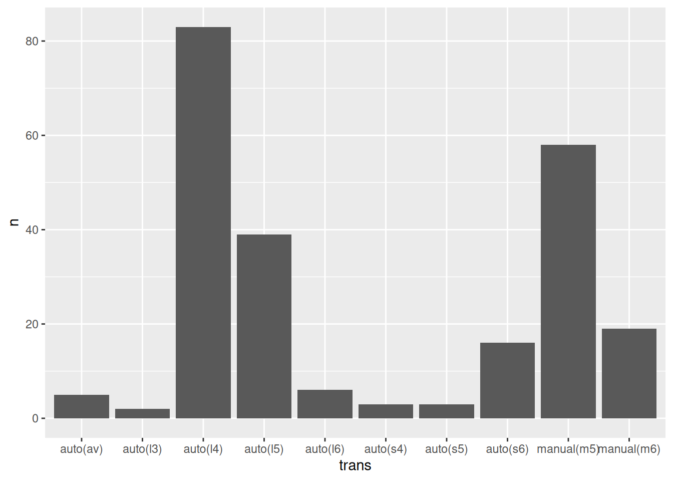
The following code attempts to visualize cty, hwy from mpg using geom_col(). There’s something fishy about the hwy values; answer the questions below.
Hint: Try adding the position = "dodge" argument to geom_col().
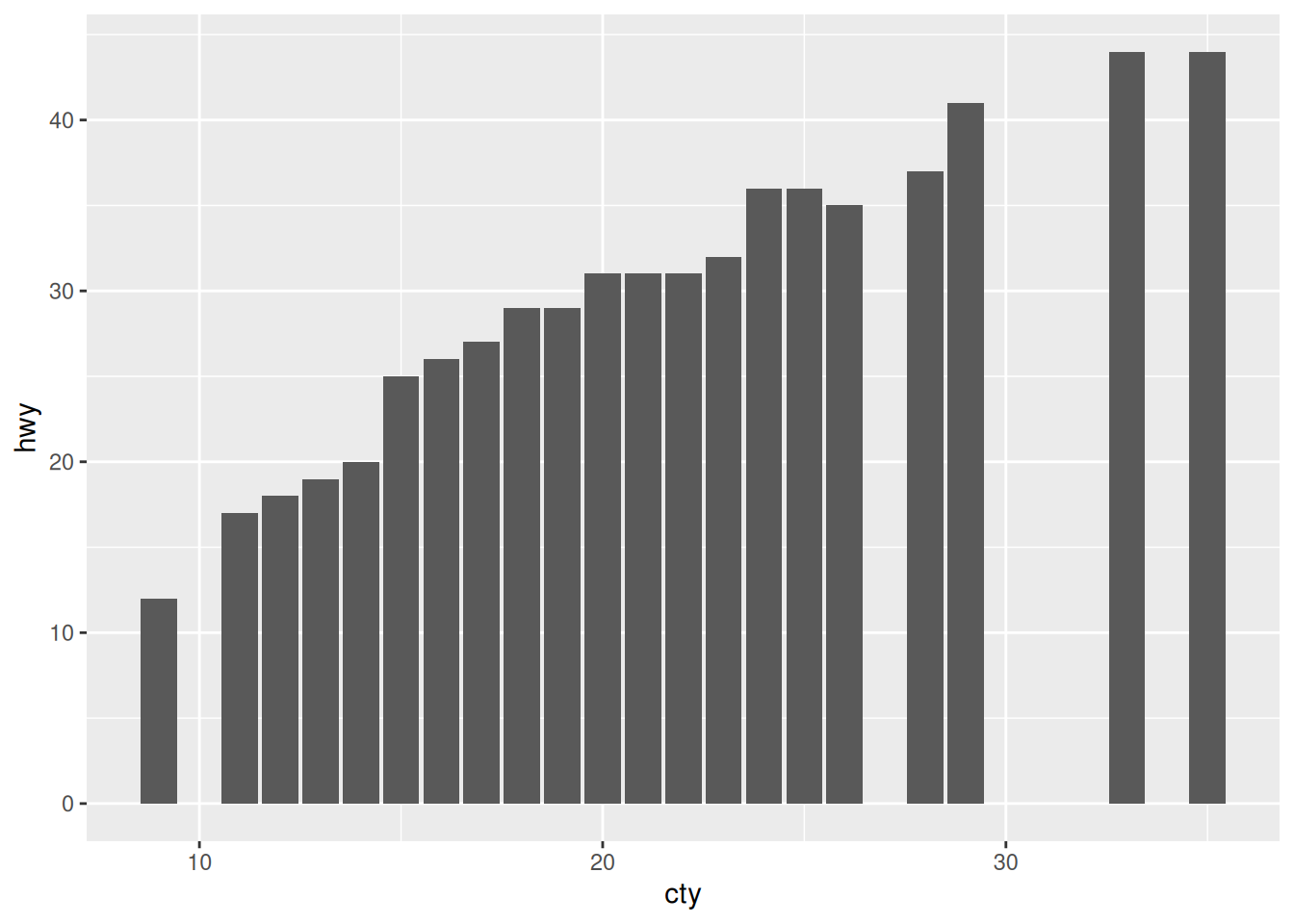
Observations:
- Since position = "stacked" is the default for geom_col(), we see not the real hwy values, but effectively a sum at each cty value!
18.3 Stacked bar charts
We can make stacked bar charts less terrible by using a third aesthetic to disambiguate the bar segments. For instance,
## NOTE: Do not edit this
tibble(
  a = c(1, 2, 2),
  b = c(3, 1, 2),
  c = c("a", "a", "b")
) %>%
  ggplot(aes(x = a, y = b, fill = c)) +
  geom_col()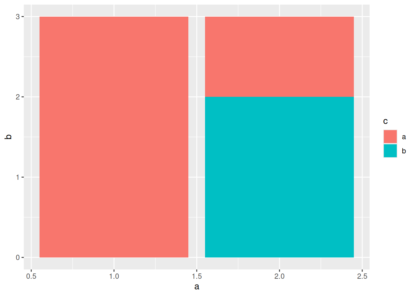
Stacked bar charts have their uses, but it’s usually better to find a different way to show this kind of data. In particular, comparing within a stack is difficult, since the bars do not all start at zero. One way to make comparisons easier is to dodge the bars, so they all start at zero. We can do this with the position = "dodge" argument:
## NOTE: Do not edit this
tibble(
  a = c(1, 2, 2),
  b = c(3, 1, 2),
  c = c("a", "a", "b")
) %>%
  ggplot(aes(x = a, y = b, fill = c)) +
  geom_col(position = "dodge")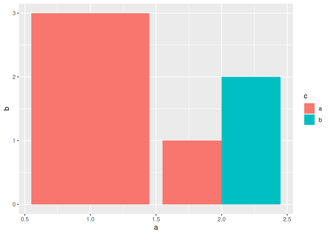
Note that this naturally “shrinks” some of the bars so we can fit them near the same value. Don’t mistake these bars as belonging to other a values (like 1.75, 2.25)—this is just an artifact of the dodging.
Note that we need to put the position = "dodge" argument inside the relevant geometry, and not, say, ggplot().
18.3.1 q3 Compare these plots
The following are two different visualizations of the mpg dataset. Document your observations between the v1 and v2 visuals. Then, determine which—v1 or v2—enabled you to make more observations. What was the difference between the two visuals?
## TODO: Run this code without changing, describe your observations on the data
mpg %>%
  ggplot(aes(x = class, fill = class)) +
  geom_bar()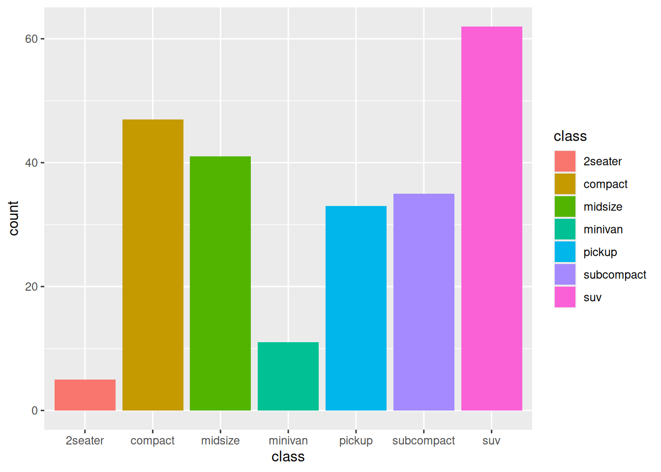
Observations:
In this dataset:
- SUV’s are most numerous, followed by compact and midsize
- There are very few 2seater vehicles
## TODO: Run this code without changing, describe your observations on the data
mpg %>%
  ggplot(aes(class, fill = drv)) +
  geom_bar()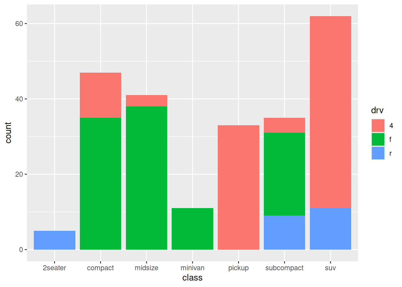
Observations:
In this dataset:
- SUV’s are most numerous, followed by compact and midsize
- There are very few 2seater vehicles
- pickup’s and SUV’s tend to have 4 wheel drive
- compact’s and midsize tend to have f drive
- All the 2seater vehicles are r drive
Compare v1 and v2:
- Which visualization—
v1orv2—enabled you to make more observations?v2enabled me to make more observations
- What was the difference between
v1andv2?v1showed the same variableclassusing two aestheticsv2showed two variablesclassanddrvusing two aesthetics
18.3.2 q4 Fix this plot
The following code has a bug; it does not do what its author intended. Identify and fix the bug. What does the resulting graph tell you about the relation between manufacturer and class of cars in this dataset?
Note: I use a theme() call to rotate the x-axis labels. We’ll learn how to do this in a future exercise.
mpg %>%
  ggplot(aes(x = manufacturer, fill = class)) +
  geom_bar(position = "dodge") +
  theme(axis.text.x = element_text(angle = 270, vjust = 0.5, hjust = 0))
Observations
- Certain manufacturers seem to favor particular classes of car. For instance,
in this dataset:
- Jeep, Land Rover, Lincoln, and Mercury only have suv’s
- Audi, Toyota, and Volkswagen favor compact
- Dodge favors pickup
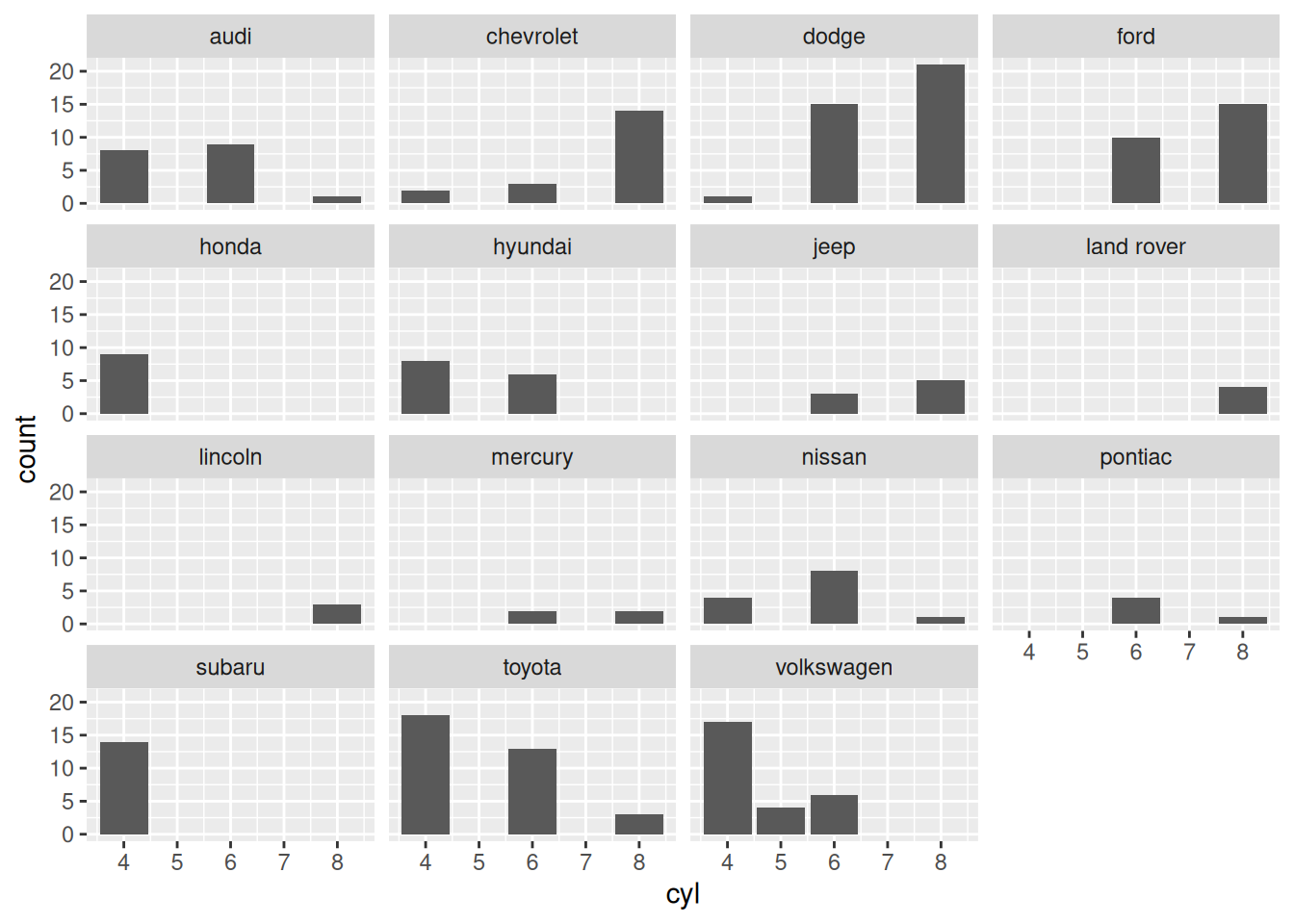
18.4 A bit on facets
Sometimes there’s just too much data to fit a set of bars on one chart. In this case, it can be wise to separate the plot into a set of small multiples, often by grouping the data on a third (or fourth) variable.
For small multiples, we can use the functions facet_wrap() or facet_grid(). facet_wrap() takes just one variable,
## NOTE: Do not edit this
tibble(
  a = c(1, 2, 1, 2),
  b = c(3, 1, 2, 2),
  c = c("a", "a", "b", "b")
) %>%
  ggplot(aes(x = a, y = b)) +
  geom_col() +
  facet_wrap(~c)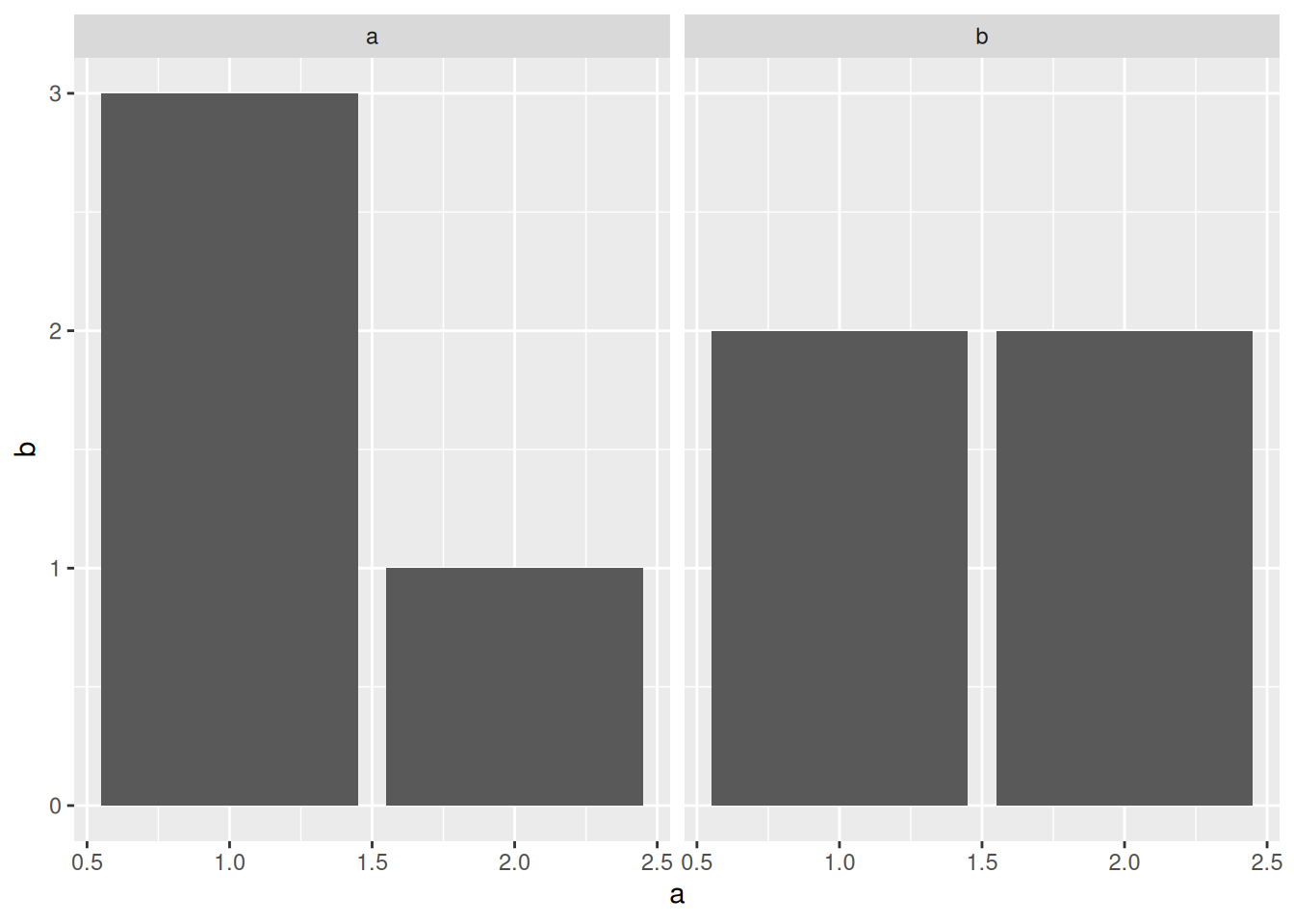
facet_grid() allows us to specify a column for horizontal and/or vertical faceting, so we can provide up to two. Here’s a lineup of examples:
## NOTE: Do not edit this
# Horizontal facets
tibble(
  a = c(1, 2, 1, 2),
  b = c(3, 1, 2, 2),
  c = c("a", "a", "b", "b")
) %>%
  ggplot(aes(x = a, y = b)) +
  geom_col() +
  facet_grid(~c)
# Vertical facets
tibble(
  a = c(1, 2, 1, 2),
  b = c(3, 1, 2, 2),
  c = c("a", "a", "b", "b")
) %>%
  ggplot(aes(x = a, y = b)) +
  geom_col() +
  facet_grid(c ~ .)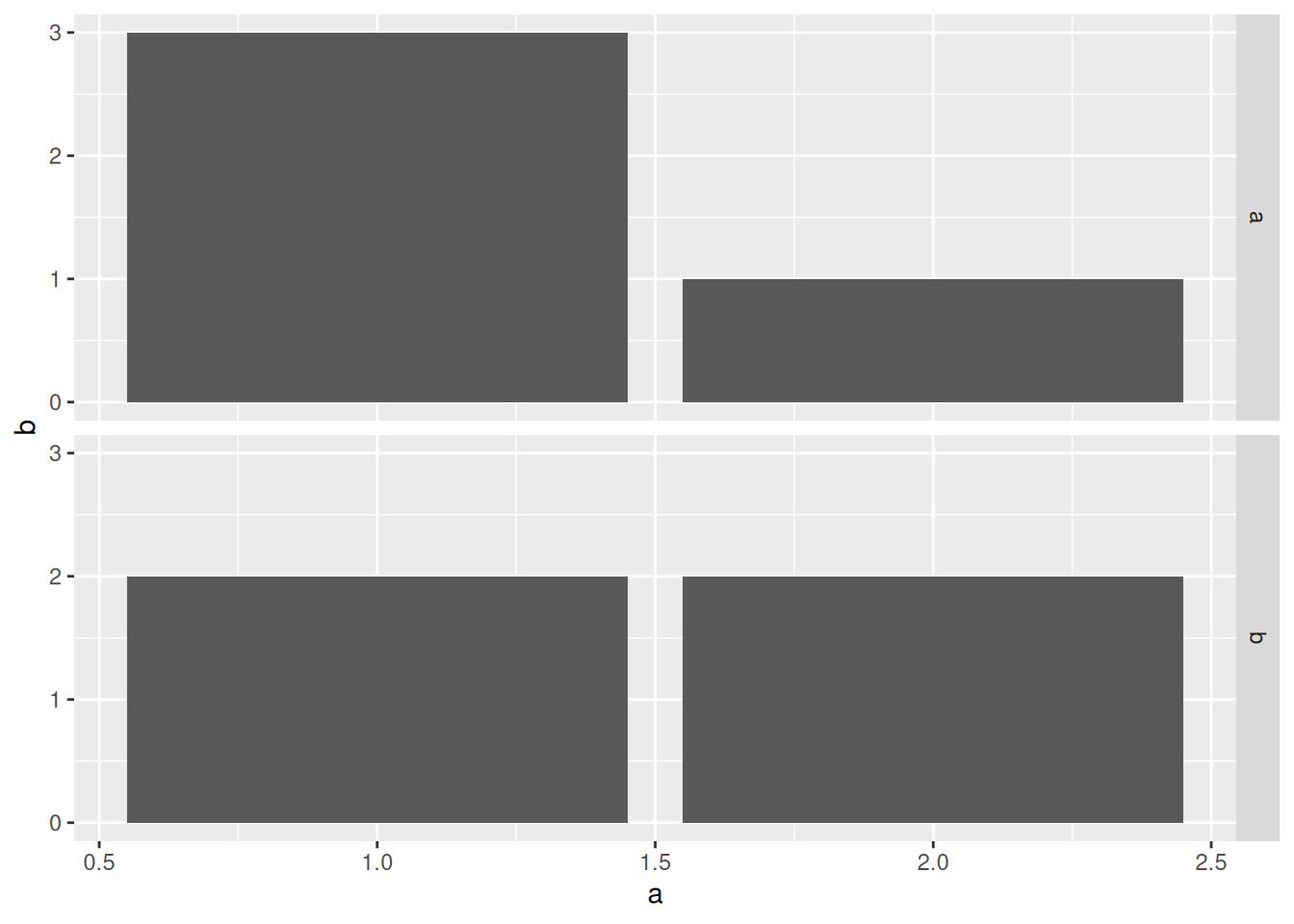
# Two-way faceting
tibble(
  a = c(1, 2, 1, 2, 1, 2),
  b = c(3, 1, 2, 2, 3, 1),
  c = c("a", "a", "b", "b", "a", "a"),
  d = c("a", "a", "a", "a", "b", "b")
) %>%
  ggplot(aes(x = a, y = b)) +
  geom_col() +
  facet_grid(c ~ d)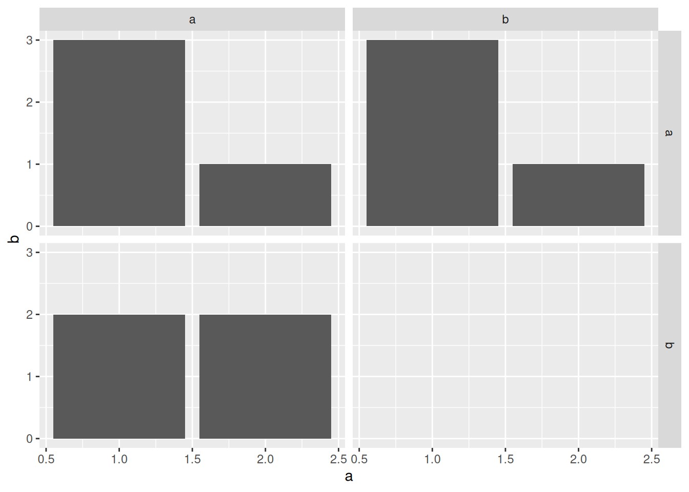
In general, if you have just one variable to facet on, you can use facet_wrap() as a default. If you want more control and options over your faceting, use facet_grid(). We’ll talk more about facets in a future exercise.