56 Model: Warnings when interpreting linear models
Purpose: When fitting a model, we might like to use that model to interpret how predictors affect some outcome of interest. This is a useful thing to do, but interpreting models is also very challenging. This exercise will give you a couple warnings about interpreting models.
Reading: (None, this is the reading)
## ── Attaching core tidyverse packages ──────────────────────── tidyverse 2.0.0 ──
## ✔ dplyr     1.1.4     ✔ readr     2.1.5
## ✔ forcats   1.0.0     ✔ stringr   1.5.1
## ✔ ggplot2   3.5.2     ✔ tibble    3.2.1
## ✔ lubridate 1.9.4     ✔ tidyr     1.3.1
## ✔ purrr     1.0.4
## ── Conflicts ────────────────────────────────────────── tidyverse_conflicts() ──
## ✖ dplyr::filter() masks stats::filter()
## ✖ dplyr::lag()    masks stats::lag()
## ℹ Use the conflicted package (<http://conflicted.r-lib.org/>) to force all conflicts to become errors##
## Attaching package: 'broom'
##
## The following object is masked from 'package:modelr':
##
## bootstrapFor this exercise, we’ll use the familiar diamonds dataset.
## NOTE: No need to edit this setup
# Create a test-validate split
set.seed(101)
diamonds_randomized <-
  diamonds %>%
  slice(sample(dim(diamonds)[1]))

diamonds_train <-
  diamonds_randomized %>%
  slice(1:10000)
56.1 1st Warning: Models Are a Function of the Population
Remember that any time we’re doing statistics, we must first define the population. That means when we’re fitting models, we need to pay attention to the data we feed the model for training.
Let’s start with a curious observation; look at the effect of cut on price at low and high carat values:
## NOTE: No need to edit this chunk
diamonds_train %>%
  mutate(
    grouping = if_else(carat < 1.0, "Lower carat", "Upper carat")
  ) %>%

  ggplot(aes(cut, price)) +
  geom_boxplot() +

  scale_y_log10() +
  facet_grid(~ grouping)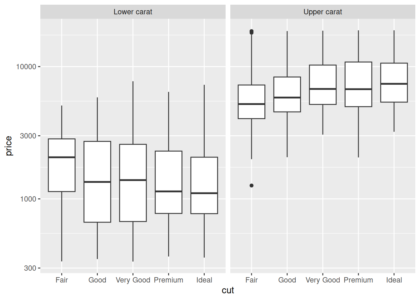
The trend in cut is what we’d expect at upper values (carat > 1), but reversed at lower values (carat <= 1)! Let’s see how this affects model predictions.
56.1.1 q1 Compare two models.
Fit two models on diamonds_train, one for carat <= 1 and one for carat > 1. Use only cut as the predictor. First, make a prediction about how the predictions for the two models will compare, and then inspect the model results below.
fit_lower <-
  diamonds_train %>%
  filter(carat <= 1) %>%
  lm(formula = price ~ cut)

fit_upper <-
  diamonds_train %>%
  filter(carat > 1) %>%
  lm(formula = price ~ cut)

## NOTE: No need to modify this code
tibble(cut = c("Fair", "Good", "Very Good", "Premium", "Ideal")) %>%
  mutate(
    cut = fct_relevel(cut, "Fair", "Good", "Very Good", "Premium", "Ideal")
  ) %>%
  add_predictions(fit_lower, var = "price_pred-lower") %>%
  add_predictions(fit_upper, var = "price_pred-upper") %>%
  pivot_longer(
    names_to = c(".value", "model"),
    names_sep = "-",
    cols = matches("price")
  ) %>%

  ggplot(aes(cut, price_pred, color = model)) +
  geom_line(aes(group = model)) +
  geom_point() +
  scale_y_log10()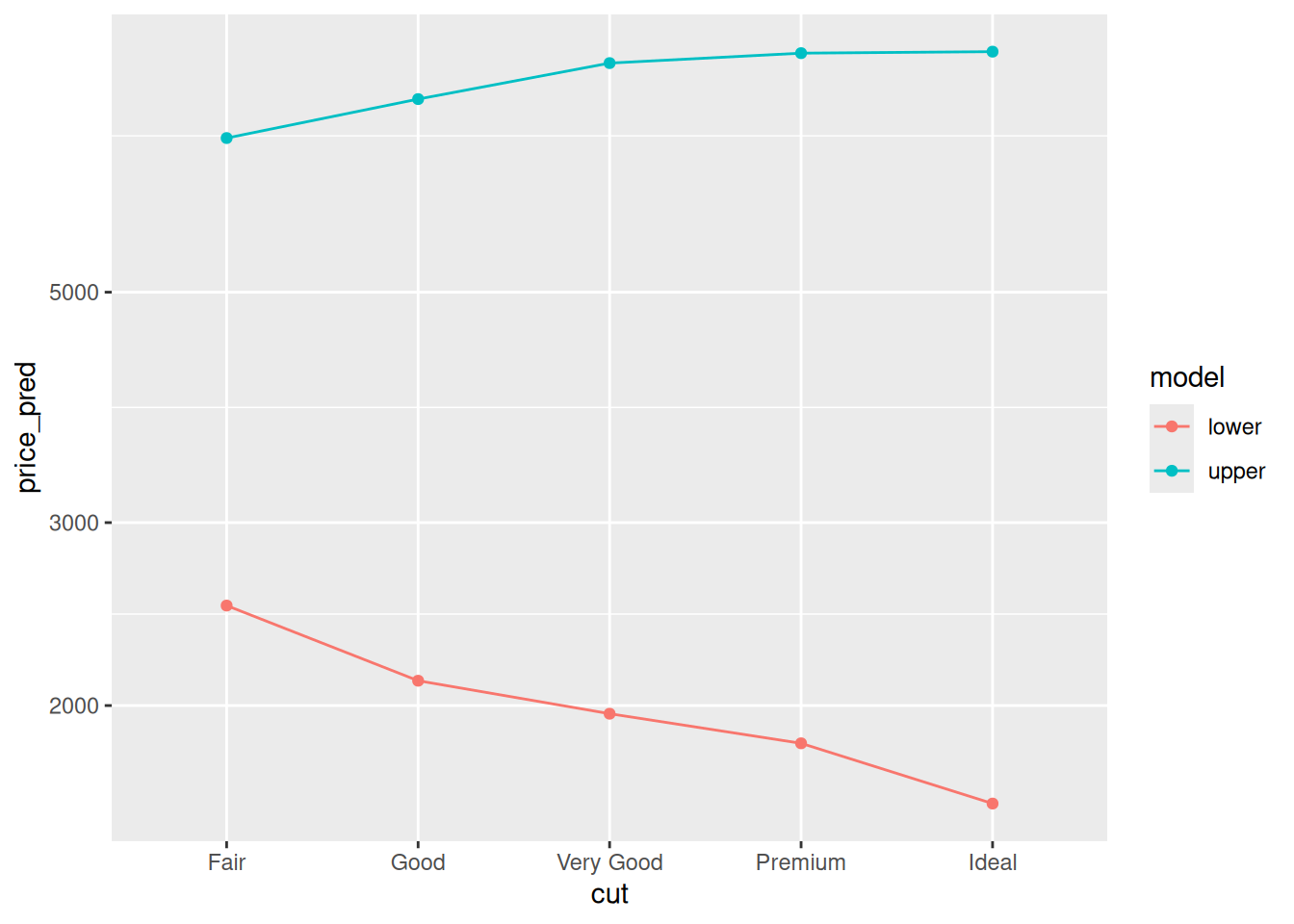
Observations:
- I expected the lower model to have decreasing price with increasing cut, and the upper model to have the reverse trend.
- Yup! The model behavior matched my expectations.
Why is this happening? Let’s investigate!
56.1.2 q2 Change the model
Repeat the same exercise above, but instead of price ~ cut fit carat ~ cut. Interpret the model results: Can the behavior we see below help explain the behavior above?
fit_carat_lower <-
  diamonds_train %>%
  filter(carat <= 1) %>%
  lm(formula = carat ~ cut)

fit_carat_upper <-
  diamonds_train %>%
  filter(carat > 1) %>%
  lm(formula = carat ~ cut)

## NOTE: No need to change this code
tibble(cut = c("Fair", "Good", "Very Good", "Premium", "Ideal")) %>%
  mutate(
    cut = fct_relevel(cut, "Fair", "Good", "Very Good", "Premium", "Ideal")
  ) %>%
  add_predictions(fit_carat_lower, var = "carat_pred-lower") %>%
  add_predictions(fit_carat_upper, var = "carat_pred-upper") %>%
  pivot_longer(
    names_to = c(".value", "model"),
    names_sep = "-",
    cols = matches("carat")
  ) %>%

  ggplot(aes(cut, carat_pred, color = model)) +
  geom_line(aes(group = model)) +
  geom_point() +
  scale_y_log10()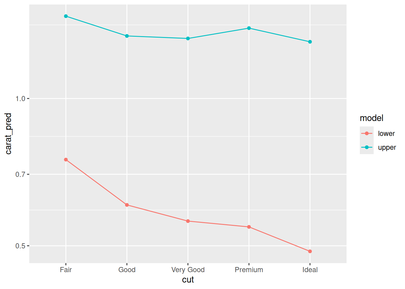
Observations:
- We see that the lower model has carat decreasing with increasing cut, while the upper model gives carat a relatively flat relationship with cut.
- This trend could account for the behavior we saw above: For the lower model, the variable
cutcould be used as a proxy forcarat, which would lead to a negative model trend.
We can try to fix these issues by adding more predictors. But that leads to our second warning….
56.2 2nd Warning: Model Coefficients are a Function of All Chosen Predictors
Our models are not just a function of the population, but also of the specific set of predictors we choose for the model. That may seem like an obvious statement, but the effects are profound: Adding a new predictor x2 can change the model’s behavior according to another predictor, say x1. This could change an effect enough to reverse the sign of a predictor!
The following task will demonstrate this effect.
56.2.1 q3 Fit two models, one with both carat and cut, and another with cut only. Fit only to the low-carat diamonds (carat <= 1). Use the provided code to compare the model behavior with cut, and answer the questions under observations below.
fit_carat_cut <-
  diamonds_train %>%
  filter(carat <= 1) %>%
  lm(formula = price ~ carat + cut)

fit_cut_only <-
  diamonds_train %>%
  filter(carat <= 1) %>%
  lm(formula = price ~ cut)

## NOTE: No need to change this code
tibble(
    cut = c("Fair", "Good", "Very Good", "Premium", "Ideal"),
    carat = c(0.4)
  ) %>%
  mutate(
    cut = fct_relevel(cut, "Fair", "Good", "Very Good", "Premium", "Ideal")
  ) %>%
  add_predictions(fit_carat_cut, var = "price_pred-carat_cut") %>%
  add_predictions(fit_cut_only, var = "price_pred-cut_only") %>%
  pivot_longer(
    names_to = c(".value", "model"),
    names_sep = "-",
    cols = matches("price")
  ) %>%

  ggplot(aes(cut, price_pred, color = model)) +
  geom_line(aes(group = model)) +
  geom_point() +
  scale_y_log10()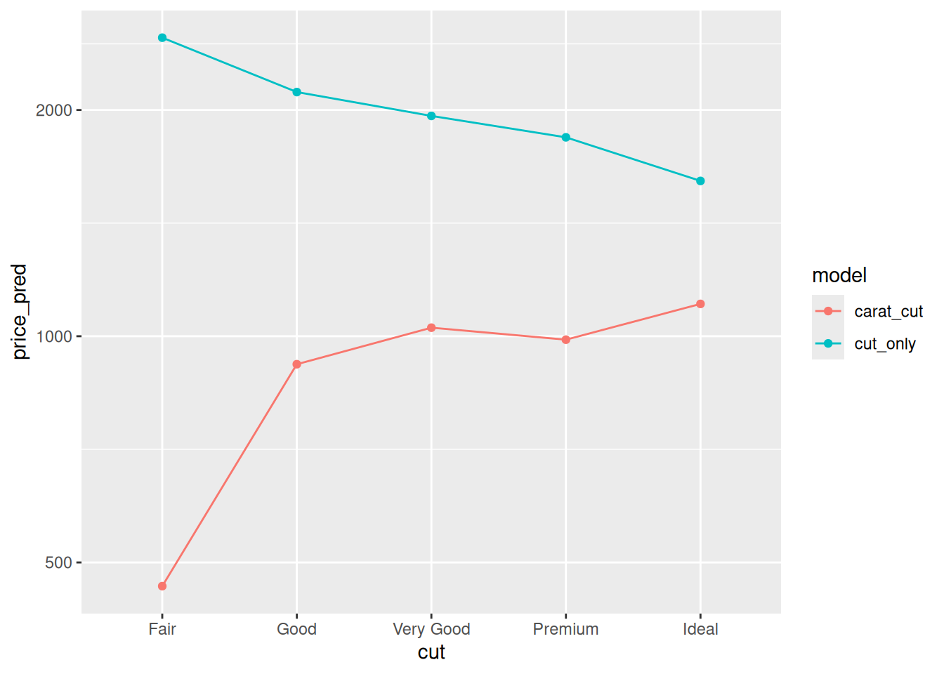
Observations:
cuthas a negative effect onpricefor thecut_onlymodel.cuthas a positive effect onpricefor thecarat_cutmodel.- We saw above that
cutpredictscaratat low carat values; when we don’t includecaratin the model, thecutvariable acts as a surrogate forcarat. When we do includecaratin the model, the model usescaratto predict the price, and can more correctly account for the behavior of `cut.
56.3 Main Punchline
When fitting a model, we might be tempted to interpret the model parameters. Sometimes this can be helpful, but as we’ve seen above the model behavior is a complex function of the population, the available data, and the specific predictors we choose for the model.
When making predictions this is not so much of an issue. But when trying to interpret a model, we need to exercise caution. A more formal treatment of these ideas is to think about confounding variables. The more general statistical exercise of assigning causal behavior to different variables is called causal inference. These topics are slippery, and largely outside the scope of this course.
If you’d like to learn more, I highly recommend taking more formal courses in statistics!