16 Stats: EDA Basics
Purpose: Exploratory Data Analysis (EDA) is a crucial skill for a practicing data scientist. Unfortunately, much like human-centered design EDA is hard to teach. This is because EDA is not a strict procedure, so much as it is a mindset. Also, much like human-centered design, EDA is an iterative, nonlinear process. There are two key principles to keep in mind when doing EDA:
- Curiosity: Generate lots of ideas and hypotheses about your data.
- Skepticism: Remain unconvinced of those ideas, unless you can find credible patterns to support them.
Since EDA is both crucial and difficult, we will practice doing EDA a lot in this course!
Reading: (None, this is the reading)
Note: This exercise will consist of interpreting pre-made graphs. You can run the whole notebook to generate all the figures at once. Just make sure to do all the exercises and write your observations!
## ── Attaching core tidyverse packages ──────────────────────── tidyverse 2.0.0 ──
## ✔ dplyr     1.1.4     ✔ readr     2.1.5
## ✔ forcats   1.0.0     ✔ stringr   1.5.1
## ✔ ggplot2   3.5.2     ✔ tibble    3.2.1
## ✔ lubridate 1.9.4     ✔ tidyr     1.3.1
## ✔ purrr     1.0.4
## ── Conflicts ────────────────────────────────────────── tidyverse_conflicts() ──
## ✖ dplyr::filter() masks stats::filter()
## ✖ dplyr::lag()    masks stats::lag()
## ℹ Use the conflicted package (<http://conflicted.r-lib.org/>) to force all conflicts to become errors
16.0.1 q0 Simple checks
Remember from e02-data-basics there were simple checks we’re supposed to do? Do those simple checks on the diamonds dataset below.
## Rows: 53,940
## Columns: 10
## $ carat   <dbl> 0.23, 0.21, 0.23, 0.29, 0.31, 0.24, 0.24, 0.26, 0.22, 0.23, 0.…
## $ cut     <ord> Ideal, Premium, Good, Premium, Good, Very Good, Very Good, Ver…
## $ color   <ord> E, E, E, I, J, J, I, H, E, H, J, J, F, J, E, E, I, J, J, J, I,…
## $ clarity <ord> SI2, SI1, VS1, VS2, SI2, VVS2, VVS1, SI1, VS2, VS1, SI1, VS1, …
## $ depth   <dbl> 61.5, 59.8, 56.9, 62.4, 63.3, 62.8, 62.3, 61.9, 65.1, 59.4, 64…
## $ table   <dbl> 55, 61, 65, 58, 58, 57, 57, 55, 61, 61, 55, 56, 61, 54, 62, 58…
## $ price   <int> 326, 326, 327, 334, 335, 336, 336, 337, 337, 338, 339, 340, 34…
## $ x       <dbl> 3.95, 3.89, 4.05, 4.20, 4.34, 3.94, 3.95, 4.07, 3.87, 4.00, 4.…
## $ y       <dbl> 3.98, 3.84, 4.07, 4.23, 4.35, 3.96, 3.98, 4.11, 3.78, 4.05, 4.…
## $ z       <dbl> 2.43, 2.31, 2.31, 2.63, 2.75, 2.48, 2.47, 2.53, 2.49, 2.39, 2.…
I’m going to walk you through a train of thought I had when studying the diamonds dataset.
There are four standard “C’s” of judging a diamond.[1] These are carat, cut, color and clarity, all of which are in the diamonds dataset.
16.1 Hypothesis 1
Here’s a hypothesis: Ideal is the “best” value of cut for a diamond.
Since an Ideal cut seems more labor-intensive, I hypothesize that Ideal cut
diamonds are less numerous than other cuts.
16.1.1 q1 Assess hypothesis 1
Run the chunk below, and study the plot. Was hypothesis 1 correct? Why or why not?
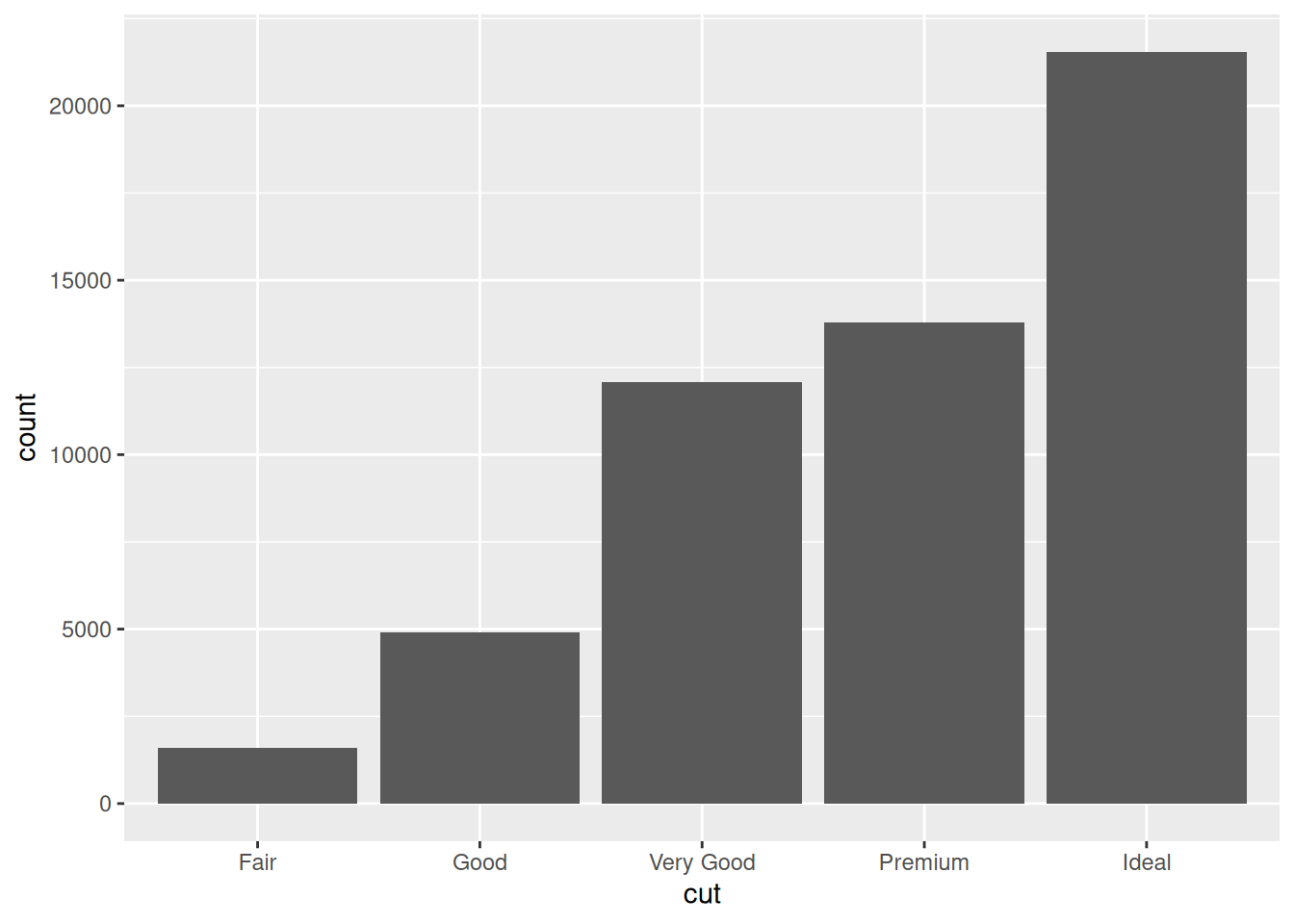
Observations:
- The truth is actually the opposite! Ideal cut diamonds are more numerous than all other cuts! Perhaps because cutting a diamond is easier than mining a new one, gemcutters add value to a diamond by striving for an ideal cut.
16.2 Hypothesis 2
Another hypothesis: The Ideal cut diamonds should be the most pricey.
16.2.1 q2.1 Assess hypothesis 2
Study the following graph; does it support, contradict, or not relate to hypothesis 2?
Hint: Is this an effective graph? Why or why not?
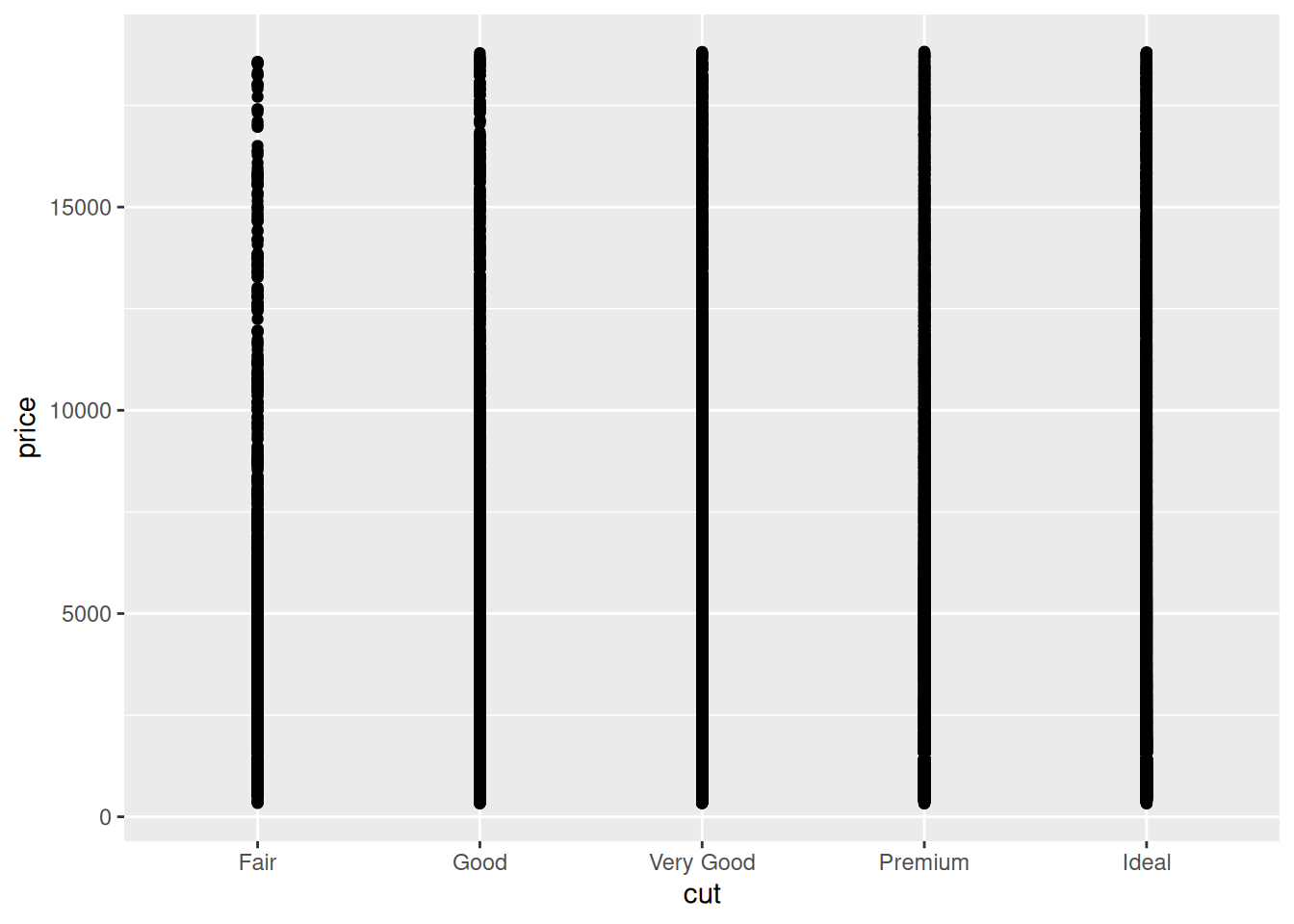
Observations: - This graph is virtually useless! There is severe overplotting. We cannot tell address Hypothesis 2 with this graph
The following is a set of boxplots; the middle bar denotes the median, the boxes denote the quartiles (upper and lower “quarters” of the data), and the lines and dots denote large values and outliers.
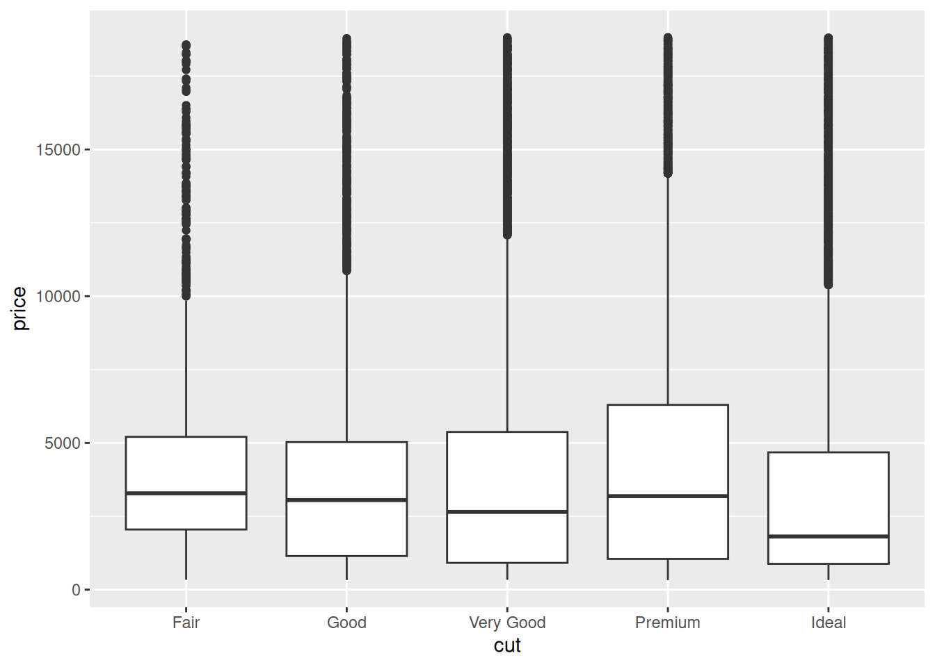
16.3 Unraveling Hypothesis 2
Upon making the graph in q2.2, I was very surprised. So I did some reading on diamond cuts. It turns out that some gemcutters sacrifice cut for carat. Could this effect explain the surprising pattern above?
16.3.1 q3 Assess hypothesis 2
Study the following graph; does it support a “carat over cut” hypothesis? How might this relate to price?
Hint: The article linked above will help you answer these questions!
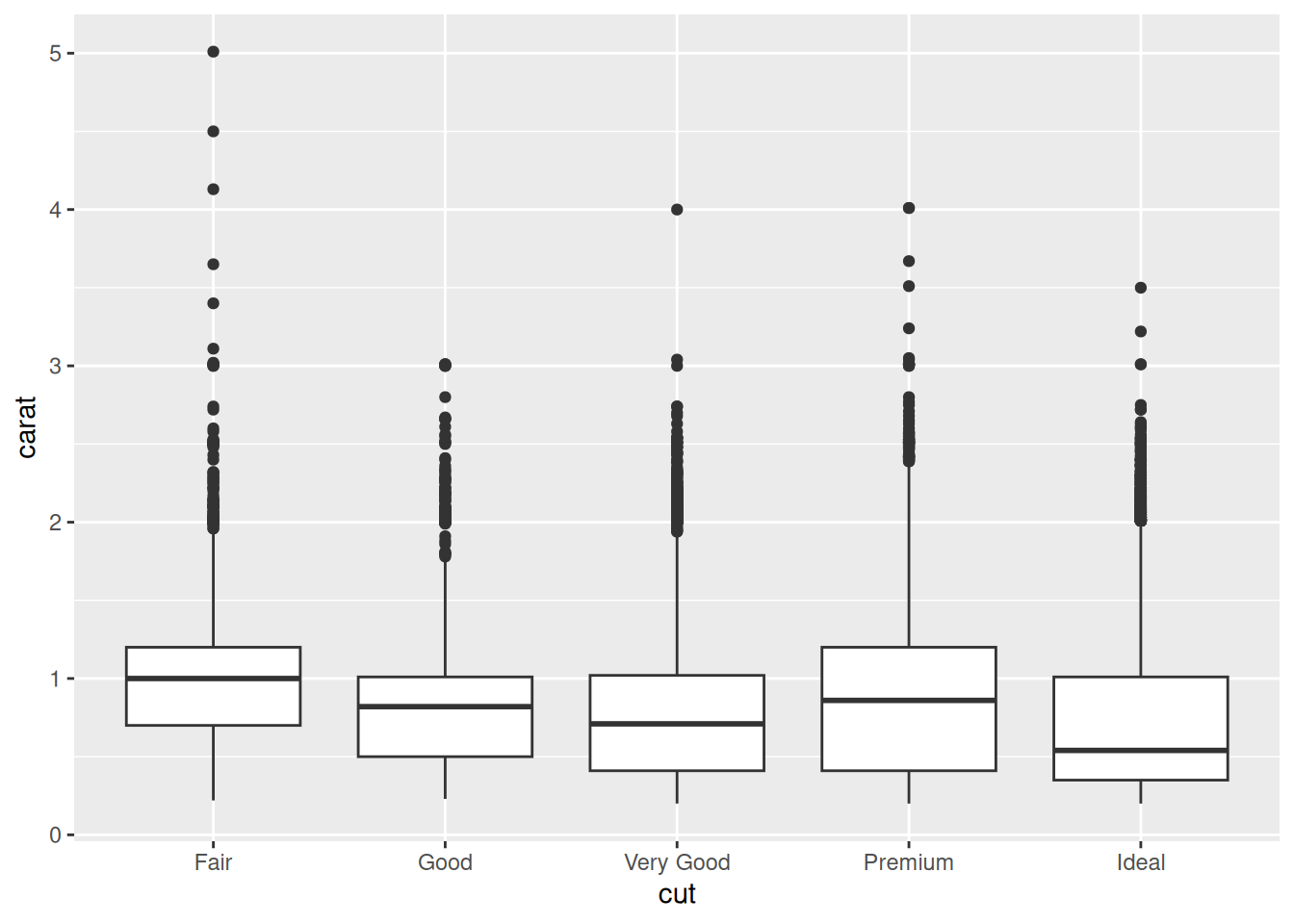
Observations:
- The median of Ideal diamonds is a fair bit lower in carat than other cuts. This provides some evidence that gemcutters trade cut for carat.
- The very largest carat diamonds tend to be of Fair cut; this makese sense, as cutting the gemstone will only reduce weight.
- It seems that many diamond purchasers are more interested in carat than fine cut. This provides some rationale for why Ideal diamonds are cheaper; they are necessarily lower-carat.
Note what we just did:
- We came up with hypotheses / questions about the data.
- We used multiple graphs to assess these hypotheses / questions.
- We used knowledge about the real world to make sense of the data.
These are some of the core “moves” of exploratory data analysis.