22 Stats: Intro to Densities
Purpose: We will use densities to model and understand data. To that end, we’ll need to understand some key ideas about densities. Namely, we’ll discuss random variables, how we model random variables with densities, and the importance of random seeds. We’re not going to learn everything we need to work with data in this single exercise, but this will be our starting point.
Reading: (None; this exercise is the reading.)
## ── Attaching core tidyverse packages ──────────────────────── tidyverse 2.0.0 ──
## ✔ dplyr     1.1.4     ✔ readr     2.1.5
## ✔ forcats   1.0.0     ✔ stringr   1.5.1
## ✔ ggplot2   3.5.2     ✔ tibble    3.2.1
## ✔ lubridate 1.9.4     ✔ tidyr     1.3.1
## ✔ purrr     1.0.4
## ── Conflicts ────────────────────────────────────────── tidyverse_conflicts() ──
## ✖ dplyr::filter() masks stats::filter()
## ✖ dplyr::lag()    masks stats::lag()
## ℹ Use the conflicted package (<http://conflicted.r-lib.org/>) to force all conflicts to become errors
22.1 Densities
Fundamentally, a density is a function: It takes an input, and returns an output. A density has a special interpretation though; it represents the relative chance of particular values occurring.
First, let’s look at a density of some real data:
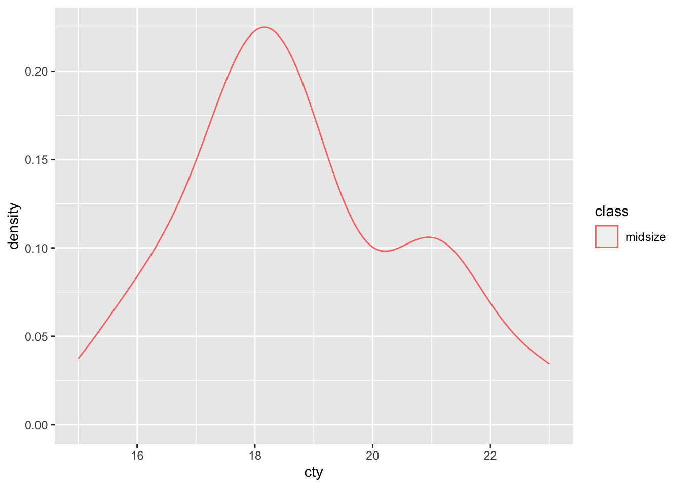
This density indicates that a value around 18 is more prevalent than other values of cty, at least for midsize vehicles in this dataset. Note that the plot above was generated by taking a set of cty values and smoothing them to create a density.
Next, let’s look at a normal density:
## NOTE: No need to change this!
df_norm_d <-
  tibble(z = seq(-5, +5, length.out = 100)) %>%
  mutate(d = dnorm(z, mean = 0, sd = 1))

df_norm_d %>%
  ggplot(aes(z, d)) +
  geom_line() +
  labs(
    y = "density"
  )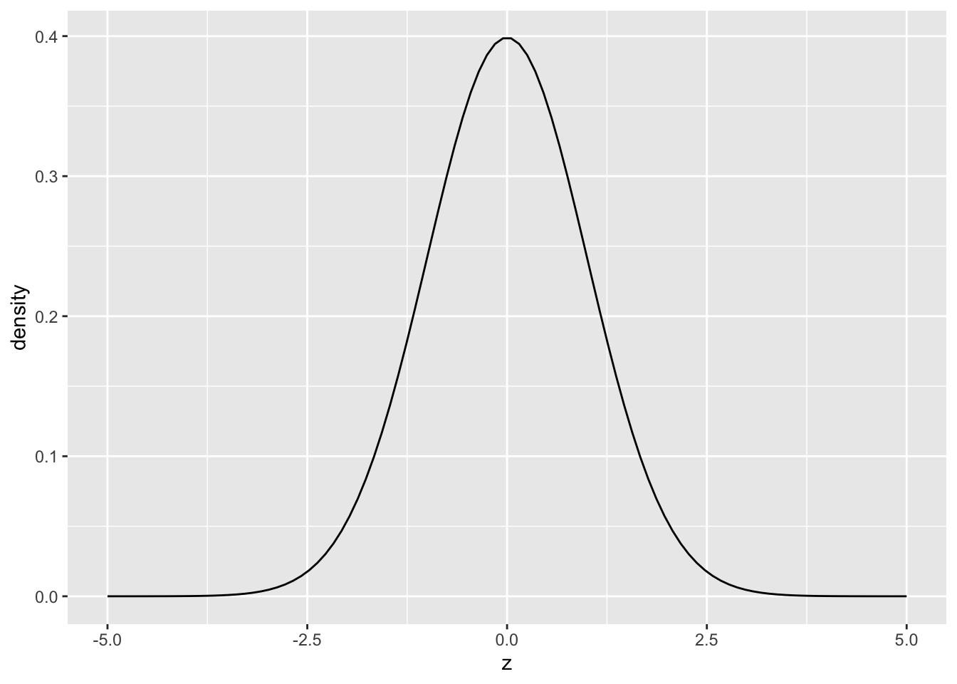
This plot of a normal density shows that the value z = 0 is most likely, while values both larger and smaller are less likely to occur. Note that the the density above was generated by dnorm(z, mean = 0, sd = 1). The values [mean, sd] are called parameters. Rather than requiring an entire dataset to define this density, the normal is fully defined by specifying values for mean and sd.
However, note that the normal density is quite a bit simpler than the density of cty values above. This is a general trend; “named” densities like the normal are simplified models we use to represent real data. Picking an appropriate model is part of the challenge in statistics.
R comes with a great many densities implemented:
| Density | Code |
|---|---|
| Normal | norm |
| Uniform | unif |
| Chi-squared | chisq |
| … | … |
In R we access a density by prefixing its name with the letter d.
22.1.1 q1 Modify the code below to evaluate a uniform density with min = -1 and max = +1. Assign this value to d.
Use the following test to check your answer.
## NOTE: No need to change this
assertthat::assert_that(
  all(
    df_q1 %>%
      filter(-1 <= x, x <= +1) %>%
      mutate(flag = d > 0) %>%
      pull(flag)
    )
)
## [1] TRUEassertthat::assert_that(
all(
df_q1 %>%
filter((x < -1) | (+1 < x)) %>%
mutate(flag = d == 0) %>%
pull(flag)
)
)## [1] TRUE## [1] "Nice!"22.2 Drawing Samples: A Model for Randomness
What does it practically mean for a value to be more or less likely? A density gives information about a random variable. A random variable is a quantity that takes a random value every time we observe it. For instance: If we roll a six-sided die, it will (unpredictably) land on values 1 through 6. In my research, I use random variables to model material properties: Every component that comes off an assembly line will have a different strength associated with it. In order to design for a desired rate of failure, I model this variability with a random variable. A single value from a random variable—a roll of the die or a single value of material strength—is called a realization.
Let’s illustrate this idea by using a normal density to define a random variable Z. This is sometimes denoted Z ~ norm(mean, sd), which means Z is density as a normal density with mean and sd. The code below illustrates what it looks like when we draw a few samples of Z.
## NOTE: No need to change this!
df_norm_samp <- tibble(Z = rnorm(n = 100, mean = 0, sd = 1))

ggplot() +
  ## Plot a *sample*
  geom_histogram(
    data = df_norm_samp,
    mapping = aes(Z, after_stat(density)),
    bins = 20
  ) +
  ## Plot a *density*
  geom_line(
    data = df_norm_d,
    mapping = aes(z, d)
  )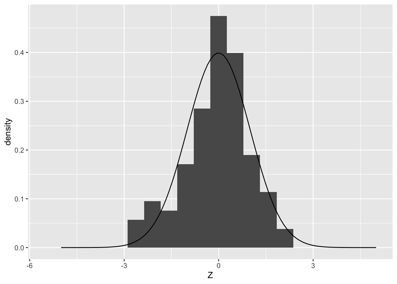
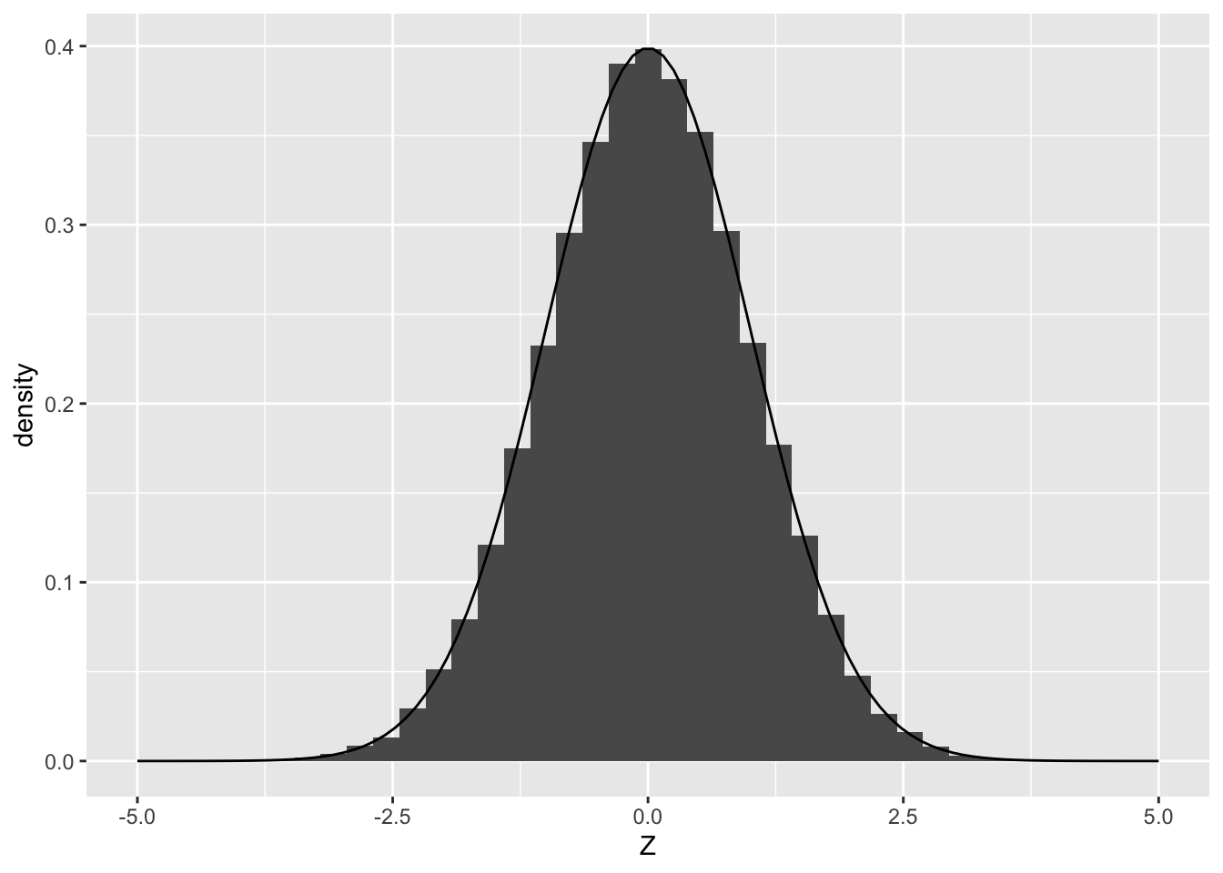
Note that the histogram of Z values looks like a “blocky” version of the density. If we draw many more samples, the histogram will start to strongly resemble the density from which it was drawn:
## NOTE: No need to change this!
ggplot() +
  ## Plot a *sample*
  geom_histogram(
    data = tibble(Z = rnorm(n = 1e5, mean = 0, sd = 1)),
    mapping = aes(Z, after_stat(density)),
    bins = 40
  ) +
  ## Plot a *density*
  geom_line(
    data = df_norm_d,
    mapping = aes(z, d)
  )
To clarify some terms:
- A realization is a single observed value of a random variable. A realization is a single value, e.g.
rnorm(n = 1). - A sample is a set of realizations. A sample is a set of values, e.g.
rnorm(n = 10). - A density is a function that describes the relative chance of all the values a random variable might take. A density is a function, e.g.
dnorm(x).
22.2.1 q2 Plot densities for Z values in df_q2. Use aesthetics to plot a separate curve for different values of n. Comment on which values of n give a density closer to “normal”.
Hint: You may need to use the group aesthetic, in addition to color or fill.
## NOTE: Use the data generated here
df_q2 <- map_dfr(
  c(5, 10, 1e3),
  function(nsamp) {
    tibble(Z = rnorm(n = nsamp), n = nsamp)
  }
)
## TODO: Create the figure
df_q2 %>%
  ggplot(aes(Z, color = n, group = n)) +
  geom_density()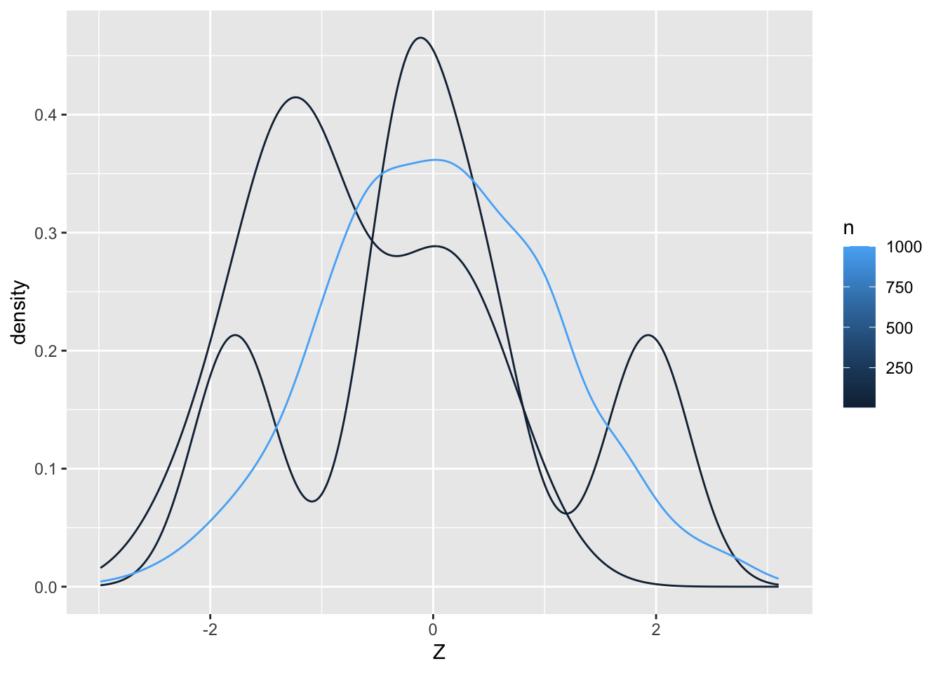
Observations
- The larger the value of n, the closer the density tends to be to normal.
22.3 Not Everything is Normal
A very common misconception is that drawing more samples will make anything look like a normal density. This is not the case! The following exercise will help us understand that the normal density is just a model, and not what we should expect all randomness to look like.
22.3.1 q3 Run the code below and inspect the resulting histogram. Increase n_diamonds below to increase the number of samples drawn: Do this a few times for an increasing number of samples. Answer the questions under observations below.
n_diamonds <- 1000

diamonds %>%
  filter(cut == "Good") %>%
  slice_sample(n = n_diamonds) %>%
  ggplot(aes(carat)) +
  geom_histogram()
## `stat_bin()` using `bins = 30`. Pick better value with `binwidth`.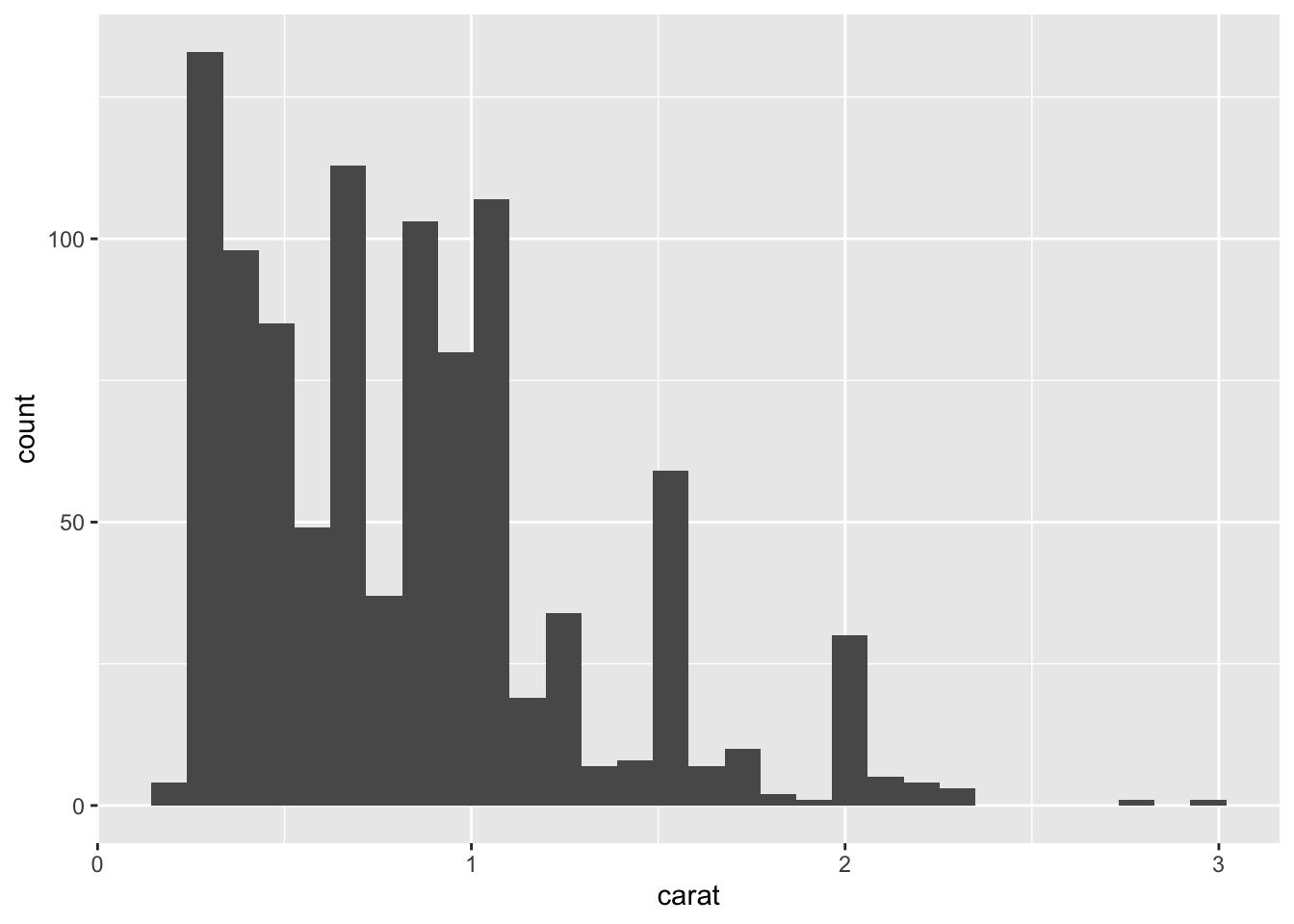
Observations:
- The histogram does not look normal for any
n_diamonds, and indeed it should not. We’ve seen before that there are very “special” values ofcaratthat gemcutters seem to favor. That “social” feature of diamonds is not at all captured by a normal density. - Carat is a measure of weight and weight cannot be negative.
The normal density is a good model for some physical phenomena, such as the set of heights among a population. However, it is not always a good model. One reason the normal density “shows up” a lot is because it is involved in estimation, which we’ll talk more about when we later discuss the central limit theorem.
22.4 Random Seeds: Setting the State
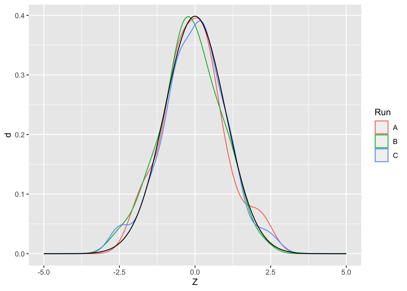
Remember that random variables are random. That means if we draw samples multiple times, we’re bound to get different values. For example, run the following code chunk multiple times.
## [1] -0.6931902 -1.6377063 1.0619610 -2.1439573 -1.4050955What this means is we’ll get a slightly different picture every time we draw a sample. This is the challenge with randomness: Since we could have drawn a different set of samples, we need to know the degree to which we can trust conclusions drawn from data. Being statistically literate means knowing how much to trust your data.
## NOTE: No need to change this!
df_samp_multi <-
  tibble(Z = rnorm(n = 50, mean = 0, sd = 1), Run = "A") %>%
  bind_rows(
    tibble(Z = rnorm(n = 50, mean = 0, sd = 1), Run = "B")
  ) %>%
  bind_rows(
    tibble(Z = rnorm(n = 50, mean = 0, sd = 1), Run = "C")
  )

ggplot() +
  ## Plot *fitted density*
  geom_density(
    data = df_samp_multi,
    mapping = aes(Z, color = Run, group = Run)
  ) +
  ## Plot a *density*
  geom_line(
    data = df_norm_d,
    mapping = aes(z, d)
  )
However for simulation purposes, we often want to be able to repeat a calculation. In order to do this, we can set the state of our random number generator by setting the seed. To illustrate, try running the following chunk multiple times.
## [1] -0.3260365 0.5524619 -0.6749438 0.2143595 0.3107692The values are identical every time!