25 Vis: Boxplots and Counts
Purpose: Boxplots are a key tool for EDA. Like histograms, boxplots give us a sense of “shape” for a distribution. However, a boxplot is a careful summary of shape. This helps us pick out key features of a distribution, and enables easier comparison of different distributions.
Reading: (None, this is the reading)
## ── Attaching core tidyverse packages ──────────────────────── tidyverse 2.0.0 ──
## ✔ dplyr     1.1.4     ✔ readr     2.1.5
## ✔ forcats   1.0.0     ✔ stringr   1.5.1
## ✔ ggplot2   3.5.2     ✔ tibble    3.2.1
## ✔ lubridate 1.9.4     ✔ tidyr     1.3.1
## ✔ purrr     1.0.4
## ── Conflicts ────────────────────────────────────────── tidyverse_conflicts() ──
## ✖ dplyr::filter() masks stats::filter()
## ✖ dplyr::lag()    masks stats::lag()
## ℹ Use the conflicted package (<http://conflicted.r-lib.org/>) to force all conflicts to become errors
25.1 Boxplots
Visuals like histograms, frequency polygons, and distributions give us a highly detailed view of our data. However, this can actually be overwhelming. To illustrate, let’s dive straight into an exercise.
25.1.1 q1 Interpret plots
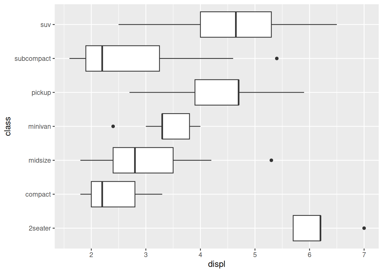
Which class of vehicle tends to have the most “middle” value of engine displacement (displ)? More importantly, which plot best helps you make that determination?
## NOTE: No need to modify
# Density plot
mpg %>%
  ggplot(aes(displ, color = class)) +
  geom_density()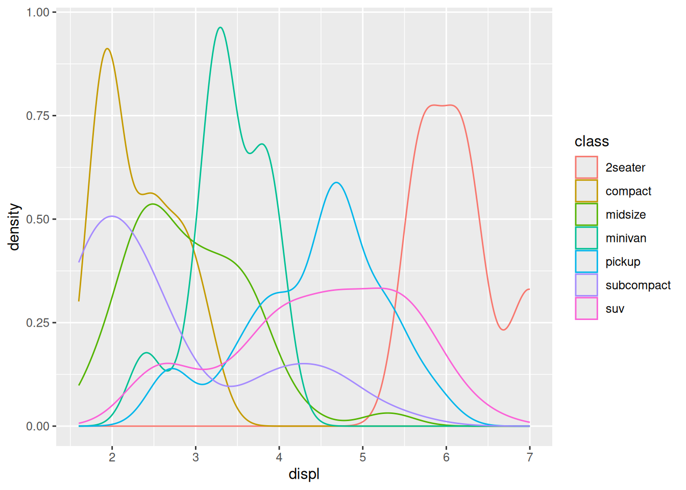
Note that the bold line in the middle of a boxplot is the median of the group.
## NOTE: No need to modify
# Boxplot
mpg %>%
  mutate(class = fct_reorder(class, displ)) %>%
  ggplot(aes(x = class, y = displ)) +
  geom_boxplot()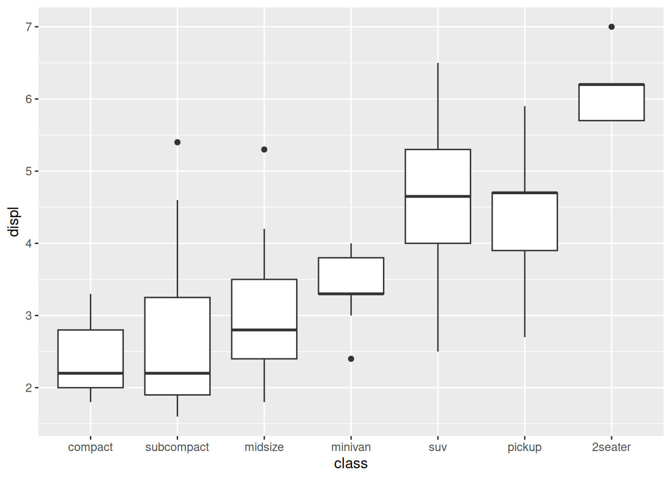
Observations
- Minivans tend to be in the middle.
- The boxplot is more effective; it literally puts minivan in the middle of the plot.
25.2 Boxplot definition
A boxplot shows a few key summary statistics from our data. The “box” itself shows the lower quartile (25% of the data) and upper quartile (75% of the data), while the bold line shows the median (50% of the data).
The following code shows how the quartiles can be manually computed.
## NOTE: No need to edit
mpg %>%
  filter(class == "midsize") %>%

  ggplot(aes(x = class, y = displ)) +
  geom_hline(
    data = . %>%
      # Compute the quartiles
      summarize(
        displ_025 = quantile(displ, 0.25),
        displ_050 = quantile(displ, 0.50),
        displ_075 = quantile(displ, 0.75),
      ) %>%
      # Reshape the data for plotting
      pivot_longer(
        cols = contains("displ"),
        names_sep = "_",
        names_to = c(".value", "quantile")
      ),
    mapping = aes(yintercept = displ, color = quantile)
  ) +
  geom_boxplot()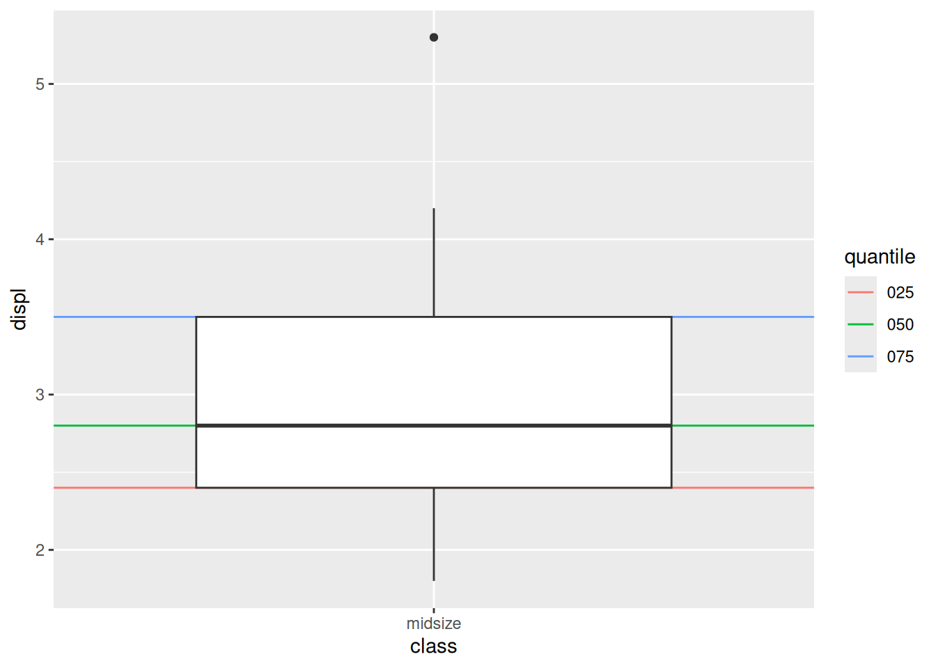
The botplot also includes fences (the thin vertical lines) to show where there is some—but not very much—data. The boxplot also includes a heuristic for identifying outliers, which show up as dots.
25.3 Reorganizing factors
There’s a “trick” I’ve pulled in the earlier boxplot; I reordered the class variable based on the value of displ in each group. This is a way to make our plots more informative. The fct_reorder(fct, x) function is used in a mutate() call to directly override the original fct column.
25.4 Cut helpers
Plotting multiple boxplots works best when we have a categorical variable for grouping. However, we can “hack” a continuous variable into a categorical one by “cutting” the values, much like when we bin values in a histogram. The following helpers give us different ways to cut a continuous variable:
cut_interval()cut_number()cut_width()
25.4.1 q3 Cut a continuous variable
Use a cut_* verb (of your choice) to create a categorical variable out of carat. Tweak the settings in your cut and document your observations.
Hint: Recall that we learned how to look up documentation in an earlier exercise!
diamonds %>%
  mutate(carat_cut = cut_width(carat, width = 0.5, boundary = 0)) %>%
  ggplot(aes(x = carat_cut, y = price)) +
  geom_boxplot()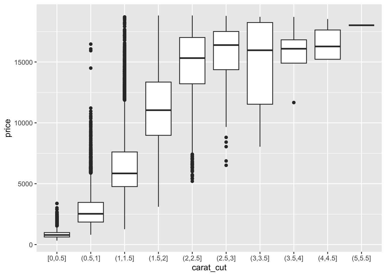
Observations - Price tends to increase with carat - Median price rises dramatically across carat [0, 2] - Median price is roughly constant across carat [2, 4.5] - Across carat [2, 4.5], the whiskers have essentially the same max price - The IQR is quite small at low carat, but increases with carat; the prices become more variable at higher carat
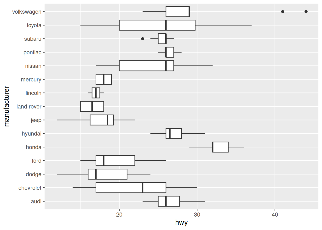
25.5 Coordinate flipping
One last visual trick: Boxplots in ggplot are usually vertically oriented. However, we can flip the plot to give them a horizontal orientation. Let’s look at an example:
Coordinate flipping is especially helpful when we have a lot of categories.