54 Model: Introduction to Modeling
Purpose: Modeling is a key tool for data science: We will use models to understand the relationships between variables and to make predictions. Building models is subtle and difficult. To that end, this will be a high-level tour through the key parts of building and assessing a model. In this exercise, you’ll learn what a model is, how to fit a model, how to assess a fitted model, some ways to improve a model, and how to quantify how trustworthy a model is.
Reading: (None, this exercise is the reading.)
## ── Attaching core tidyverse packages ──────────────────────── tidyverse 2.0.0 ──
## ✔ dplyr     1.1.4     ✔ readr     2.1.5
## ✔ forcats   1.0.0     ✔ stringr   1.5.1
## ✔ ggplot2   3.5.2     ✔ tibble    3.2.1
## ✔ lubridate 1.9.4     ✔ tidyr     1.3.1
## ✔ purrr     1.0.4
## ── Conflicts ────────────────────────────────────────── tidyverse_conflicts() ──
## ✖ dplyr::filter() masks stats::filter()
## ✖ dplyr::lag()    masks stats::lag()
## ℹ Use the conflicted package (<http://conflicted.r-lib.org/>) to force all conflicts to become errors##
## Attaching package: 'broom'
##
## The following object is masked from 'package:modelr':
##
## bootstrap## NOTE: No need to edit this chunk
set.seed(101)
## Select training data
df_train <-
diamonds %>%
slice(1:1e4)
## Select test data
df_test <-
diamonds %>%
slice((1e4 + 1):2e4)54.1 A simple model
In what follows, we’ll try to fit a linear, one-dimensional model for the price of a diamond. It will be linear in the sense that it will be a linear function of its inputs; i.e. for an input \(x\) we’ll limit ourselves to scaling the input \(\beta \times x\). It will also be one-dimensional in the sense that we will only consider one input; namely, the carat of the diamond. Thus, my model for predicted price \(\hat{f}\) will be
\[\hat{f} = \beta_0 + \beta_{\text{carat}} (\text{carat}) + \epsilon,\]
where \(\epsilon\) is an additive error term, which we’ll model as a random variable. Remember that \(\hat{f}\) notation indicates an estimate for the quantity \(f\). To start modeling, I’ll choose parameters for my model by selecting values for the slope and intercept.
## Set model parameter values [theta]
slope <- 1000 / 0.5 # Eyeball: $1000 / (1/2) carat
intercept <- 0

## Represent model as an `abline`
df_train %>%

  ggplot(aes(carat, price)) +
  geom_point() +
  geom_abline(
    slope = slope,
    intercept = intercept,
    linetype = 2,
    color = "salmon"
  )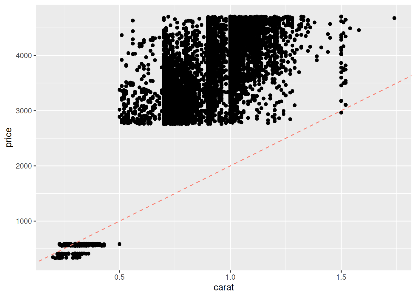
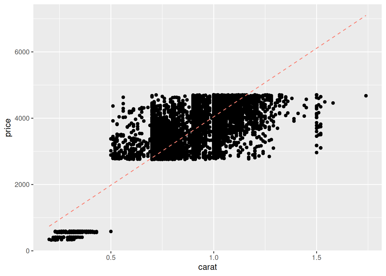
That doesn’t look very good; the line tends to miss the higher-carat values. I manually adjust the slope up by a factor of two:
## Set model parameter values [theta]
slope <- 2000 / 0.5 # Adjusted by factor of 2
intercept <- 0

## Represent model as an `abline`
df_train %>%

  ggplot(aes(carat, price)) +
  geom_point() +
  geom_abline(
    slope = slope,
    intercept = intercept,
    linetype = 2,
    color = "salmon"
  )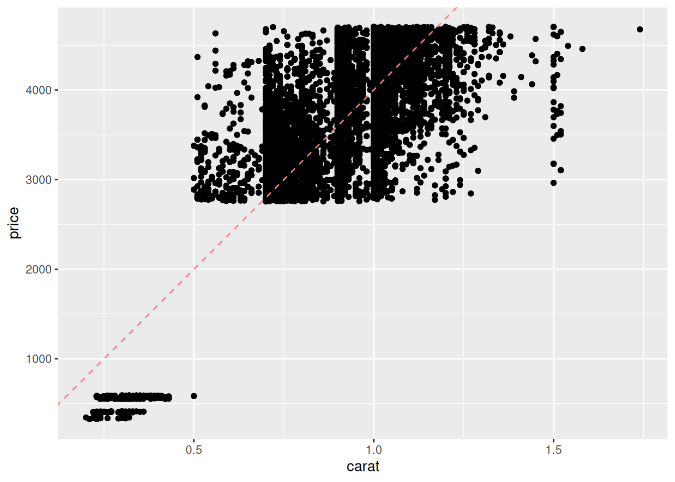
This manual approach to fitting a model—choosing parameter values—is labor-intensive and silly. Fortunately, there’s a better way. We can optimize the parameter values by minimizing a chosen metric.
First, let’s visualize the quantities we will seek to minimize:
## Set model parameter values [theta]
slope <- 2000 / 0.5
intercept <- 0

## Compute predicted values
df_train %>%
  mutate(price_pred = slope * carat + intercept) %>%

  ## Visualize *residuals* as vertical bars
  ggplot(aes(carat, price)) +
  geom_point() +
  geom_segment(
    aes(xend = carat, yend = price_pred),
    color = "salmon"
  ) +
  geom_line(
    aes(y = price_pred),
    linetype = 2,
    color = "salmon"
  )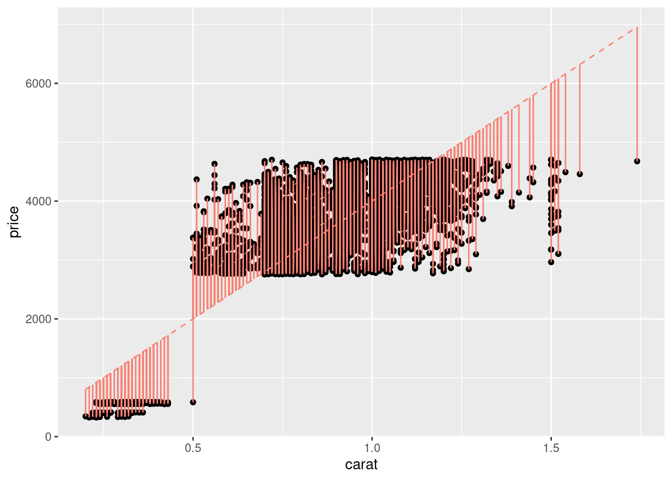
This plot shows the residuals of the model, that is
\[\text{Residual}_i(\theta) = \hat{f}_i(\theta) - f_i,\]
where \(f_i\) is the i-th observed output value (price), \(\hat{f}_i(\theta)\) is the i-th prediction from the model (price_pred), and \(\theta\) is the set of parameter values for the model. For instance, the linear, one-dimensional model above has as parameters theta = c(slope, intercept). We can use these residuals to define an error metric and fit a model.
54.2 Fitting a model
Define the mean squared error (MSE) via
\[\text{MSE}(\theta) = \frac{1}{n} \sum_{i=1}^n \text{Residual}_i(\theta)^2 = \frac{1}{n} \sum_{i=1}^n (\hat{f}_i(\theta) - f_i)^2.\]
This is a summary of the total error of the model. While we could carry out this optimization by hand, the R routine lm() (which stands for linear model) automates this procedure. We simply give it data over which to fit the model, and a formula defining which inputs and output to consider.
## Fit model
fit_carat <-
  df_train %>%
  lm(
    data = .,               # Data for fit
    formula = price ~ carat # Formula for fit
  )

fit_carat %>% tidy()
## # A tibble: 2 × 5
## term estimate std.error statistic p.value
## <chr> <dbl> <dbl> <dbl> <dbl>
## 1 (Intercept) -84.6 21.0 -4.04 0.0000546
## 2 carat 4129. 23.9 173. 0The tidy() function takes a fit and returns the model’s parameters; here we can see the estimate values for the coefficients, as well as some statistical information (which we’ll discuss in a future exercise). The formula argument uses R’s formula notation, where Y ~ X means “fit a linear model with Y as the value to predict, and with X as an input.” The formula price ~ carat translates to the linear model
\[\widehat{\text{price}} = \beta_0 + \beta_{\text{carat}} (\text{carat}) + \epsilon.\]
This slightly-mysterious formula notation price ~ carat is convenient for defining many kinds of models, as we’ll see in the following task.
54.2.1 q1 Fit a basic model.
Copy the code above to fit a model of the form
\[\widehat{\text{price}} = \beta_0 + \beta_{\text{carat}} (\text{carat}) + \beta_{\text{cut}} (\text{cut}) + \epsilon.\]
Answer the questions below to investigate how this model form handles the variable cut.
## # A tibble: 6 × 5
##   term        estimate std.error statistic  p.value
##   <chr>          <dbl>     <dbl>     <dbl>    <dbl>
## 1 (Intercept)   -294.       22.1    -13.3  3.39e-40
## 2 carat         4280.       24.0    178.   0
## 3 cut.L          349.       17.7     19.7  4.10e-85
## 4 cut.Q         -135.       15.8     -8.56 1.26e-17
## 5 cut.C          208.       14.3     14.5  2.94e-47
## 6 cut^4 82.2 12.1 6.78 1.26e-11Observations:
caratis a continuous variable, whilecutis an (ordinal) factor; it only takes fixed non-numerical values.- We can’t reasonably multiply
cutby a constant as it is not a number. - The
termforcaratis just one numerical value (a slope), while there are multipleterms forcut.- These are
lm()s way of encoding thecutfactor as a numerical value: Note that there are5levels forcutand4terms representingcut.
- These are
Aside: Handling factors in modeling is handled automatically by lm() by introducing dummy variables. Conceptually, what the linear model does is fit a single contant value for each level of the factor. This gives us a different prediction for each factor level, as the next example shows.
## NOTE: No need to edit; just run and inspect
fit_cut <-
  lm(
    data = df_train,
    formula = price ~ cut
  )

df_train %>%
  add_predictions(fit_cut, var = "price_pred") %>%
  ggplot(aes(cut)) +
  geom_errorbar(aes(ymin = price_pred, ymax = price_pred), color = "salmon") +
  geom_point(aes(y = price))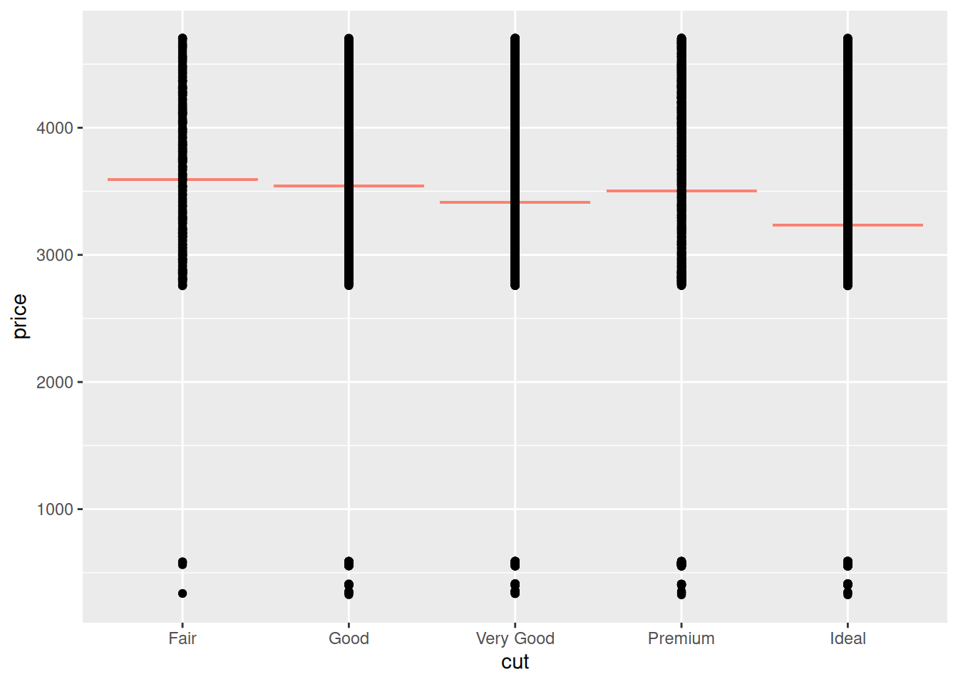
54.3 Assessing a model
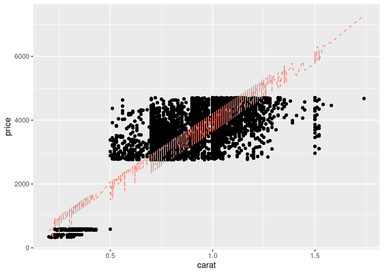
Next, let’s visually inspect the results of model fit_carat using the function modelr::add_predictions():
## Compute predicted values
df_train %>%
  add_predictions(
    model = fit_carat,
    var = "price_pred"
  ) %>%

  ggplot(aes(carat, price)) +
  geom_point() +
  geom_line(
    aes(y = price_pred),
    linetype = 2,
    color = "salmon"
  )
Frankly, these model predictions don’t look very good! We know that diamond prices probably depend on the “4 C’s”; maybe your model using more predictors will be more effective?
54.3.1 q2 Repeat the code above from chunk vis-carat to produce a similar visual with your model fit_q1. This visual is unlikely to be effective, note in your observations why that might be.
df_train %>%
  add_predictions(
    model = fit_q1,
    var = "price_pred"
  ) %>%

  ggplot(aes(carat, price)) +
  geom_point() +
  geom_line(
    aes(y = price_pred),
    linetype = 2,
    color = "salmon"
  )
Observations:
- A diamond can have a different value of
cutat a fixed value ofcarat; this means our model can take different values at a fixed value ofcarat. This leads to the “squiggles” we see above.
Visualizing the results against a single variable quickly breaks down when we have more than one predictor! Let’s learn some other tools for assessing model accuracy.
54.4 Model Diagnostics
The plot above allows us to visually assess the model performance, but sometimes we’ll want a quick numerical summary of model accuracy, particularly when comparing multiple models for the same data. The functions modelr::mse and modelr::rsquare are two error metrics we can use to summarize accuracy:
## [1] 309104.4## [1] 0.7491572mseis the mean squared error. Lower values are more accurate.- The
msehas no formal upper bound, so we can only comparemsevalues between models. - The
msealso has the square-units of the quantity we’re predicting; for instance our model’smsehas units of \(\$^2\).
- The
rsquare, also known as the coefficient of determination, lies between[0, 1]. Higher values are more accurate.- The
rsquarehas bounded values, so we can think about it in absolute terms: a model withrsquare == 1is essentially perfect, and values closer to1are better.
- The
54.4.1 q3 Compute the mse and rsquare for your model fit_q1, and compare the values against those for fit_carat. Is your model more accurate?
## [1] 290675.2## [1] 0.7641128Observations:
- The model
fit_q1is slightly more accurate thanfit_carat, at least ondf_train
Aside: What’s an acceptable r-squared value? That really depends on the application. For some physics-related problems \(R \approx 0.9\) might be considered unacceptably low, while for some human-behavior related problems \(R \approx 0.7\) might be considered quite good!
While it’s difficult to visualize model results against multiple variables, we can always compare predicted vs actual values. If the model fit were perfect, then the predicted \(\hat{f}\) and actual \(f\) values would like along a straight line with slope one.
## NOTE: No need to change this
## predicted vs actual
df_train %>%
  add_predictions(
    model = fit_carat,
    var = "price_pred"
  ) %>%

  ggplot(aes(price, price_pred)) +
  geom_abline(slope = 1, intercept = 0, color = "grey50", size = 2) +
  geom_point()
## Warning: Using `size` aesthetic for lines was deprecated in ggplot2 3.4.0.
## ℹ Please use `linewidth` instead.
## This warning is displayed once every 8 hours.
## Call `lifecycle::last_lifecycle_warnings()` to see where this warning was
## generated.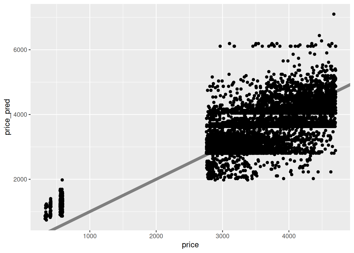
This fit looks quite poor—there is a great deal of scatter of actual values away from the predicted values. What’s more, the scatter doesn’t look random; there seem to be some consistent patterns (e.g. “stripes”) in the plot that suggest there may be additional patterns we could incorporate in our model, if we added more variables. Let’s try that!
54.5 Improving a model
The plot above suggests there may be some patterns we’re not accounting for in our model: Let’s build another model to use that intuition.
54.5.1 q4 Fit an updated model.
Fit a model fit_4c of the form:
\[\widehat{\text{price}} = \beta_0 + \beta_{\text{carat}} (\text{carat}) + \beta_{\text{cut}} (\text{cut}) + \beta_{\text{color}} (\text{color}) + \beta_{\text{clarity}} (\text{clarity}) + \epsilon.\]
Compute the mse and rsquare of your new model, and compare against the previous models.
fit_4c <-
  df_train %>%
  lm(
    data = .,
    formula = price ~ carat + cut + color + clarity
  )

rsquare(fit_q1, df_train)
## [1] 0.7641128## [1] 0.897396Observations:
- I find that adding all four C’s improves the model accuracy quite a bit.
Generally, adding more variables tends to improve model accuracy. However, this is not always the case. In a future exercise we’ll learn more about selecting meaningful variables in the context of modeling.
Note that even when we use all 4 C’s, we still do not have a perfect model. Generally, any model we fit will have some inaccuracy. If we plan to use our model to make decisions, it’s important to have some sense of how much we can trust our predictions. Metrics like model error are a coarse description of general model accuracy, but we can get much more useful information for individual predictions by quantifying uncertainty.
54.6 Quantifying uncertainty
We’ve talked about confidence intervals before for estimates like the sample mean. Let’s take a (brief) look now at prediction intervals (PI). The code below approximates prediction intervals based on the fit_carat model.
## NOTE: No need to edit this chunk
## Helper function to compute uncertainty bounds
add_uncertainties <- function(data, model, prefix = "pred", ...) {
  df_fit <-
    stats::predict(model, data, ...) %>%
    as_tibble() %>%
    rename_with(~ str_c(prefix, "_", .))

  bind_cols(data, df_fit)
}

## Generate predictions with uncertainties
df_pred_uq <-
  df_train %>%
  add_uncertainties(
    model = fit_carat,
    prefix = "pred",
    interval = "prediction",
    level = 0.95
  )

df_pred_uq %>% glimpse()
## Rows: 10,000
## Columns: 13
## $ carat <dbl> 0.23, 0.21, 0.23, 0.29, 0.31, 0.24, 0.24, 0.26, 0.22, 0.23, 0…
## $ cut <ord> Ideal, Premium, Good, Premium, Good, Very Good, Very Good, Ve…
## $ color <ord> E, E, E, I, J, J, I, H, E, H, J, J, F, J, E, E, I, J, J, J, I…
## $ clarity <ord> SI2, SI1, VS1, VS2, SI2, VVS2, VVS1, SI1, VS2, VS1, SI1, VS1,…
## $ depth <dbl> 61.5, 59.8, 56.9, 62.4, 63.3, 62.8, 62.3, 61.9, 65.1, 59.4, 6…
## $ table <dbl> 55, 61, 65, 58, 58, 57, 57, 55, 61, 61, 55, 56, 61, 54, 62, 5…
## $ price <int> 326, 326, 327, 334, 335, 336, 336, 337, 337, 338, 339, 340, 3…
## $ x <dbl> 3.95, 3.89, 4.05, 4.20, 4.34, 3.94, 3.95, 4.07, 3.87, 4.00, 4…
## $ y <dbl> 3.98, 3.84, 4.07, 4.23, 4.35, 3.96, 3.98, 4.11, 3.78, 4.05, 4…
## $ z <dbl> 2.43, 2.31, 2.31, 2.63, 2.75, 2.48, 2.47, 2.53, 2.49, 2.39, 2…
## $ pred_fit <dbl> 865.1024, 782.5204, 865.1024, 1112.8483, 1195.4303, 906.3934,…
## $ pred_lwr <dbl> -225.25853, -307.86569, -225.25853, 22.55812, 105.16206, -183…
## $ pred_upr <dbl> 1955.463, 1872.906, 1955.463, 2203.139, 2285.699, 1996.742, 1…The helper function add_uncertainties() added the columns pred_fit (the predicted price), as well as two new columns: pred_lwr and pred_upr. These are the bounds of a prediction interval (PI), an interview meant to capture not a future sample statistic, but rather a future observation.
The following visualization illustrates the computed prediction intervals: I visualize the prediction intervals with geom_errorbar. Note that we get a PI for each observation; every dot gets an interval.
Since we have access to the true values price, we can assess whether the true observed values fall within the model prediction intervals; this happens when the diagonal falls within the interval on a predicted-vs-actual plot.
## NOTE: No need to edit this chunk
# Visualize
df_pred_uq %>%
  filter(price < 1000) %>%

  ggplot(aes(price)) +
  geom_abline(slope = 1, intercept = 0, size = 2, color = "grey50") +
  geom_errorbar(
    data = . %>% filter(pred_lwr <= price & price <= pred_upr),
    aes(ymin = pred_lwr, ymax = pred_upr),
    width = 0,
    size = 0.5,
    alpha = 1 / 2,
    color = "darkturquoise"
  ) +
  geom_errorbar(
    data = . %>% filter(price < pred_lwr | pred_upr < price),
    aes(ymin = pred_lwr, ymax = pred_upr),
    width = 0,
    size = 0.5,
    color = "salmon"
  ) +
  geom_point(aes(y = pred_fit), size = 0.1) +
  theme_minimal()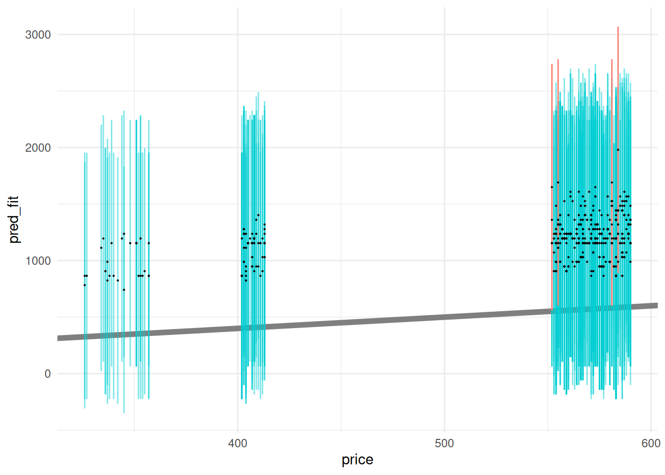
Ideally these prediction intervals should include a desired fraction of observed values; let’s compute the empirical coverage to see if this matches our desired level = 0.95.
## NOTE: No need to edit this chunk
# Compute empirical coverage
df_pred_uq %>%
  summarize(coverage = mean(pred_lwr <= price & price <= pred_upr))
## # A tibble: 1 × 1
## coverage
## <dbl>
## 1 0.959The empirical coverage is quite close to our desired level.
54.6.1 q6 Use the helper function add_uncertainties() to add prediction intervals to df_train based on the model fit_4c.
df_q6 <-
  df_train %>%
  add_uncertainties(
    model = fit_4c,
    prefix = "pred",
    interval = "prediction",
    level = 0.95
  )

## NOTE: No need to edit code below
# Compute empirical coverage
df_q6 %>%
  summarize(coverage = mean(pred_lwr <= price & price <= pred_upr))
## # A tibble: 1 × 1
## coverage
## <dbl>
## 1 0.956# Visualize
df_q6 %>%
ggplot(aes(price)) +
geom_abline(slope = 1, intercept = 0, size = 2, color = "grey50") +
geom_errorbar(
data = . %>% filter(pred_lwr <= price & price <= pred_upr),
aes(ymin = pred_lwr, ymax = pred_upr),
width = 0,
size = 0.1,
alpha = 1 / 5,
color = "darkturquoise"
) +
geom_errorbar(
data = . %>% filter(price < pred_lwr | pred_upr < price),
aes(ymin = pred_lwr, ymax = pred_upr),
width = 0,
size = 0.1,
color = "salmon"
) +
geom_point(aes(y = pred_fit), size = 0.1) +
theme_minimal()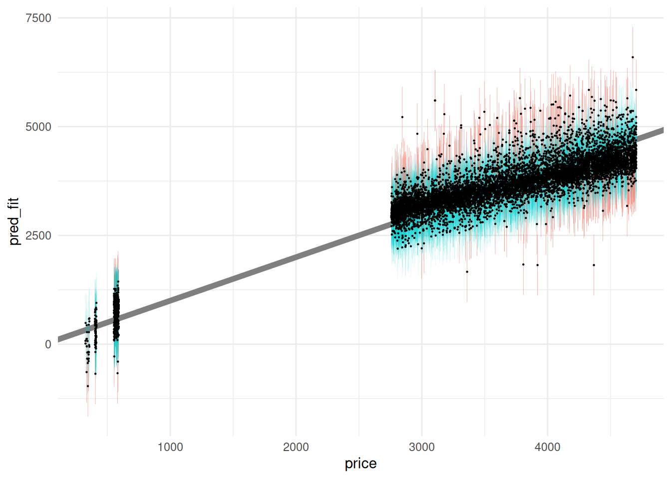 We will discuss prediction intervals further in a future exercise. For now, know that they give us a sense of how much we should trust our model predictions.
54.7 Summary
To summarize this reading, here are the steps to fitting and using a model:
- Choose a model form, e.g. if only considering linear models, we may consider
price ~ caratvsprice ~ carat + cut. - Fit the model with data; this is done by optimizing a user-chosen metric, such as the
mse. - Assess the model with metrics (
mse, rsquare) and plots (predicted-vs-actual). - Improve the model if needed, e.g. by adding more predictors.
- Quantify the trustworthiness of the model, e.g. with prediction intervals.
- Use the model to do useful work! We’ll cover this in future exercises.
54.8 Preview
Notice that in this exercise, we only used df_test, but I also defined a tibble df_train. What happens when we fit the model on df_train, but assess it on df_test?
## [1] 0.897396## [1] 0.7860757Note that rsquare on the training data df_train is much higher than rsquare on the test data df_test. This indicates that the assessment of model accuracy is overly optimistic when assessing the model with df_train. We will explore this idea more in e-stat12-models-train-test.