46 Stats: Randomization
Purpose: You’ve probably heard that a “control” is important for doing science. If you’re lucky, you may have also heard about randomization. These two ideas are the backbone of sound data collection. In this exercise, you’ll learn the basics about how to plan data collection.
Reading: (None, this is the reading)
## ── Attaching core tidyverse packages ──────────────────────── tidyverse 2.0.0 ──
## ✔ dplyr     1.1.4     ✔ readr     2.1.5
## ✔ forcats   1.0.0     ✔ stringr   1.5.1
## ✔ ggplot2   3.5.2     ✔ tibble    3.2.1
## ✔ lubridate 1.9.4     ✔ tidyr     1.3.1
## ✔ purrr     1.0.4
## ── Conflicts ────────────────────────────────────────── tidyverse_conflicts() ──
## ✖ dplyr::filter() masks stats::filter()
## ✖ dplyr::lag()    masks stats::lag()
## ℹ Use the conflicted package (<http://conflicted.r-lib.org/>) to force all conflicts to become errors
## NOTE: Don't edit this; this sets up the example
simulate_yield <- function(v) {
## Check assertions
if (length(v) != 6) {
stop("Design must be a vector of length 6")
}
if (length(setdiff(v, c("T", "C")) != 0)) {
stop("Design must be a vector with 'T' and 'C' characters only")
}
if (length(setdiff(c("T", "C"), v)) > 0) {
stop("Design must contain at least one 'T' and at least one 'C'")
}
## Simulate data
tibble(condition = v) %>%
mutate(
condition = fct_relevel(condition, "T", "C"),
plot = row_number(),
yield = if_else(condition == "T", 1, 0) + plot / 3 + rnorm(n(), mean = 1, sd = 0.5)
)
}46.1 An Example: Fertilizer and Crop Yield
It’s difficult to explain the ideas behind data collection without talking about data to collect, so let’s consider a specific example:
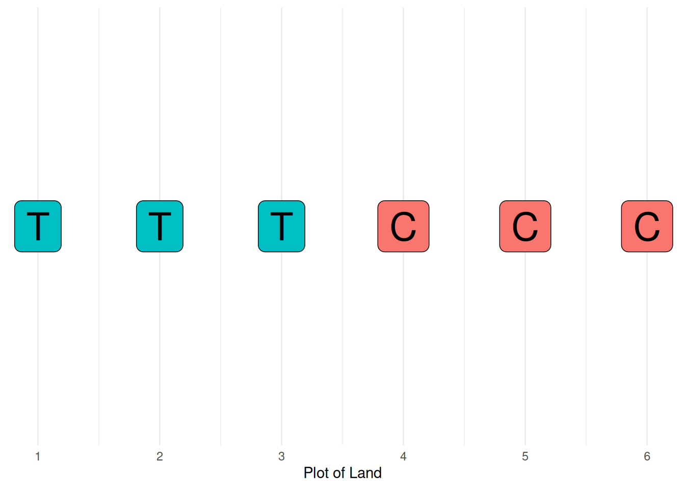
Imagine we’re testing a fertilizer, and we want to know how much it affects the yield of a specific crop. We have access to a farm, which we section off into six plots. In order to determine the effect the fertilizer has, we need to add fertilizer to some plots, and leave other plots without fertilizer (to serve as a comparison). In scientific jargon, these choices are referred to as the “treatment” and “control”. The treatment will have the effect we wish to study, while the control serves as a baseline for a meaningful (quantitative) comparison.
The code below selects a simple arrangement of treatment and control plots.
## Define the sequence of treatment (T) and control (C) plots
experimental_design <- c("T", "T", "T", "C", "C", "C")
In statistics, the word “design” refers to the “design of data collection”. The purposeful planning of data collection is called statistical design of experiments.
46.2 Visualize the Scenario
The following code visualizes the scenario: how experimental conditions are arranged spatially on our test farm.
tibble(
  condition = experimental_design,
  plot = 1:length(experimental_design)
) %>%
  ggplot(aes(plot, 1)) +
  geom_label(
    aes(label = condition, fill = condition),
    size = 10
  ) +

  scale_x_continuous(breaks = 1:6) +
  scale_y_continuous(breaks = NULL) +
  theme_minimal() +
  theme(legend.position = "none") +
  labs(
    x = "Plot of Land",
    y = NULL
  )
Now let’s simulate the results of the experiment!
46.2.1 q1 Simulate
Simulate the results of this experimental design, and answer the questions under Observations below.
## TODO: Do not edit; run the following code, answer the questions below
## For reproducibility, set the seed
set.seed(101)
## Simulate the experimental yields
experimental_design %>%
  simulate_yield() %>%
  ## Analyze the data
  group_by(condition) %>%
  summarize(
    yield_mean = mean(yield),
    yield_sd = sd(yield)
  )
## # A tibble: 2 × 3
## condition yield_mean yield_sd
## <fct> <dbl> <dbl>
## 1 T 2.59 0.391
## 2 C 2.95 0.584Observations
- The treatment is to add fertilizer. Based on the description above, I would expect the treatment to have greater yield.
- However, in this case, the control has greater yield by ~
0.3. This is the reverse of what we would expect! - The mean difference has the wrong sign!
46.3 Confound - Increased yield due to proximity to the river!
What I didn’t tell you about the experimental setup is that there’s a river on the right-hand-side of the plots:
tibble(
  condition = experimental_design,
  plot = 1:length(experimental_design)
) %>%
  ggplot(aes(plot, 1)) +
  geom_label(
    aes(label = condition, fill = condition),
    size = 10
  ) +
  geom_vline(
    xintercept = 7,
    color = "cornflowerblue",
    size = 8
  ) +
  annotate(
    "text",
    x = 6.7, y = 1.25, label = "River",
    hjust = 1
  ) +

  scale_x_continuous(breaks = 1:6) +
  scale_y_continuous(breaks = NULL, limits = c(0.5, 1.5)) +
  theme_minimal() +
  theme(legend.position = "none") +
  labs(
    x = "Plot of Land",
    y = NULL
  )
## Warning: Using `size` aesthetic for lines was deprecated in ggplot2 3.4.0.
## ℹ Please use `linewidth` instead.
## This warning is displayed once every 8 hours.
## Call `lifecycle::last_lifecycle_warnings()` to see where this warning was
## generated.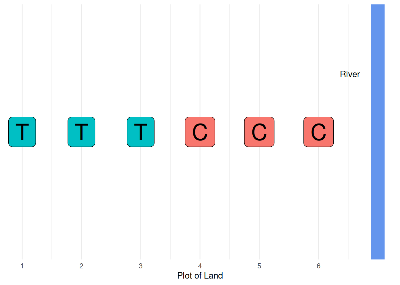
While fertilizer leads to an increase in crop yield, additional water also leads to a higher crop yield. These are the only plots we have available for planting, and it’s too expensive to move the river, so we’ll have to figure out how to place the plots to deal with this experimental reality.
Terminology: When there are other factors present in an experiment affecting our outcome of interest, we call those factors confounds. When we don’t know that a confound exists, it is sometimes called a lurking variable (Joiner 1979).
46.3.1 q2 “Outsmart” the confound
Try defining a different order of the plots to overcome the confound (river).
## TODO: Define your own experimental design
## An "obvious" first attempt would be to simply switch the order, but this
## will tend to over-estimate the effect of the treatment
your_design <- c("C", "C", "C", "T", "T", "T")

## NOTE: No need to edit; use this to simulate your design
your_design %>%
  simulate_yield() %>%
  group_by(condition) %>%
  summarize(
    yield_mean = mean(yield),
    yield_sd = sd(yield)
  )
## # A tibble: 2 × 3
## condition yield_mean yield_sd
## <fct> <dbl> <dbl>
## 1 T 3.58 0.354
## 2 C 1.90 0.481Observations
- In my case, I found the treatment to have a higher yield than the control.
- In my case, I found the treatment to have a higher yield by about two units; this is a drastic overestimate of the effect.
- In my case, the effects I see are due to both the treatment and the river; this leads to a strong overestimate of the effect of the treatment on the yield.
46.4 Randomization to the rescue!
To recap: We’re trying to accurately estimate the effect of the treatment over the control. However, there is a river that tends to increase the yield of plots nearby. The only thing we can affect in our data collection is where to place the treatment and control plots.
You might be tempted to try to do something “smart” to cancel out the effects of the river (such as alternate the order of T and C). While that might work for this specific example, in real experiments there are often many different confounds with all sorts of complicated effects on the quantity we seek to study. What we need is a general-purpose way to do statistical design of experiments that can deal with any kind of confound.
To that end, the gold-standard for dealing with confounds is to randomize our data collection.
The sample() function will randomize the order of a vector, as the following code shows.
## NOTE: No need to edit; run and inspect
## Start with a simple arrangement
experimental_design %>%
  ## Randomize the order
  sample()
## [1] "C" "T" "T" "T" "C" "C"If we randomize the order of treatment and control plots, then we transform the effects of the river (and any other confounds) into a random effect.
46.4.1 q3 Randomize
Randomize the run order to produce your design. Answer the questions under Observations below.
## TODO: Complete the code below
## Set the seed for reproducibility
set.seed(101)

## Simulate the experimental results
experimental_design %>%
  ## Randomize the plot order
  sample() %>%
  simulate_yield() %>%
  group_by(condition) %>%
  summarize(
    yield_mean = mean(yield),
    yield_sd = sd(yield)
  )
## # A tibble: 2 × 3
## condition yield_mean yield_sd
## <fct> <dbl> <dbl>
## 1 T 3.22 0.679
## 2 C 2.63 0.818Observations
- In this case, we find the treatment has a higher yield than the control.
- Since we randomized the run order, the confound cannot have a consistent effect on the outcome (on average).
- In my case, I found the difference to be about
0.6units; this is smaller than the true treatment effect, but less optimistic than before.
46.5 Why does randomization work?
Let’s visually compare a naive (sequential) design with a randomized design, and draw a line to represent the effects of the river on crop yield.
set.seed(101)
bind_rows(
  experimental_design %>%
    simulate_yield() %>%
    mutate(design = "Naive"),
  experimental_design %>%
    sample() %>%
    simulate_yield() %>%
    mutate(design = "Randomized"),
) %>%

  ggplot(aes(plot, yield)) +
  geom_line(aes(y = plot / 3), color = "cornflowerblue") +
  geom_segment(
    aes(y = plot / 3, yend = yield, xend = plot),
    arrow = arrow(length = unit(0.05, "npc")),
    color = "grey70"
  ) +
  geom_point(aes(color = condition)) +
  facet_grid(design~.) +
  theme_minimal()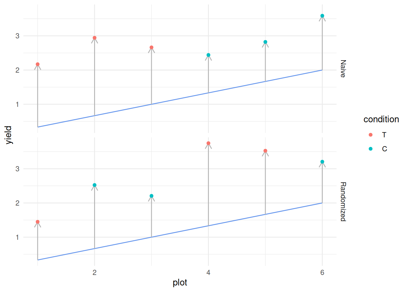
In the naive case, we’ve placed all our treatments at locations where the river has a low effect, and our controls at locations where the river has a high effect. This results in a consistent effect that reverses the perceived difference between treatment and control.
However, when we randomize, a mix of high and low river effects enter into both the treatment and control conditions. So long as there is an average difference between the treatment and control, we can detect it with sufficiently many observations from a well-designed study.
It’s not randomization alone that’s saving us from confounds: The river will boost production for all plots, so we’ll always see a yield higher than what we’d get with the treatment or control alone. Studying the difference between treatment and control cancels out any constant difference, while randomization scrambles the effect of the river. This is why we combine randomization with a treatment-to-control comparison:
- Randomization allows us to transform confounds into a random effect
- Comparing a treatment and control allows us to isolate the effect of the treatment
Using both ideas together—randomization with a control—is the foundation of sound experimental design. A similar idea—random assignment—is used in medical science to determine the effects of new drugs and other medical interventions.
46.6 Conclusion
Here are the key takeaways from this lesson:
- “More data” is not enough for sound science; the right data is what you need to understand an effect.
- Getting the right data is a matter of carefully planning your data collection; designing an experiment.
- Confounds can confuse our analysis of data, and lead us to make incorrect conclusions.
- No amount of fancy math can overcome poorly-collected data.
- Randomization, paired with a treatment-to-control comparison, is our best tool to deal with confounds.
46.7 References
Joiner, B., “Lurking Variables: Some Examples” (1979) link