30 Vis: Lines
Purpose: Line plots are a key tool for EDA. In contrast with a scatterplot, a line plot assumes the data have a function relation. This can create an issue if we try to plot data that do not satisfy our assumptions. In this exercise, we’ll practice some best-practices for constructing line plots.
Reading: (None, this is the reading)
## ── Attaching core tidyverse packages ──────────────────────── tidyverse 2.0.0 ──
## ✔ dplyr     1.1.4     ✔ readr     2.1.5
## ✔ forcats   1.0.0     ✔ stringr   1.5.1
## ✔ ggplot2   3.5.2     ✔ tibble    3.2.1
## ✔ lubridate 1.9.4     ✔ tidyr     1.3.1
## ✔ purrr     1.0.4
## ── Conflicts ────────────────────────────────────────── tidyverse_conflicts() ──
## ✖ dplyr::filter() masks stats::filter()
## ✖ dplyr::lag()    masks stats::lag()
## ℹ Use the conflicted package (<http://conflicted.r-lib.org/>) to force all conflicts to become errors30.1 Line plots
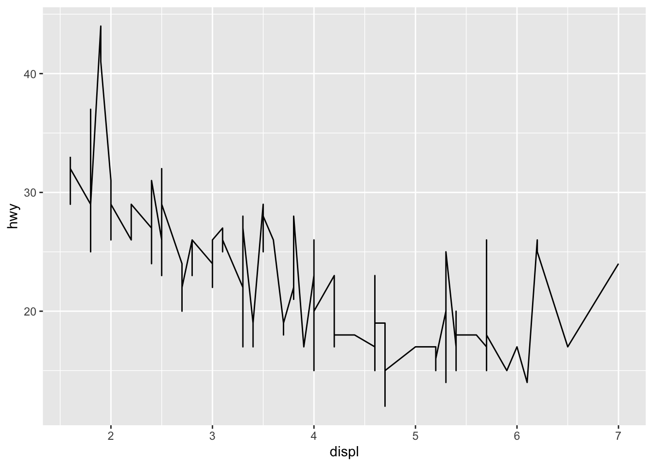
We can make a line plot using the geom_line() geometry. Line plots are a lot like bar charts: The data must be 1:1 in order to have a line plot. Let’s look at what can go wrong when our data are not 1:1:
## NOTE: No need to edit
tibble(
  x = c(1, 2, 2, 2, 3),
  y = c(0, 1, 3, 2, 4)
) %>%
  ggplot(aes(x, y)) +
  geom_line()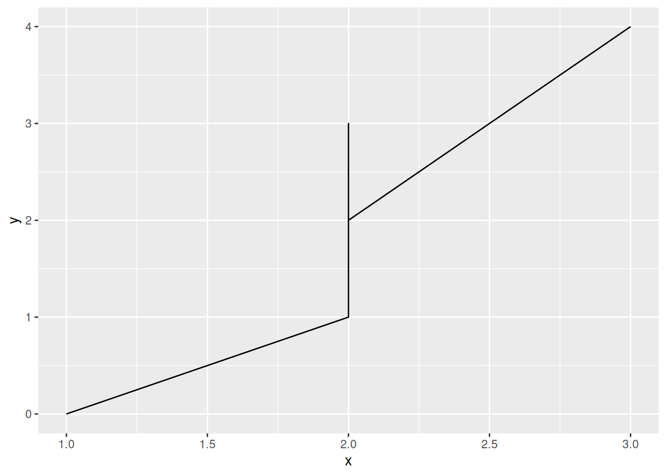
There are couple ways we can deal with non 1:1 data.
30.1.1 Summarize the data
If we can pick a meaningful summary function, then we can summarize the data at a variety of x values and plot the summary as our y. For instance, we could compute the average life expentancy across all nations reported in the Gapminder dataset:
## NOTE: No need to edit
gapminder %>%
  group_by(year) %>%
  summarize(lifeExp = mean(lifeExp)) %>%

  ggplot(aes(year, lifeExp)) +
  geom_line()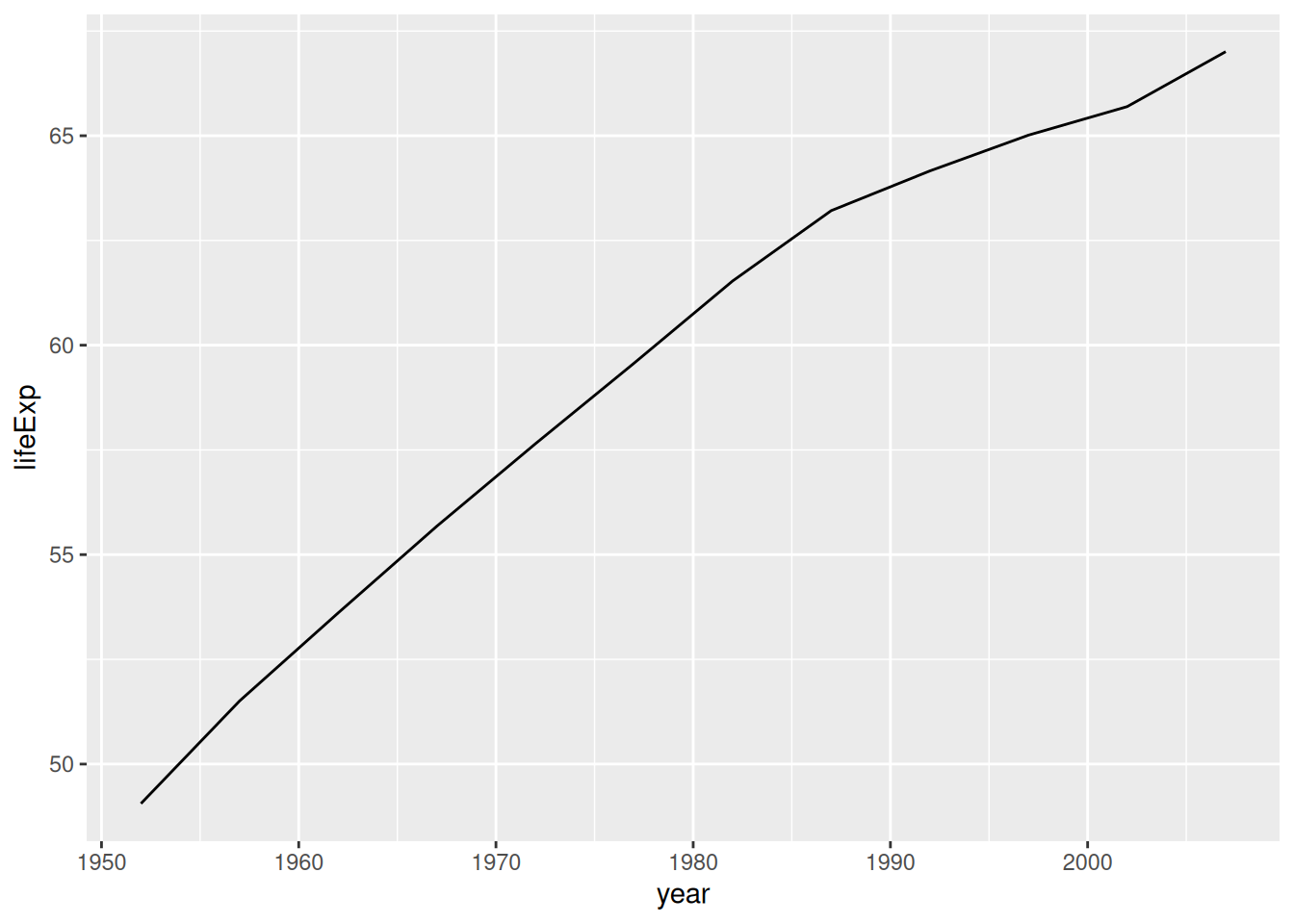
This gives us a valid line plot, but it hides a lot of the differences among countries.
30.1.2 Show additional variables
Rather than summarize so aggressively, we can instead map an additional variable to an additional aesthetic. If the data are 1:1 within each group, then we can make a valid line plot.
## NOTE: No need to edit
gapminder %>%
  group_by(continent, year) %>%
  summarize(lifeExp = mean(lifeExp)) %>%

  ggplot(aes(year, lifeExp, color = continent)) +
  geom_line()
## `summarise()` has grouped output by 'continent'. You can override using the
## `.groups` argument.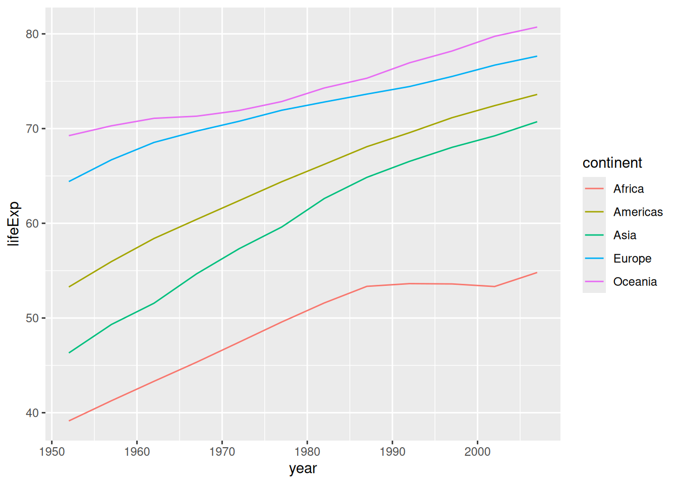
This plot gives us a better sense of the disparities in life expectancy across continents.
30.1.3 q1 Fix this plot
The following graph doesn’t work as its author intended. Based on what we learned above, fix the following code.
gapminder %>%
  filter(continent == "Asia") %>%
  ggplot(aes(year, lifeExp, color = country)) +
  geom_line()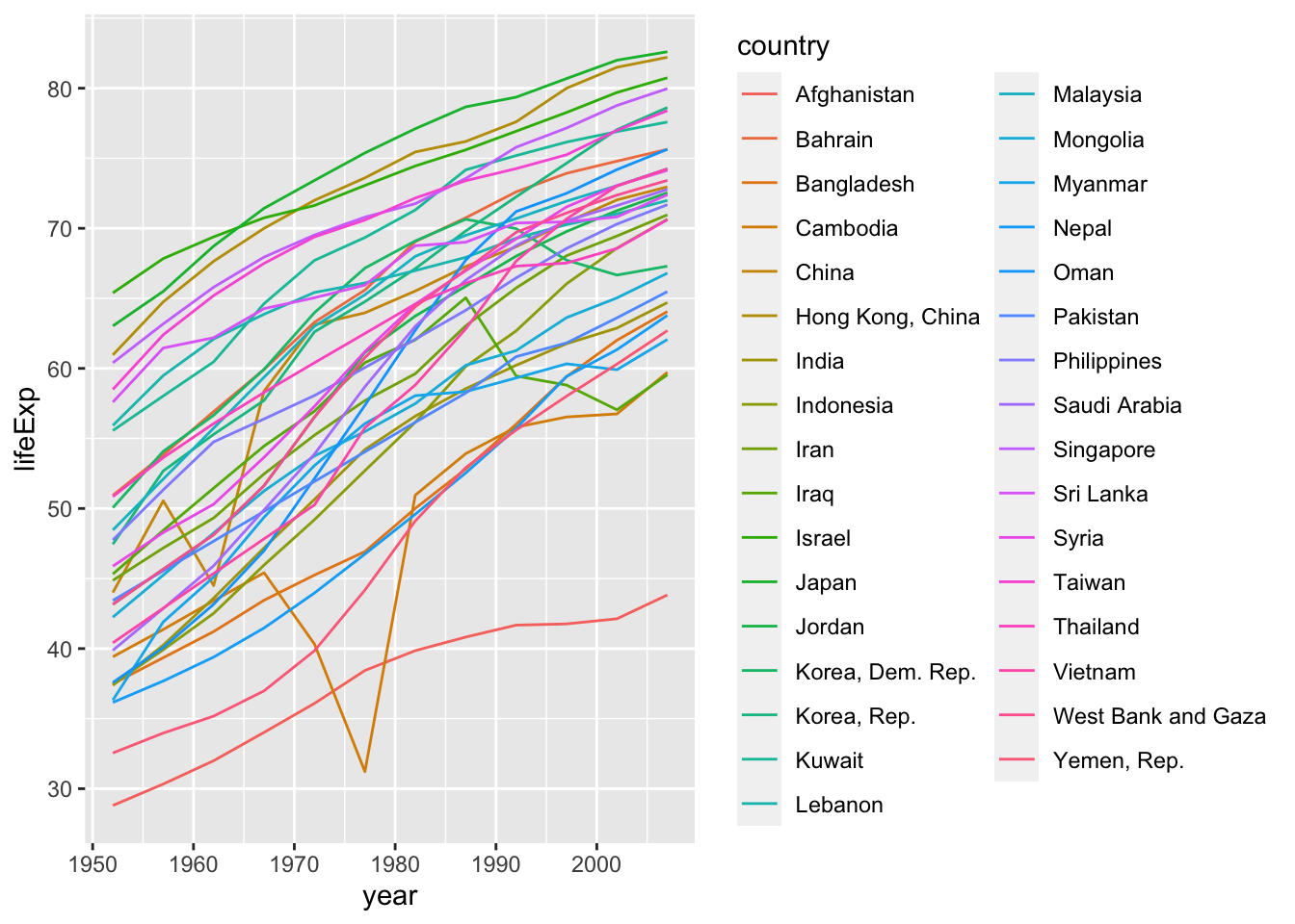
30.1.4 q2 Diagnose this plot
A line plot makes a certain assumption about the underlying data. What assumption is this? How does that assumption relate to the following graph? Put differently, why is the use of geom_line a bad idea for the following dataset?
Observations:
- A line plot assumes the underlying data have a function relationship; that is, that there is one y value for every x value
- The mpg dataset does not have a function relation between displ and hwy; there are cars with identical values of displ but different values of hwy
30.2 Smoothing data
There’s one more way we can make a line plot out of a non 1:1 dataset which is much more heavy-handed than the previous methods: We can fit a statistical model to the data, and plot the predictions from the model. There is a family of statistical models called smoothings that are implemented in geom_smooth(). These are very similar to taking averages at different values of x:
## NOTE: No need to edit
gapminder %>%

  ggplot(aes(year, lifeExp, color = continent)) +
  geom_line(
    data = . %>%
      group_by(continent, year) %>%
      summarize(lifeExp = mean(lifeExp)),
  ) +
  geom_smooth(linetype = "dotted", se = FALSE)
## `summarise()` has grouped output by 'continent'. You can override using the
## `.groups` argument.
## `geom_smooth()` using method = 'loess' and formula = 'y ~ x'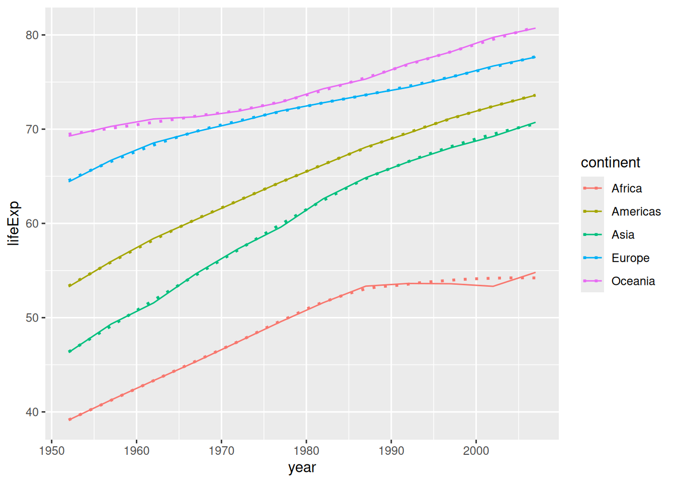
However, geom_smooth() also works in cases where the data are more “sparse”.
## `geom_smooth()` using method = 'loess' and formula = 'y ~ x'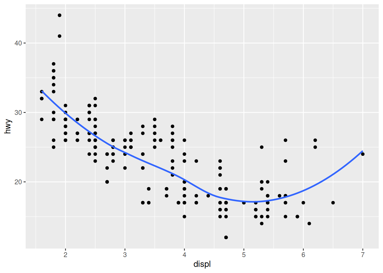
One advantage of geom_smooth() is that it will automatically generate a confidence region. This is automatically reported as a light grey region, unless we turn it off.
## `geom_smooth()` using method = 'loess' and formula = 'y ~ x'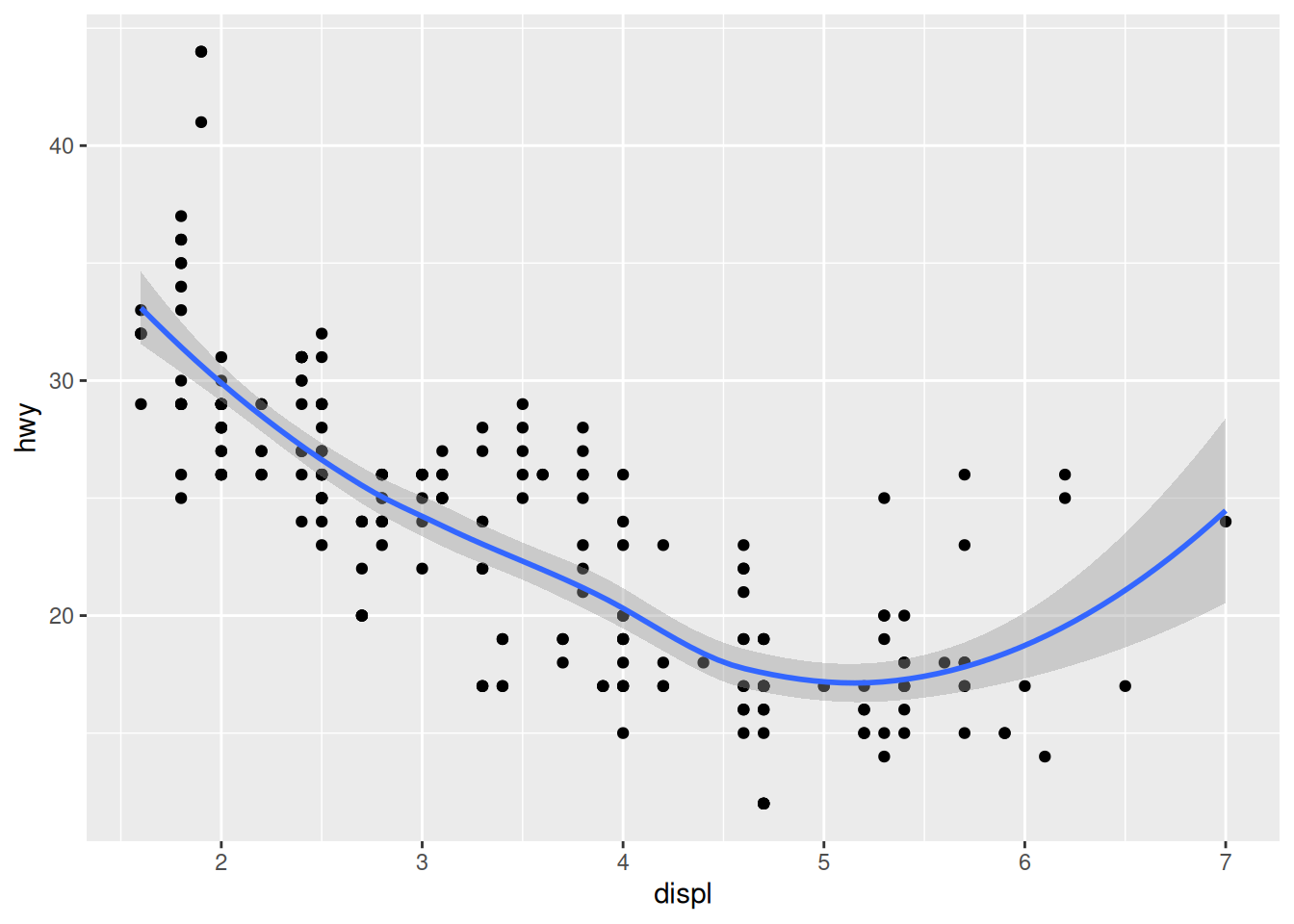
We will talk later in the class about confidence intervals; for now, know that a wider confidence band indicates a less trustworthy fit of the model. For instance, we can see that the model has only one data point at displ == 7. Consequently, the model is less confident about the trend in that region.
30.2.1 q3 Compare raw and smoothed data
The following graph shows both the raw data and a smoothed version. Describe the trends that you can see in the different curves.
## TODO: No need to edit; just interpret the graph
economics %>%
  ggplot(aes(date, unemploy)) +
  geom_line(aes(color = "Raw")) +
  geom_smooth(aes(color = "Smoothed"), se = FALSE) +
  scale_color_discrete(name = "Source")
## `geom_smooth()` using method = 'loess' and formula = 'y ~ x'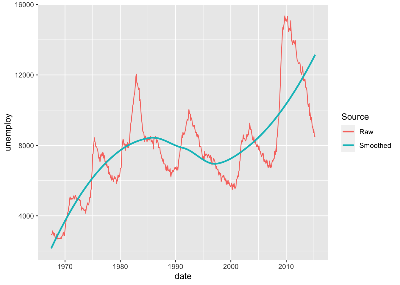
Observations:
- The Raw data indicate short-term cyclical patterns that occur over a few years
- The Smoothed data indicate a longer-term trend occurring over decades