Stats: Distributions#
Purpose: We will use distributions to model uncertain quantities. Distributions (and densities, random variables) are useful mathematical objects, but we will need to understand their properties to use them as effective models. This exercise is about distributions and their fundamental properties: In a future exercise (e-grama06-fit-univar) we will discuss how to model real quantities with distributions.
Setup#
import grama as gr
import numpy as np
DF = gr.Intention()
%matplotlib inline
Motivation: Modeling Uncertainty#
Before we discuss distributions, let’s first talk about why distributions are necessary and useful.
To Model Variability#
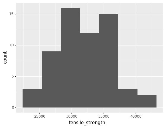
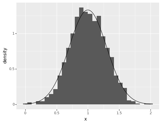
Many real physical quantities exhibit variability; that is, different instances of “the same” quantity take different numerical values. This includes things like part geometry (tolerances), a person’s height and weight, and even material properties. Let’s look at a specific dataset of die cast aluminum material properties.
# NOTE: No need to edit
from grama.data import df_shewhart
If we inspect the tensile_strength values, we can see that they are quite variable.
# NOTE: No need to edit
(
    df_shewhart
    >> gr.ggplot(gr.aes("tensile_strength"))
    + gr.geom_histogram()
)
/Users/zach/opt/anaconda3/envs/evc/lib/python3.9/site-packages/plotnine/stats/stat_bin.py:95: PlotnineWarning: 'stat_bin()' using 'bins = 7'. Pick better value with 'binwidth'.
<ggplot: (8779106334148)>
In order to design in the presence of this variability, we need a way to represent this variability in a quantitative fashion. Distributions offer one way to quantitatively describe variability.
To Summarize Data#
A distribution is one way to summarize a dataset. Rather than using a (potentially large) dataset to describe a variable quantity, we can use a distribution.
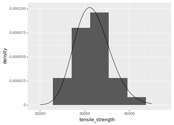
Fitting a lognormal distribution allows us to summarize the variability in tensile_strength. The following code fits a lognormal distribution to the tensile_strength data.
# NOTE: No need to edit
# Fit a lognormal distribution
mg_tensile_strength = gr.marg_fit(
    "lognorm",
    df_shewhart.tensile_strength,
    floc=0,
)
# Show a summary
mg_tensile_strength
(+0) lognorm, {'mean': '3.187e+04', 's.d.': '4.019e+03', 'COV': 0.13, 'skew.': 0.38, 'kurt.': 3.26}
The distribution is defined in terms of a handful of parameters—scalar values that affect the quantitative properties of the distribution.
When we compare the fitted distribution against the data, we can see that the fitted distribution is in the same location and has the same width as the data.
# NOTE: No need to edit
# Visualize the density against the data
(
    df_shewhart
    >> gr.ggplot(gr.aes("tensile_strength"))
    + gr.geom_histogram(gr.aes(y=gr.after_stat("density")))
    + gr.geom_line(
        data=gr.df_make(tensile_strength=gr.linspace(20e3, 45e3, 100))
        >> gr.tf_mutate(d=mg_tensile_strength.d(DF.tensile_strength)),
        mapping=gr.aes(y="d")
    )
)
/Users/zach/opt/anaconda3/envs/evc/lib/python3.9/site-packages/plotnine/stats/stat_bin.py:95: PlotnineWarning: 'stat_bin()' using 'bins = 7'. Pick better value with 'binwidth'.
<ggplot: (8779123879403)>
To Make Assumptions Explicit#
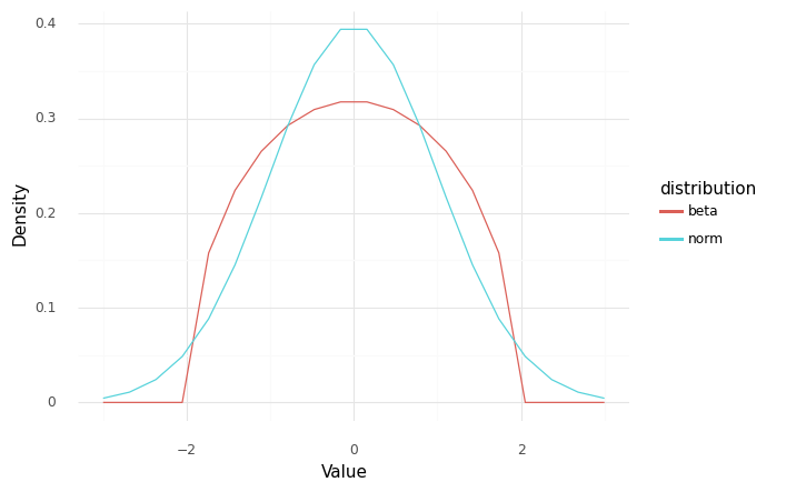
Selecting a distribtion helps us make assumptions about an uncertain quantity explicit. For instance, are we assuming that values are strictly bounded between low and high values? Or are there no bounds?
For example, a normal distribution can take all values between \(-\infty\) and \(+\infty\), while a beta distribution has a finite width. The following visual compares the two distribution shapes.
# NOTE: No need to edit
# Normal is unbounded
mg_norm = gr.marg_mom("norm", mean=0, sd=1)
# Beta is strictly bounded
mg_beta = gr.marg_mom("beta", mean=0, sd=1, skew=0, kurt=2)

(
    gr.df_make(x=gr.linspace(-3, +3, 20))
    >> gr.tf_mutate(
        d_norm=mg_norm.d(DF.x),
        d_beta=mg_beta.d(DF.x),
    )
    >> gr.tf_pivot_longer(
        columns=["d_norm", "d_beta"],
        names_to=[".value", "distribution"],
        names_sep="_",
    )

    >> gr.ggplot(gr.aes("x", "d", color="distribution"))
    + gr.geom_line()
    + gr.theme_minimal()
    + gr.labs(
        x="Value",
        y="Density",
    )
)
/Users/zach/Git/py_grama/grama/tran_pivot.py:471: SettingWithCopyWarning:
A value is trying to be set on a copy of a slice from a DataFrame

See the caveats in the documentation: https://pandas.pydata.org/pandas-docs/stable/user_guide/indexing.html#returning-a-view-versus-a-copy
<ggplot: (8779145038065)>
Distribution Fundamentals#
Note: In this exercise, to keep things simple, we will focus on distributions for continuous variable.
What a distribution represents#
Fundamentally, a distribution describes an uncertain value in a quantitative fashion. Rather than simply saying “I don’t know what value this is,” with a distribution we can express the fact that some values are more likely than others.
Distributions are particularly useful because they free us from “just” picking a single number. With a distribution we can get a lot more nuanced in our description of uncertain quantities. This exercise is all about using concepts about distributions to represent uncertain quantities.
Random variables#
Clearly tensile_strength does not take a single value; therefore, we should think of tensile_strength as a random variable. A random variable is a mathematical object that we can use to model an uncertain quantity. Unlike a deterministic variable that has one fixed value (say \(x = 1\)), a random variable can take a different value each time we observe it. For instance, if \(X\) were a random variable, and we used \(X_i\) to denote the value that occurs on the \(i\)-th observation, then we might see a sequence like
What counts as an observation depends on what we are using the random variable to model. Essentially, an observation is an occurrence that gives us the potential to “see” a new value.
Let’s take a look at the tensile_strength example to get a better sense of these ideas.
For the tensile_strength, we saw a sequence of different values:
# NOTE: No need to edit
(
    df_shewhart
    >> gr.tf_head(4)
)
| specimen | tensile_strength | hardness | density | |
|---|---|---|---|---|
| 0 | 1 | 29314 | 53.0 | 2.666 |
| 1 | 2 | 34860 | 70.2 | 2.708 |
| 2 | 3 | 36818 | 84.3 | 2.865 |
| 3 | 4 | 30120 | 55.3 | 2.627 |
Every time we manufacture a new part, we perform a sequence of manufacturing steps that work together to “lock in” a particular value of tensile_strength. Those individual steps tend to go slightly differently each time we make a part (e.g. an operator calls in sick one day, we get a slightly more dense batch of raw material, it’s a particularly hot summer day, etc.), so we end up with different properties in each part.
Given the complicated realities of manfacturing, it makes sense to think of an observation as being one complete run of the manufacturing process that generates a particular part with its own tensile_strength. This is what the specimen column in df_shewhart refers to; a unique identifier tracking individual runs of the complete manufacturing process, resulting in a unique part.
Nomenclature: A realization is like a single roll of a die
Some nomenclature: When we talk about random quantities, we use the term realization (or observation) to refer to a single event that yields a random value, according to a particular distribution. For instance, a single manufactured part will have a realized strength value. If we take multiple realizations, we will tend to see different values. For instance, we saw a large amount of variability among the realized tensile_strength values above.
A single realization tells us very little about how the distribution tends to behave, but a set of realizations (a sample) will give us a sense of how the random values tend to behave collectively. A distribution is a way to model that collective behavior.
A distribution defines a random variable. We say that a random variable \(X\) is distributed according to a particular distribution \(\rho\), and we express the same statement mathematically as
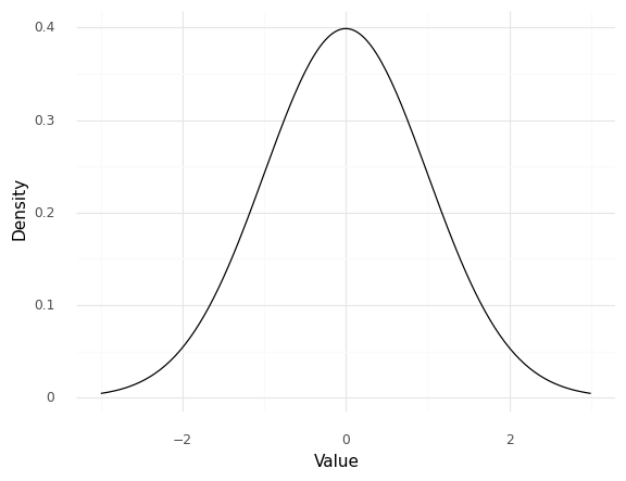
One way to represent a distribution is with a density function. The following plot displays the density for a normal distribution:
## NOTE: No need to edit
# This visualizes a density function
(
    gr.df_make(x=gr.linspace(-3, +3, 200))
    >> gr.tf_mutate(d=mg_norm.d(DF.x))

    >> gr.ggplot(gr.aes("x", "d"))
    + gr.geom_line()
    + gr.theme_minimal()
    + gr.labs(
        x="Value",
        y="Density",
    )
)
<ggplot: (8779106618103)>
The Value pictured here corresponds to all of the potential values that the random variable can take, while the Density quantitatively describes how likely (or unlikely) each of those values are. A value with a higher density will tend to occur more often. Density functions tend to “fall off” towards zero as we move towards more extreme values; these lower regions of the density are called “tails” of the distribution. The smallest values are associated with the “lower” or “left” tail, while the largest values are associated with the “upper” or “right” tail.
q1 Define a distribution#
Use the grama helper function gr.marg_mom() to define a distribution in terms of its moments. Fit a normal "norm" distribution with a mean of 1 and a standard deviation of 0.3.
## TASK: Define a normal distribution

mg_norm = gr.marg_mom("norm", mean=1, sd=0.3)
## NOTE: No need to edit; this will plot your distribution
(
    gr.df_make(x=gr.linspace(0, 3, 100))
    >> gr.tf_mutate(d=mg_norm.d(DF.x))
    >> gr.ggplot(gr.aes("x", "d"))
    + gr.geom_line()
)
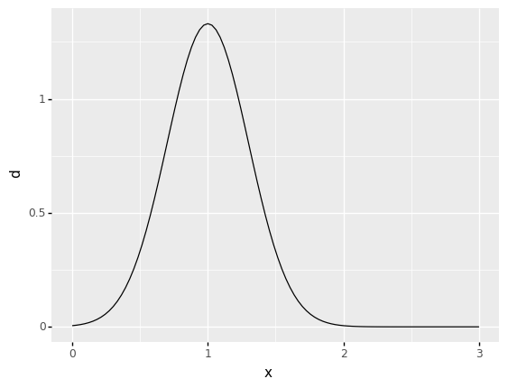
<ggplot: (8779106627301)>
q2 Check your distribution’s summary#
Print the distribution’s summary by simply “executing” the distribution (like you would with a DataFrame or grama model).
## TASK: Print the summary of mg_norm
mg_norm
# solution-end
(+0) norm, {'mean': '1.000e+00', 's.d.': '3.000e-01', 'COV': 0.3, 'skew.': 0.0, 'kurt.': 3.0}
Observations
What mean does your distribution have?
mean = 1.0
What value of skewness does your distribution have?
skewness = 0.0
What value of kurtosis does your distribution have?
kurtosis = 3.0
Moments#
The summary of a distribution reports a few of its moments. These moments tell us different “facts” about the distribution:
Moment |
Meaning |
|---|---|
Mean |
Location |
Standard deviation |
Width |
Skewness |
Left- or right-lopsidedness |
Kurtosis |
Tendency to produce extreme (large) values |
Note that the distribution summary also reports the coefficient of variation (COV), which is a normalized version of the standard deviation (COV = sd / mean).
The next few exercises will help you recognize how different moment values affect a distribution.
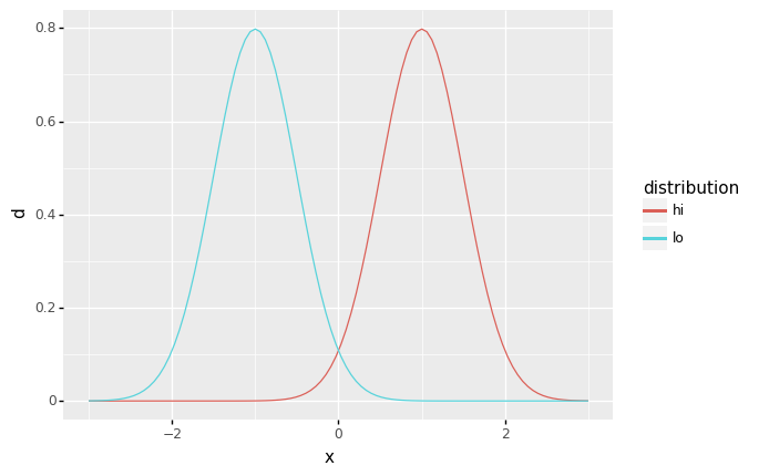
q3 Compare different means#
Inspect the following distribution summaries and the plot. Answer the questions under obervations below.
## NOTE: No need to edit; this will plot and compare two distributions
mg_lo = gr.marg_mom("norm", mean=-1, sd=0.5)
mg_hi = gr.marg_mom("norm", mean=+1, sd=0.5)

## Print the summaries
print(mg_lo)
print(mg_hi)

## Visualize the distributions
(
    gr.df_make(x=gr.linspace(-3, 3, 100))
    >> gr.tf_mutate(
        d_lo=mg_lo.d(DF.x),
        d_hi=mg_hi.d(DF.x),
    )
    >> gr.tf_pivot_longer(
        columns=["d_lo", "d_hi"],
        names_to=[".value", "distribution"],
        names_sep="_",
    )

    >> gr.ggplot(gr.aes("x", "d", color="distribution"))
    + gr.geom_line()
)
(+0) norm, {'mean': '-1.000e+00', 's.d.': '5.000e-01', 'COV': -0.5, 'skew.': 0.0, 'kurt.': 3.0}
(+0) norm, {'mean': '1.000e+00', 's.d.': '5.000e-01', 'COV': 0.5, 'skew.': 0.0, 'kurt.': 3.0}
/Users/zach/Git/py_grama/grama/tran_pivot.py:471: SettingWithCopyWarning:
A value is trying to be set on a copy of a slice from a DataFrame

See the caveats in the documentation: https://pandas.pydata.org/pandas-docs/stable/user_guide/indexing.html#returning-a-view-versus-a-copy
<ggplot: (8779145236625)>
Observations
What is the mean (
mean) of thelodistribution? How does that compare with themeanof thehidistribution?For
lo:mean == -1, forhi:mean == +1.
The mean is a measure of the “location” of a distribution: In your own words, how does the
lodistribution compare with thehidistribution?The
lodistribution is shifted to the left (towards more negative values) than thehidistribution. Both are identical in shape; they are simply located at different centers.
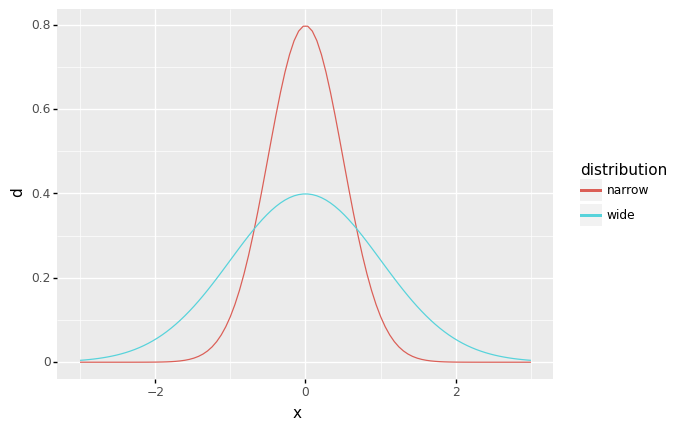
q4 Compare different standard deviations#
Inspect the following distribution summaries and the plot. Answer the questions under obervations below.
## NOTE: No need to edit; this will plot and compare distributions
mg_narrow = gr.marg_mom("norm", mean=0, sd=0.5)
mg_wide = gr.marg_mom("norm", mean=0, sd=1.0)

## Print the summaries
print(mg_narrow)
print(mg_wide)

## Visualize the distributions
(
    gr.df_make(x=gr.linspace(-3, 3, 100))
    >> gr.tf_mutate(
        d_narrow=mg_narrow.d(DF.x),
        d_wide=mg_wide.d(DF.x),
    )
    >> gr.tf_pivot_longer(
        columns=["d_narrow", "d_wide"],
        names_to=[".value", "distribution"],
        names_sep="_",
    )

    >> gr.ggplot(gr.aes("x", "d", color="distribution"))
    + gr.geom_line()
)
/Users/zach/Git/py_grama/grama/marginals.py:336: RuntimeWarning: divide by zero encountered in double_scalars
/Users/zach/Git/py_grama/grama/tran_pivot.py:471: SettingWithCopyWarning:
A value is trying to be set on a copy of a slice from a DataFrame

See the caveats in the documentation: https://pandas.pydata.org/pandas-docs/stable/user_guide/indexing.html#returning-a-view-versus-a-copy
(+0) norm, {'mean': '0.000e+00', 's.d.': '5.000e-01', 'COV': inf, 'skew.': 0.0, 'kurt.': 3.0}
(+0) norm, {'mean': '0.000e+00', 's.d.': '1.000e+00', 'COV': inf, 'skew.': 0.0, 'kurt.': 3.0}
<ggplot: (8779124034265)>
Observations
What is the standard deviation (
sd) of thenarrowdistribution? How does that compare with thesdof thewidedistribution?The
narrowdistribution hassd == 0.5, thewidedistribution hassd == 1.0.
Standard deviation is a measure of “width” of a distribution: In your own words, how does the
widedistribution compare with thenarrowdistribution?For the
widedistribution, larger values (more-negative and more-positive) are more plausible (as measured by a larger density).
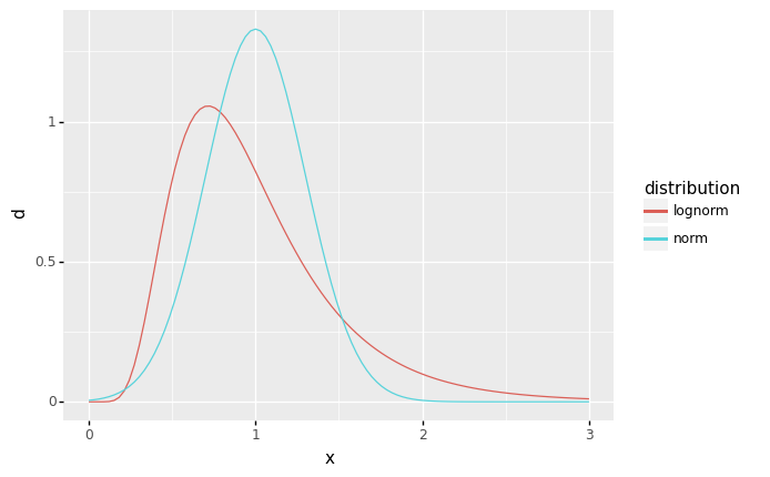
q5 Compare different skewnesses#
Inspect the following distribution summaries and the plot. Answer the questions under obervations below.
## NOTE: No need to edit; this will plot and compare distributions
mg_lognorm = gr.marg_mom("lognorm", mean=1, sd=0.5, floc=0)

## Print the summaries
print(mg_norm)
print(mg_lognorm)

## Visualize the distributions
(
    gr.df_make(x=gr.linspace(0, 3, 100))
    >> gr.tf_mutate(
        d_norm=mg_norm.d(DF.x),
        d_lognorm=mg_lognorm.d(DF.x),
    )
    >> gr.tf_pivot_longer(
        columns=["d_norm", "d_lognorm"],
        names_to=[".value", "distribution"],
        names_sep="_",
    )

    >> gr.ggplot(gr.aes("x", "d", color="distribution"))
    + gr.geom_line()
)
(+0) norm, {'mean': '1.000e+00', 's.d.': '3.000e-01', 'COV': 0.3, 'skew.': 0.0, 'kurt.': 3.0}
(+0) lognorm, {'mean': '1.000e+00', 's.d.': '5.000e-01', 'COV': 0.5, 'skew.': 1.62, 'kurt.': 8.04}
/Users/zach/Git/py_grama/grama/tran_pivot.py:471: SettingWithCopyWarning:
A value is trying to be set on a copy of a slice from a DataFrame

See the caveats in the documentation: https://pandas.pydata.org/pandas-docs/stable/user_guide/indexing.html#returning-a-view-versus-a-copy
<ggplot: (8779124051023)>
Observations
What is the
skew.of thenormdistribution? How does that compare with theskewof thelognormdistribution?The
normdistribution hasskew. == 0, while thelognormdistribution hasskew. == 1.62.
Skewness is related to asymmetry of a distribution: In your own words, how is the lognormal distribution above asymmetric?
The lognormal distribution has a “longer” right tail
Simulating values#
With a distribution, we can draw realizations in to generate a synthetic dataset.
q6 Draw random values from your distribution#
Use the Marginal.r(n) method to draw 1000 random values from your distribution. Play with the sample size n, and answer the questions under observations below.
Hint: A method is a function that you invoke using dot notation. If the marginal were named mg, then you could call the random value method via mg.r(1000).
## TASK: Draw 1000 random values from mg_norm

X = mg_norm.r(1000)
## NOTE: No need to edit; use this to check your answer
(
    gr.df_make(x=X)
    >> gr.ggplot(gr.aes("x"))
    + gr.geom_histogram(bins=30, mapping=gr.aes(y="stat(density)"))
    + gr.geom_line(
        data=gr.df_make(x=gr.linspace(0, 2, 100))
        >> gr.tf_mutate(d=mg_norm.d(DF.x)),
        mapping=gr.aes(y="d")
    )
)
<ggplot: (8779124024191)>
Observations
Set
nto a small value (sayn=100). How well does the histogram match the density (soid curve)?The histogram really does not resemble the density at all….
What value of
nis necessary for the histogram to resemble the density?I find that a modestly-large value (around
n=1000) is necessary for the histogram to resemble the density.
Estimating the Mean#
The average of multiple realizations \(X_i \sim \rho\) is called the sample mean
The true mean of a distribution is called the expectation \(\mathbb{E}[X]\). The sample mean will tend to converge to the true mean as the number of realizations \(n\) increases
However, when \(n < \infty\), the sample mean will tend to be different from the true mean of the distribution.
q7 Estimate a (sample) mean#
Complete the following code to compute the sample mean. Answer the questions under observations below.
## TASK: Compute the sample mean
# NOTE: No need to edit; this will report the true mean
print(mg_norm)

(
    gr.df_make(x=mg_norm.r(100))

    >> gr.tf_summarize(
        x_mean=gr.mean(DF.x)
    )
)
(+0) norm, {'mean': '1.000e+00', 's.d.': '3.000e-01', 'COV': 0.3, 'skew.': 0.0, 'kurt.': 3.0}
| x_mean | |
|---|---|
| 0 | 0.98557 |
Observations
How does the sample mean compare with the true mean of your distribution
mg_norm?The value is different each time, but I get a value quite close to
1.0, the true mean.
What might account for this difference?
We took a limited sample \(n < \infty\), thus there is sampling error in the estimated mean.
Re-run the cell; do you get an identical value?
Nope! There is randomness in the estimate.
The sample mean is a random variable
Noting that the sample mean will tend to be different from the true mean highlights the essence of estimation with limited data: The sample mean is itself a random quantity.
Note that the sample mean (and other estimated quantities) tend to exhibit erroneous variability; there is some true fixed value for the mean, and we see variability only because we have collected a limited amount of data. Increasing our sample size will tend to reduce this variability. Since this uncertainty is due to sampling, it is also called sampling uncertainty.
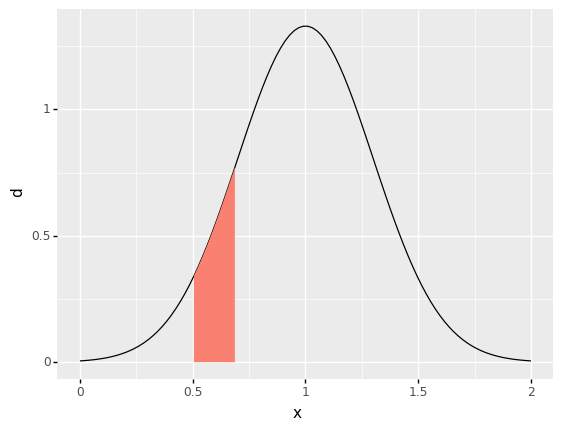
Probability#
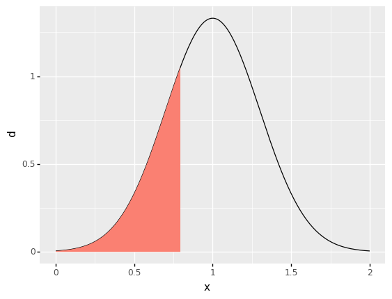
Probability is the area under the density curve, within a set that you specify. Thus probability is associated with both a set \(A\) and a random variable \(X\). The set \(A\) is chosen to correspond to an event of interest.
For instance, if we were interested in the probability of the event \(A = \{0.5 <= X <= 0.7\}\), the following area would be the probability:
## NOTE: No need to edit; run and inspect
df_tmp = (
    gr.df_make(x=gr.linspace(0, 2, 100))
    >> gr.tf_mutate(d=mg_norm.d(DF.x))
)

(
    df_tmp
    >> gr.ggplot(gr.aes("x", "d"))
    + gr.geom_line()
    + gr.geom_ribbon(
        data=df_tmp
        >> gr.tf_filter(0.5 <= DF.x, DF.x <= 0.7),
        mapping=gr.aes(ymin=0, ymax="d"),
        fill="salmon",
        color=None,
    )
)
<ggplot: (8779145316340)>
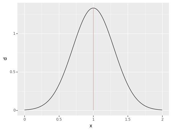
Note that probability is associated with a set—a range of values—not just a single value. Note that the area under the curve for a single value would have zero width, hence zero probability!
The following pictures the case where \(\{X = 1\}\), an event with just one value.
## NOTE: No need to edit; run and inspect
df_tmp = (
    gr.df_make(x=gr.linspace(0, 2, 101))
    >> gr.tf_mutate(d=mg_norm.d(DF.x))
)

(
    df_tmp
    >> gr.ggplot(gr.aes("x", "d"))
    + gr.geom_line()
    + gr.geom_segment(
        data=df_tmp
        >> gr.tf_filter(DF.x == gr.median(DF.x)),
        mapping=gr.aes(xend="x", yend=0),
        color="salmon",
    )
)
<ggplot: (8779124021221)>
A more mathematical definition for probability is in terms of the expectation
where \(1(X \in A)\) is the indicator function, which is just a compact way of tracking whether or not a point lands in the set \(A\). The symbol \(\in\) just means “inside a set”; for example, \(1 \in \{1, 2, 3\}\), but \(0 \not\in \{1, 2, 3\}\).
The indicator function takes values \(1,0\) depending on whether or not a value \(X\) lands inside the set \(A\).
This expectation definition is not just math for its own sake; this expectation of the indicator definition is easy to translate into computer code. We can use the sample mean of an indicator to estimate a probability
You will use this expression in the next tasks to approximate a probability.
q8 Compute an indicator#
Compute an indicator for the event \(A = \{X \leq +1\}\).
Hint: Comparison operators like <, >, <=, >=, and == return boolean values True and False. However, python also treats these as numerical values, where True == 1 and False == 0. This means you can use a simple comparison to compute an indicator value!
## TASK: Compute an indicator for the event where x <= 1
df_ind = (
    gr.df_make(x=mg_norm.r(100))
    >> gr.tf_mutate(

        ind=DF.x <= 1,
    )
)

# NOTE: No need to edit; use this to check your work
assert \
    "ind" in df_ind.columns, \
    "The result df_ind does not have an indicator column `ind`"

assert \
    (all(df_ind.ind == (df_ind.x <= 1))), \
    "Your indicator column `ind` is incorrect."

df_ind
| x | ind | |
|---|---|---|
| 0 | 1.110060 | False |
| 1 | 0.637335 | True |
| 2 | 1.473643 | False |
| 3 | 0.854875 | True |
| 4 | 1.531506 | False |
| ... | ... | ... |
| 95 | 0.633529 | True |
| 96 | 1.215205 | False |
| 97 | 0.717967 | True |
| 98 | 0.548411 | True |
| 99 | 0.664019 | True |
100 rows × 2 columns
q9 Estimate a probability#
Use the definition of probability along with your indicator value to approximate the probability that \(X \leq 1\).
## TASK: Estimate the probability; call that column `pr`
df_pr = (
    df_ind

    >> gr.tf_summarize(pr=gr.mean(DF.ind))
)

# NOTE: No need to edit; use this to check your work
assert \
    "pr" in df_pr.columns, \
    "The result df_pr does not have the column `pr`"

assert \
    df_pr.pr.values[0] == df_ind.ind.mean(), \
    "The value of df_pr.pr is incorrect"

df_pr
| pr | |
|---|---|
| 0 | 0.51 |
Probability of Failure#
Probability is useful as a quantitative measure of a design’s performance. For example, reliability engineers strive to produce designs that have a low probability of failure. This is important for safety-critical applications, such as in the design of buildings, bridges, or aircraft.
To use probability to describe failure, we need to define an event \(A\) that corresponds to failure for the system we are studying. For example, with the tensile_strength of an alloy, we can say failure occurs when the applied stress is greater than the strength. Rendered mathematically, this is the event
The probability of failure is then
We can approximate the probability of failure of a part if we know the applied stress and have a dataset of tensile_strength values.
q10 Estimate a probability of failure#
Suppose the applied stress is \(\sigma_{\text{applied}} = 25 \times 10^3\) psi. Estimate the probability of failure of a part following the distribution of tensile_strength in the df_shewhart dataset. Answer the questions under observations below.
## TASK: Estimate the probability of failure associated with the applied stress above
## provide this as the column `pof`
df_pof = (
    df_shewhart

    >> gr.tf_summarize(
        pof=gr.mean(DF.tensile_strength <= 25e3)
    )
)

# NOTE: No need to edit; use this to check your work
assert \
    "pof" in df_pof.columns, \
    "The result df_pof does not have the column `pof`"

assert \
    abs(df_pof.pof.values[0] - 0.05) < 1e-3, \
    "The value of df_pof.pof is incorrect"

df_pof
| pof | |
|---|---|
| 0 | 0.05 |
Observations
What probability of failure
pofdid you estimate?I estimate
pof == 0.05
Is your value
pofthe true probability of failure? Why or why not?No; remember that any time we have a limited dataset there is sampling uncertainty. Like the sample mean we computed above, the estimated pof here is not exactly equal to the true pof.
Quantiles#
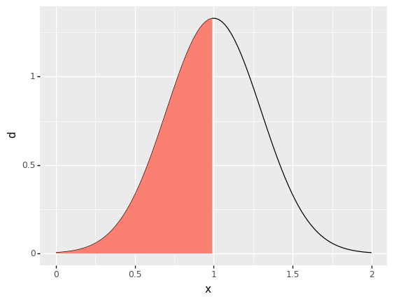
Quantiles “turn around” the idea of probability. With probability we start with a set \(A\) and arrive at a probability value \(p\). With a quantile we start with a probability value \(p\) and arrive at a set \(A\) that is below a single value \(q\); that is \(A = \{X \leq q\}\).
For instance, for a normal distribution the 0.50 quantile is the value \(q\) where 50% of the probability lies below that value; this will be the middle of the distribution, which happens to be the mean:
## NOTE: No need to edit; run and inspect
# Compute the 0.50 quantile
q_mid = mg_norm.q(0.50)

# Visualize
df_tmp = (
    gr.df_make(x=gr.linspace(0, 2, 100))
    >> gr.tf_mutate(d=mg_norm.d(DF.x))
)

(
    df_tmp
    >> gr.ggplot(gr.aes("x", "d"))
    + gr.geom_line()
    + gr.geom_ribbon(
        data=df_tmp
        >> gr.tf_filter(0.0 <= DF.x, DF.x <= q_mid),
        mapping=gr.aes(ymin=0, ymax="d"),
        fill="salmon",
        color=None,
    )
)
<ggplot: (8779145316346)>
However, quantiles allow us to target values other than the mean. For instance, we could seek a moderately low value by targeting the 0.25 quantile, which will be the point where 25% of the probability is below the value \(q\).
## NOTE: No need to edit; run and inspect
# Compute the 0.25 quantile
q_lo = mg_norm.q(0.25)

# Visualize
df_tmp = (
    gr.df_make(x=gr.linspace(0, 2, 200))
    >> gr.tf_mutate(d=mg_norm.d(DF.x))
)

(
    df_tmp
    >> gr.ggplot(gr.aes("x", "d"))
    + gr.geom_line()
    + gr.geom_ribbon(
        data=df_tmp
        >> gr.tf_filter(0.0 <= DF.x, DF.x <= q_lo),
        mapping=gr.aes(ymin=0, ymax="d"),
        fill="salmon",
        color=None,
    )
)
<ggplot: (8779145337697)>
As with the sample mean and a sample probability, we can compute sample quantiles from a dataset.
q11 Compute sample quantiles#
Use the quantile method q() to compute the 0.10 and 0.50 quantiles of the mg_norm distribution. Answer the questions under observations below.
## TASK: Compute the exact 0.10 and 0.50 quantiles of mg_norm

q_10 = mg_norm.q(0.10)
q_50 = mg_norm.q(0.50)
## NOTE: No need to edit; use this to check your work
# This compute sample quantiles
(
    gr.df_make(x=mg_norm.r(1000))
    >> gr.tf_summarize(
        pr_10=gr.mean(DF.x <= q_10), # Should be around 0.10
        pr_50=gr.mean(DF.x <= q_50), # Should be around 0.50
    )
)
| pr_10 | pr_50 | |
|---|---|---|
| 0 | 0.116 | 0.537 |
Observations
Are the
q_10andq_50you computed above sample values or true values ofmg_norm?q_10andq_50are the true quantiles ofmg_norm.
What does the line of code
pr_10=gr.mean(DF.x <= q_10)compute?This compute the probability that
xis below the valueq_10
Why are the values
pr_10andpr_50not exactly equal to the probability values used to computeq_10andq_50?pr_10andpr_50are sample probabilities, not true probabilities. Since there is sampling uncertainty, their values will be close to—but not exactly equal to—their true value.
Conservative values#
Quantiles are a useful way to define conservative values associated with a desired probability. Rather than simply “take the mean” of a set of values, we can pick a small or larger probability and compute an associated quantile.
For instance, since failure under tensile loading occurs when \(\sigma_{\text{strength}} \leq \sigma_{\text{applied}}\), taking a lower quantile of tensile_strength will provide a conservative value appropriate for design.
q12 Estimate a conservative strength#
Compute the empirical 0.10 quantile of the tensile_strength in df_shewhart; provide this as the column lower. Additionally, compute the sample mean of tensile_strength; provide this as the column mean. Answer the questions under observations below.
## TASK: Compute the lower 0.10 quantile and mean of `tensile_strength`
df_values = (
    df_shewhart

    >> gr.tf_summarize(
        lower=gr.quant(DF.tensile_strength, 0.10),
        mean=gr.mean(DF.tensile_strength),
    )
)

# NOTE: No need to edit; use this to check your work
assert \
    "lower" in df_values.columns, \
    "The result df_values does not have the column `lower`"

assert \
    "mean" in df_values.columns, \
    "The result df_values does not have the column `mean`"

assert \
    df_values.lower.values[0] == gr.quant(df_shewhart.tensile_strength, 0.10), \
    "incorrect value of `lower`"

print(df_values)
print("")
print(
    df_shewhart
    >> gr.tf_summarize(
        pof_lower=gr.mean(DF.tensile_strength <= df_values.lower.values[0]),
        pof_mean=gr.mean(DF.tensile_strength <= df_values['mean'].values[0]),
    )
)
     lower          mean
0  26395.0  31869.366667

   pof_lower  pof_mean
0        0.1       0.5
Observations
Are the
lowerandmeanvalues that you computed sample values or true values?These are both sample values, as they are computed from a dataset.
What probability of failure
pofis associated with thelowervalue? What probability of failurepofis associated with themean?The
lowervalue is associated withpof == 0.1; themeanvalue is associated withpof == 0.5.
Suppose the observed variability in the
tensile_strengthis real. Which ofmeanorloweris safer to use for design purposes? Why?If the variability is real, then
loweris definitely safer for design. Real variability means that parts can end up with a strength lower than themean; thus if we design assuming themeanvalue, real parts may end up failing.