Vis: Data Visualization Basics#
Purpose: The most powerful way for us to learn about a dataset is to visualize the data. Throughout this class we will make extensive use of the grammar of graphics, a powerful graphical programming grammar that will allow us to create just about any graph you can imagine!
Setup#
import grama as gr
DF = gr.Intention()
%matplotlib inline
The following code loads a built-in dataset.
from grama.data import df_diamonds
df_diamonds.head(6)
| carat | cut | color | clarity | depth | table | price | x | y | z | |
|---|---|---|---|---|---|---|---|---|---|---|
| 0 | 0.23 | Ideal | E | SI2 | 61.5 | 55.0 | 326 | 3.95 | 3.98 | 2.43 |
| 1 | 0.21 | Premium | E | SI1 | 59.8 | 61.0 | 326 | 3.89 | 3.84 | 2.31 |
| 2 | 0.23 | Good | E | VS1 | 56.9 | 65.0 | 327 | 4.05 | 4.07 | 2.31 |
| 3 | 0.29 | Premium | I | VS2 | 62.4 | 58.0 | 334 | 4.20 | 4.23 | 2.63 |
| 4 | 0.31 | Good | J | SI2 | 63.3 | 58.0 | 335 | 4.34 | 4.35 | 2.75 |
| 5 | 0.24 | Very Good | J | VVS2 | 62.8 | 57.0 | 336 | 3.94 | 3.96 | 2.48 |
The head() function allows us to select the first few rows of the dataset; from the call above, we can see that the dataset has variables such as carat, cut, color, clarity, and price. This is a dataset of the attributes and prices of various diamonds: With these data, we can see how variables like carat affect the price of a diamond.
The head() function shows us just a few rows, while the shape() function will tell us how many rows and columns the dataset has.
df_diamonds.shape
(53940, 10)
That’s nearly 54,000 rows! Inspecting that many rows would be impossible; instead, let’s visualize the dataset to get a sense for these diamonds.
The Grammar of Graphics#
The grammar of graphics (ggplot) is an extremely powerful idea for making graphs. Ggplot is implemented in the Python package plotnine, which is available through grama.
Fundamentals#
The following code annotates a basic ggplot.
(
    # Select a dataset
    df_dataset
    # Start the plot
    >> gr.ggplot(
        # Map the aesthetics to variables in df_dataset
        gr.aes(
            x="x_variable_name",
            y="y_variable_name",
        )
    )
    # Select a geometry to visualize the aesthetics
    + gr.geom_point()
)
Note the special syntax: We use a pipe >> to “give” the dataset df_dataset to gr.ggplot(). We then use “addition” + to add graphical elements to the ggplot.
This will make a scatterplot of df_dataset with "x_variable_name" on the horizontal axis and "y_variable_name" on the vertical axis.
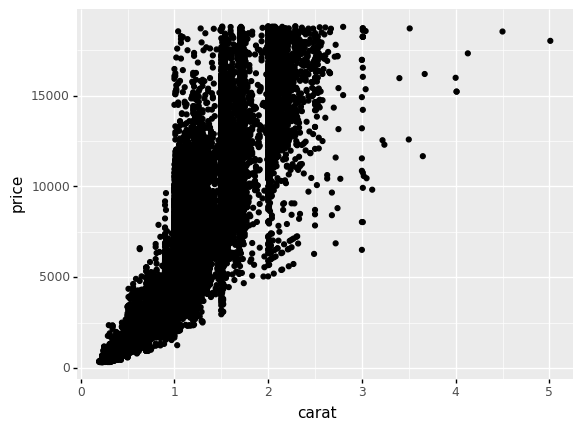
q1 Make a simple scatterplot#
Visualize the df_diamonds dataset with a scatterplot. Put "price" on the vertical axis and "carat" on the horizontal axis. Study the plot, and note your observations below.
Hint: Copy and modify the example code above to make this plot.
## TASK: Visualize df_diamonds with "price" on the vertical
## and "carat" on the horizontal.
(
    df_diamonds
    >> gr.ggplot(gr.aes(x="carat", y="price"))
    + gr.geom_point()
)
<ggplot: (8762296482570)>
Observations
pricegenerally increases withcaratThe trend is not ‘clean’; there is no single curve in the relationship
Aesthetics#
The function gr.aes() is short for aesthetics. Aesthetics in ggplot are the mapping of variables in a dataframe to visual elements in the graph. For instance, in the plot above you assigned carat to the x aesthetic, and price to the y aesthetic. But there are many more aesthetics you can set, some of which vary based on the geom_ you are using to visualize.
Adding additional aesthetic mappings is done by adding additional keyword arguments to gr.aes(). For instance, the following single line change allows us to visualize an additional variable.
(
    df_dataset
    >> gr.ggplot(
        gr.aes(
            x="x_variable_name",
            y="y_variable_name",
            # One-line change allows us to visualize an
            # additional variable
            color="color_variable_name",
        )
    )
    + gr.geom_point()
)
The next question will have you apply this idea.
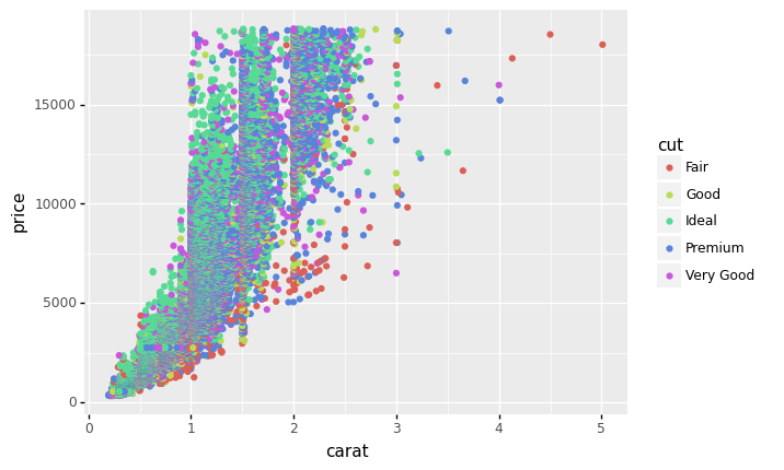
q2 Modify and interpret#
Modify the following graph to visualize an additional variable "cut". Study the plot, and note your observations below.
Hint: Remember that you can add additional aesthetic mappings in aes(). Some options include size, color, and shape.
## TASK: Modify the plot below to *also* visualize the variable "cut".
(
    df_diamonds
    >> gr.ggplot(gr.aes(
        x="carat",
        y="price",
        color="cut",
    ))
    + gr.geom_point()
)
<ggplot: (8762279629014)>
Observations
pricegenerally increases withcaratThe
cuthelps explain the variation in price;Idealcut diamonds tend to be more expensiveMany of the low-price diamonds have
Faircut
Part of the big advantage of ggplot is the ability to easily try out different plots. We specify the mapping from variables to aesthetics, and ggplot automatically takes care of generating the plot.
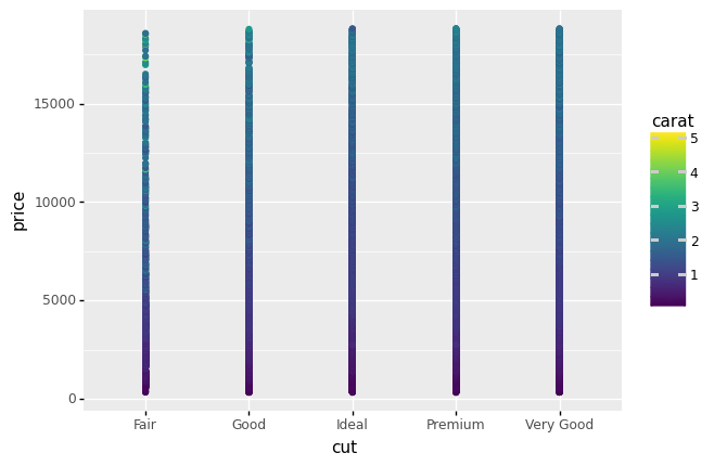
q3 “Swap” aesthetics#
Swap the aesthetic mappings for "carat" and "cut" and inspect the plot.
## TASK: Swap "carat" and "cut"
(
    df_diamonds
    >> gr.ggplot(gr.aes(

        x="cut",
        y="price",
        color="carat",
    ))
    + gr.geom_point()
)
<ggplot: (8762316722996)>
Observations
Compare this plot with the previous one; is it as effective at showing trends in the data?
This plot is not very effective; it’s difficult to say much about the data based on this visualization.
How difficult was it to try out this new plot? How difficult would it be to swap the variables again?
It was very easy to modify the plot! It would be simplicity itself to try something different.
Options#
In addition to mapping variables to aesthetics, we can also fix aesthetics to modify the plot. This is one way we can toggle various options in the plot.
For instance, rather than mapping color to a variable, we can simply fix color to a single value:
(
    df_dataset
    >> gr.ggplot(
        gr.aes(
            x="x_variable_name",
            y="y_variable_name",
            # Don't map color
            # color="color_variable_name",
        )
    )
    + gr.geom_point(color="salmon")
)
Note that here we set the color keyword in the geometry gr.geom_point(), not in the aesthetic gr.aes(). Every aesthetic of a geometry can be set to a fixed value, or mapped to a variable. You will practice doing this in the next task.
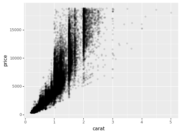
q4 Set an option#
Make the points in the following plot highly transparent using the alpha aesthetic. Answer the questions under observations below.
Note: The alpha keyword argument takes values between [0, 1]; values of 1 are completely opaque, while values of 0 are completely transparent. Intermediate values are more or less opaque.
## TASK: Modify the following visual to reduce the transparency
# of the points with the `alpha` keyword argument.
(
    df_diamonds
    >> gr.ggplot(gr.aes(x="carat", y="price"))
    + gr.geom_point(
        alpha=1/10,
    )
)
<ggplot: (8762263998862)>
Due to the transparency, darker regions are places where there are more points, and lighter regions are plaes where there are fewer points. Keep this in mind when interpreting the graph.
Observations
Where do you see more points? Where do you see fewer points?
There are generally more points at lower carat, with a large bulk below
carat < 1.5. There are also concentrations of points at some select highercaratvalues.
Do you see any strange “patterns” in the plot?
There are strange “vertical bands” in the data at special
caratvalues; for instance, note the vertical band nearcarat == 1.5andcarat == 2.0.