Demo Notebook 2022-06-20#
Demos from the live sessions on 2022-06-20.
Setup#
Ye olde setup chunk below.
import grama as gr
import pandas as pd
DF = gr.Intention()
%matplotlib inline
Preview: Using layers#
We’ll cover this in a future exercise, but for the moment let’s have a preview of the layer functionality in ggplot. We’ll use the diamonds dataset to demonstrate.
from grama.data import df_diamonds
Make a plot highlighting only the "Fair" diamonds.
(
    df_diamonds

    >> gr.ggplot(gr.aes("carat", "price"))
    + gr.geom_point(
        # Layer functionality: Specify the data for this geom_point *only*
        data=df_diamonds
        >> gr.tf_filter(DF.cut == "Fair"),
        # Make this set of points a "black highlight"
        color="black",
    )
    # This layer inherits the full dataset
    + gr.geom_point(
        # Layer functionality: Color the small points by `cut` (instead of all black)
        gr.aes(color="cut"),
        # Reducing point size allows the "black highlight" to show
        size=0.5,
    )
)
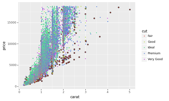
<ggplot: (8768999007735)>
Jupyter shows last command#
Jupyter shows the results of the last command run in the cell. This can make it difficult to show multiple quantities.
x = 1
y = 2

x # This won't be shown
y # This will be shown
2
To show multiple quantities from a single cell, we can use a print() statement.
print(x) # Using a print() will definitely show!
print(y)
1
2
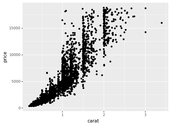
We can use print() statements with more complex operations as well, as the next cell demonstrates.
print(
    df_diamonds
    >> gr.tf_head(10)
)

print(
    df_diamonds
    >> gr.tf_sample(5000)

    >> gr.ggplot(gr.aes("carat", "price"))
    + gr.geom_point()
)
   carat        cut color clarity  depth  table  price     x     y     z
0   0.23      Ideal     E     SI2   61.5   55.0    326  3.95  3.98  2.43
1   0.21    Premium     E     SI1   59.8   61.0    326  3.89  3.84  2.31
2   0.23       Good     E     VS1   56.9   65.0    327  4.05  4.07  2.31
3   0.29    Premium     I     VS2   62.4   58.0    334  4.20  4.23  2.63
4   0.31       Good     J     SI2   63.3   58.0    335  4.34  4.35  2.75
5   0.24  Very Good     J    VVS2   62.8   57.0    336  3.94  3.96  2.48
6   0.24  Very Good     I    VVS1   62.3   57.0    336  3.95  3.98  2.47
7   0.26  Very Good     H     SI1   61.9   55.0    337  4.07  4.11  2.53
8   0.22       Fair     E     VS2   65.1   61.0    337  3.87  3.78  2.49
9   0.23  Very Good     H     VS1   59.4   61.0    338  4.00  4.05  2.39
Scales#
We’ll talk about this more in a future exercise, but we can use scales to modify the way ggplot maps variables to aesthetics. We’ll demo with the Titanic dataset from c01.
df_titanic = pd.read_csv("../challenges/data/titanic.csv")

df_prop = (
    df_titanic
    >> gr.tf_group_by(DF.Class, DF.Sex, DF.Age)
    >> gr.tf_mutate(
        Total=gr.sum(DF.n),
        Prop=DF.n/gr.sum(DF.n),
    )
    >> gr.tf_ungroup()
)
We can use scales to change which numerical values are shown, or even to override the labels for the numerical values. For instance, we can use this to show percentages, rather than proportions:
(
    df_prop
    >> gr.tf_filter(DF.Survived == "Yes", DF.Age == "Adult")

    >> gr.ggplot(gr.aes("Class", "Prop", fill="Sex"))
    + gr.geom_col(position="dodge")
    + gr.scale_y_continuous(
        breaks=[0, 0.25, 0.5, 0.75, 1],
        labels=["0%", "25%", "50%", "75%", "100%"],
    )
)
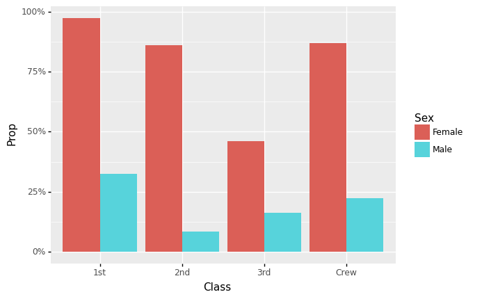
<ggplot: (8769016423012)>
We can use a scale for any aesthetic in ggplot. For instance, the following modifies the range of sizes used to visualize a discrete variable. (NB. This isn’t necessarily a good way to visualize the cut—ggplot even warns us about this choice!)
(
    df_diamonds
    >> gr.ggplot(gr.aes("carat", "price", size="cut"))
    + gr.geom_point()
    + gr.scale_size_discrete(range=(0.1, 1))
)
/Users/zach/opt/anaconda3/envs/evc/lib/python3.9/site-packages/plotnine/scales/scale_size.py:48: PlotnineWarning: Using size for a discrete variable is not advised.
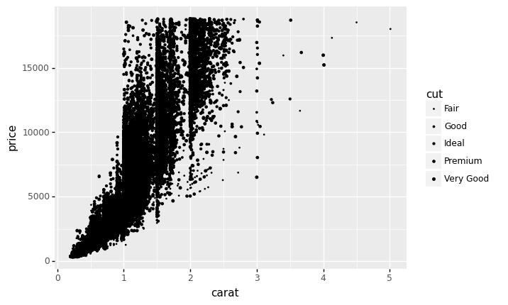
<ggplot: (8768999180719)>
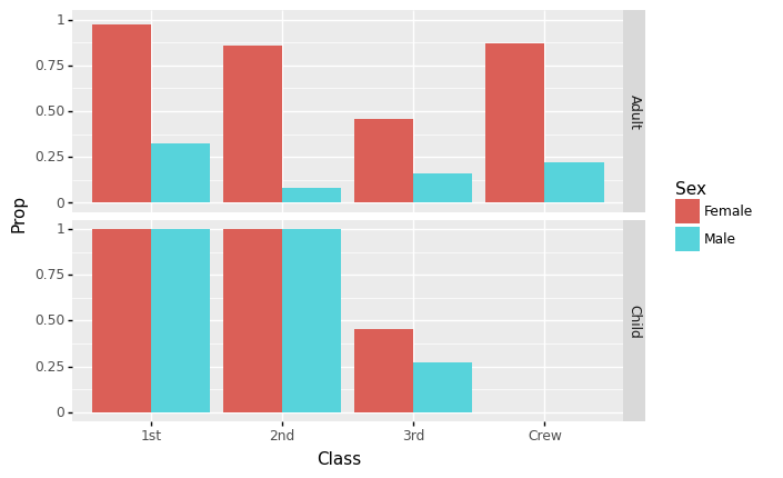
My primary Titanic vis#
(
    df_prop
    >> gr.tf_filter(DF.Survived == "Yes")

    >> gr.ggplot(gr.aes("Class", "Prop", fill="Sex"))
    + gr.geom_col(position="dodge")
    + gr.facet_grid("Age~.")
)
/Users/zach/opt/anaconda3/envs/evc/lib/python3.9/site-packages/plotnine/utils.py:371: FutureWarning: The frame.append method is deprecated and will be removed from pandas in a future version. Use pandas.concat instead.
/Users/zach/opt/anaconda3/envs/evc/lib/python3.9/site-packages/plotnine/layer.py:401: PlotnineWarning: geom_col : Removed 2 rows containing missing values.
<ggplot: (8768999212045)>
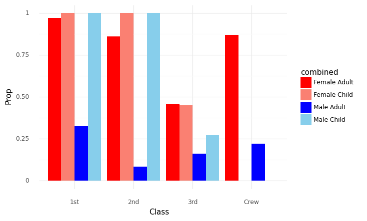
“Multiple” x-axes#
It was asked during the evening session if there is a way to accomplish “multiple” x-axes in a single plot. The way to do this in ggplot is to “dodge” the bars. We can add more groups to this dodging by modifying the data to create a new column, as I show below:
(
    df_prop
    >> gr.tf_filter(DF.Survived == "Yes")
    # Modify the data to combine the Sex and Age variables into one string column
    >> gr.tf_mutate(combined=gr.str_c(DF.Sex, " ", DF.Age))

    >> gr.ggplot(gr.aes("Class", "Prop", fill="combined"))
    # position="dodge" un-stacks the bars
    + gr.geom_col(position="dodge")
    # Set manual fill colors to associate the bars visually
    + gr.scale_fill_manual(
        values={
            "Female Adult": "red",
            "Female Child": "salmon",
            "Male Adult": "blue",
            "Male Child": "skyblue",
        }
    )
    + gr.theme_minimal()
)
/Users/zach/opt/anaconda3/envs/evc/lib/python3.9/site-packages/plotnine/layer.py:401: PlotnineWarning: geom_col : Removed 2 rows containing missing values.
<ggplot: (8769053648887)>