Line Plots#
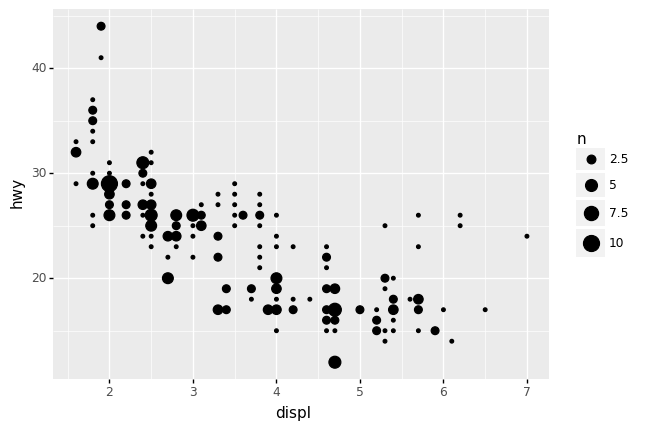
In the previous exercise we learned about using scatterplots to study the relationship between two variables. This works well for a variety of datasets, as our eyes can readily pick out trends in the data even in a “sea of dots.”
## NOTE: No need to edit
(
    df_mpg
    >> gr.ggplot(gr.aes("displ", "hwy"))
    + gr.geom_count()
)
<ggplot: (8770709791263)>
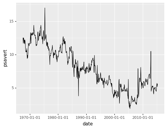
However, a scatterplot is not always the ideal visual; for instance, the following shows the personal savings rate psavert of the US Population.
## NOTE: No need to edit
(
    df_economics
    >> gr.ggplot(gr.aes("date", "psavert"))
    + gr.geom_point()
)

<ggplot: (8770709864554)>
Here we can see the overall trend in the data, but it’s harder to make out the smaller ups and downs in the value. We could visualize the same dataset with gr.geom_line() to directly connect each point with lines:
## NOTE: No need to edit
(
    df_economics
    >> gr.ggplot(gr.aes("date", "psavert"))
    + gr.geom_line()
)
<ggplot: (8770726185051)>
Since each point is now directly connected to its neighbor, we can more readily see the small changes in psavert across time.
Limitations of Lines: Function relations only#
While lines have their advantages, they have an important limitation:
A line plot is only appropriate for data that have a function relationship; that is, for each
xvalue, there is only oneyvalue.
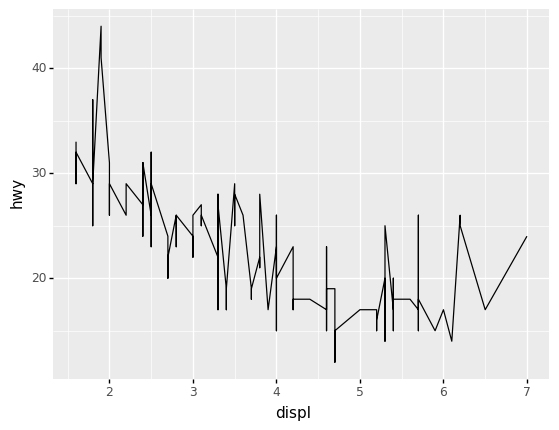
Let’s use the mpg dataset to see what happens when we plot data that fail to have this function relationship.
q1 Make and assess a line plot#
Convert the following into a line plot. Answer the questions under observations below.
## TASK: Convert to a line plot
(
    df_mpg
    >> gr.ggplot(gr.aes("displ", "hwy"))
    # + gr.geom_point()
    + gr.geom_line()
)
<ggplot: (8770709826618)>
Observations
Using the scatterplot, can you tell if the data have a function relationship? How do you know?
The data do not have a function relationship; we can clearly see that there are multiple values of
hwyfor the same value ofdisp. For example, atdisp == 2.0we see a “string” of values fromhwy == 26tohwy == 31.
Hide the dots and show the line; does this give you a correct impression of the trends in the data? Why or why not?
No; the line plot does not give a correct impression of the data. For instance, we cannot see the “string” of values at
disp == 2.0from the line plot; are there values at only the pointshwy == 26andhwy == 31, or are there values at all of the points between those two ends?
Functions within groups#
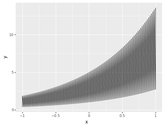
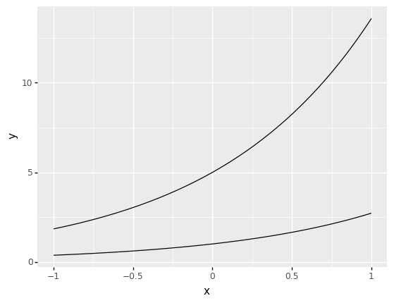
Sometimes a dataset will fail to have a function relationship because there are multiple groups that each have their own function relationship. For instance, if we were doing sweeps in \(x\) for the following function
and we considered multiple values of \(c\), there would be a function relationship, but we would need to consider each unique value of \(c\) separately. Visualizing multiple values of \(c\) together would create an incomprehensible mess:
## NOTE: No need to edit
# Generate a dataset
df_groups = (
    gr.Model()
    >> gr.cp_vec_function(
        fun=lambda df: gr.df_make(y=df.c * gr.exp(df.x)),
        var=["c", "x"],
        out=["y"],
    )
    >> gr.ev_df(df=gr.df_grid(c=[1, 5], x=gr.linspace(-1, 1, 100)))
)

# Visualize
(
    df_groups
    >> gr.ggplot(gr.aes("x", "y"))
    + gr.geom_line()
)
<ggplot: (8770710220858)>
However, we can easily fix this problem by using the group aesthetic.
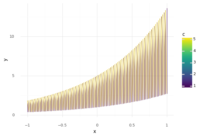
q2 Separate the lines#
Use the group aesthetic to separate the lines belonging to different values of c.
## TASK: Assign the `group` aesthetic to separate the lines
(
    df_groups
    >> gr.ggplot(gr.aes(
        x="x",
        y="y",
        group="c",
    ))
    + gr.geom_line()
)
<ggplot: (8770676036051)>
Note that it’s good practice to visually distinguish different groups. However, you’ll need to assign both the group aesthetic along with the visual aesthetic to make this work. The following plot demonstrates this; try uncommenting the group aesthetic to see how this affects the plot.
## TRY IT: Try uncommenting the line below to see how it changes the plot
(
    df_groups
    >> gr.ggplot(gr.aes(
        x="x",
        y="y",
        # group="c", # Try uncommenting this to fix the plot
        color="c",
    ))
    + gr.geom_line()
    + gr.theme_minimal()
)
<ggplot: (8770710210609)>
Line Helpers#
In addition to a “raw” line plot, there are a variety of related geometries that we can use a “line-like helpers.”
Guide lines#
There are a variety of line geometries that are useful as guide lines:
Geometry |
Use |
Key Aesthetics |
|---|---|---|
|
Horizontal guideline |
|
|
Vertical guideline |
|
|
Diagonal guideline |
|
For example, we can use a horizontal guideline to compare a trend in time against some fixed value of interest. Suppose we were interested in the value \(10\%\); we could mark that value on the economics dataset:
## NOTE: No need to edit
(
    df_economics
    >> gr.ggplot(gr.aes("date", "psavert"))
    + gr.geom_hline(yintercept=10, linetype="dashed")
    + gr.geom_line()
)
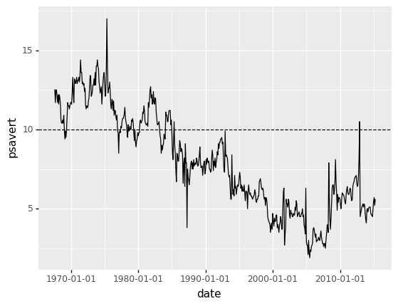
<ggplot: (8770726381291)>
Using a "dashed" line simply helps distinguish it from the plot of the data.
However, we can also assign the aesthetic within gr.aes() in order to use values in the dataset. For instance, we could use this to compute and visualize the mean over all time:
## NOTE: No need to edit
(
    df_economics
    >> gr.ggplot(gr.aes("date", "psavert"))
    + gr.geom_hline(
        data=df_economics
        >> gr.tf_summarize(psavert=gr.mean(DF.psavert)),
        # NOTE: We're using `yintercept` *inside* gr.aes(...)
        mapping=gr.aes(yintercept="psavert"),
        # NOTE: We're not using `yintercept` outside gr.aes(...)
        # yintercept=???, # This is how we "hard code" a value, not how we use data
        linetype="dashed",
    )
    + gr.geom_line()
)
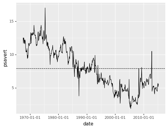
<ggplot: (8770726368160)>
Let’s practice applying a guideline to a plot.
q3 Add a diagonal guideline#
Add a diagonal guideline with a slope of 1 and an intercept of 0. Answer the questions under observations below.
## TASK: Add a guideline with slope=1 and intercept=0
(
    df_mpg
    >> gr.ggplot(gr.aes("cty", "hwy"))
    + gr.geom_abline(slope=1, intercept=0, linetype="dashed")
    + gr.geom_count()
)
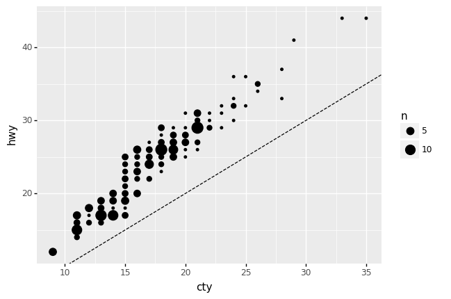
<ggplot: (8770726404069)>
Observations
Are there any vehicles that have a
ctyvalue larger than theirhwyvalue? How do you know?No; we can tell because all of the dots lie above the line with
slope=1andintercept=0. This is the line wherehwy == cty; points above this line havehwy > cty.
Note that we can use additional aesthetics within guidelines such as gr.geom_vline() and gr.geom_hline(). For instance, the following plot computes a mean displ for each vehicle class, and visualizes it as a vertical line:
## NOTE: No need to edit
(
    df_mpg
    >> gr.ggplot(gr.aes("displ", "hwy", color="class"))
    + gr.geom_vline(
        # Summarize across `class`
        data=df_mpg
        >> gr.tf_group_by("class")
        >> gr.tf_summarize(displ=gr.mean(DF.displ)),
        mapping=gr.aes(xintercept="displ", color="class"),
        size=1.5,
        alpha=1/3,
    )
    + gr.geom_point()
    + gr.theme_minimal()
)
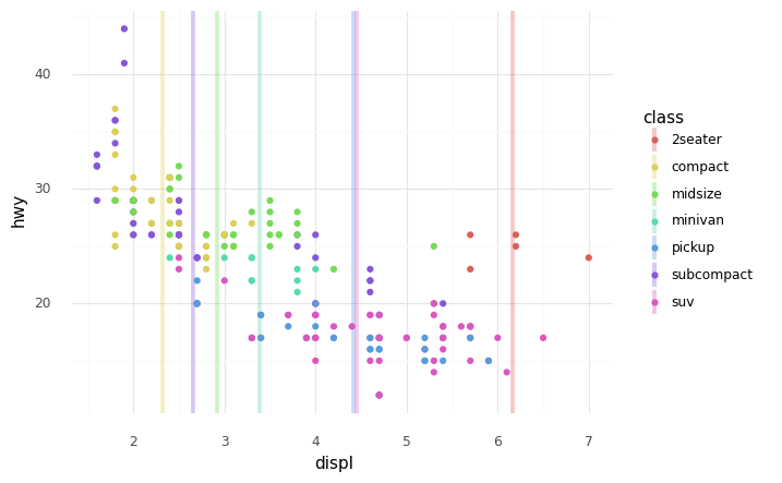
<ggplot: (8770697797885)>
Using a combination of guidelines and aesthetics (possibly driven by the dataset), we have extraordinary flexibility in desining and annotating plots!
Smooth trends#
When our data do not have a function relationship, we can use smoothing to add a trend line to the data. This is useful for highlighting an “overall” trend, and often works well when combined with a scatterplot.
## NOTE: No need to edit
(
    df_mpg
    >> gr.ggplot(gr.aes("displ", "hwy"))
    + gr.geom_smooth(color="grey", size=2)
    + gr.geom_count()
    + gr.theme_minimal()
)
/Users/zach/opt/anaconda3/envs/evc/lib/python3.9/site-packages/plotnine/stats/smoothers.py:310: PlotnineWarning: Confidence intervals are not yet implementedfor lowess smoothings.
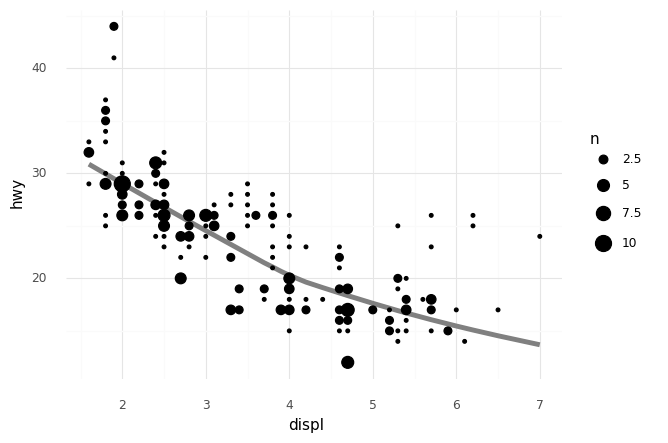
<ggplot: (8770726190068)>
Note that the trend line tends to follow the “middle” of the data; for instance, the small set of higher-hwy cars at higher displ (the 2seater vehicles) do not strongly affect the trend, which instead follows the bulk of the data.
The geometry gr.geom_smooth() also accepts additional aesthetics, as you’ll see in the following task:
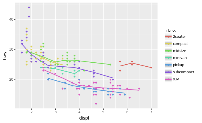
q4 Add an aesthetic to a smoothed plot#
Use an additional aesthetic to distinguish between class in the following plot. Answer the questions under observations below.
## TASK: Add an aesthetic to distinguish the `class` variable
(
    df_mpg
    >> gr.ggplot(gr.aes(
        x="displ",
        y="hwy",
        color="class"
    ))
    + gr.geom_smooth()
    + gr.geom_point()
)
/Users/zach/opt/anaconda3/envs/evc/lib/python3.9/site-packages/plotnine/stats/smoothers.py:310: PlotnineWarning: Confidence intervals are not yet implementedfor lowess smoothings.
/Users/zach/opt/anaconda3/envs/evc/lib/python3.9/site-packages/plotnine/stats/smoothers.py:310: PlotnineWarning: Confidence intervals are not yet implementedfor lowess smoothings.
/Users/zach/opt/anaconda3/envs/evc/lib/python3.9/site-packages/plotnine/stats/smoothers.py:310: PlotnineWarning: Confidence intervals are not yet implementedfor lowess smoothings.
/Users/zach/opt/anaconda3/envs/evc/lib/python3.9/site-packages/plotnine/stats/smoothers.py:310: PlotnineWarning: Confidence intervals are not yet implementedfor lowess smoothings.
/Users/zach/opt/anaconda3/envs/evc/lib/python3.9/site-packages/plotnine/stats/smoothers.py:310: PlotnineWarning: Confidence intervals are not yet implementedfor lowess smoothings.
/Users/zach/opt/anaconda3/envs/evc/lib/python3.9/site-packages/plotnine/stats/smoothers.py:310: PlotnineWarning: Confidence intervals are not yet implementedfor lowess smoothings.
/Users/zach/opt/anaconda3/envs/evc/lib/python3.9/site-packages/plotnine/stats/smoothers.py:310: PlotnineWarning: Confidence intervals are not yet implementedfor lowess smoothings.
<ggplot: (8770697867825)>
Observations
What is similar about the smoothed trend across different vehicle
classes?Generally, every class tends to have a downward trend between
hwyanddispl.
What is different about the smoothed trend across different vehicle
classes?The various trends tend to be quite offset in their
hwyvalues; for instance, themidsizevehicles span a similar range ofdisplas thesubcompactvehicles, but themidsizetrend line is entirely above thesubcompacttrendline.