Vis: Scatterplots and Layers#
Purpose: Scatterplots are a key tool for EDA. Scatteplots help us inspect the relationship between two variables. To enhance our scatterplots, we’ll learn how to use layers in ggplot to add multiple pieces of information to our plots.
Setup#
import grama as gr
DF = gr.Intention()
%matplotlib inline
We’ll use the diamonds and mpg datasets in this exercise.
from grama.data import df_diamonds
from plotnine.data import mpg as df_mpg
Introduction#
Scatterplots#
So far, we have focused on studying one variable at a time using bars/columns:
## NOTE: No need to edit
(
    df_diamonds
    >> gr.ggplot(gr.aes(x="carat"))
    + gr.geom_histogram()
)
/Users/zach/opt/anaconda3/envs/evc/lib/python3.9/site-packages/plotnine/stats/stat_bin.py:95: PlotnineWarning: 'stat_bin()' using 'bins = 142'. Pick better value with 'binwidth'.
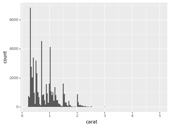
<ggplot: (8776099688867)>
This gives us a sense of how a single variable is distributed in a dataset, but it gives us no sense for how carat relates to other variables.
A scatterplot helps us to see relationships between two variables. A scatterplot shows two variables on the x and y aesthetics, and visualizes observations using one point per observation. Thus, in ggplot, we use the geometry gr.geom_point() to construct a scatterplot.
## NOTE: No need to edit
(
    df_diamonds
    >> gr.ggplot(gr.aes(x="carat", y="price"))
    + gr.geom_point()
)

<ggplot: (8776129725630)>
q1 How do price and carat relate?#
Use the plot above to answer the questions under Observations.
Observations
How does
pricetend to change ascaratincreases? Is this trend linear or nonlinear?Generally,
priceincreases withcarat. This trend is certainly nonlinear; we see the increase in price grow faster at highercaratvalues.
Consider diamonds with
carat == 2.0. What range ofpricedo you see for this kind of diamond? Iscaratalone able to predict thepriceof a diamond?We see a range of about
5,000to about18,000. Since we see such a wide range, it is clear thatcaratalone is not able to predictprice.
Overplotting#
With larger datasets, it is possible for many observations to “land” in the same x, y location on a scatterplot. For instance, with the following (silly) dataset, we get the false impression that there are only two points:
## NOTE: No need to edit
(
    gr.df_make(
        x=[0,0,0,0,1],
        y=[1,1,1,1,0],
    )

    >> gr.ggplot(gr.aes(x="x", y="y"))
    + gr.geom_point()
)
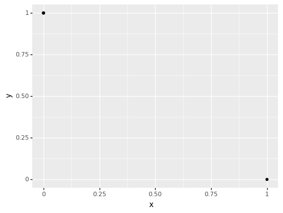
<ggplot: (8776129768189)>
There are various ways to visually indicate the number of observations at each point; a simple way is to use size to denote count, as with gr.geom_count().
## NOTE: No need to edit
(
    gr.df_make(
        x=[0,0,0,0,1],
        y=[1,1,1,1,0],
    )

    >> gr.ggplot(gr.aes(x="x", y="y"))
    + gr.geom_count()
)
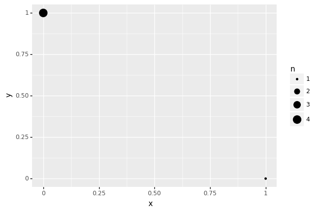
<ggplot: (8776099776802)>
q2 Use gr.geom_count()#
Replace gr.geom_point() with gr.geom_count() in the following plot. Answer the questions under observations below.
## TASK: Replace gr.geom_point() with gr.geom_count()
(
    df_mpg
    >> gr.ggplot(gr.aes(x="displ", y="hwy"))

    + gr.geom_count()
)
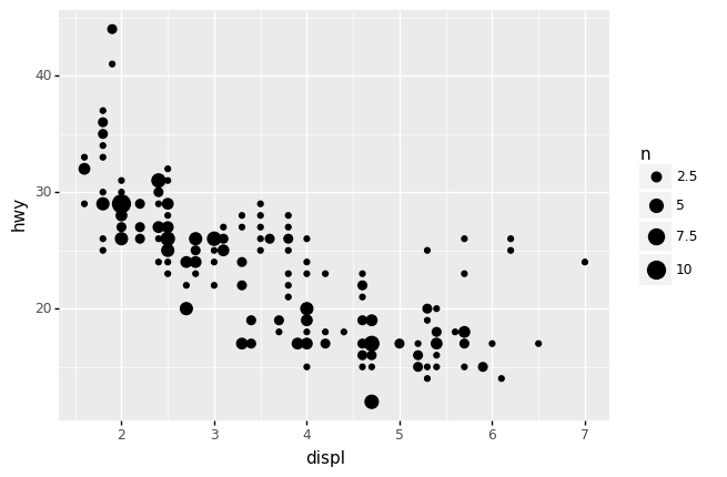
<ggplot: (8776111791318)>
Observations
With
gr.geom_point(), how evenly spread do the observations seem to be?The observations appear to be evenly spread across
displ; there are a few fewer points at higherdisplvalues, but not by much.
With
gr.geom_count(), how evenly spread do the observations seem to be?The observations appear to concentrate in a “band” curving from around
displ == 2todispl == 6. The points off of this band (arounddispl == 3.5, hwy == 28anddispl == 6.0, hwy == 25) are far more sparse.
What does
gr.geom_point()hide in this case?Visualizing with points (not counts) hides the multiple observations at each point; with points we cannot see the concentrated “band”.
To deal with overplotting, we can also make points transparent. Then overlapping points will tend to appear darker, giving us the means to see where there are more points.
q3 Use the alpha option#
Adjust the alpha option in gr.geom_point() to better understand where observations concentrate. Answer the questions under observations below.
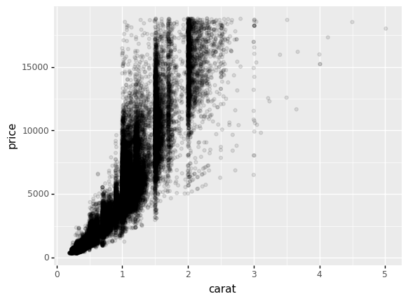
(
    df_diamonds
    >> gr.ggplot(gr.aes(x="carat", y="price"))
    + gr.geom_point(

        alpha=1/10,
    )
)
<ggplot: (8776077910291)>
Observations
Do observations tend to concentrate at “special” values? If yes, do they concentrate at values in
carat, inpriceor in both?Yes; observations tend to concentrate at “special” values of
carat. We can see this by the vertical “streaks” of points, indicating that values tend to concentrate at special values incarat. We do not see the same kinds of patterns inprice—we see more uniform variability in this variable..
Layers in ggplot#
Now is a great time to learn some of the more powerful features of ggplot. We’ll take advantage of the layer functionality to construct more informative plots.
Default aesthetic order#
So far, we have specified the aesthetic names explicitly in gr.aes() with calls like gr.aes(x="carat", y="price"). However, we can save ourselves a bit of typing by using the order of the arguments. The default order of arguments in gr.aes() is x, y.
Thus, we can re-write the following:
(
    df_data
    >> gr.ggplot(gr.aes(x="var1", y="var2"))
    + gr.geom_point()
)
With slightly shorter code:
(
    df_data
    ## NOTE: The `x=` and `y=` are dropped
    >> gr.ggplot(gr.aes("var1", "var2"))
    + gr.geom_point()
)
q4 Use the default order#
Re-write the following code to use the default x,y order in gr.aes().
## TASK: Re-write this code to use the default order
(
    df_diamonds
    >> gr.ggplot(gr.aes(

        "carat",
        "price",
    ))
    + gr.geom_point()
)
<ggplot: (8776078426832)>
Default data#
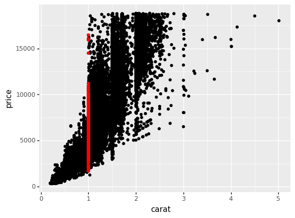
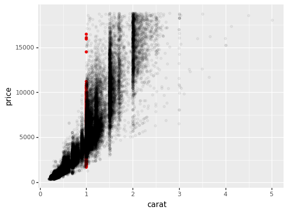
Every geometry in a ggplot object also takes a data argument. By default all geometries visualize the same dataset, but we can override that default with the data argument. This is helpful if we want to highlight particular observations; for instance, the code below highlights all diamonds that have carat == 1.0.
## NOTE: No need to edit
(
    df_diamonds
    >> gr.ggplot(gr.aes("carat", "price"))
    + gr.geom_point()
    + gr.geom_point(
        ## NOTE: This overrides the data to plot
        data=df_diamonds
        >> gr.tf_filter(DF.carat == 1.0),
        color="red",
    )
)
<ggplot: (8776078416782)>
This is made even more flexible when we combine data operations such as a summary; the following plot shows highway fuel economy against engine displacement for a variety of car classes, but also shows the mean performance within each group as a larger dot:
## NOTE: No need to edit
(
    df_mpg
    >> gr.ggplot(gr.aes("displ", "hwy", color="class"))
    + gr.geom_point(
        data=df_mpg
        >> gr.tf_group_by("class")
        >> gr.tf_summarize(displ=gr.mean(DF.displ), hwy=gr.mean(DF.hwy)),
        size=10,
        alpha=1/2,
    )
    + gr.geom_point()
)
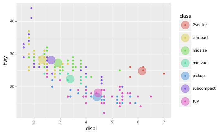
<ggplot: (8776133149678)>
Such a plot helps us to compare both typical (mean) behavior and variation in the same plot.
Layer Order#
The order in which you add geometries to a ggplot is the order in which they are drawn. You can use this to “stack” visual elements in a desirable order.
For instance; here’s the same diamonds plot from above with carat == 1.0 highlighted, but with the order of the layers reverse.
## NOTE: No need to edit
(
    df_diamonds
    >> gr.ggplot(gr.aes("carat", "price"))
    + gr.geom_point(
        data=df_diamonds
        >> gr.tf_filter(DF.carat == 1.0),
        color="red",
    )
    ## NOTE: The full dataset comes last
    + gr.geom_point()
)
<ggplot: (8776133143775)>
Note that we cannot see the additional layer at all! Overplotting is preventing us from seeing the lower layer. As before, we could use alpha to make more of the plot visible.
## NOTE: No need to edit
(
    df_diamonds
    >> gr.ggplot(gr.aes("carat", "price"))
    + gr.geom_point(
        data=df_diamonds
        >> gr.tf_filter(DF.carat == 1.0),
        color="red",
    )
    ## NOTE: The full dataset comes last
    + gr.geom_point(alpha=1/20)
)
<ggplot: (8776130955255)>
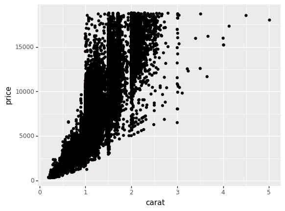
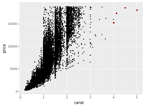
An even more effective use of this functionality is to use layers to highlight particular observations; for instance, some of the more extreme cases in the dataset:
## NOTE: No need to edit
(
    df_diamonds
    >> gr.ggplot(gr.aes("carat", "price"))
    + gr.geom_point(
        data=df_diamonds
        >> gr.tf_filter(DF.carat > 4),
        color="red",
        size=1.5,
    )
    ## NOTE: The full dataset comes last
    + gr.geom_point(size=0.5)
)
<ggplot: (8776129905924)>
By slightly oversizing the lower-layer, we effectively add a “highlight” to our selected points.
Scales#
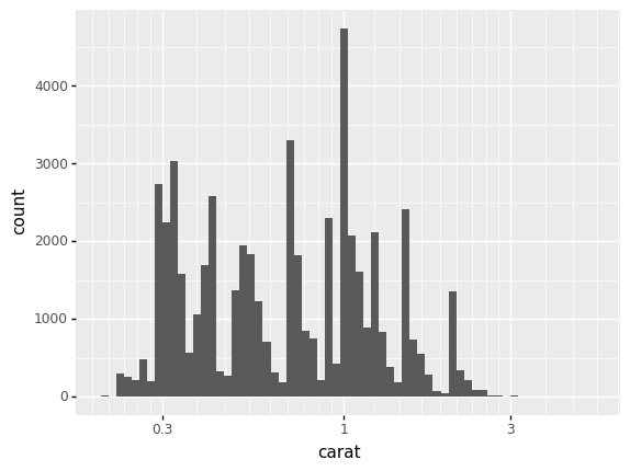
One more layer option; by default ggplot maps the x, y scales to values linearly, but we can apply transforms to the scales to aid in visualization. For instance, we can transform the horizontal axis to use a log10() transform using gr.scale_x_log10().
## NOTE: No need to edit; run and inspect
(
    df_diamonds
    >> gr.ggplot(gr.aes("carat"))
    + gr.geom_histogram()
    + gr.scale_x_log10(bins=60)
)
/Users/zach/opt/anaconda3/envs/evc/lib/python3.9/site-packages/plotnine/scales/scale.py:102: PlotnineWarning: scale_x_log10 could not recognise parameter `bins`
/Users/zach/opt/anaconda3/envs/evc/lib/python3.9/site-packages/plotnine/stats/stat_bin.py:95: PlotnineWarning: 'stat_bin()' using 'bins = 64'. Pick better value with 'binwidth'.
<ggplot: (8776036675178)>
Note that the linear scaling led to bars being “squished” at lower values; a log transformation better “spreads out” the data.
Rule of thumb: Use a log-scale when values vary over multiple order-of-magnitude
There is a bit of artistry to deciding when to log transform (or not). A good rule-of-thumb is to log-transform a variable when it varies over multiple order of magnitude.
However, it’s also a good idea to simply “play” with different visuals to see what works for your dataset.
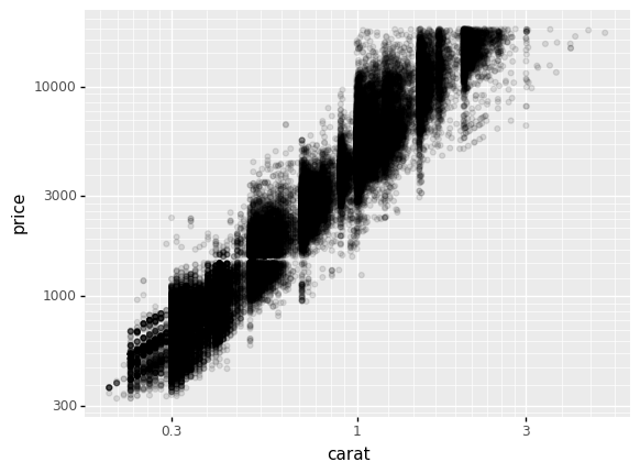
q5 Apply log10 scales to both axes#
Apply a log10() transform to both the x and y axes.
Hint: If gr.scale_x_log10() transforms the x axis, what might transform the y axis?
(
    df_diamonds
    >> gr.ggplot(gr.aes("carat", "price"))
    + gr.geom_point(alpha=1/10)
    + gr.scale_x_log10()
    + gr.scale_y_log10()
)
<ggplot: (8776036696715)>
Exercises#
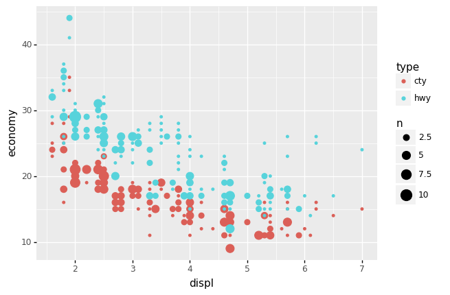
q6 Interpret this plot#
Inspect the following plot, and answer the questions under observations below.
## TASK: No need to edit; run and inspect this plot
(
    df_mpg
    >> gr.tf_pivot_longer(
        columns=["cty", "hwy"],
        names_to="type",
        values_to="economy",
    )
    >> gr.ggplot(gr.aes("displ", "economy", color="type"))
    + gr.geom_count()
)
<ggplot: (8776116031368)>
Observations
Which
displvalues tend to have a higher fueleconomy?Lower
displvalues tend to yield higher fueleconomy.
Which tends to be higher:
ctyorhwyfueleconomy?Generally
hwytends to be higher thancty; this is not always true, though.
Are there any vehicles that get a
ctyfueleconomythat is higher than another vehicle’shwyfueleconomy?Yes; in cases where we see a red dot above a blue dot, this indicates that one vehicle’s
ctyis higher than another vehicle’shwy.
From this plot, can we tell whether any single vehicle has its
ctyvalue higher than itshwyvalue?We cannot! Note that this visual does not give any indication of which pairs of dots are associated. While we expect that
cty <= hwyfor all vehicles, this visual does not give us a means to test that hypothesis.
q7 Interpret this plot#
Inspect the following plot, and answer the questions under observations below.
## TASK: No need to edit; run and inspect this plot
(
    df_mpg
    >> gr.ggplot(gr.aes("cty", "hwy"))
    + gr.geom_abline(intercept=0, slope=1, linetype="dashed")
    + gr.geom_count()
)
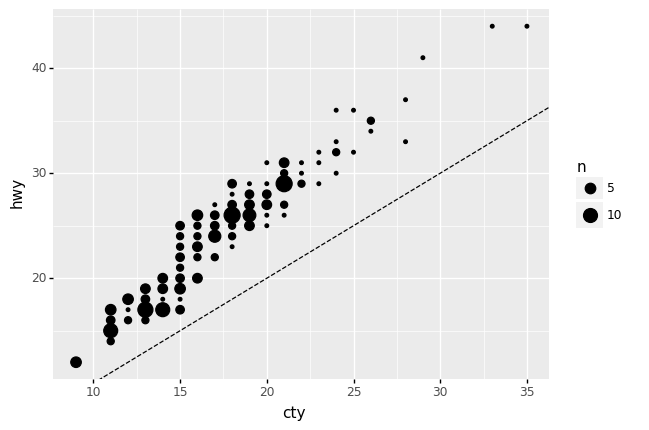
<ggplot: (8776081186958)>
Observations
Note: The dashed line above shows the line of y == x.
From this plot, can we tell whether any single vehicle has its
ctyvalue higher than itshwyvalue?Yes! Here every point associates the
ctyandhwyvalues for a single vehicle. Therefore, we can check whethercty < hwysimply by checking whether the point falls above the liney == x.