Vis: Histograms#
Purpose: Histograms are a key tool for EDA, as they are a powerful lense to help us understand how a single variable is “distributed” in a dataset. In this exercise we’ll introduce and interpret histograms and some variants (frequency polygons).
Setup#
import grama as gr
DF = gr.Intention()
%matplotlib inline
We’ll use the mpg dataset from plotnine: This is a dataset describing different automobiles, including their mileage (hence mpg).
from plotnine.data import mpg as df_mpg
Introduction#
What is a Histogram?#
As we saw in the previous exercise, a bar plot shows the count of observations within various categories:
## NOTE: No need to edit
(
    df_mpg
    >> gr.ggplot(gr.aes(x="class"))
    + gr.geom_bar()
)
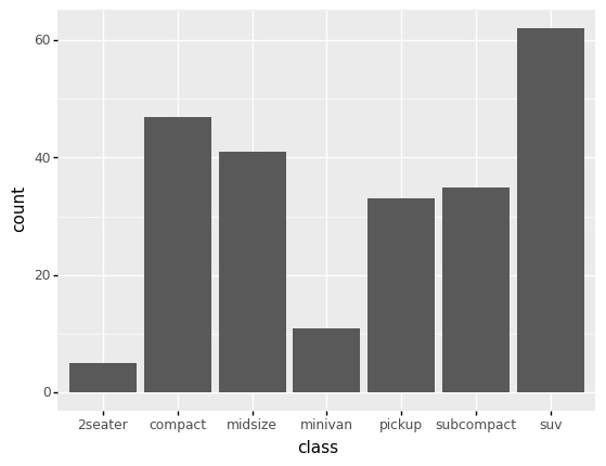
<ggplot: (8792286165800)>
However, if we try to visualize a continuous variable with a bar chart, we’re likely to run into issues. It happens that the exact same values do occur multiple times in the df_mpg dataset, but that is due to rounding:
## NOTE: No need to edit
(
    df_mpg
    >> gr.ggplot(gr.aes(x="displ"))
    + gr.geom_bar()
)
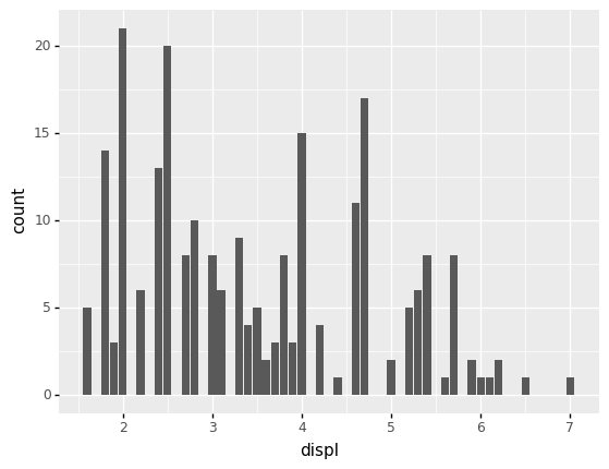
<ggplot: (8792339961366)>
If we didn’t have rounding, it would be harder to visualize the data with a bar chart:
## NOTE: No need to edit
(
    df_mpg
    >> gr.tf_mutate(
        ## Simulate a lack of rounding by "jittering" the displ values
        displ=DF.displ + gr.marg_mom("norm", mean=0, sd=0.1).r(df_mpg.shape[0])
    )
    >> gr.ggplot(gr.aes(x="displ"))
    + gr.geom_bar()
)
<ggplot: (8792286287445)>
Rather than assuming repetitions of continuous values, we can instead bin the values into groups. For instance, the following bins the displ values to the nearest integer:
## NOTE: No need to edit
(
    df_mpg
    >> gr.tf_mutate(displ_group=DF.displ // 1)
    >> gr.tf_select(DF.displ, DF.displ_group, gr.everything())
)
| displ | displ_group | manufacturer | model | year | cyl | trans | drv | cty | hwy | fl | class | |
|---|---|---|---|---|---|---|---|---|---|---|---|---|
| 0 | 1.8 | 1.0 | audi | a4 | 1999 | 4 | auto(l5) | f | 18 | 29 | p | compact |
| 1 | 1.8 | 1.0 | audi | a4 | 1999 | 4 | manual(m5) | f | 21 | 29 | p | compact |
| 2 | 2.0 | 2.0 | audi | a4 | 2008 | 4 | manual(m6) | f | 20 | 31 | p | compact |
| 3 | 2.0 | 2.0 | audi | a4 | 2008 | 4 | auto(av) | f | 21 | 30 | p | compact |
| 4 | 2.8 | 2.0 | audi | a4 | 1999 | 6 | auto(l5) | f | 16 | 26 | p | compact |
| ... | ... | ... | ... | ... | ... | ... | ... | ... | ... | ... | ... | ... |
| 229 | 2.0 | 2.0 | volkswagen | passat | 2008 | 4 | auto(s6) | f | 19 | 28 | p | midsize |
| 230 | 2.0 | 2.0 | volkswagen | passat | 2008 | 4 | manual(m6) | f | 21 | 29 | p | midsize |
| 231 | 2.8 | 2.0 | volkswagen | passat | 1999 | 6 | auto(l5) | f | 16 | 26 | p | midsize |
| 232 | 2.8 | 2.0 | volkswagen | passat | 1999 | 6 | manual(m5) | f | 18 | 26 | p | midsize |
| 233 | 3.6 | 3.0 | volkswagen | passat | 2008 | 6 | auto(s6) | f | 17 | 26 | p | midsize |
234 rows × 12 columns
We can use the binned displ to create groups and compute counts within each group.
## NOTE: No need to edit
(
    df_mpg
    >> gr.tf_mutate(displ_group=DF.displ // 1)
    >> gr.tf_count(DF.displ_group)
)
| displ_group | n | |
|---|---|---|
| 0 | 1.0 | 22 |
| 1 | 2.0 | 78 |
| 2 | 3.0 | 48 |
| 3 | 4.0 | 48 |
| 4 | 5.0 | 32 |
| 5 | 6.0 | 5 |
| 6 | 7.0 | 1 |
Now we can visualize those counts n with a column chart:
## NOTE: No need to edit
(
    df_mpg
    >> gr.tf_mutate(displ_group=DF.displ // 1)
    >> gr.tf_count(DF.displ_group)
    >> gr.ggplot(gr.aes(x="displ_group", y="n"))
    + gr.geom_col()
)
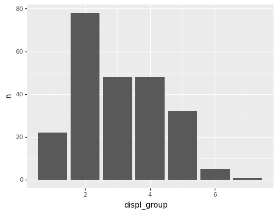
<ggplot: (8792318387026)>
Enter gr.geom_histogram()#
Rather than do all of that grouping manually, the geometry gr.geom_histogram() does this automatically. This geometry accepts a bins argument that allows us to change the number of groups; ggplot then figures out the bin widths automatically.
## NOTE: No need to edit
(
    df_mpg
    >> gr.ggplot(gr.aes(x="displ"))
    + gr.geom_histogram(bins=20)
)
<ggplot: (8792318416818)>
What do Histograms tell us?#
Histograms give us a visual sense of frequency of values in a dataset. This provides an extremely useful window into “what is going on” in any given continuous variable. From a histogram, we can tell:
Which are more common values?
Which are less common values?
Do observations tend to cluster at particular values?
Note: A “bump” or “cluster” of points is sometimes called a mode. A dataset with multiple bumps is then called multi-modal.
What range of values occur?
And so much more.
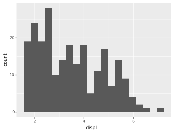
For example, let’s interpret the displ histogram from above.
## NOTE: No need to edit
(
    df_mpg
    >> gr.ggplot(gr.aes(x="displ"))
    + gr.geom_histogram(bins=10)
)
<ggplot: (8792318419065)>
Here are my observations
displranges between a little under2and a bit above6.Smaller values (around
2) are more common.There is an additional “bump” around
displ == 5.Values of
displ == 6and above are quite rare.
Part of the value of such a plot is that it can help us to frame other questions, such as “Which vehicles do have a displ >= 6?
Rule #1 of Histograms#
Note that we have to select a number of bins when we construct a histogram. This is an important parameter that makes a big difference. Therefore, we have Rule #1 of Histograms:
Rule #1 of Histograms
Experiment with different numbers of bins when plotting a histogram.
Different bin counts will enable different observations. For instance, still with the df_mpg dataset. You’ll practice this below.
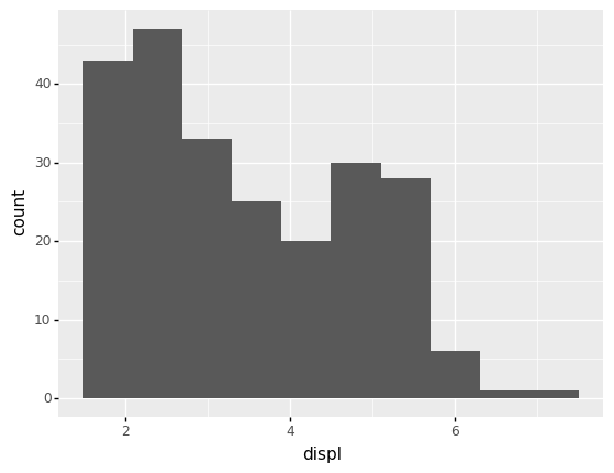
q1 Change the bin size#
Re-construct the histogram of displ in df_mpg, and experiment with different bin sizes. Answer the questions under observations below.
## TASK: Create a histogram of `displ`, experiment with the number of bins
(
    df_mpg
    >> gr.ggplot(gr.aes(x="displ"))
    + gr.geom_histogram(bins=20)
)
<ggplot: (8792318413114)>
Observations
What additional observations can you make, based on varying the
binsargument?With the larger number of
bins=2, we can see that there may actually be three “bumps” in values, with a concentration of values arounddispl == 2, one arounddispl ~= 3.5, and a third arounddispl == 5.
Histogram Variant: Frequency Polygons#
A useful variant of the histogram is the frequency polygon. This simply visualizes the counts as a line rather than with bars:
## NOTE: No need to edit
(
    df_mpg
    >> gr.ggplot(gr.aes(x="displ"))
    + gr.geom_freqpoly(bins=20)
)
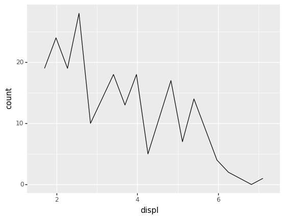
<ggplot: (8792318427935)>
This may seem like a silly distinction to make, but it is actually extremely useful when we start comparing multiple histograms on the same plot. While we would have to dodge (or stack—yuck) bars with multiple groups, lines can sit on top of one another:
## NOTE: No need to edit
(
    df_mpg
    >> gr.ggplot(gr.aes(x="displ", color="class"))
    + gr.geom_freqpoly(bins=10)
)
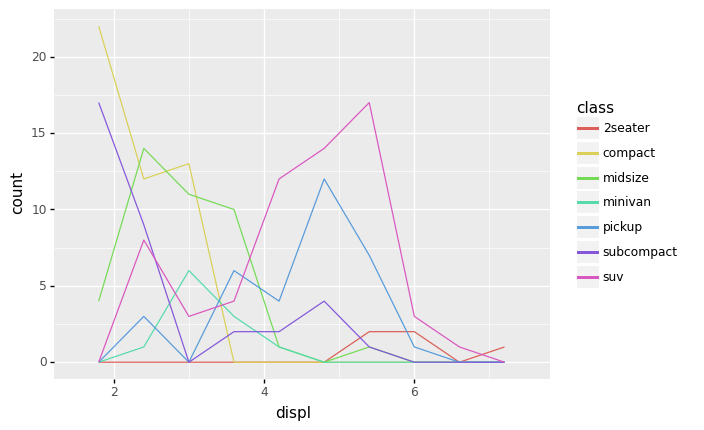
<ggplot: (8792339925101)>
From this frequency polygon plot, we can now see all manner of new insights! For instance:
The
2seaterclass tends to have much higherdisplThe
suvclass tends to have higherdispl, but some are near the low endThe
midsizeclass tends to have much lowerdispl
Case Study: Diamonds#
Now let’s practice using histograms with the diamonds dataset.
from grama.data import df_diamonds
df_diamonds
| carat | cut | color | clarity | depth | table | price | x | y | z | |
|---|---|---|---|---|---|---|---|---|---|---|
| 0 | 0.23 | Ideal | E | SI2 | 61.5 | 55.0 | 326 | 3.95 | 3.98 | 2.43 |
| 1 | 0.21 | Premium | E | SI1 | 59.8 | 61.0 | 326 | 3.89 | 3.84 | 2.31 |
| 2 | 0.23 | Good | E | VS1 | 56.9 | 65.0 | 327 | 4.05 | 4.07 | 2.31 |
| 3 | 0.29 | Premium | I | VS2 | 62.4 | 58.0 | 334 | 4.20 | 4.23 | 2.63 |
| 4 | 0.31 | Good | J | SI2 | 63.3 | 58.0 | 335 | 4.34 | 4.35 | 2.75 |
| ... | ... | ... | ... | ... | ... | ... | ... | ... | ... | ... |
| 53935 | 0.72 | Ideal | D | SI1 | 60.8 | 57.0 | 2757 | 5.75 | 5.76 | 3.50 |
| 53936 | 0.72 | Good | D | SI1 | 63.1 | 55.0 | 2757 | 5.69 | 5.75 | 3.61 |
| 53937 | 0.70 | Very Good | D | SI1 | 62.8 | 60.0 | 2757 | 5.66 | 5.68 | 3.56 |
| 53938 | 0.86 | Premium | H | SI2 | 61.0 | 58.0 | 2757 | 6.15 | 6.12 | 3.74 |
| 53939 | 0.75 | Ideal | D | SI2 | 62.2 | 55.0 | 2757 | 5.83 | 5.87 | 3.64 |
53940 rows × 10 columns
This is a dataset of nearly 54,000 diamonds, including their sale price and characteristics (carat, cut, color, clarity) and geometry.
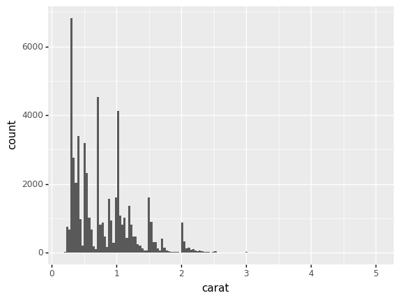
q2 Study the carat distribution#
Create a histogram of the carat. Answer the questions under observations below.
## TASK: Create a histogram of `carat`
(
    df_diamonds
    >> gr.ggplot(gr.aes(x="carat"))
    + gr.geom_histogram()
)
/Users/zach/opt/anaconda3/envs/evc/lib/python3.9/site-packages/plotnine/stats/stat_bin.py:95: PlotnineWarning: 'stat_bin()' using 'bins = 142'. Pick better value with 'binwidth'.
<ggplot: (8792318390149)>
Observations
What range of
caratvalues occur in the dataset?We see
caratvalues from around0.25up to around5.
What values tend to be more common?
This is a highly multi-modal distribution of values (many bumps), but broadly we see more values between
0.25 < carat < 2.0.
What values tend to be less common?
Values of
caratabove 3 are very rare, and we see a lot of “space” between the multiple-modes below2.
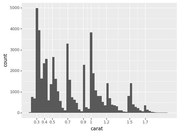
q3 Study the carat distribution, closer look#
Inspect the following plot. Answer the questions under observations below.
## TASK: No need to edit; run and inspect
(
    df_diamonds
    >> gr.tf_filter(DF.carat < 2.0)
    >> gr.ggplot(gr.aes(x="carat"))
    + gr.geom_histogram(bins=60)
    + gr.scale_x_continuous(breaks=(0.3, 0.4, 0.5, 0.7, 0.9, 1.0, 1.2, 1.5, 1.7))
)
<ggplot: (8792339928308)>
Observations
What do you notice about the most-common values of
carat?We see very sharp concentrations around “special” values, such as
carat == 1.0. We also see that values tend to land at values larger than these “special” values, but not below. Put differently, the modes around each special value are asymmetric—they skew towards larger values.
Note that
caratis a quality that a jeweler can control, to some extent. When cutting a diamond, a jeweler can choose to take off less material in order to preservecarat, possibly at the loss of not getting as high quality acut. What does the histogram above suggest about jeweler behavior?The concentration around “special” values probably relates to what purchasers of diamonds want: It could be that the “special” values are desirable values of
carat. This may also explain the skew we see around each special value; people may like acarat == 1.01diamond, but acarat == 0.99might make you look like a cheapskate. Particularly since diamonds are used in engagement rings, there is likely social pressure around these numbers!
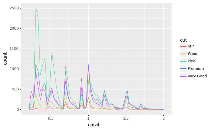
q4 Bring in the cut#
Re-create the plot from q3, but visualize the cut as well. Answer the questions under observations below.
## TASK: Re-create the plot from q3, but visualize the `cut` as well
(
    df_diamonds
    >> gr.tf_filter(DF.carat < 2.0)
    >> gr.ggplot(gr.aes(x="carat", color="cut"))
    + gr.geom_freqpoly(bins=60)
)
<ggplot: (8792340497851)>
Observations
What is the most numerous
cutat lowercaratvalues? (Saycarat <= 0.5)Idealcut diamonds are the most numerous at lowercaratvalues.
What is the most numerous cut around
carat == 1.0?Premiumis the most numerous aroundcarat == 1.0, though it is closely followed byVery Good.