Stats: Introduction to Exploratory Data Analysis#
Purpose: Exploratory Data Analysis (EDA) is a crucial skill for a practicing data scientist. Unfortunately, much like human-centered design EDA is hard to teach. This is because EDA is not a strict procedure, so much as it is a mindset. Also, much like human-centered design, EDA is an iterative, nonlinear process. There are two key principles to keep in mind when doing EDA:
Curiosity: Generate lots of ideas and hypotheses about your data.
Skepticism: Remain unconvinced of those ideas, unless you can find credible patterns to support them.
Since EDA is both crucial and difficult, we will practice doing EDA a lot in this course!
Reading#
Reading: Exploratory Data Analysis
Topics: (All topics)
Reading Time: ~45 minutes
Setup#
import grama as gr
DF = gr.Intention()
%matplotlib inline
We’ll study the diamonds dataset for this exercise.
from grama.data import df_diamonds
df_diamonds = (
    df_diamonds
    >> gr.tf_mutate(
        # Order the cut to aid in plotting
        cut=gr.as_factor(
            DF.cut,
            categories=[
                "Fair",
                "Good",
                "Very Good",
                "Premium",
                "Ideal"
            ]
        )
    )
)
Basic EDA Tools#
There are a few simple tools we can use to investigate a dataset. We should use these tools even before making visuals of the data.
q1 Take the head#
Use the appropriate function to get the first 5 observations in df_diamonds. Answer the questions under observations below.
# TASK: Get the first 10 observations
(
    df_diamonds
    >> gr.tf_head(5)
)
| carat | cut | color | clarity | depth | table | price | x | y | z | |
|---|---|---|---|---|---|---|---|---|---|---|
| 0 | 0.23 | Ideal | E | SI2 | 61.5 | 55.0 | 326 | 3.95 | 3.98 | 2.43 |
| 1 | 0.21 | Premium | E | SI1 | 59.8 | 61.0 | 326 | 3.89 | 3.84 | 2.31 |
| 2 | 0.23 | Good | E | VS1 | 56.9 | 65.0 | 327 | 4.05 | 4.07 | 2.31 |
| 3 | 0.29 | Premium | I | VS2 | 62.4 | 58.0 | 334 | 4.20 | 4.23 | 2.63 |
| 4 | 0.31 | Good | J | SI2 | 63.3 | 58.0 | 335 | 4.34 | 4.35 | 2.75 |
Observations
What variables does this dataset have?
carat,cut,color,clarity,depth,table,price,x,y,z
q2 Use descriptive statistics#
The gr.tf_describe() function gives useful descriptive statistics on a dataset. Use these values to answer the questions under observations below.
# NOTE: No need to edit; run and inspect
(
    df_diamonds
    >> gr.tf_describe()
)
| carat | depth | table | price | x | y | z | |
|---|---|---|---|---|---|---|---|
| count | 53940.000000 | 53940.000000 | 53940.000000 | 53940.000000 | 53940.000000 | 53940.000000 | 53940.000000 |
| mean | 0.797940 | 61.749405 | 57.457184 | 3932.799722 | 5.731157 | 5.734526 | 3.538734 |
| std | 0.474011 | 1.432621 | 2.234491 | 3989.439738 | 1.121761 | 1.142135 | 0.705699 |
| min | 0.200000 | 43.000000 | 43.000000 | 326.000000 | 0.000000 | 0.000000 | 0.000000 |
| 25% | 0.400000 | 61.000000 | 56.000000 | 950.000000 | 4.710000 | 4.720000 | 2.910000 |
| 50% | 0.700000 | 61.800000 | 57.000000 | 2401.000000 | 5.700000 | 5.710000 | 3.530000 |
| 75% | 1.040000 | 62.500000 | 59.000000 | 5324.250000 | 6.540000 | 6.540000 | 4.040000 |
| max | 5.010000 | 79.000000 | 95.000000 | 18823.000000 | 10.740000 | 58.900000 | 31.800000 |
Observations
How many observations are in the dataset?
There are
53940observations.
What is a typical value for the
priceof a diamond, according to this dataset?A typical price is around
3000. The mean price is3932.80and the median price is2401.
What is the largest diamond in the dataset? (According to
carat.) What is the smallest?The smallest carat is
0.2and the largest carat is5.01.
You identified all the variables in the dataset in q1 above. Do the results from
gr.tf_describe()provide information on all of these variables?No: we do not see results for
cut,color, orclarity.
Distinct Values (levels)#
Variables that do not take numerical values are sometimes called categorical variables; there are other tools that are useful for investigating categorical variables.
The verb gr.tf_distinct() is like gr.tf_filter(), but it filters for rows that are distinct according to the given variables. For instance, if we wanted to know what distinct values of x exist in df_data, we would call:
(
    df_data
    >> gr.tf_distinct(DF.x)
)
Aside: A categorical variable is sometimes called a factor. The unique values of a categorical variable are called levels.
We can use gr.tf_distinct() to figure out what values show up for a categorical variable.
q3 Find the distinct cut values#
Use gr.tf_distinct() to find the unique values of cut in df_diamonds.
# TASK: Find the distinct `cut` values in the dataset
(
    df_diamonds
    >> gr.tf_distinct(DF.cut)
)
| carat | cut | color | clarity | depth | table | price | x | y | z | |
|---|---|---|---|---|---|---|---|---|---|---|
| 0 | 0.23 | Ideal | E | SI2 | 61.5 | 55.0 | 326 | 3.95 | 3.98 | 2.43 |
| 1 | 0.21 | Premium | E | SI1 | 59.8 | 61.0 | 326 | 3.89 | 3.84 | 2.31 |
| 2 | 0.23 | Good | E | VS1 | 56.9 | 65.0 | 327 | 4.05 | 4.07 | 2.31 |
| 3 | 0.24 | Very Good | J | VVS2 | 62.8 | 57.0 | 336 | 3.94 | 3.96 | 2.48 |
| 4 | 0.22 | Fair | E | VS2 | 65.1 | 61.0 | 337 | 3.87 | 3.78 | 2.49 |
Counts#
Another approach to assessing a categorical is to simply count the number of rows that correspond to each distinct value. We can do this with the gr.tf_count() verb. For instance, if we wanted to know how may rows there are for each value of x in df_data, we would call:
(
    df_data
    >> gr.tf_count(DF.x)
)
q4 Find the count of cut values#
Use gr.tf_count() to find the number of rows for each distinct cut value in df_diamonds.
# TASK: Find the distinct `cut` values in the dataset
(
    df_diamonds
    >> gr.tf_count(DF.cut)
)
| cut | n | |
|---|---|---|
| 0 | Fair | 1610 |
| 1 | Good | 4906 |
| 2 | Very Good | 12082 |
| 3 | Premium | 13791 |
| 4 | Ideal | 21551 |
Guided EDA#
I’m going to walk you through a train of thought I had when studying the diamonds dataset.
There are four standard “C’s” of judging a diamond. These are carat, cut, color and clarity, all of which are in the df_diamonds dataset.
Note: This remainder of this exercise will consist of interpreting pre-made graphs. You can run the whole notebook to generate all the figures at once. Just make sure to do all the exercises and write your observations!
Hypothesis 1#
Here’s a hypothesis:
Idealis the “best” value ofcutfor a diamond. Since anIdealcut seems more labor-intensive, I hypothesize thatIdealcut diamonds are less numerous than other cuts.
q5 Assess hypothesis 1#
Run the chunk below, and study the plot. Was hypothesis 1 correct? Why or why not?
# NOTE: No need to edit; run and inspect
(
    df_diamonds
    >> gr.ggplot(gr.aes("cut"))
    + gr.geom_bar()
)
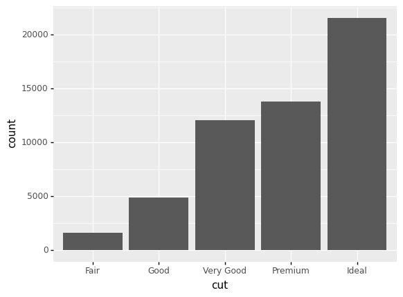
<ggplot: (8762373088910)>
Observations
Is hypothesis 1 true or not?
The hypothesis was wrong:
Idealcut diamonds are more numerous than all other cuts! Perhaps because cutting a diamond is easier than mining a new one, gemcutters add value to a diamond by striving for an ideal cut.
Hypothesis 2#
Another hypothesis:
The
Idealcut diamonds should be the most pricey.
q6 Assess hypothesis 2#
Study the following graph; does it support, contradict, or not relate to hypothesis 2?
# NOTE: No need to edit; run and inspect
(
    df_diamonds
    >> gr.ggplot(gr.aes("cut", "price"))
    + gr.geom_point()
)
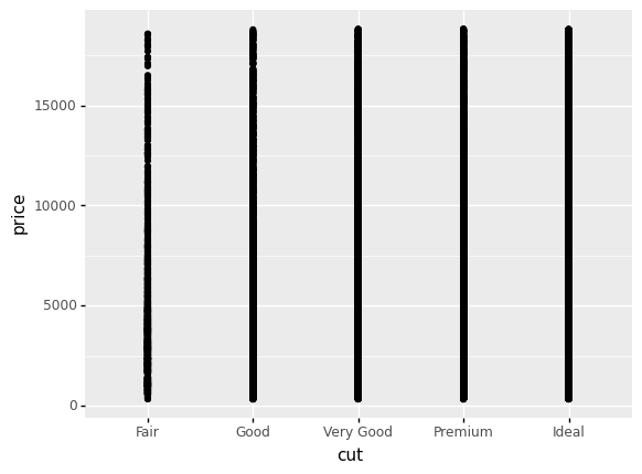
<ggplot: (8762375049593)>
Observations
Does this plot support, contradict, or not relate to hypothesis 2?
This graph is virtually useless! There is severe overplotting. We cannot address Hypothesis 2 with this graph.
The following is a set of boxplots; the middle bar denotes the median, the boxes denote the quartiles (upper and lower “quarters” of the data), and the lines and dots denote large values and outliers.
q7 Assess hypothesis 2, take 2#
Study the following graph; does it support or contradict hypothesis 2?
# NOTE: No need to edit; run and inspect
(
    df_diamonds
    >> gr.ggplot(gr.aes("cut", "price"))
    + gr.geom_boxplot()
)
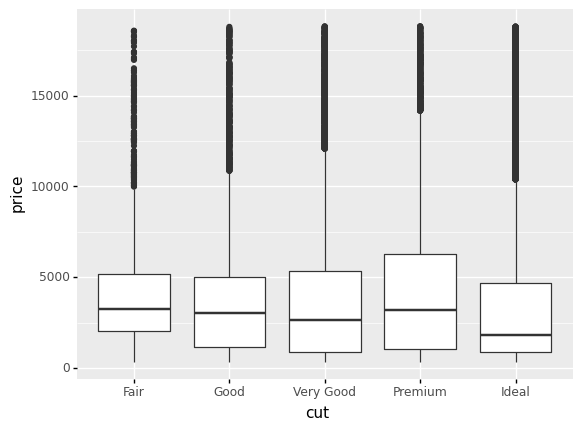
<ggplot: (8762375125170)>
Observations
Does this plot support or contradict hypothesis 2?
Surprisingly,
Idealdiamonds tend to be the least pricey! This was very surprising to me.
Upon making the graph in q3, I was very surprised, so I did some reading on diamond cuts. It turns out that some gemcutters sacrifice cut for carat. Could this effect explain the surprising pattern above?
q8 Unravel hypothesis 2#
Study the following graph; does it support a “sacrifice cut for carat” hypothesis? How might this relate to price?
Hint: The article linked above will help you answer these questions!
# NOTE: No need to edit; run and inspect
(
    df_diamonds
    >> gr.ggplot(gr.aes("cut", "carat"))
    + gr.geom_boxplot()
)
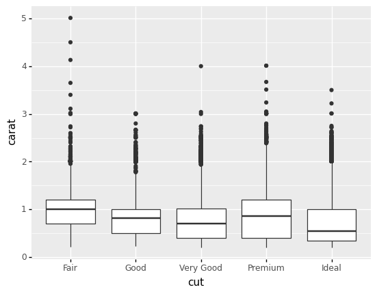
<ggplot: (8762373433293)>
Observations
The median of
Idealdiamonds is a fair bit lower incaratthan other cuts. This provides some evidence that gemcutters tradecutforcarat.The very largest
caratdiamonds tend to be ofFaircut; this makes sense, as cutting the gemstone will only reduce weight.It seems that many diamond purchasers are more interested in carat than fine cut. This provides some rationale for why
Idealdiamonds are cheaper; they are necessarily lower-carat.