Stats: Descriptive Statistics#
Purpose: We will use descriptive statistics to make quantitative summaries of a dataset. Descriptive statistics provide a much more compact description than a visualization, and are important when a data consumer wants “just one number”. However, there are many subtleties to working with descriptive statistics, which we’ll discuss in this exercise.
Setup#
import grama as gr
import pandas as pd
DF = gr.Intention()
%matplotlib inline
Statistics#
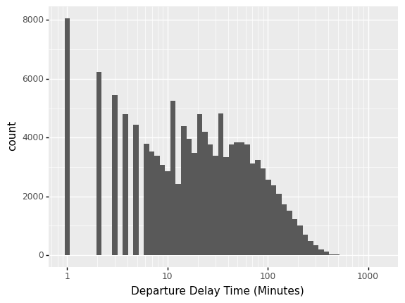
A statistic is a numerical summary of a sample. Statistics are useful because they provide a useful summary about our data. A histogram gives us a rich summary of a datset: for example the departure delay time in the NYC flight data.
## NOTE: Don't edit; run and inspect
from nycflights13 import flights as df_flights

(
    df_flights
    >> gr.ggplot(gr.aes("dep_delay"))
    + gr.geom_histogram(bins=60)
    + gr.scale_x_log10()
    + gr.labs(
        x="Departure Delay Time (Minutes)",
    )
)
/Users/zach/opt/anaconda3/envs/evc/lib/python3.9/site-packages/pandas/core/arraylike.py:397: RuntimeWarning: divide by zero encountered in log10
/Users/zach/opt/anaconda3/envs/evc/lib/python3.9/site-packages/pandas/core/arraylike.py:397: RuntimeWarning: invalid value encountered in log10
/Users/zach/opt/anaconda3/envs/evc/lib/python3.9/site-packages/plotnine/layer.py:324: PlotnineWarning: stat_bin : Removed 208344 rows containing non-finite values.
<ggplot: (8775467204497)>
This shows the departure delay time, in minutes.
However, we might be interested in a few questions about these data:
What is a typical value for the departure delay? (Location)
How variable are departure delay times? (Spread)
How much does departure delay co-vary with distance? (Dependence)
We can give quantitative answers to all these questions using statistics!
Central Tendency#
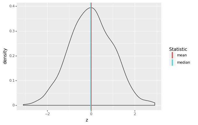
Central tendency is the idea of where data tend to be “located”—this concept is also called location. It is best thought of as the “center” of the data. The following graph illustrates central tendency, as operationalized by the mean and median.
## NOTE: No need to edit
# Generate data
df_standard = gr.df_make(z=gr.marg_mom("norm", mean=0, sd=1).r(1000))

# Visualize
(
    df_standard
    >> gr.ggplot(gr.aes("z"))
    + gr.geom_density()
    + gr.geom_vline(
        data=df_standard
        >> gr.tf_summarize(
            z_mean=gr.mean(DF.z),
            z_median=gr.median(DF.z),
        )
        >> gr.tf_pivot_longer(
            columns=["z_mean", "z_median"],
            names_to=[".value", "stat"],
            names_sep="_",
        ),
        mapping=gr.aes(xintercept="z", color="stat"),
        size=1,
    )
    + gr.scale_color_discrete(name="Statistic")
)
<ggplot: (8775487522440)>
There are two primary measures of central tendency; the mean and median. The mean is the simple arithmetic average: the sum of all values divided by the total number of values. The mean is denoted by \(\overline{x}\) and defined by
where \(n\) is the number of data points, and the \(X_i\) are the individual values.
The median is the value that separates half the data above and below. Weirdly, there’s no standard symbol for the median, so we’ll just denote it as \(\text{Median}[X]\) to denote the median of a quantity \(X\).
The median is a robust statistic, which is best illustrated by example. Consider the following two samples v_base and v_outlier. The sample v_outlier has an outlier, a value very different from the other values. Observe what value the mean and median take for these different samples.
## NOTE: No need to change this!
v_base = pd.Series([1, 2, 3, 4, 5])
v_outlier = v_base.copy()
v_outlier[-1] = 1e3

gr.df_make(
  mean_base=gr.mean(v_base),
  median_base=gr.median(v_base),

  mean_outlier=gr.mean(v_outlier),
  median_outlier=gr.median(v_outlier)
)
| mean_base | median_base | mean_outlier | median_outlier | |
|---|---|---|---|---|
| 0 | 3.0 | 3.0 | 169.166667 | 3.5 |
Note that for v_outlier the mean is greatly increased, but the median is only slightly changed. It is in this sense that the median is robust—it is robust to outliers. When one has a dataset with outliers, the median is usually a better measure of central tendency [1].
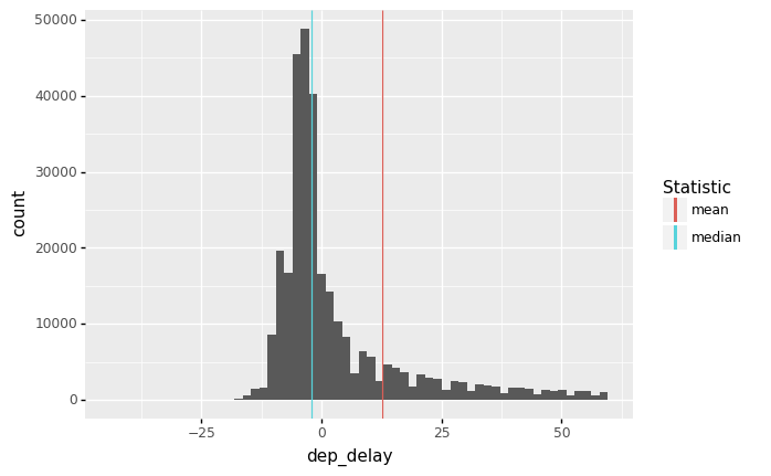
It can be useful to recognize when the mean and median agree or disagree with each other. For instance, with the flights data we see strong disagreement between the mean and median of dep_delay.
(
    df_flights
    >> gr.tf_filter(DF.dep_delay < 60)
    >> gr.ggplot(gr.aes("dep_delay"))
    + gr.geom_histogram(bins=60)
    + gr.geom_vline(
        data=df_flights
        >> gr.tf_summarize(
            dep_delayXmean=gr.mean(DF.dep_delay),
            dep_delayXmedian=gr.median(DF.dep_delay),
        )
        >> gr.tf_pivot_longer(
            columns=["dep_delayXmean", "dep_delayXmedian"],
            names_to=[".value", "stat"],
            names_sep="X",
        ),
        mapping=gr.aes(xintercept="dep_delay", color="stat"),
    )
    + gr.scale_color_discrete(name="Statistic")
)
<ggplot: (8775487466066)>
The median is in the bulk of the negative values, while the mean is pulled higher by the long right tail of the distribution.
q1 Compare conclusions from mean and median#
The following code computes the mean and median dep_delay for each carrier, and sorts based on mean. Duplicate the code, and sort by median instead. Answer the questions under observations below.
## NOTE: No need to edit; adapt this code to sort by median
(
    df_flights
    >> gr.tf_group_by(DF.carrier)
    >> gr.tf_summarize(
        mean=gr.mean(DF.dep_delay),
        median=gr.median(DF.dep_delay),
    )
    >> gr.tf_ungroup()
    >> gr.tf_arrange(gr.desc(DF["mean"]))
    >> gr.tf_head(5)
)
| carrier | mean | median | |
|---|---|---|---|
| 0 | F9 | 20.215543 | 0.5 |
| 1 | EV | 19.955390 | -1.0 |
| 2 | YV | 18.996330 | -2.0 |
| 3 | FL | 18.726075 | 1.0 |
| 4 | WN | 17.711744 | 1.0 |
## NOTE: No need to edit; adapt this code to sort by median
(
    df_flights
    >> gr.tf_group_by(DF.carrier)
    >> gr.tf_summarize(
        mean=gr.mean(DF.dep_delay),
        median=gr.median(DF.dep_delay),
    )
    >> gr.tf_ungroup()
    >> gr.tf_arrange(gr.desc(DF["median"]))
    >> gr.tf_head(5)
)
| carrier | mean | median | |
|---|---|---|---|
| 0 | FL | 18.726075 | 1.0 |
| 1 | WN | 17.711744 | 1.0 |
| 2 | F9 | 20.215543 | 0.5 |
| 3 | UA | 12.106073 | 0.0 |
| 4 | VX | 12.869421 | 0.0 |
Observations
Which carriers show up in the top 5 in both lists?
F9,FL,WN
Which carriers show up in the top 5 for only one of the lists?
EVandWN(Mean);UAandVX(Median)
Aside: Some variable names are tricky…#
There’s an issue we’ll start to run into as we start naming columns the same as builtin functions. For instance, the following code will throw an error:
## TODO: Uncomment the code below and run
## NOTE: This will throw a huge, scary error!
# (
#     df_flights
#     >> gr.tf_summarize(
#         ## Here we assign a new column with the name `mean`
#         mean=gr.mean(DF.dep_delay)
#     )
#     >> gr.tf_mutate(
#         ## Here we attempt to access that `mean` column, but it goes wrong....
#         mean2x=DF.mean * 2
#     )
# )
The issue here is a bit technical, but it boils down to the fact that mean is now a column of the DataFrame, but also a method that we can call as a function df.mean().
There’s a way around this issue, which is to access the column through bracket notation df["column"] rather than dot notation df.column. This will correctly access the column mean rather than the method mean().
q2 Fix this code#
Use bracket [] notation to access the "mean" column and fix the code below.
## TASK: Use bracket [] notation to fix the following code
(
    df_flights
    >> gr.tf_summarize(mean=gr.mean(DF.dep_delay))
    >> gr.tf_mutate(

        mean2x=DF["mean"] * 2
    )
)
| mean | mean2x | |
|---|---|---|
| 0 | 12.63907 | 25.278141 |
Multi-modality#
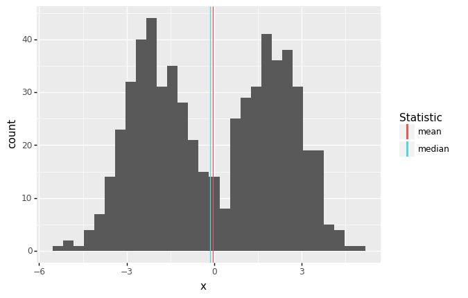
It may not seem like it, but we’re actually making an assumption when we use the mean (or median) as a typical value. Imagine we had the following data:
## NOTE: No need to edit
df_bimodal = (
    gr.df_make(x=gr.marg_mom("norm", mean=-2, sd=1).r(300))
    >> gr.tf_bind_rows(gr.df_make(x=gr.marg_mom("norm", mean=+2, sd=1).r(300)))
)

(
    df_bimodal
    >> gr.ggplot(gr.aes("x"))
    + gr.geom_histogram(bins=30)
    + gr.geom_vline(
        data=df_bimodal
        >> gr.tf_summarize(
            x_mean=gr.mean(DF.x),
            x_median=gr.median(DF.x),
        )
        >> gr.tf_pivot_longer(
            columns=["x_mean", "x_median"],
            names_to=[".value", "stat"],
            names_sep="_",
        ),
        mapping=gr.aes(xintercept="x", color="stat"),
    )
    + gr.scale_color_discrete(name="Statistic")
)
<ggplot: (8775467343668)>
Here the mean and median are both close to zero, but zero is an atypical number! This is partly why we don’t only compute descriptive statistics, but also do a deeper dive into our data. Here, we should probably refuse to give a single typical value; instead, it seems there might really be two populations showing up in the same dataset, so we can give two typical numbers, say -2, +2.
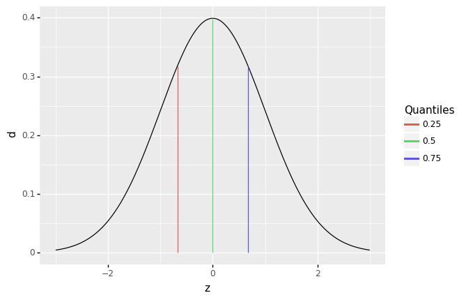
Quantiles#
Before we can talk about spread, we need to talk about quantiles. A quantile is a value that separates a user-specified fraction of data (or a distribution). For instance, the median is the \(50\%\) quantile; thus \(\text{Median}[X] = Q_{0.5}[X]\). We can generalize this idea to talk about any quantile between \(0\%\) and \(100\%\).
The following graph visualizes the \(25\%, 50\%, 75\%\) quantiles of a standard normal. Since these are the quarter-quantiles (\(1/4, 2/4, 3/4\)), these are often called the quartiles.
## NOTE: No need to edit
mg_standard = gr.marg_mom("norm", mean=0, sd=1)

(
    gr.df_make(z=gr.linspace(-3, +3, 500))
    >> gr.tf_mutate(d=mg_standard.d(DF.z))

    >> gr.ggplot(gr.aes("z", "d"))
    + gr.geom_line()
    + gr.geom_segment(
        data=gr.df_make(p=[0.25, 0.50, 0.75])
        >> gr.tf_mutate(z=mg_standard.q(DF.p))
        >> gr.tf_mutate(d=mg_standard.d(DF.z)),
        mapping=gr.aes(xend="z", yend=0, color="factor(p)")
    )
    + gr.scale_color_discrete(name="Quantiles")
)
<ggplot: (8775466883880)>
Note: This code makes use of distributions such as mg_standard; we’ll learn more about that in a future exercise. For this exercise, we’re focused more on taking statistics of datasets.
We’ll use the quartiles to define the interquartile range. First, the quant() function computes quantiles of a sample. For example:
## NOTE: No need to change this! Run for an example
(
    df_flights
    >> gr.tf_summarize(
        dep_delay_25=gr.quant(DF.dep_delay, 0.25),
        dep_delay_50=gr.quant(DF.dep_delay, 0.50),
        dep_delay_75=gr.quant(DF.dep_delay, 0.75),
    )
)
| dep_delay_25 | dep_delay_50 | dep_delay_75 | |
|---|---|---|---|
| 0 | -5.0 | -2.0 | 11.0 |
We provide to gr.quant() a column to analyze and a probability level. Remember: a probability is a value between \([0, 1]\), while a quantile is a value that probably has units, like minutes in the case of dep_delay.
Now we can define the interquartile range:
where \(Q_{p}[X]\) is the \(p\)-th quantile of a sample \(X\).
q3 Compute the IQR#
Using the function quantile, compute the interquartile range; this is the difference between the \(75%\) and \(25%\) quantiles. Provide this as a column called iqr.
## TASK: Compute the IQR
df_standard_iqr = (
    df_standard
    >> gr.tf_summarize(

        iqr=gr.quant(DF.z, 0.75) - gr.quant(DF.z, 0.25),
    )
)

## NOTE: Use this to check your work
print(df_standard_iqr)

assert \
    "iqr" in df_standard_iqr.columns, \
    "df_standard_iqr does not have an `iqr` column"
assert \
    abs(df_standard_iqr.iqr.values[0] - gr.IQR(df_standard.z)) < 1e-3, \
    "Computed IQR is incorrect"
       iqr
0  1.34706
Spread#
Spread is the concept of how tightly or widely data are spread out. There are two primary measures of spread: the standard deviation, and the interquartile range.
The standard deviation (SD) is denoted by \(s\) and defined by
where \(\overline{X}\) is the mean of the data. Note the factor of \(n-1\) rather than \(n\): This slippery idea is called Bessel’s correction. Note that \(\sigma^2\) is called the variance.
By way of analogy, mean is to standard deviation as median is to IQR: The IQR is a robust measure of spread. Returning to our outlier example:
## NOTE: No need to change this!
v_base = pd.Series([1, 2, 3, 4, 5])
v_outlier = v_base.copy()
v_outlier[-1] = 1e3

gr.df_make(
  sd_base=gr.sd(v_base),
  IQR_base=gr.IQR(v_base),

  sd_outlier=gr.sd(v_outlier),
  IQR_outlier=gr.IQR(v_outlier)
)
| sd_base | IQR_base | sd_outlier | IQR_outlier | |
|---|---|---|---|---|
| 0 | 1.581139 | 2.0 | 407.026002 | 2.5 |
q4 Compare conclusions from sd and IQR#
Using the code from q2 as a starting point, compute the standard deviation (sd()) and interquartile range (IQR()), and rank the top five carriers, this time by sd and IQR. Answer the questions under observations below.
## TASK: Find top 5 sd and IQR carriers
print(
    df_flights
# task-begin
    ## TODO: Compute sd and IQR of dep_delay, take top 5 highest sd
# task-begin
    >> gr.tf_group_by(DF.carrier)
    >> gr.tf_summarize(
        sd=gr.sd(DF.dep_delay),
        IQR=gr.IQR(DF.dep_delay),
    )
    >> gr.tf_ungroup()
    >> gr.tf_arrange(gr.desc(DF["sd"]))
    >> gr.tf_head(5)
)

print(
    df_flights
# task-begin
    ## TODO: Compute sd and IQR of dep_delay, take top 5 highest IQR
# task-begin
    >> gr.tf_group_by(DF.carrier)
    >> gr.tf_summarize(
        sd=gr.sd(DF.dep_delay),
        IQR=gr.IQR(DF.dep_delay),
    )
    >> gr.tf_ungroup()
    >> gr.tf_arrange(gr.desc(DF["IQR"]))
    >> gr.tf_head(5)
)
  carrier         sd   IQR
0      HA  74.109901   6.0
1      F9  58.362648  22.0
2      FL  52.661600  21.0
3      YV  49.172266  30.0
4      EV  46.552354  30.0
  carrier         sd   IQR
0      EV  46.552354  30.0
1      YV  49.172266  30.0
2      9E  45.906038  23.0
3      F9  58.362648  22.0
4      FL  52.661600  21.0
Observations
Which carriers show up in the top 5 in both lists?
F9,FL,YV,EV
Which carriers show up in the top 5 for only one of the lists?
HA(sd);9E(IQR)
Which carrier (among your top-ranked) has the largest difference between
sdandIQR? What might this difference suggest?HAhas a huge standard deviation, but a relatively smallIQR. It may be thatHAhas some extreme outlier delays that skew thesd.
Dependence#
So far, we’ve talked about descriptive statistics to consider one variable at a time. To conclude, we’ll talk about statistics to consider dependence between two variables in a dataset.
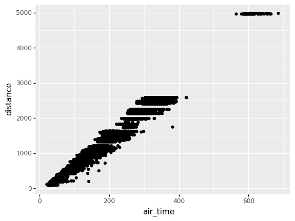
Dependence—like location or spread—is a general idea of relation between two variables. For instance, when it comes to flights we’d expect trips between more distant airports to take longer. If we plot distance vs air_time in a scatterplot, we indeed see this dependence.
## NOTE: No need to edit
(
    df_flights
    >> gr.tf_sample(frac=0.10) # Subsample the rows for speed

    >> gr.ggplot(gr.aes("air_time", "distance"))
    + gr.geom_point()
)
/Users/zach/opt/anaconda3/envs/evc/lib/python3.9/site-packages/plotnine/layer.py:401: PlotnineWarning: geom_point : Removed 924 rows containing missing values.
<ggplot: (8775500150848)>
Two flavors of correlation help us make this idea quantitative: the Pearson correlation and Spearman correlation. Unlike our previous quantities for location and spread, these correlations are dimensionless (they have no units), and they are bounded between \([-1, +1]\).
The Pearson correlation is often denoted by \(r_{XY}\), and it specifies the variables being considered \(X, Y\). It is defined by
The Spearman correlation is often denoted by \(\rho_{XY}\), and is actually defined in terms of the Pearson correlation \(r_{XY}\), but with the ranks (\(1\) to \(n\)) rather than the values \(X_i, Y_i\).
For example, we might expect a strong correlation between the air_time and the distance between airports. The function gr.corr() can compute both Pearson and Spearman correlation.
## NOTE: No need to edit
(
    df_flights
    >> gr.tf_summarize(
        r=gr.corr(DF.air_time, DF.distance, nan_drop=True), # Default is pearson correlation
        rho=gr.corr(DF.air_time, DF.distance, method="spearman", nan_drop=True),
    )
)
| r | rho | |
|---|---|---|
| 0 | 0.99065 | 0.984445 |
As expected, we see a strong correlation between air_time and distance (according to both correlation metrics).
However, we wouldn’t expect any relation between air_time and month.
## NOTE: No need to edit
(
    df_flights
    >> gr.tf_summarize(
        r=gr.corr(DF.air_time, DF.month, nan_drop=True), # Default is pearson correlation
        rho=gr.corr(DF.air_time, DF.month, method="spearman", nan_drop=True),
    )
)
| r | rho | |
|---|---|---|
| 0 | 0.010924 | 0.005213 |
In the case of a perfect linear relationships the Pearson correlation takes the value \(+1\) (for a positive slope) or \(-1\) for a negative slope.
q5 Build your intuition for correlation#
Compute the Pearson correlation between x, y below. Play with the slope and observe the change in the correlation. Answer the questions under observations below.
## TASK: Vary the slope and re-run the code below
slope = 0.5

## NOTE: No need to edit beyond here
df_line = (
    gr.df_make(x=gr.linspace(-1, +1, 50))
    >> gr.tf_mutate(y=slope * DF.x)
)

print(
    df_line
    >> gr.tf_summarize(r=gr.corr(DF.x, DF.y))
)

(
    df_line
    >> gr.ggplot(gr.aes("x", "y"))
    + gr.geom_point()
)
     r
0  1.0
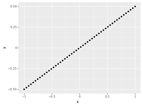
<ggplot: (8775533187178)>
Observations:
For what values of
slopeis the correlation positive?slopevalues greater than 0 have a positive correlation
For what values of
slopeis the correlation negative?slopevalues less than 0 have a negative correlation
Is correlation a measure of the slope?
No; the correlation does not measure slope! Note that in this example, for any nonzero slope, we always find that \(r = \pm 1\).
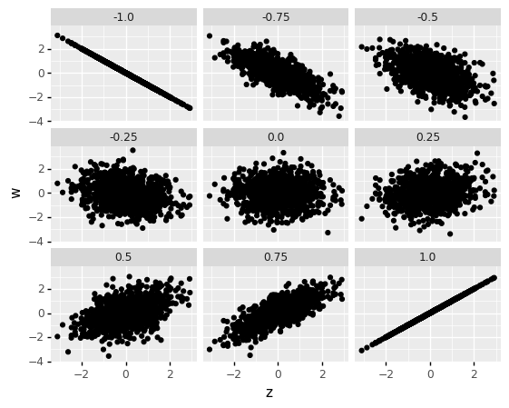
Note that this means correlation is a measure of dependence; it is not a measure of slope! It is better thought of as how strong the relationship between two variables is. A closer-to-zero correlation indicates a noisy relationship between variables, while a closer-to-one (in absolute value) indicates a more perfect, predictable relationship between the variables. For instance, the following code simulates data with different correlations, and facets the data based on the underlying correlation.
## NOTE: No need to edit
# Generate data
df_correlated = gr.df_grid()
v_corr = [-1.0, -0.75, -0.5, -0.25, +0.0, +0.25, +0.5, +0.75, +1.0]
n = df_standard.shape[0]
for r in v_corr:
    df_correlated = (
        df_correlated
        >> gr.tf_bind_rows(
            df_standard
            >> gr.tf_mutate(
                # Use the conditional gaussian formula to generate correlated observations
                w=r * DF.z + mg_standard.r(n) * gr.sqrt(1 - r**2),
                r=r,
            )
        )
    )
# Visualize
(
    df_correlated
    >> gr.ggplot(gr.aes("z", "w"))
    + gr.geom_point()
    + gr.facet_wrap("r")
)
/Users/zach/opt/anaconda3/envs/evc/lib/python3.9/site-packages/plotnine/utils.py:371: FutureWarning: The frame.append method is deprecated and will be removed from pandas in a future version. Use pandas.concat instead.
<ggplot: (8775466857692)>
One of the primary differences between Pearson and Spearman is that Pearson is a linear correlation, while Spearman is a nonlinear correlation.
For instance, the following data have a perfect relationship. However, the pearson correlation suggests the relationship is imperfect, while the spearman correlation correctly indicates a perfect relationship.
## NOTE: No need to edit
df_monotone = (
    gr.df_make(x=gr.linspace(-3.14159/2 + 0.1, +3.14159/2 - 0.1, 50))
    >> gr.tf_mutate(y=gr.tan(DF.x))
)

print(
    df_monotone
    >> gr.tf_summarize(
        r=gr.corr(DF.x, DF.y),
        rho=gr.corr(DF.x, DF.y, method="spearman")
    )
)

(
    df_monotone
    >> gr.ggplot(gr.aes("x", "y"))
    + gr.geom_point()
)
          r  rho
0  0.846169  1.0
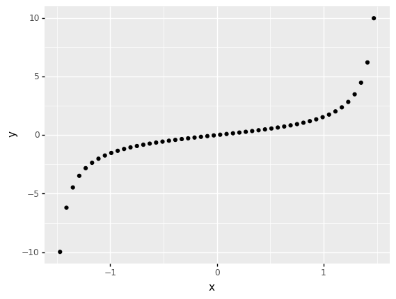
<ggplot: (8775487671824)>
One more note about functional relationships: Neither Pearson nor Spearman can pick up on arbitrary dependencies.
q6 Make a prediction#
Run the code chunk below and look at the visualization: Make a prediction about what you think the correlation will be. Then compute the Pearson correlation between x, y below.
## NOTE: Don't edit; run and inspect
df_quad = (
    gr.df_make(x=gr.linspace(-1, +1, 51))
    >> gr.tf_mutate(y=DF.x**2 - 0.5)
)

(
    df_quad
    >> gr.ggplot(gr.aes("x", "y"))
    + gr.geom_point()
)
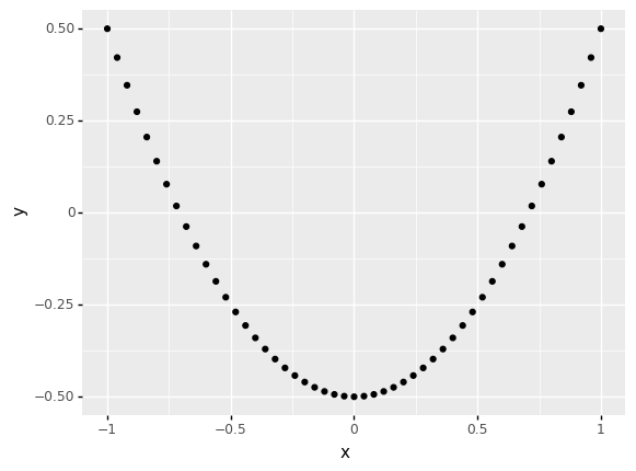
<ggplot: (8775465522568)>
## TASK: Compute the correlation between `x` and `y`
(
    df_quad
    >> gr.tf_summarize(
        r=gr.corr(DF.x, DF.y),
        rho=gr.corr(DF.x, DF.y, method="spearman"),
    )
)
| r | rho | |
|---|---|---|
| 0 | 5.551115e-17 | 0.006699 |
Observations
Both correlations are near-zero
One last point about correlation: The mean is to Pearson correlation as the median is to Spearman correlation. The median and Spearman’s rho are robust to outliers.
## NOTE: No need to edit
df_corr_outliers = (
    gr.df_make(x=mg_standard.r(25))
    >> gr.tf_mutate(y=0.9 * DF.x + gr.sqrt(1-0.9**2) * mg_standard.r(25))
    >> gr.tf_bind_rows(gr.df_make(
        x=[-10.1, -10, 10, 10.1],
        y=[-1.2, -1.1, 1.1, 1.2],
    ))
)

print(
    df_corr_outliers
    >> gr.tf_summarize(
        r=gr.corr(DF.x, DF.y),
        rho=gr.corr(DF.x, DF.y, method="spearman"),
    )
)

(
    df_corr_outliers
    >> gr.ggplot(gr.aes("x", "y"))
    + gr.geom_point()
)
          r     rho
0  0.676332  0.8133
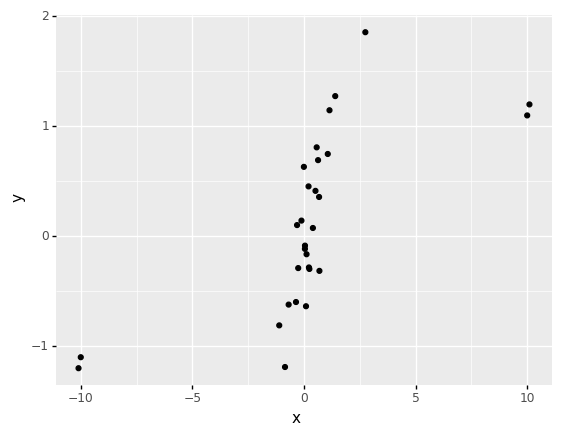
<ggplot: (8775486321695)>
Real Variability vs Error#
As we’ve seen in this exercise, we are making modeling assumptions even when we do simple things like compute and use the mean. We should use multiple analyses—such as multiple statistics and visual inspection—to fully make sense of a dataset.
However, beyond simply treating the data as a set of numbers, we should also think critically about what the data mean, and what the sources of variability might be. Recall that sources of variability can be either real or erroneous; that is, the source either affect the physical system we are studying, or it can represent corrupted measurements. Most likely, the variability we see is a combination of both real and erroneous sources.
To close out this exercise, let’s practice reasoning about sources of variability and choosing appropriate statistics for our analysis.
q7 Reason about sources of variability#
Choose a set of statistics to compute for the dep_delay column. Answer the questions under observations below. Note that you will need to compute multiple statistics in response to the questions below.
## TASK: Compute your statistics on `dep_delay`
(
    df_flights
    >> gr.tf_summarize(
        dep_delay_mean=gr.mean(DF.dep_delay),
        dep_delay_median=gr.median(DF.dep_delay),
        pr_early=gr.pr(DF.dep_delay < 0),
    )
)
| dep_delay_mean | dep_delay_median | pr_early | |
|---|---|---|---|
| 0 | 12.63907 | -2.0 | 0.545095 |
Observations
Is the variability in
dep_delaymost likely real or erroneous?Aircraft departures are subject to all sorts of phenomena that could create delays, such as equipment failures, difficulties loading the plane, irate or uncooperative passengers, etc. I find it highly likely that a large fraction of the variability we see here is real.
Compute the mean of
dep_delay. Does this summary on its own suggest that departures could occur early?No; the mean of
dep_delayis positive (around13minutes), which on its own does not suggest that flights could ever depart early.
Is it ever the case that a plane departs early? How typical is that occurrence?
Yes; the median delay is negative, which tells us that at least half the distribution is negative. In fact a little over half (
0.55) the sample has a negativedep_delay.
q8 Select the most consistent airline#
Take a look at the questions under observations below; compute the statistics necessary to answer the following questions.
## TASK: Compute your statistics on `dep_delay`
(
    df_flights
    >> gr.tf_group_by(DF.carrier)
    >> gr.tf_summarize(
        dep_delay_iqr=gr.IQR(DF.dep_delay),
        dep_delay_sd=gr.sd(DF.dep_delay),
        dep_delay_median=gr.median(DF.dep_delay),
        dep_delay_mean=gr.mean(DF.dep_delay),
        n=gr.n(),
    )
    >> gr.tf_ungroup()
    >> gr.tf_arrange(DF.dep_delay_iqr)
)
| carrier | dep_delay_iqr | dep_delay_sd | dep_delay_median | dep_delay_mean | n | |
|---|---|---|---|---|---|---|
| 0 | HA | 6.0 | 74.109901 | -4.0 | 4.900585 | 342 |
| 1 | US | 7.0 | 28.056334 | -4.0 | 3.782418 | 20536 |
| 2 | AA | 10.0 | 37.354861 | -3.0 | 8.586016 | 32729 |
| 3 | AS | 10.0 | 31.363032 | -3.0 | 5.804775 | 714 |
| 4 | DL | 10.0 | 39.735052 | -2.0 | 9.264505 | 48110 |
| 5 | VX | 12.0 | 44.815099 | 0.0 | 12.869421 | 5162 |
| 6 | OO | 13.0 | 43.065994 | -6.0 | 12.586207 | 32 |
| 7 | UA | 15.0 | 35.716597 | 0.0 | 12.106073 | 58665 |
| 8 | MQ | 16.0 | 39.184566 | -3.0 | 10.552041 | 26397 |
| 9 | B6 | 17.0 | 38.503368 | -1.0 | 13.022522 | 54635 |
| 10 | WN | 19.0 | 43.344355 | 1.0 | 17.711744 | 12275 |
| 11 | FL | 21.0 | 52.661600 | 1.0 | 18.726075 | 3260 |
| 12 | F9 | 22.0 | 58.362648 | 0.5 | 20.215543 | 685 |
| 13 | 9E | 23.0 | 45.906038 | -2.0 | 16.725769 | 18460 |
| 14 | EV | 30.0 | 46.552354 | -1.0 | 19.955390 | 54173 |
| 15 | YV | 30.0 | 49.172266 | -2.0 | 18.996330 | 601 |
Observations
Which
carrieris the most consistent, in terms ofdep_delay?It’s a bit of a toss-up between
HA(which has the smallest IQR) andUS(which has the smallest standard deviation). HoweverHAhas relatively few observations in the dataset (n=342forHA, cf.n=20536forUS), so it’s less impressive that they are more consistent.