Vis: Bar Charts#
Purpose: Bar charts are a key tool for EDA. In this exercise, we’ll learn how to construct a variety of different bar charts, as well as when—and when not—to use various charts.
Setup#
import grama as gr
DF = gr.Intention()
%matplotlib inline
We’ll use the mpg dataset from plotnine: This is a dataset describing different automobiles, including their mileage (hence mpg).
from plotnine.data import mpg as df_mpg
Bars and Cols#
A bar chart visualizes data using bars. A bar chart is most effective at showing a continuous variable against a discrete one.
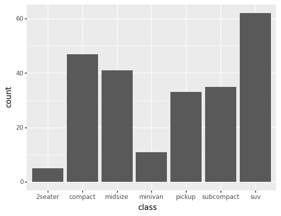
With ggplot we have two ways to make a bar chart: The first is geom_bar(), which takes just one aesthetic x. The geometry geom_bar() visualizes the number of observations (count) in the dataset associated with each unique value of the given variable. For instance, the following plot shows the number of vehicles according to each class.
# NOTE: No need to edit
(
    df_mpg
    >> gr.ggplot(mapping=gr.aes(x="class"))
    + gr.geom_bar()
)
<ggplot: (8773447564129)>
Clearly, there are far more SUVs, compacts, and midsize vehicles in the dataset than other classes.
The other bar geometry is geom_col(), which takes two aesthetics. The geometry geom_col() extends from zero to a desired value y, within each x value. The following gives a simple demo with made-up data.
# NOTE: No need to edit
(
    gr.df_make(
        category=["A", "B"],
        value=[3, 5],
    )
    >> gr.ggplot(gr.aes(x="category", y="value"))
    + gr.geom_col()
)
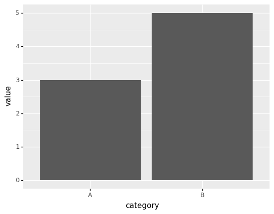
<ggplot: (8773447855737)>
We can actually recreate a geom_bar() plot by using tf_count() and geom_col(), which you’ll do in the next task.
q1 Convert bars to cols#
Recreate the following plot using geom_col().
# TASK: Convert this plot to use geom_col()

(
    df_mpg
    >> gr.tf_count(DF.trans)
    >> gr.ggplot(gr.aes(x="trans", y="n"))
    + gr.geom_col()
)
# solution-end
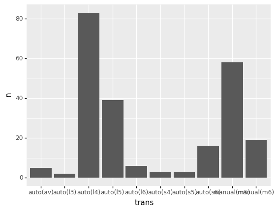
<ggplot: (8773460739292)>
Note that the labels for trans overlap; we’ll fix that in the next section.
Challenges with bar charts#
There are a few “gotchas” when visualizing with bar charts; we’ll go over two:
Overlapping Labels#
We saw in the previous plot that when our x variable has a lot of levels, the labels can overlap. One simple way to fix this is to flip the coordinates. We can’t simply swap the aesthetics x and y, as this will not give us what we want:
# NOTE: No need to edit; run and inspect
(
    df_mpg
    >> gr.tf_count(DF.trans)
    >> gr.ggplot(gr.aes(y="trans", x="n"))
    + gr.geom_col()
)
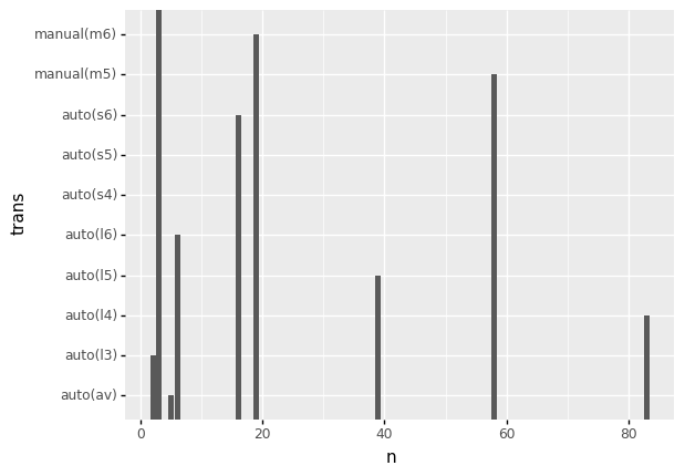
<ggplot: (8773447758800)>
Instead, we can flip the entire plot using coord_flip(). We use this by adding it to the ggplot object:
(
    df_data
    >> gr.ggplot(gr.aes(x="x", y="y"))
    + gr.geom_col()
    + gr.coord_flip()
)
q2 Flip coordinates to fix overlap#
Flip the coordinates to fix the overlapping labels in the following plot.
# TASK: Flip the coordinates to fix the overlapping labels
(
    df_mpg
    >> gr.ggplot(gr.aes(x="trans"))
    + gr.geom_bar()
    + gr.coord_flip()
)
<ggplot: (8773412858534)>
1-to-1 Data#
A bar chart draws a bar for every observation, this means that the data need to be “1-to-1”. This is an important limitation of bar charts, which is best understood through an example:
q3 Inspect the plot#
Inspect the following plot, and answer the questions under observations below.
# TASK: No need to edit; run and inspect
(
    df_mpg
    >> gr.ggplot(gr.aes(x="cty", y="hwy"))
    + gr.geom_col()
)

<ggplot: (8773447808994)>
Observations
What is the largest
hwyvalue shown in the plot above? Does this seem like a realistic value for the highway mileage?The largest
hwyvalue is over 600; this is totally unreasonable!
The following plot helps us understand the issue: With outlines around each bar, we can see that there are multiple stacked bars at each x level.
# TASK: No need to edit; run and inspect
(
    df_mpg
    >> gr.ggplot(gr.aes(x="cty", y="hwy"))
    + gr.geom_col(color="black")
)
<ggplot: (8773460820312)>
In order to avoid overlap, the data need to have just one observation for each level of the horizontal factor. Put differently, the data must be 1-to-1. We can check this with some simple counting.
q4 Check if data are 1-to-1#
If the data were 1-to-1 in the cty to hwy values, then there would be only one hwy value for each unique cty value. Check whether this is the case in df_mpg.
# TASK: Check if the data are 1-to-1 (in cty and hwy)
(
    df_mpg
    >> gr.tf_count(DF.cty, DF.hwy)
    >> gr.tf_head()
)
| cty | hwy | n | |
|---|---|---|---|
| 0 | 9 | 12 | 5 |
| 1 | 11 | 14 | 2 |
| 2 | 11 | 15 | 10 |
| 3 | 11 | 16 | 3 |
| 4 | 11 | 17 | 5 |
Observations
Is the data 1-to-1? Why or why not?
No, the data are not 1-to-1: For instance, for the value
cty==11,hwytakes multiple different values.
Design Considerations#
To close this exercise, we’ll cover some design considerations when making (bar) charts.
Picking aesthetics#
A major part of designing any plot is making choices about assigning variables to aesthetics.
One option we have is to “double-assign” a variable to multiple aesthetics. In the next task you’ll compare the efficacy of double-assigning aesthetics.
q5 Compare two plots#
Compare the following two plots, and answer the questions under observations below.
# TASK: No need to edit; run and inspect
(
    df_mpg
    >> gr.ggplot(gr.aes(x="class", fill="class"))
    + gr.geom_bar()
)
<ggplot: (8773427264856)>
Observations
What observations can you make?
The
suvobservations are most numerousThere are fewest
2seaterobservations
# TASK: No need to edit; run and inspect
# NOTE: the "drv" variable represent the "drivetrain" for each vehicle entry
# where r is rear, f is front, and 4 is 4-wheel/all wheel drive
(
    df_mpg
    >> gr.ggplot(gr.aes(x="class", fill="drv"))
    + gr.geom_bar()
)
<ggplot: (8773461126304)>
Observations
What additional observations can you make on this version of the plot?
Rear-wheel drive vehicles in the dataset are only
2seater,subcompact, andsuv.All the
2seatervehicles are rear-wheel drive.All the
minivanvehicles are forward-wheel drive.
What is different in the design of this graph, as compared with the previous one?
This version of the graph uses
fillfor an additional variabledrv, rather than repeating thexaestheticclass.
q6 Pros and cons of double-assignment#
Answer the questions below:
What are some pros of double-assigning a single variable to multiple aesthetics?
Double-assigning a variable can more highly-emphasize a variable.
What are some pros of single-assigning aesthetics, in order to show more variables?
Showing more variables opens up the possibility of seeing more patterns.